Ir al contenido
ImágenesGratis

Pósters de viaje premium con trama asiática vintage

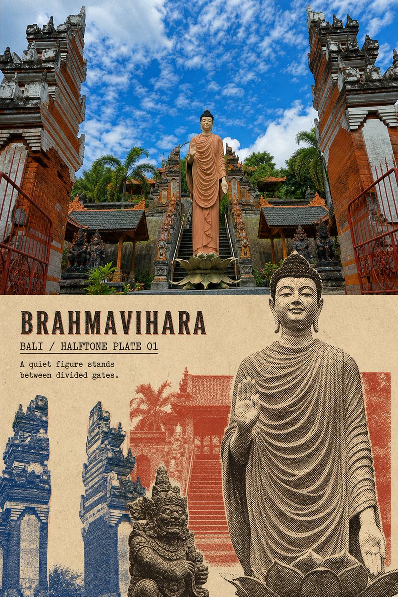
Una plantilla que convierte cada foto de viaje subida en un póster premium 3:4 que combina la fotografía original fielmente tratada arriba con un collage impreso vintage de trama asiática abajo, usando solo elementos extraídos de esa foto, una paleta limitada y texto en inglés estilo tipografía antigua.

OpenAI

Ejemplos de la fuente

Estas imágenes provienen de la fuente original. DROPIDEA no ha probado estos ejemplos; los resultados dependen del modelo y los ajustes.

Listo para personalizar

Tu prompt

Inglés

Sustituye las variables en rojo por tus datos. Copia el texto completo y úsalo con tu agente preferido.

TXT MD Versión en inglés
Please create an individual, premium-designed poster for each of the travel photos I upload. Output each photo on its own. Do not combine different photos or different locations in the same piece. Use a 3:4 vertical composition, made up of a clear contrast between authentic photography and stylized reinterpretation. The upper half should occupy roughly 50% of the canvas and faithfully preserve the original photograph. Accurately maintain the subject's identity, number, pose, architectural structure, terrain relationships, viewing angle, true materials, natural light and shadow, and original color atmosphere. Apply only a light travel-magazine and art-publication color grade, and add an extremely fine film grain. Do not redraw the photo as an illustration. Do not add or remove people, move objects, alter architecture, mirror, stretch, or distort the subject. Use a straight, clear, restrained horizontal boundary between the upper and lower zones. A very narrow warm paper gap may be retained. No gradients, feathering, bleed effects, or elements crossing the boundary. In the lower half, rebuild the same photograph as a "vintage Asian halftone travel collage." Extract only 2–4 real, most recognizable elements from this photograph—for example, landmark buildings, people, Buddha statues, vehicles, boats, rocks, rooftops, plants, or roads. Do not add other landmarks, people, vehicles, or cultural symbols that are not present in the photo. Do not redraw the full composition of the original photograph. Actively alter the subject scale, cropping, and spatial relationships: - Select one subject to enlarge and crop boldly, serving as the main visual anchor; - Break the remaining elements into independent plates of varying sizes; - Allow elements to overlap, misalign, bleed off the page, or form an editorial collage that does not conform to photographic perspective; - Remove complex backgrounds and minute details; - Choose between "distilled reduction" or "full-bleed impact" based on the photo's content; do not mechanically apply a fixed template; - The lower half should retain roughly 30%–40% of continuous warm-beige blank paper surface, allowing the graphics and text room to breathe. Use warm beige or ivory aged paper, clearly showing paper fiber, grain, slight stains, and a sense of age. The imagery uses dark-brown coarse halftone dots, hand-cut edges, localized ink loss, uneven ink coverage, and slight misregistration. The color palette must be extracted from the original photograph and compressed into a limited palette: - Dark brown as the main halftone plate; - Add at most two low-saturation spot colors; - Options include cobalt blue, indigo, gray-blue, brick red, terracotta red, ochre yellow, or the most recognizable color from the photograph; - Retain only one more vivid color as a visual accent; - Do not lock every location into the same red-and-blue palette. Text must be determined in advance based on the photo's reliable location and visual facts, and must enter the lower half naturally as part of the print medium. Default inclusions: 1. A location or theme title of 1–3 English words; 2. A short field, such as "LOCATION / HALFTONE PLATE 01"; 3. An observation sentence of 5–12 English words describing the architecture, weather, action, or spatial feeling actually visible in the photograph. The main title uses a clearly legible narrow serif typeface, old-style letterpress, or vintage publishing font, remaining recognizable even at chat preview size. Supporting text may be slightly smaller, but must not shrink into decorative hairlines. The text uses the same ink as the imagery, with slight ink loss, paper tooth, and misregistration—it must not look like a smooth digital type layer.
Ver resultados

Tu prompt

Please create an individual, premium-designed poster for each of the travel photos I upload. Output each photo on its own. Do not combine different photos or different locations in the same piece. Use a 3:4 vertical composition, made up of a clear contrast between authentic photography and stylized reinterpretation. The upper half should occupy roughly 50% of the canvas and faithfully preserve the original photograph. Accurately maintain the subject's identity, number, pose, architectural structure, terrain relationships, viewing angle, true materials, natural light and shadow, and original color atmosphere. Apply only a light travel-magazine and art-publication color grade, and add an extremely fine film grain. Do not redraw the photo as an illustration. Do not add or remove people, move objects, alter architecture, mirror, stretch, or distort the subject. Use a straight, clear, restrained horizontal boundary between the upper and lower zones. A very narrow warm paper gap may be retained. No gradients, feathering, bleed effects, or elements crossing the boundary. In the lower half, rebuild the same photograph as a "vintage Asian halftone travel collage." Extract only 2–4 real, most recognizable elements from this photograph—for example, landmark buildings, people, Buddha statues, vehicles, boats, rocks, rooftops, plants, or roads. Do not add other landmarks, people, vehicles, or cultural symbols that are not present in the photo. Do not redraw the full composition of the original photograph. Actively alter the subject scale, cropping, and spatial relationships: - Select one subject to enlarge and crop boldly, serving as the main visual anchor; - Break the remaining elements into independent plates of varying sizes; - Allow elements to overlap, misalign, bleed off the page, or form an editorial collage that does not conform to photographic perspective; - Remove complex backgrounds and minute details; - Choose between "distilled reduction" or "full-bleed impact" based on the photo's content; do not mechanically apply a fixed template; - The lower half should retain roughly 30%–40% of continuous warm-beige blank paper surface, allowing the graphics and text room to breathe. Use warm beige or ivory aged paper, clearly showing paper fiber, grain, slight stains, and a sense of age. The imagery uses dark-brown coarse halftone dots, hand-cut edges, localized ink loss, uneven ink coverage, and slight misregistration. The color palette must be extracted from the original photograph and compressed into a limited palette: - Dark brown as the main halftone plate; - Add at most two low-saturation spot colors; - Options include cobalt blue, indigo, gray-blue, brick red, terracotta red, ochre yellow, or the most recognizable color from the photograph; - Retain only one more vivid color as a visual accent; - Do not lock every location into the same red-and-blue palette. Text must be determined in advance based on the photo's reliable location and visual facts, and must enter the lower half naturally as part of the print medium. Default inclusions: 1. A location or theme title of 1–3 English words; 2. A short field, such as "LOCATION / HALFTONE PLATE 01"; 3. An observation sentence of 5–12 English words describing the architecture, weather, action, or spatial feeling actually visible in the photograph. The main title uses a clearly legible narrow serif typeface, old-style letterpress, or vintage publishing font, remaining recognizable even at chat preview size. Supporting text may be slightly smaller, but must not shrink into decorative hairlines. The text uses the same ink as the imagery, with slight ink loss, paper tooth, and misregistration—it must not look like a smooth digital type layer.

Qué obtienes

  • Un póster vertical premium 3:4 por foto, con un límite horizontal recto que separa la fotografía auténtica de la reinterpretación estilizada.
  • Una mitad superior que preserva la identidad e iluminación de la foto original con un graded suave de revista de viajes y grano de película fino.
  • Una mitad inferior como collage asiático vintage de trama marrón oscuro con 2–4 elementos reales de la misma foto y un 30%–40% de papel beige en blanco.
  • Texto en inglés estilo tipografía antigua (título de 1–3 palabras, un campo como "LOCATION / HALFTONE PLATE 01", y una observación de 5–12 palabras) con la misma tinta y textura impresa envejecida.

Casos de uso

  • Una serie de pósters de viaje para un álbum, apartamento u oficina.
  • Publicaciones para redes sociales o material impreso para una marca de viajes, cafetería o agencia.
  • Impresiones enmarcadas pequeñas o tarjetas postales premium a partir de fotos de viaje personales.
  • Arte mural estilo publicación vintage para salas, hoteles o espacios creativos.

Cómo usarlo

  • Sube una o más fotos de viaje; cada una se procesa por separado en su propio póster independiente.
  • Asegúrate de que cada foto sea nítida y que sus sujetos principales y su ubicación sean reconocibles, ya que el texto y el collage se construyen con los hechos de esa foto.
  • Deja las instrucciones tal cual para el estilo predeterminado, o ajusta los colores sugeridos (cobalto, índigo, rojo ladrillo, ocre) según los colores de tu foto.
  • Reutiliza la plantilla con fotos de distintos lugares para obtener una serie variada con paletas adaptadas a cada ubicación.

Prompts relacionados