Ir al contenido
ImágenesGratis

Póster vertical 3:4 foto y abstracción geométrica

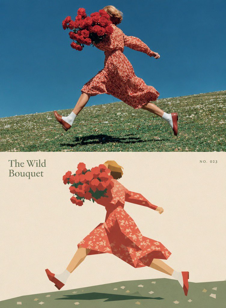
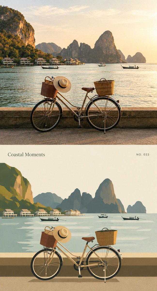
Crea un póster vertical 3:4 que combina la foto original subida arriba con una interpretación geométrica plana y de bordes duros debajo, usando una paleta limitada y tipografía de archivo al estilo de un libro de arte contemporáneo.

OpenAI

Ejemplos de la fuente

Estas imágenes provienen de la fuente original. DROPIDEA no ha probado estos ejemplos; los resultados dependen del modelo y los ajustes.

Listo para personalizar

Tu prompt

Inglés

Sustituye las variables en rojo por tus datos. Copia el texto completo y úsalo con tu agente preferido.

TXT MD Versión en inglés
Using the uploaded photo, create a vertical 3:4 “before-and-after” comparison poster. If multiple photos are uploaded, create one separate poster for each photo; do not mix different photos on the same page. The upper and lower sections should each occupy exactly half of the total height, with a seamless transition between them. Do not add borders, arrows, or “Before” / “After” labels. 【TOP SECTION: ORIGINAL PHOTO】 The top section should use the uploaded original photo, filling the full width of the canvas. Preserve the original subject, pose/action, scene, natural lighting, and dominant color palette. Only allow subtle overall color adjustments; do not change the atmosphere or add any filter effects. Maintain the photo’s original aspect ratio and do not stretch the subject. To fit the top section, you may crop unimportant edges; if cropping would remove the main subject, prioritize adding a small amount of background instead, but never invent or alter the subject or key elements of the scene. 【BOTTOM SECTION: GEOMETRIC ABSTRACT】 Using the same photo from the top section as the only reference, recreate the core subject and a few key environmental elements as a hard-edged, geometric, flat-style illustration. Do not add any people, animals, objects, or actions that were not present in the original photo. Preserve the core subject’s left/right position, pose, direction, interactions, and major occlusion relationships from the photo so that the top and bottom sections appear visually aligned at first glance; however, there is no need to reproduce the image pixel-for-pixel. Remove secondary background elements and insignificant details. The subject may be scaled down slightly to create generous negative space around it. Construct objects using a limited number of polygons of varying sizes, simplified curves, and solid color blocks. Preserve enough of the subject’s silhouette, movement, and defining characteristics so that it remains recognizable as the specific subject from the original photo; do not reduce it to a generic icon. Use adjacent color blocks of different shapes and brightness levels to define structure. Do not use gradients, outlines, 3D shadows, or realistic textures. Extract approximately 5–6 representative colors from the original photo and organize them into a cohesive palette with slightly reduced saturation. Use a warm off-white/beige tone as the background color for the lower section. Reserve the darkest tones for a few visual focal points, and retain one accent color that echoes the original photograph. Do not arbitrarily change the most recognizable colors of the core subject. Keep all geometric edges crisp and sharp. Add only an extremely subtle printed grain texture within the color blocks, with slight registration misalignment allowed on a few edges. Do not render the entire image with a rough paper texture or glitch-art effect. 【TEXT】 Add a small amount of archival-style typography to the lower section: automatically generate a short English title based on the content of the photo, accompanied by the small number “NO. 023”. Place the title in an area of negative space where it does not obstruct the subject, and position the number diagonally opposite the title to create visual balance. Do not fabricate real locations, dates, identities, or events, and do not add overly dense explanatory text. The overall composition should resemble a page from a contemporary art book: a rich, realistic photograph on top paired with a bold, highly simplified, orderly geometric interpretation beneath it. Keep the overall work restrained, gentle, and distinctive. Avoid cartoon-like faces, 3D effects, plastic-like materials, clashing neon colors, or random doodles.
Ver resultados

Tu prompt

Using the uploaded photo, create a vertical 3:4 “before-and-after” comparison poster. If multiple photos are uploaded, create one separate poster for each photo; do not mix different photos on the same page. The upper and lower sections should each occupy exactly half of the total height, with a seamless transition between them. Do not add borders, arrows, or “Before” / “After” labels. 【TOP SECTION: ORIGINAL PHOTO】 The top section should use the uploaded original photo, filling the full width of the canvas. Preserve the original subject, pose/action, scene, natural lighting, and dominant color palette. Only allow subtle overall color adjustments; do not change the atmosphere or add any filter effects. Maintain the photo’s original aspect ratio and do not stretch the subject. To fit the top section, you may crop unimportant edges; if cropping would remove the main subject, prioritize adding a small amount of background instead, but never invent or alter the subject or key elements of the scene. 【BOTTOM SECTION: GEOMETRIC ABSTRACT】 Using the same photo from the top section as the only reference, recreate the core subject and a few key environmental elements as a hard-edged, geometric, flat-style illustration. Do not add any people, animals, objects, or actions that were not present in the original photo. Preserve the core subject’s left/right position, pose, direction, interactions, and major occlusion relationships from the photo so that the top and bottom sections appear visually aligned at first glance; however, there is no need to reproduce the image pixel-for-pixel. Remove secondary background elements and insignificant details. The subject may be scaled down slightly to create generous negative space around it. Construct objects using a limited number of polygons of varying sizes, simplified curves, and solid color blocks. Preserve enough of the subject’s silhouette, movement, and defining characteristics so that it remains recognizable as the specific subject from the original photo; do not reduce it to a generic icon. Use adjacent color blocks of different shapes and brightness levels to define structure. Do not use gradients, outlines, 3D shadows, or realistic textures. Extract approximately 5–6 representative colors from the original photo and organize them into a cohesive palette with slightly reduced saturation. Use a warm off-white/beige tone as the background color for the lower section. Reserve the darkest tones for a few visual focal points, and retain one accent color that echoes the original photograph. Do not arbitrarily change the most recognizable colors of the core subject. Keep all geometric edges crisp and sharp. Add only an extremely subtle printed grain texture within the color blocks, with slight registration misalignment allowed on a few edges. Do not render the entire image with a rough paper texture or glitch-art effect. 【TEXT】 Add a small amount of archival-style typography to the lower section: automatically generate a short English title based on the content of the photo, accompanied by the small number “NO. 023”. Place the title in an area of negative space where it does not obstruct the subject, and position the number diagonally opposite the title to create visual balance. Do not fabricate real locations, dates, identities, or events, and do not add overly dense explanatory text. The overall composition should resemble a page from a contemporary art book: a rich, realistic photograph on top paired with a bold, highly simplified, orderly geometric interpretation beneath it. Keep the overall work restrained, gentle, and distinctive. Avoid cartoon-like faces, 3D effects, plastic-like materials, clashing neon colors, or random doodles.

Guía de variables

NO. 023

El pequeño número de archivo situado en diagonal frente al título en la sección inferior.

Dentro del párrafo 【النص】 de la plantilla; sustituye la cadena "NO. 023" por otro número con el formato NO. seguido de tres dígitos.

Valor de ejemplo

NO. 007

Qué obtienes

  • Un póster vertical 3:4 dividido en dos mitades exactas con una transición fluida.
  • Una mitad superior con la foto original, su color e iluminación naturales y sin filtros.
  • Una mitad inferior en estilo geométrico plano de bordes duros con unos 5–6 colores extraídos de la foto.
  • Un título corto en inglés generado automáticamente y el número de archivo "NO. 023" en tipografía de archivo.
  • Un aspecto similar a una página de un libro de arte contemporáneo.

Casos de uso

  • Portadas visuales para proyectos de diseño personal.
  • Publicaciones de Instagram y Pinterest en formato vertical.
  • Láminas artísticas conmemorativas de viajes o retratos.
  • Piezas de identidad de marca o exposiciones de diseño.
  • Regalos impresos en estilo artístico simplificado.

Cómo usarlo

  • Sube una foto clara con un sujeto principal definido; si subes varias fotos, se crea un póster separado por cada una.
  • Conserva la etiqueta de archivo "NO. 023" o sustitúyela por otro número con el mismo formato.
  • Ejecuta la plantilla y deja que el título corto en inglés se genere automáticamente a partir del contenido de la foto.
  • Revisa el resultado y comprueba que la mitad inferior conserve la pose, la dirección y una paleta extraída de la foto.
  • Exporta el póster vertical 3:4 final y úsalo como quieras.

Prompts relacionados