Ir al contenido
ImágenesGratis

Pósters editoriales de papel cortado de tus fotos

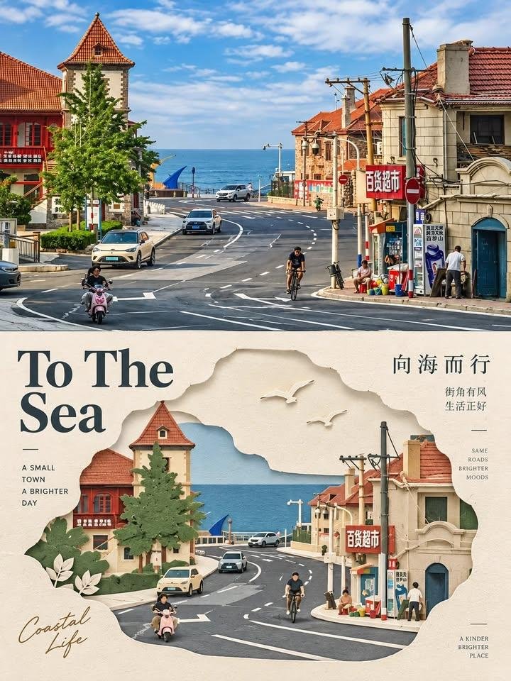
Convierte cada foto subida en un póster editorial vertical de 3:4: la mitad superior conserva la fotografía original con una corrección de color editorial sutil, mientras que la mitad inferior reinterpreta el sujeto más reconocible como una composición minimalista de papel cortado en capas, con un sistema tipográfico editorial refinado y una paleta armoniosa extraída de la propia foto.

Generación de imágenes

Ejemplos de la fuente

Estas imágenes provienen de la fuente original. DROPIDEA no ha probado estos ejemplos; los resultados dependen del modelo y los ajustes.

Listo para personalizar

Tu prompt

Inglés

Sustituye las variables en rojo por tus datos. Copia el texto completo y úsalo con tu agente preferido.

TXT MD Versión en inglés
Unlock an AI prompt in one day This prompt is pretty fun Create one independent editorial-style poster for each uploaded photo. Do not make a collage. Process and output each photo separately. Use a strict 3:4 vertical composition, divided horizontally into two exactly equal sections, each occupying 50% of the canvas. TOP HALF — ORIGINAL PHOTOGRAPH Preserve the original photo. Keep the main subject unchanged while retaining its realistic texture, natural lighting, and original color atmosphere. Apply only subtle editorial-grade color correction to create the refined feel of an art magazine, independent publication, or exhibition photography. To fit the composition, you may gently extend the sky, ground, or surrounding environmental background, but do not stretch, distort, or alter the main subject. BOTTOM HALF — LAYERED PAPER CUT / PAPER ART REINTERPRETATION Reinterpret the most recognizable subject, silhouette, pose, and spatial relationships from the photo as a minimalist layered paper-cut / paper-art composition. Use one primary subject as the visual anchor. Do not mechanically reproduce every detail. Instead, reconstruct the key silhouette, proportions, and structure through folding, cutting, layering, and overlapping. Transform only a few supporting environmental elements into foreground, midground, and background paper layers. Use scale contrast, negative space, clean alignment, and front-to-back layering to make the subject immediately recognizable while maintaining a restrained editorial composition. COLOR & MATERIAL Extract the most distinctive and recognizable colors from the original photo, then reduce them into a limited and harmonious paper-art palette. Use warm ivory or light-colored paper as the base, supported by a small amount of stronger accent colors, darker structural tones, soft transitional layer colors, and very limited highlights. The material should resemble high-quality matte cardstock, with subtle visible paper fibers, clean cut edges, and soft contact shadows under natural diffused lighting. Emphasize the tactile quality of real handcrafted paper art. Avoid glossy plastic-like 3D effects, cheap craft-paper aesthetics, neon colors, and overly saturated or complex gradients. EDITORIAL TYPOGRAPHY SYSTEM Add a refined editorial typography system. Based on the identity, location, action, material, emotion, or symbolic meaning of the subject, create one short main title. Add 2–4 groups of smaller supporting text. These may include object names, location information, numbers, sequence markers, coordinate-like numbers, direction words, status words, material descriptions, classification labels, or a very short poetic phrase. Do not use any year or date. The main title should convey emotion and identity, while the smaller text should add rhythm, structure, and refinement. TYPOGRAPHY INTEGRATION Integrate the typography naturally into the composition so that it interacts with the paper-cut forms. Arrange text along paper-layer edges, subject contours, geometric axes, or areas of negative space. Use horizontal or vertical typesetting, rotated text, generous letter spacing, edge alignment, corner placement, cross-section layouts, embedded typography, or partially overlapped text. The main title may have a subtle paper-cut or folded-paper quality, while the supporting text should remain thin, modern, restrained, and precise. The final result should feel elegant, tactile, balanced, art-directed, and distinctly editorial. #PaperCutArt
Ver resultados

Tu prompt

Unlock an AI prompt in one day This prompt is pretty fun Create one independent editorial-style poster for each uploaded photo. Do not make a collage. Process and output each photo separately. Use a strict 3:4 vertical composition, divided horizontally into two exactly equal sections, each occupying 50% of the canvas. TOP HALF — ORIGINAL PHOTOGRAPH Preserve the original photo. Keep the main subject unchanged while retaining its realistic texture, natural lighting, and original color atmosphere. Apply only subtle editorial-grade color correction to create the refined feel of an art magazine, independent publication, or exhibition photography. To fit the composition, you may gently extend the sky, ground, or surrounding environmental background, but do not stretch, distort, or alter the main subject. BOTTOM HALF — LAYERED PAPER CUT / PAPER ART REINTERPRETATION Reinterpret the most recognizable subject, silhouette, pose, and spatial relationships from the photo as a minimalist layered paper-cut / paper-art composition. Use one primary subject as the visual anchor. Do not mechanically reproduce every detail. Instead, reconstruct the key silhouette, proportions, and structure through folding, cutting, layering, and overlapping. Transform only a few supporting environmental elements into foreground, midground, and background paper layers. Use scale contrast, negative space, clean alignment, and front-to-back layering to make the subject immediately recognizable while maintaining a restrained editorial composition. COLOR & MATERIAL Extract the most distinctive and recognizable colors from the original photo, then reduce them into a limited and harmonious paper-art palette. Use warm ivory or light-colored paper as the base, supported by a small amount of stronger accent colors, darker structural tones, soft transitional layer colors, and very limited highlights. The material should resemble high-quality matte cardstock, with subtle visible paper fibers, clean cut edges, and soft contact shadows under natural diffused lighting. Emphasize the tactile quality of real handcrafted paper art. Avoid glossy plastic-like 3D effects, cheap craft-paper aesthetics, neon colors, and overly saturated or complex gradients. EDITORIAL TYPOGRAPHY SYSTEM Add a refined editorial typography system. Based on the identity, location, action, material, emotion, or symbolic meaning of the subject, create one short main title. Add 2–4 groups of smaller supporting text. These may include object names, location information, numbers, sequence markers, coordinate-like numbers, direction words, status words, material descriptions, classification labels, or a very short poetic phrase. Do not use any year or date. The main title should convey emotion and identity, while the smaller text should add rhythm, structure, and refinement. TYPOGRAPHY INTEGRATION Integrate the typography naturally into the composition so that it interacts with the paper-cut forms. Arrange text along paper-layer edges, subject contours, geometric axes, or areas of negative space. Use horizontal or vertical typesetting, rotated text, generous letter spacing, edge alignment, corner placement, cross-section layouts, embedded typography, or partially overlapped text. The main title may have a subtle paper-cut or folded-paper quality, while the supporting text should remain thin, modern, restrained, and precise. The final result should feel elegant, tactile, balanced, art-directed, and distinctly editorial. #PaperCutArt
Qué obtienes

  • Un póster vertical estricto de 3:4 por cada foto subida, dividido horizontalmente en dos mitades exactamente iguales que ocupan cada una el 50% del lienzo.
  • Una mitad superior que conserva la textura, la iluminación y los colores de la foto original con una corrección editorial sutil.
  • Una mitad inferior que reconstruye el sujeto como composición minimalista de papel cortado en capas con primer plano, plano medio y fondo.
  • Una paleta armoniosa de papel extraída de la foto y un acabado de cartulina mate de alta calidad con fibras visibles.
  • Un sistema tipográfico editorial refinado con un título principal corto y 2–4 grupos de texto de apoyo pequeño, sin ningún año ni fecha.

Casos de uso

  • Pósters para exposiciones de arte y eventos culturales.
  • Publicaciones artísticas destacadas para redes sociales.
  • Portadas y contenido visual para revistas de arte y publicaciones independientes.
  • Identidades visuales con dirección de arte para tiendas y proyectos creativos.
  • Tarjetas de invitación y diseños de decoración con espíritu de papel arte manual.

Cómo usarlo

  • Sube una o varias fotos nítidas; cada foto se procesa por separado y genera su propio póster independiente.
  • Pega el prompt completo en una herramienta de generación de imágenes que admita imágenes de referencia subidas.
  • Asegúrate de que la foto subida esté adjunta y visible, porque la mitad superior del póster se construye directamente a partir de ella.
  • Espera la generación y revisa el resultado: arriba la foto original con gradación de color editorial, abajo una reinterpretación de papel cortado en capas del mismo sujeto.
  • Vuelve a generar o prueba fotos distintas para obtener varias versiones; cada foto produce un póster separado, nunca un collage.

Prompts relacionados