Ir al contenido
ImágenesGratis

Póster editorial de postal panorámica por ambas caras

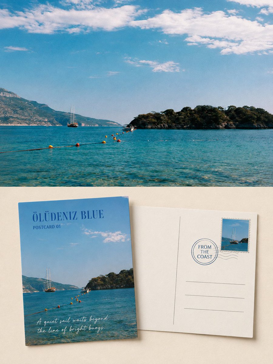
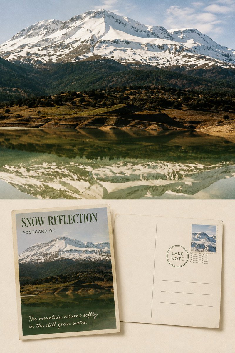
Convierte cada foto de viaje subida en un póster editorial vertical 3:4 de alto nivel: la foto original conservada como evidencia comparativa, más dos postales físicas que muestran el anverso y el reverso en un estilo sereno y coleccionable.

OpenAI

Ejemplos de la fuente

Estas imágenes provienen de la fuente original. DROPIDEA no ha probado estos ejemplos; los resultados dependen del modelo y los ajustes.

Listo para personalizar

Tu prompt

Inglés

Sustituye las variables en rojo por tus datos. Copia el texto completo y úsalo con tu agente preferido.

TXT MD Versión en inglés
Please produce, for each of my uploaded travel photos, an independent, high-end scenic postcard front-and-back editorial poster — not a multi-image collage, and output each photo separately. Use an overall 3:4 vertical composition, and clearly retain the same original travel photo as comparative evidence. The upper half or background of the image should occupy roughly 45%–55% of the entire work, faithfully presenting the original photo, accurately preserving the identity, quantity, direction, proportion, spatial position, viewing angle, natural light and shadow, true texture, and original color atmosphere of mountains, coastline, lakes, architecture, boats, roads, plants, people, or animals. Only perform subtle high-end travel-photography color grading and a very light film-grain treatment; do not turn the photo into an illustration, do not replace the sky, add or remove subjects, move scenery, change terrain, or reshape architecture. On the lower half, on a warm-white, pale ivory, or quietly tinted paper derived from the photo, simultaneously display two same-size, tangibly real physical postcards: one showing the front, one showing the back. The two cards should maintain standard horizontal postcard proportions, slightly offset or rotated at corners, but must not occlude each other in a large area. Clearly convey paper thickness, stiff edges, slight wear, natural shadows, and uncoated paper fibers. The original photo must not be hidden only inside the front card; the upper real-photography area must still have substantial area and be clearly legible. The front postcard should re-select the most representative scenic crop from the original photo, preserving the most identifiable silhouette, terrain relationships, weather, color, and spatial direction of the subject, but do not simply shrink the complete photo to fit proportionally inside the card. You may enlarge one visual anchor and remove cluttered background, so the front reads more like a carefully chosen travel scenic print. Add a place or scene title of 1–3 English words, as well as restrained fields such as "SCENIC NOTE 01" or "POSTCARD STUDY". The back postcard should use clear centerlines, address lines, a stamp area, and appropriate blank space. The stamp is derived from a subject, silhouette, or accent color in the same photo — keep only one stamp; keep the postmark restrained, and do not fabricate complex postal information. In the writing area, place an original travel observation of no more than two sentences, describing only the weather, light, color, boats, mountains, lake surface, village, or spatial feeling actually visible in the photo. All text must be determined word-for-word from the photo, with clear and legible size. The paper should be primarily warm white or pale ivory; the ink color should be extracted from the deep blue, gray-green, charcoal, or brown tones of the photo; the stamp may retain one accent color from the original photo. The two cards should occupy roughly 45%–65% of the lower area, with at least 30% continuous low-information negative space preserved around them. Titles and short phrases should use a gentle serif, handwriting, or postal typeface, with slight paper-teeth, broken ink, and old-print deviations, so the text truly belongs to the postcard. There must be a clear, restrained hierarchical relationship between the original photo and the postcard display area. If a top-and-bottom structure is used, the boundary must be clear — no haze, no feathering, no blending into a single image. Overall, reference collectible travel postcards, independent publications, photographic archives, and modern editorial design — conveying a quiet, sincere, restrained visual temperament with paper warmth and an unfinished story. Avoid: multi-photo collages, nine-grid layouts, missing photos, the original image used only as tiny decoration, duplicate cards, excessive stamps, complex stickers, fabricated cities, long garbled text, author names, account names, brands, QR codes, logos, photo-frame mockups, handheld displays, watermarks…
Ver resultados

Tu prompt

Please produce, for each of my uploaded travel photos, an independent, high-end scenic postcard front-and-back editorial poster — not a multi-image collage, and output each photo separately. Use an overall 3:4 vertical composition, and clearly retain the same original travel photo as comparative evidence. The upper half or background of the image should occupy roughly 45%–55% of the entire work, faithfully presenting the original photo, accurately preserving the identity, quantity, direction, proportion, spatial position, viewing angle, natural light and shadow, true texture, and original color atmosphere of mountains, coastline, lakes, architecture, boats, roads, plants, people, or animals. Only perform subtle high-end travel-photography color grading and a very light film-grain treatment; do not turn the photo into an illustration, do not replace the sky, add or remove subjects, move scenery, change terrain, or reshape architecture. On the lower half, on a warm-white, pale ivory, or quietly tinted paper derived from the photo, simultaneously display two same-size, tangibly real physical postcards: one showing the front, one showing the back. The two cards should maintain standard horizontal postcard proportions, slightly offset or rotated at corners, but must not occlude each other in a large area. Clearly convey paper thickness, stiff edges, slight wear, natural shadows, and uncoated paper fibers. The original photo must not be hidden only inside the front card; the upper real-photography area must still have substantial area and be clearly legible. The front postcard should re-select the most representative scenic crop from the original photo, preserving the most identifiable silhouette, terrain relationships, weather, color, and spatial direction of the subject, but do not simply shrink the complete photo to fit proportionally inside the card. You may enlarge one visual anchor and remove cluttered background, so the front reads more like a carefully chosen travel scenic print. Add a place or scene title of 1–3 English words, as well as restrained fields such as "SCENIC NOTE 01" or "POSTCARD STUDY". The back postcard should use clear centerlines, address lines, a stamp area, and appropriate blank space. The stamp is derived from a subject, silhouette, or accent color in the same photo — keep only one stamp; keep the postmark restrained, and do not fabricate complex postal information. In the writing area, place an original travel observation of no more than two sentences, describing only the weather, light, color, boats, mountains, lake surface, village, or spatial feeling actually visible in the photo. All text must be determined word-for-word from the photo, with clear and legible size. The paper should be primarily warm white or pale ivory; the ink color should be extracted from the deep blue, gray-green, charcoal, or brown tones of the photo; the stamp may retain one accent color from the original photo. The two cards should occupy roughly 45%–65% of the lower area, with at least 30% continuous low-information negative space preserved around them. Titles and short phrases should use a gentle serif, handwriting, or postal typeface, with slight paper-teeth, broken ink, and old-print deviations, so the text truly belongs to the postcard. There must be a clear, restrained hierarchical relationship between the original photo and the postcard display area. If a top-and-bottom structure is used, the boundary must be clear — no haze, no feathering, no blending into a single image. Overall, reference collectible travel postcards, independent publications, photographic archives, and modern editorial design — conveying a quiet, sincere, restrained visual temperament with paper warmth and an unfinished story. Avoid: multi-photo collages, nine-grid layouts, missing photos, the original image used only as tiny decoration, duplicate cards, excessive stamps, complex stickers, fabricated cities, long garbled text, author names, account names, brands, QR codes, logos, photo-frame mockups, handheld displays, watermarks…

Qué obtienes

  • Un póster editorial vertical 3:4 por cada foto de viaje subida, sin collage de múltiples imágenes.
  • Un área de fotografía real de aproximadamente 45%–55% que conserva fielmente la foto original con gradación sutil y grano de película muy ligero.
  • Dos postales de papel del mismo tamaño: un anverso con un recorte panorámico elegido con cuidado y un título corto en inglés, y un reverso con línea central, líneas de dirección, un solo sello y una observación de dos frases como máximo.
  • Al menos 30% de espacio negativo continuo alrededor de las tarjetas, con una estética serena de papel inspirada en postales coleccionables y publicaciones independientes.

Casos de uso

  • Crear una serie de postales recuerdo a partir de fotos reales de un viaje.
  • Preparar una presentación editorial o portafolio fotográfico con estilo de archivo.
  • Diseñar material impreso premium para agencias de viajes o marcas de hospitalidad.
  • Convertir un álbum de viaje en una publicación impresa o un recuerdo enmarcado por destino.

Cómo usarlo

  • Sube una o más fotos de viaje; cada foto se generará como un póster independiente propio.
  • Conserva la estructura del mensaje para el resultado predeterminado: foto original arriba y dos postales abajo.
  • Opcionalmente, sustituye los títulos en inglés citados como "SCENIC NOTE 01" por un título real de lugar de 1–3 palabras acorde con la foto.
  • Genera en una composición vertical 3:4 y verifica que la foto original permanezca clara y sin alteraciones sustanciales.
  • Revisa el reverso para confirmar que la observación escrita no excede dos frases y describe solo lo visible en la foto.

Prompts relacionados