Ir al contenido
ImágenesGratis

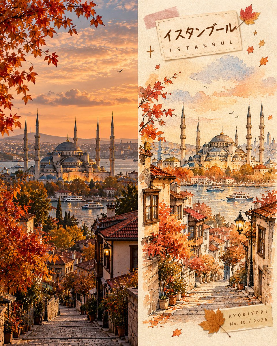
Diseño de Diario de Viajes Otoñal en Acuarela

Crea una obra artística dividida 50/50 que combina una vista fotográfica realista con una cálida ilustración otoñal en acuarela.

OpenAI

Ejemplos de la fuente

Estas imágenes provienen de la fuente original. DROPIDEA no ha probado estos ejemplos; los resultados dependen del modelo y los ajustes.

Listo para personalizar

Tu prompt

Inglés

Sustituye las variables en rojo por tus datos. Copia el texto completo y úsalo con tu agente preferido.

TXT MD Versión en inglés
Create a premium 4:5 vertical autumn travel-journal artwork for [COUNTRY / CITY / LOCATION / SUBJECT]. TEXT-TO-IMAGE ONLY — generate every element from the written destination or subject alone. Do not request, upload, use, or depend on any reference image, existing photograph, or source image. MASTER STYLE LOCK: Hand-painted autumn watercolor on warm ivory paper, minimalist travel-editorial illustration, transparent watercolor washes mixed with soft gouache, delicate imperfect ink outlines, visible paper grain, natural pigment blooms, soft edges, muted autumn colors, generous negative space, warm nostalgic atmosphere, premium handcrafted art-book aesthetic. COMPOSITION: Divide the vertical canvas into two equal halves using a precise 50/50 left-right split. LEFT HALF — REALISTIC DESTINATION: Generate an original, natural-looking photograph-style scene of [COUNTRY / CITY / LOCATION / SUBJECT]. Automatically determine its recognizable architecture, scenery, atmosphere, and natural lighting. Preserve realistic textures, authentic colors, and believable perspective. Keep this entire half clean, with no text, labels, illustrations, borders, or decorative elements. RIGHT HALF — AUTUMN WATERCOLOR JOURNAL: Reimagine the same destination as a delicate, handmade autumn watercolor illustration. Use simplified rounded architecture, warm glowing windows, a small tree with dusty rose, apricot, and amber foliage, a few drifting leaves, and subtle watercolor clouds. Include only a few meaningful local details, keeping the composition airy and uncluttered. COLOR PALETTE: Caramel brown, dusty rose, apricot orange, creamy yellow, muted maple red, warm ivory, and faint lavender-grey shadows. Use soft, low-saturation afternoon light. No neon colors or harsh black. HANDMADE DETAILS: Add one or two narrow kraft-brown or dusty-pink washi tape strips, a small pressed autumn leaf, and a few delicate hand-drawn stars or arrows. Integrate these details naturally without overcrowding the illustration. DESTINATION LABEL: Place a small cream-colored paper label near the upper-left corner of the RIGHT HALF. Main title: [LOCATION NAME] Subtitle: [ENGLISH LOCATION NAME] Use rounded, handwritten Japanese-inspired lettering for the main title and smaller, widely spaced handwritten English lettering for the subtitle. Keep spelling accurate and typography legible. SIGNATURE LABEL: Near the bottom-right corner of the RIGHT HALF, add a small kraft-paper label with exactly this text: RYOBIYORI No. [NUMBER] / [YEAR] Use subtle, fine dark-brown lettering. STRICT LAYOUT RULES: All text, labels, washi tape, and decorative elements must remain entirely within the right half. The left half must contain only the original generated realistic destination scene. Never reproduce or modify an existing photograph. PAPER & FINISH: Warm ivory watercolor-paper texture, delicate fibers, subtle grain, organic pigment edges, and a carefully assembled travel-journal feeling. FINAL AESTHETIC: Realistic destination imagery × autumn watercolor illustration × handmade travel journal × nostalgic seasonal palette × premium editorial design. AVOID: Reference-image requests, image-editing instructions, existing-photo preservation, unequal panel widths, text crossing the center divider, excessive decoration, oversaturated colors, glossy digital painting, 3D rendering, misspelled text, extra logos, watermarks, and interface elements. OUTPUT: 4:5 vertical portrait, exact 50/50 left-right composition, realistic generated destination scene on the left, watercolor travel-journal illustration on the right, ultra-high definition.
Ver resultados

Tu prompt

Create a premium 4:5 vertical autumn travel-journal artwork for [COUNTRY / CITY / LOCATION / SUBJECT]. TEXT-TO-IMAGE ONLY — generate every element from the written destination or subject alone. Do not request, upload, use, or depend on any reference image, existing photograph, or source image. MASTER STYLE LOCK: Hand-painted autumn watercolor on warm ivory paper, minimalist travel-editorial illustration, transparent watercolor washes mixed with soft gouache, delicate imperfect ink outlines, visible paper grain, natural pigment blooms, soft edges, muted autumn colors, generous negative space, warm nostalgic atmosphere, premium handcrafted art-book aesthetic. COMPOSITION: Divide the vertical canvas into two equal halves using a precise 50/50 left-right split. LEFT HALF — REALISTIC DESTINATION: Generate an original, natural-looking photograph-style scene of [COUNTRY / CITY / LOCATION / SUBJECT]. Automatically determine its recognizable architecture, scenery, atmosphere, and natural lighting. Preserve realistic textures, authentic colors, and believable perspective. Keep this entire half clean, with no text, labels, illustrations, borders, or decorative elements. RIGHT HALF — AUTUMN WATERCOLOR JOURNAL: Reimagine the same destination as a delicate, handmade autumn watercolor illustration. Use simplified rounded architecture, warm glowing windows, a small tree with dusty rose, apricot, and amber foliage, a few drifting leaves, and subtle watercolor clouds. Include only a few meaningful local details, keeping the composition airy and uncluttered. COLOR PALETTE: Caramel brown, dusty rose, apricot orange, creamy yellow, muted maple red, warm ivory, and faint lavender-grey shadows. Use soft, low-saturation afternoon light. No neon colors or harsh black. HANDMADE DETAILS: Add one or two narrow kraft-brown or dusty-pink washi tape strips, a small pressed autumn leaf, and a few delicate hand-drawn stars or arrows. Integrate these details naturally without overcrowding the illustration. DESTINATION LABEL: Place a small cream-colored paper label near the upper-left corner of the RIGHT HALF. Main title: [LOCATION NAME] Subtitle: [ENGLISH LOCATION NAME] Use rounded, handwritten Japanese-inspired lettering for the main title and smaller, widely spaced handwritten English lettering for the subtitle. Keep spelling accurate and typography legible. SIGNATURE LABEL: Near the bottom-right corner of the RIGHT HALF, add a small kraft-paper label with exactly this text: RYOBIYORI No. [NUMBER] / [YEAR] Use subtle, fine dark-brown lettering. STRICT LAYOUT RULES: All text, labels, washi tape, and decorative elements must remain entirely within the right half. The left half must contain only the original generated realistic destination scene. Never reproduce or modify an existing photograph. PAPER & FINISH: Warm ivory watercolor-paper texture, delicate fibers, subtle grain, organic pigment edges, and a carefully assembled travel-journal feeling. FINAL AESTHETIC: Realistic destination imagery × autumn watercolor illustration × handmade travel journal × nostalgic seasonal palette × premium editorial design. AVOID: Reference-image requests, image-editing instructions, existing-photo preservation, unequal panel widths, text crossing the center divider, excessive decoration, oversaturated colors, glossy digital painting, 3D rendering, misspelled text, extra logos, watermarks, and interface elements. OUTPUT: 4:5 vertical portrait, exact 50/50 left-right composition, realistic generated destination scene on the left, watercolor travel-journal illustration on the right, ultra-high definition.

Guía de variables

[COUNTRY / CITY / LOCATION / SUBJECT]

El país, ciudad o lugar a representar

En la primera línea y en la sección del panel izquierdo

Valor de ejemplo

Kyoto, Japan

[LOCATION NAME]

Título del lugar en tipografía manuscrita inspirada en el estilo japonés

En 'Main title:' dentro de la etiqueta de destino

Valor de ejemplo

KYOTO

[ENGLISH LOCATION NAME]

Subtítulo en inglés con letras espaciadas

En 'Subtitle:' dentro de la etiqueta de destino

Valor de ejemplo

JAPAN

[NUMBER]

Número de entrada del diario

En la etiqueta de firma

Valor de ejemplo

04

[YEAR]

Año de la publicación o del diario

En la etiqueta de firma

Valor de ejemplo

2024

Qué obtienes

  • Una composición vertical en 4:5 dividida exactamente al 50/50 entre realismo fotográfico y arte en acuarela.
  • Una mitad izquierda limpia con una vista realista y natural del destino.
  • Una mitad derecha artesanal diseñada como un diario de viaje otoñal con washi tape y etiquetas.

Casos de uso

  • Contenido editorial para blogs de viajes, redes sociales y tableros estéticos.
  • Postales de viaje artísticas, impresiones decorativas y portadas de cuadernos.
  • Diseño gráfico editorial para guías y revistas turísticas.

Cómo usarlo

  • Elige el destino o tema otoñal que desees ilustrar (por ejemplo, Kyoto, Japan o Praga, República Checa).
  • Sustituye [COUNTRY / CITY / LOCATION / SUBJECT], [LOCATION NAME] y [ENGLISH LOCATION NAME] con los datos de tu lugar.
  • Asigna el número de entrada [NUMBER] y el año [YEAR] para la etiqueta de firma.
  • Ejecuta en modo de texto a imagen sin imágenes de referencia para obtener la composición dividida al 50/50.

Prompts relacionados