Ir al contenido
ImágenesGratis

Póster publicitario prémium de bebida tropical dentro de sandía

Prompt para crear un póster comercial de nivel publicitario prémium que muestra una botella fría integrada en el corazón de una sandía fresca.

OpenAI

Ejemplos de la fuente

Estas imágenes provienen de la fuente original. DROPIDEA no ha probado estos ejemplos; los resultados dependen del modelo y los ajustes.

Listo para personalizar

Tu prompt

Inglés

Sustituye las variables en rojo por tus datos. Copia el texto completo y úsalo con tu agente preferido.

TXT MD Versión en inglés
The watermelon is not a prop—it is the product’s display architecture. 🍉 one upright half watermelon cut toward camera, with its inner flesh curving inward to create a clean central chamber for the bottle The fruit gives the bottle scale, flavor, and instant recognition without competing with the label. You see the drink as the core of the fruit, not something placed in front of it. ✨ keep the bottle pristine and vertically isolated inside the lighter fruit center; limit juice trails to the lower cut edge and one small pool beneath This preserves the contrast between controlled premium packaging and juicy organic texture. The result feels fresh and tactile, never messy. GPT- image 2.5 prompt👇 Create a Cannes-level commercial beverage poster for fictional premium tropical drink brand MELORA COAST, unifying lush fruit realism, sculptural product staging, and clean gallery-grade advertising design into one highly controlled hero image. The central concept is flavor architecture: a monumental half watermelon becomes a natural display chamber for a single chilled bottle, turning the fruit into packaging, environment, and taste narrative. The product must remain the absolute visual leader. Use a vertical full-bleed poster with a frontal studio shot, centered and nearly symmetrical composition. A giant upright half watermelon dominates the frame, cut cleanly toward the camera and filling most of the height and width. At its exact center, a single slim beverage bottle stands vertically embedded within the fruit core, fully readable and visually isolated by the lighter inner flesh around it. Keep controlled negative space in the upper field for elegant brand typography and in the lower strip for a concise campaign line. The image should feel bold, simple, iconic, and instantly legible from distance. Design a premium ready-to-drink bottle with a matte white cap, clear chilled plastic, and a radiant liquid gradient shifting from coral-red to soft coconut cream and fresh fruit blush. Use the fictional brand name “MELORA COAST”, the product line “COCO MELON ELIXIR”, and the descriptor “WATERMELON COCONUT INFUSION”. The label should feel contemporary and collectible, with vertically stacked brand typography, a restrained tropical emblem, and a small refined watermelon-coconut illustration integrated into the graphic system. The bottle must look manufacturable, premium, tactile, and shelf-perfect. The bottle is nested precisely into the central split of the watermelon as if the fruit opened naturally to reveal it. The surrounding flesh curves inward with believable depth, pressure, and organic irregularity. A few clean juice trails descend from the lower cut edge into a glossy puddle beneath the fruit. Keep the bottle pristine and dominant, never swallowed by the fruit texture. Seeds remain naturally distributed but controlled, supporting rhythm rather than clutter. No hand, no straw, no extra garnish, no secondary products. Build a minimal premium studio field with a seamless warm coral-to-watermelon-red background, slightly graded for depth but still graphically clean. The fruit and product create almost all the spatial hierarchy. Use rind thickness, wet flesh translucency, seed placement, bottle silhouette, and subtle liquid pooling to establish depth. The world remains stripped back and poster-clean, letting the fruit-object relationship carry the entire idea. Lighting is bright controlled studio light with a soft frontal key, delicate upper-left freshness lift, and gentle lateral shaping to define bottle curves and fruit volume. Palette hierarchy: 60% coral-red, watermelon pink, and juicy rose flesh; 30% coconut white, bottle highlights, and liquid reflections; 10% rind green, seed brown-black, and tiny cool specular accents. Keep the reds luminous and expensive, never muddy; keep contrast crisp but soft-edged; avoid dead shadows and dirty saturation. The emotional tone is juicy, tropical, radiant, fresh, and premium. Materials must feel extremely photoreal: dense fibrous watermelon flesh, subtle translucency near wet edges, realistic seed gloss, natural rind pores, fine droplets on the outer skin, cold plastic reflectance on the bottle, fine condensation beads, internal liquid refraction, sharp label print, and premium commercial finishing. Juice at the base must feel clean, glossy, and physically convincing. Maintain a polished print-ready finish with restrained luxury refinement and no cheap CGI appearance. Integrate refined English typography without copying existing wording. Place “MELORA COAST” in the upper left as a custom elegant wordmark. Add a bold sculptural campaign title in the left upper field: “OPEN / THE / CORE”, stacked with strong spatial rhythm and premium letter spacing. In the upper right, place a lighter editorial support line reading “WATERMELON COCONUT INFUSION”. At the bottom center, add the concise line “DRINK FROM THE HEART”. Typography must feel embedded into the poster architecture, balanced against the fruit mass, and kept away from the bottle recognition zone. Output: a full-bleed premium beverage poster with product-first hierarchy, exact label readability, hyper-clean commercial realism, minimal clutter, strong graphic order, and elegant tropical identity. Avoid extra bottles, messy splashes, random props, chaotic seeds, warped fruit anatomy, distorted bottle proportions, unreadable text, muddy reds, dead black blocks, overbuilt decoration, low-quality AI texture, stock-ad genericity, or resemblance to existing real beverage packaging.
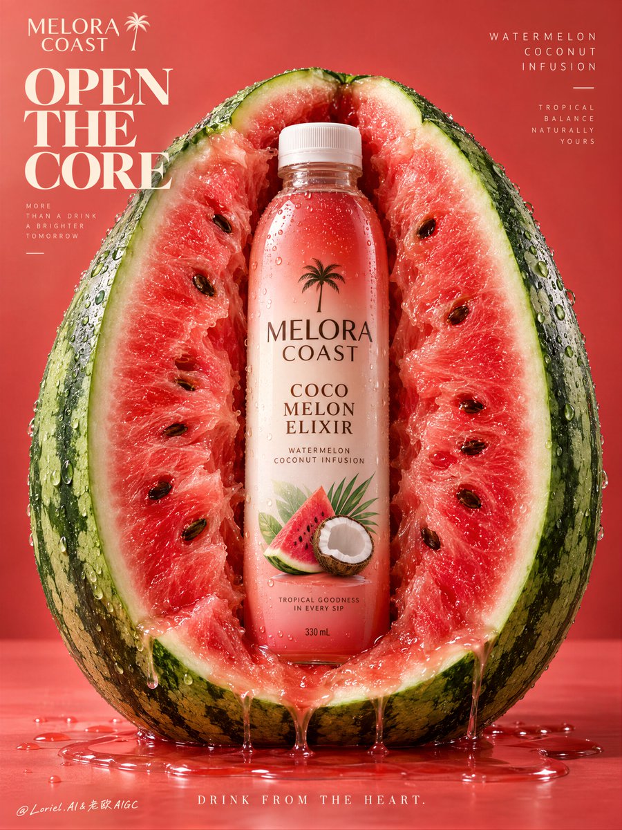
Ver resultados

Tu prompt

The watermelon is not a prop—it is the product’s display architecture. 🍉 one upright half watermelon cut toward camera, with its inner flesh curving inward to create a clean central chamber for the bottle The fruit gives the bottle scale, flavor, and instant recognition without competing with the label. You see the drink as the core of the fruit, not something placed in front of it. ✨ keep the bottle pristine and vertically isolated inside the lighter fruit center; limit juice trails to the lower cut edge and one small pool beneath This preserves the contrast between controlled premium packaging and juicy organic texture. The result feels fresh and tactile, never messy. GPT- image 2.5 prompt👇 Create a Cannes-level commercial beverage poster for fictional premium tropical drink brand MELORA COAST, unifying lush fruit realism, sculptural product staging, and clean gallery-grade advertising design into one highly controlled hero image. The central concept is flavor architecture: a monumental half watermelon becomes a natural display chamber for a single chilled bottle, turning the fruit into packaging, environment, and taste narrative. The product must remain the absolute visual leader. Use a vertical full-bleed poster with a frontal studio shot, centered and nearly symmetrical composition. A giant upright half watermelon dominates the frame, cut cleanly toward the camera and filling most of the height and width. At its exact center, a single slim beverage bottle stands vertically embedded within the fruit core, fully readable and visually isolated by the lighter inner flesh around it. Keep controlled negative space in the upper field for elegant brand typography and in the lower strip for a concise campaign line. The image should feel bold, simple, iconic, and instantly legible from distance. Design a premium ready-to-drink bottle with a matte white cap, clear chilled plastic, and a radiant liquid gradient shifting from coral-red to soft coconut cream and fresh fruit blush. Use the fictional brand name “MELORA COAST”, the product line “COCO MELON ELIXIR”, and the descriptor “WATERMELON COCONUT INFUSION”. The label should feel contemporary and collectible, with vertically stacked brand typography, a restrained tropical emblem, and a small refined watermelon-coconut illustration integrated into the graphic system. The bottle must look manufacturable, premium, tactile, and shelf-perfect. The bottle is nested precisely into the central split of the watermelon as if the fruit opened naturally to reveal it. The surrounding flesh curves inward with believable depth, pressure, and organic irregularity. A few clean juice trails descend from the lower cut edge into a glossy puddle beneath the fruit. Keep the bottle pristine and dominant, never swallowed by the fruit texture. Seeds remain naturally distributed but controlled, supporting rhythm rather than clutter. No hand, no straw, no extra garnish, no secondary products. Build a minimal premium studio field with a seamless warm coral-to-watermelon-red background, slightly graded for depth but still graphically clean. The fruit and product create almost all the spatial hierarchy. Use rind thickness, wet flesh translucency, seed placement, bottle silhouette, and subtle liquid pooling to establish depth. The world remains stripped back and poster-clean, letting the fruit-object relationship carry the entire idea. Lighting is bright controlled studio light with a soft frontal key, delicate upper-left freshness lift, and gentle lateral shaping to define bottle curves and fruit volume. Palette hierarchy: 60% coral-red, watermelon pink, and juicy rose flesh; 30% coconut white, bottle highlights, and liquid reflections; 10% rind green, seed brown-black, and tiny cool specular accents. Keep the reds luminous and expensive, never muddy; keep contrast crisp but soft-edged; avoid dead shadows and dirty saturation. The emotional tone is juicy, tropical, radiant, fresh, and premium. Materials must feel extremely photoreal: dense fibrous watermelon flesh, subtle translucency near wet edges, realistic seed gloss, natural rind pores, fine droplets on the outer skin, cold plastic reflectance on the bottle, fine condensation beads, internal liquid refraction, sharp label print, and premium commercial finishing. Juice at the base must feel clean, glossy, and physically convincing. Maintain a polished print-ready finish with restrained luxury refinement and no cheap CGI appearance. Integrate refined English typography without copying existing wording. Place “MELORA COAST” in the upper left as a custom elegant wordmark. Add a bold sculptural campaign title in the left upper field: “OPEN / THE / CORE”, stacked with strong spatial rhythm and premium letter spacing. In the upper right, place a lighter editorial support line reading “WATERMELON COCONUT INFUSION”. At the bottom center, add the concise line “DRINK FROM THE HEART”. Typography must feel embedded into the poster architecture, balanced against the fruit mass, and kept away from the bottle recognition zone. Output: a full-bleed premium beverage poster with product-first hierarchy, exact label readability, hyper-clean commercial realism, minimal clutter, strong graphic order, and elegant tropical identity. Avoid extra bottles, messy splashes, random props, chaotic seeds, warped fruit anatomy, distorted bottle proportions, unreadable text, muddy reds, dead black blocks, overbuilt decoration, low-quality AI texture, stock-ad genericity, or resemblance to existing real beverage packaging.

Guía de variables

MELORA COAST

Nombre de la marca ficticia

En las menciones del nombre de marca en el texto

Valor de ejemplo

MELORA COAST

COCO MELON ELIXIR

Nombre de la línea de producto

En la descripción del diseño de la botella

Valor de ejemplo

COCO MELON ELIXIR

WATERMELON COCONUT INFUSION

Descripción de sabor e ingredientes

En la sección de la etiqueta y texto superior derecho

Valor de ejemplo

WATERMELON COCONUT INFUSION

OPEN / THE / CORE

Titular principal apilado de campaña

En las instrucciones de tipografía superior izquierda

Valor de ejemplo

OPEN / THE / CORE

DRINK FROM THE HEART

Lema o línea de cierre al pie del póster

En la sección de tipografía inferior central

Valor de ejemplo

DRINK FROM THE HEART

Qué obtienes

  • Un póster publicitario prémium con enfoque absoluto en el producto y calidad de premio creativo.
  • Texturas fotorrealistas de sandía húmeda, semillas brillantes y gotas de condensación.
  • Composición equilibrada con iluminación de estudio y espacios para tipografía comercial.

Casos de uso

  • Campañas visuales para bebidas listas para consumir y zumos prémium.
  • Propuestas conceptuales y presentaciones de empaque para clientes.
  • Pósteres publicitarios impresos y contenido publicitario para redes sociales.

Cómo usarlo

  • Copia el prompt completo y pégalo en la herramienta de IA gráfica (como GPT Image 2.5 o Midjourney).
  • Modifica los textos entre comillas (nombre de marca, eslóganes) según tus necesidades comerciales.
  • Selecciona un formato vertical (como 9:16 o 4:5) para respetar el diseño de póster publicitario centrado.
  • Genera la imagen y revisa la nitidez del etiquetado y los detalles de condensación en la botella.

Prompts relacionados