Ir al contenido
ImágenesGratis

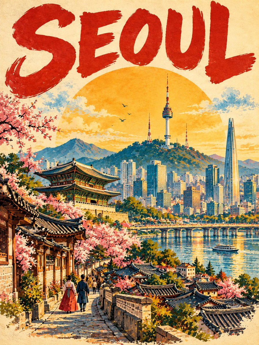
Póster de Viajes Vintage Premium Estilo Mid-Century

Crea elegantes carteles turísticos vintage de colección con estilo de aguada y acuarela pintada a mano, tipografía retro y composición editorial de mediados de siglo.

OpenAI

Ejemplos de la fuente

Estas imágenes provienen de la fuente original. DROPIDEA no ha probado estos ejemplos; los resultados dependen del modelo y los ajustes.

Listo para personalizar

Tu prompt

Inglés

Sustituye las variables en rojo por tus datos. Copia el texto completo y úsalo con tu agente preferido.

TXT MD Versión en inglés
Create a premium 3:4 vertical vintage travel poster for [COUNTRY / CITY / LOCATION / SUBJECT]. TEXT-TO-IMAGE ONLY — create the entire artwork from the destination alone. No reference image required. CORE CONCEPT Reimagine [COUNTRY / CITY / LOCATION / SUBJECT] as a cohesive collectible vintage travel poster, using hand-painted gouache and watercolor with a sophisticated mid-century tourism aesthetic. COMPOSITION Use a warm cream paper background with generous negative space. Place a huge hand-painted destination name across the top in bold, imperfect deep-red uppercase lettering. Behind the main scene, add a large glowing golden-yellow sun or atmospheric disc. Build the destination in clear overlapping layers — foreground, water/road/landscape, primary landmark, secondary architecture and nature, distant skyline or mountains, then sky. Automatically choose 4–6 of the destination’s most recognizable visual elements. Make ONE iconic landmark the dominant focal point and use the others to support the story. Add a characteristic local transportation element when naturally appropriate. VISUAL STYLE Hand-painted gouache × watercolor travel illustration × vintage postcard × elegant editorial poster. Use visible brushstrokes, subtle paper grain, imperfect painted edges, layered washes, simplified graphic forms, crisp silhouettes, selective fine details, and slightly exaggerated but believable proportions. No photorealism. COLOR Use warm cream as the base with a destination-specific palette built around deep red, golden ochre, teal/turquoise, sky blue, leafy green, terracotta, and warm architectural neutrals. Keep the colors rich, harmonious, and distinctly vintage. ATMOSPHERE Bright, optimistic, nostalgic, and aspirational. Add only a few purposeful clouds, birds, foliage, people, or atmospheric details to give the scene life without creating clutter. FOREGROUND Create a strong local foreground element — such as a street, boat, train, tram, cable car, road, waterfront, vegetation, or characteristic landscape — with painterly shadows, reflections, and tiny human details. FINAL AESTHETIC A unified hand-painted travel illustration that feels like a premium vintage tourism poster from a collectible series. Strong hierarchy, layered depth, recognizable silhouettes, balanced asymmetry, elegant typography, and a clear sense of place. Avoid generic tourist imagery, unrelated landmarks, collage-like composition, excessive tiny details, 3D rendering, glossy CGI, photorealism, modern digital effects, logos, watermarks, and clutter. FORMAT 3:4 vertical, single cohesive illustration, premium print quality, sophisticated vintage travel-poster finish.
Ver resultados

Tu prompt

Create a premium 3:4 vertical vintage travel poster for [COUNTRY / CITY / LOCATION / SUBJECT]. TEXT-TO-IMAGE ONLY — create the entire artwork from the destination alone. No reference image required. CORE CONCEPT Reimagine [COUNTRY / CITY / LOCATION / SUBJECT] as a cohesive collectible vintage travel poster, using hand-painted gouache and watercolor with a sophisticated mid-century tourism aesthetic. COMPOSITION Use a warm cream paper background with generous negative space. Place a huge hand-painted destination name across the top in bold, imperfect deep-red uppercase lettering. Behind the main scene, add a large glowing golden-yellow sun or atmospheric disc. Build the destination in clear overlapping layers — foreground, water/road/landscape, primary landmark, secondary architecture and nature, distant skyline or mountains, then sky. Automatically choose 4–6 of the destination’s most recognizable visual elements. Make ONE iconic landmark the dominant focal point and use the others to support the story. Add a characteristic local transportation element when naturally appropriate. VISUAL STYLE Hand-painted gouache × watercolor travel illustration × vintage postcard × elegant editorial poster. Use visible brushstrokes, subtle paper grain, imperfect painted edges, layered washes, simplified graphic forms, crisp silhouettes, selective fine details, and slightly exaggerated but believable proportions. No photorealism. COLOR Use warm cream as the base with a destination-specific palette built around deep red, golden ochre, teal/turquoise, sky blue, leafy green, terracotta, and warm architectural neutrals. Keep the colors rich, harmonious, and distinctly vintage. ATMOSPHERE Bright, optimistic, nostalgic, and aspirational. Add only a few purposeful clouds, birds, foliage, people, or atmospheric details to give the scene life without creating clutter. FOREGROUND Create a strong local foreground element — such as a street, boat, train, tram, cable car, road, waterfront, vegetation, or characteristic landscape — with painterly shadows, reflections, and tiny human details. FINAL AESTHETIC A unified hand-painted travel illustration that feels like a premium vintage tourism poster from a collectible series. Strong hierarchy, layered depth, recognizable silhouettes, balanced asymmetry, elegant typography, and a clear sense of place. Avoid generic tourist imagery, unrelated landmarks, collage-like composition, excessive tiny details, 3D rendering, glossy CGI, photorealism, modern digital effects, logos, watermarks, and clutter. FORMAT 3:4 vertical, single cohesive illustration, premium print quality, sophisticated vintage travel-poster finish.

Guía de variables

[COUNTRY / CITY / LOCATION / SUBJECT]

El país, ciudad, ubicación geográfica o temática para el cartel

En la primera línea y bajo CORE CONCEPT en [COUNTRY / CITY / LOCATION / SUBJECT]

Valor de ejemplo

Kyoto, Japan

Qué obtienes

  • Una ilustración vertical 3:4 con estética de cartel turístico retro de mediados del siglo XX en aguada y acuarela.
  • Estructura visual refinada con tipografía llamativa, sol/disco de fondo y capas ordenadas de paisajes y arquitectura.
  • Gama cromática nostálgica y equilibrada sobre textura de papel crema con detalles de transporte local.

Casos de uso

  • Láminas decorativas y cuadros de viaje para interiores.
  • Creación de postales, papelería y productos coleccionables de recuerdos turísticos.
  • Identidad visual y publicidad temática para agencias de viaje y hoteles.

Cómo usarlo

  • Sustituye el marcador [COUNTRY / CITY / LOCATION / SUBJECT] por la ciudad, país o hito deseado.
  • Configura una relación de aspecto vertical 3:4 en tu generador de imágenes para respetar la proporción del cartel.
  • Ejecuta la generación en modo texto a imagen sin imágenes de referencia; el prompt organizará automáticamente los elementos clave.
  • Exporta y utiliza el diseño resultante para impresión decorativa o proyectos editoriales vintage.

Prompts relacionados