Ir al contenido
ImágenesGratis

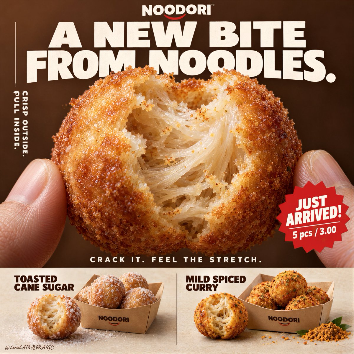
Póster premium de lanzamiento NOODORI Noodle Puff

Prompt para un póster publicitario hiperrealista premium de un snack frito de fideos: una bola mordida como héroe macro, tipografía inglesa controlada, franja inferior de dos sabores, paleta 60/30/10 y restricciones estrictas de calidad.

OpenAI

Ejemplos de la fuente

Estas imágenes provienen de la fuente original. DROPIDEA no ha probado estos ejemplos; los resultados dependen del modelo y los ajustes.

Listo para personalizar

Tu prompt

Inglés

Sustituye las variables en rojo por tus datos. Copia el texto completo y úsalo con tu agente preferido.

TXT MD Versión en inglés
Don’t write “gooey filling.” That turns this into cheese bread. 🧊 a naturally torn bite edge revealing translucent noodle strands, layered starch threads, and elastic pull inside the shell This makes the center read as a real noodle structure—not a generic soft crumb. 🍊 thin blistered golden crust with fine fried granularity, light oil sheen, and a sharp material contrast against the pale interior The bite becomes instantly legible: crisp outside, stretch inside. GPT- image 2.5 prompt👇 A hyper-real premium poster advertisement for a fictional snack brand called NOODORI, designed in an Orbit-plus-Port direction: a bold product-launch key visual with one monumental macro food hero, highly controlled graphic typography, and a refined lower product strip. The core product is a fried noodle-dough snack ball called "Noodle Puff", presented as an ultra-real edible object with intense tactile realism and a surprising internal structure. One giant bitten snack ball dominates the center of the frame, delicately held between two natural human fingertips entering from the lower left and lower right edges. The bite opening reveals an airy fibrous interior with visible noodle-like stretch, layered starch threads, and a soft elastic pull inside a thin crisp golden shell. The product is the absolute visual hero. Framing and composition: vertical poster layout, strong central macro composition, oversized hero product cropped large enough to feel immediate and almost architectural. Keep the upper field as a warm chestnut-brown poster plane with large white typographic mass, a cleaner vertical support text column on the left, one sharp promotional badge on the lower right of the hero area, and a highly disciplined product information strip running across the bottom. Preserve the original retail-poster logic, but reduce noise and make the entire page more sculptural, gallery-like, and premium. The fingers act only as scale and human interaction cues, never competing with the food. Product design: the hero snack is a perfectly round fried noodle puff with a thin blistered golden crust, subtle fried granularity, light oil sheen, and a naturally torn bite edge exposing a mochi-like noodle matrix inside. The interior should feel surprising, soft, and layered rather than bread-like. In the bottom product strip, present two flavor variants in a clean side-by-side system: one pale sugar-dusted version and one deeper warm curry-spiced version. Each flavor sits beside a simple folded kraft takeaway tray with a few neatly arranged full snack balls. The lower strip must feel tidy, retail-ready, and secondary to the hero bite. Lighting and color: soft but directional premium food lighting from upper front-right, gentle warm fill from the left, crisp readability inside the torn interior, elegant highlights on the crust, and subtle shadows under the bottom flavor presentations. Build stronger light-dark separation than a typical snack poster so the shell volume, interior fibers, and headline typography gain sculptural force. Palette balance: 60% chestnut brown, toasted amber, and warm golden crust; 30% creamy ivory interior and kraft-paper neutrals; 10% saturated red promotion accents and spice-yellow flavor notes. No muddy browns, no dead black patches, no greasy over-darkness. Materials and finish: hyper-real food photography fused with premium Japanese-style poster design. Show crisp fried crust grain, delicate starch translucency in the inner layers, realistic soft tear fibers, matte paper tray texture, natural fingertip skin texture, and clean print-like typography integration. The final finish should feel like a Cannes-level convenience-food launch poster: tactile, surprising, minimal yet commercially explosive. Typography: all visible copy in English only, highly art-directed and integrated into the poster. Top brand mark reads exactly: "NOODORI". Main headline at the top reads exactly: "A NEW BITE FROM NOODLES." Left vertical support line reads exactly: "CRISP OUTSIDE. PULL INSIDE." Small excitement line above the bottom strip reads exactly: "CRACK IT. FEEL THE STRETCH." Promotional burst on the lower right of the hero area reads exactly: "JUST ARRIVED!" and beneath it exactly: "5 pcs / 3.00". In the bottom strip, the left flavor label reads exactly: "TOASTED CANE SUGAR" and the right flavor label reads exactly: "MILD SPICED CURRY". Typography should be bold, soft-edged, graphic, and beautifully spaced, with large white forms against the brown field and restrained red accents. Output and constraints: polished premium snack poster, product-first hierarchy, no copied source text, no real brand names, no extra props, no cluttered background scene, no people beyond the partial fingertips. Keep the hands anatomically correct with natural finger joints and correct finger count. Keep the hero snack spherical and believable, the bite natural, the lower strip orderly, and the overall page clean and high-end. Avoid fused fingers, swollen joints, broken snack geometry, messy crumb explosions, excessive oil, warped trays, duplicated snack balls, unreadable text, plastic-looking crust, oversharpening, AI gibberish text, muddy color cast, or drift away from premium commercial food realism.
Ver resultados

Tu prompt

Don’t write “gooey filling.” That turns this into cheese bread. 🧊 a naturally torn bite edge revealing translucent noodle strands, layered starch threads, and elastic pull inside the shell This makes the center read as a real noodle structure—not a generic soft crumb. 🍊 thin blistered golden crust with fine fried granularity, light oil sheen, and a sharp material contrast against the pale interior The bite becomes instantly legible: crisp outside, stretch inside. GPT- image 2.5 prompt👇 A hyper-real premium poster advertisement for a fictional snack brand called NOODORI, designed in an Orbit-plus-Port direction: a bold product-launch key visual with one monumental macro food hero, highly controlled graphic typography, and a refined lower product strip. The core product is a fried noodle-dough snack ball called "Noodle Puff", presented as an ultra-real edible object with intense tactile realism and a surprising internal structure. One giant bitten snack ball dominates the center of the frame, delicately held between two natural human fingertips entering from the lower left and lower right edges. The bite opening reveals an airy fibrous interior with visible noodle-like stretch, layered starch threads, and a soft elastic pull inside a thin crisp golden shell. The product is the absolute visual hero. Framing and composition: vertical poster layout, strong central macro composition, oversized hero product cropped large enough to feel immediate and almost architectural. Keep the upper field as a warm chestnut-brown poster plane with large white typographic mass, a cleaner vertical support text column on the left, one sharp promotional badge on the lower right of the hero area, and a highly disciplined product information strip running across the bottom. Preserve the original retail-poster logic, but reduce noise and make the entire page more sculptural, gallery-like, and premium. The fingers act only as scale and human interaction cues, never competing with the food. Product design: the hero snack is a perfectly round fried noodle puff with a thin blistered golden crust, subtle fried granularity, light oil sheen, and a naturally torn bite edge exposing a mochi-like noodle matrix inside. The interior should feel surprising, soft, and layered rather than bread-like. In the bottom product strip, present two flavor variants in a clean side-by-side system: one pale sugar-dusted version and one deeper warm curry-spiced version. Each flavor sits beside a simple folded kraft takeaway tray with a few neatly arranged full snack balls. The lower strip must feel tidy, retail-ready, and secondary to the hero bite. Lighting and color: soft but directional premium food lighting from upper front-right, gentle warm fill from the left, crisp readability inside the torn interior, elegant highlights on the crust, and subtle shadows under the bottom flavor presentations. Build stronger light-dark separation than a typical snack poster so the shell volume, interior fibers, and headline typography gain sculptural force. Palette balance: 60% chestnut brown, toasted amber, and warm golden crust; 30% creamy ivory interior and kraft-paper neutrals; 10% saturated red promotion accents and spice-yellow flavor notes. No muddy browns, no dead black patches, no greasy over-darkness. Materials and finish: hyper-real food photography fused with premium Japanese-style poster design. Show crisp fried crust grain, delicate starch translucency in the inner layers, realistic soft tear fibers, matte paper tray texture, natural fingertip skin texture, and clean print-like typography integration. The final finish should feel like a Cannes-level convenience-food launch poster: tactile, surprising, minimal yet commercially explosive. Typography: all visible copy in English only, highly art-directed and integrated into the poster. Top brand mark reads exactly: "NOODORI". Main headline at the top reads exactly: "A NEW BITE FROM NOODLES." Left vertical support line reads exactly: "CRISP OUTSIDE. PULL INSIDE." Small excitement line above the bottom strip reads exactly: "CRACK IT. FEEL THE STRETCH." Promotional burst on the lower right of the hero area reads exactly: "JUST ARRIVED!" and beneath it exactly: "5 pcs / 3.00". In the bottom strip, the left flavor label reads exactly: "TOASTED CANE SUGAR" and the right flavor label reads exactly: "MILD SPICED CURRY". Typography should be bold, soft-edged, graphic, and beautifully spaced, with large white forms against the brown field and restrained red accents. Output and constraints: polished premium snack poster, product-first hierarchy, no copied source text, no real brand names, no extra props, no cluttered background scene, no people beyond the partial fingertips. Keep the hands anatomically correct with natural finger joints and correct finger count. Keep the hero snack spherical and believable, the bite natural, the lower strip orderly, and the overall page clean and high-end. Avoid fused fingers, swollen joints, broken snack geometry, messy crumb explosions, excessive oil, warped trays, duplicated snack balls, unreadable text, plastic-looking crust, oversharpening, AI gibberish text, muddy color cast, or drift away from premium commercial food realism.

Guía de variables

NOODORI

Nombre ficticio de la marca en la parte superior del póster.

Sección de tipografía, línea del logotipo, y la primera mención en el párrafo inicial.

Valor de ejemplo

MOMOCHA

Noodle Puff

Nombre del producto protagonista.

Párrafo inicial: una bola frita llamada "Noodle Puff".

Valor de ejemplo

Noodle Bun

A NEW BITE FROM NOODLES.

Titular principal grande arriba; debe quedar en inglés.

Sección de tipografía: el titular principal arriba dice exactamente.

Valor de ejemplo

THE NOODLE BITE.

CRISP OUTSIDE. PULL INSIDE.

Línea de texto vertical de apoyo a la izquierda.

Sección de tipografía: la línea vertical izquierda dice exactamente.

Valor de ejemplo

CRUNCH. STRETCH. REPEAT.

JUST ARRIVED!

Texto del sello promocional rojo abajo a la derecha del héroe.

Sección de tipografía: el estallido promocional dice exactamente.

Valor de ejemplo

NEW DROP!

TOASTED CANE SUGAR

Etiqueta de sabor izquierda en la franja inferior (variante pálida con azúcar).

Sección de tipografía: la etiqueta de sabor izquierda dice exactamente.

Valor de ejemplo

BROWN BUTTER SUGAR

MILD SPICED CURRY

Etiqueta de sabor derecha en la franja inferior (variante más oscura al curry).

Sección de tipografía: la etiqueta de sabor derecha dice exactamente.

Valor de ejemplo

SMOKEY CHILI CURRY

Qué obtienes

  • Un póster vertical premium estilo japonés con un héroe macro: una bola de fideos fritos mordida sostenida por dos yemas de dedos.
  • Un interior fibroso sorprendente con hebras translúcidas de fideo y capas elásticas de almidón frente a una cáscara dorada delgada y ampollada.
  • Tipografía disciplinada: titular principal, columna vertical izquierda, sello promocional y franja inferior con dos variantes de sabor en bandejas de kraft.
  • Iluminación direccional premium de comida con paleta 60% marrones cálidos, 30% marfil/kraft, 10% acentos rojos y amarillos especia.
  • Una imagen comercial limpia sin accesorios extra ni texto incoherente, con texturas táctiles realistas de cáscara, fibras y dedos.

Casos de uso

  • Campaña de lanzamiento de producto para una marca de snacks o snacks de fideos en canales digitales.
  • Pósters en tienda o punto de venta para presentar un nuevo sabor.
  • Tableros de concepto (key visual) para presentaciones a clientes o agencias.
  • Referencia estilística que fusiona fotografía hiperreal de comida con diseño gráfico de póster.
  • Inspiración visual para contenido en redes o moodboards de packaging de snacks.

Cómo usarlo

  • Copia el prompt árabe completo y pégalo en una herramienta de texto a imagen que admita prompts largos (p. ej., el modo de imagen de un modelo tipo GPT- image 2.5).
  • Edita solo los valores creativos si lo deseas: nombre de marca NOODORI, producto Noodle Puff, titular principal, línea vertical de apoyo, sello promocional y las dos etiquetas de sabor — mantén todo en inglés en el resultado.
  • No cambies las proporciones de paleta 60% / 30% / 10%, el texto "5 pcs / 3.00" ni ningún ajuste técnico; son parte del equilibrio visual previsto.
  • No se necesitan imágenes de referencia ni cargas; el prompt es totalmente autónomo.
  • Genera con una relación de aspecto vertical (póster) para respetar el diseño.
  • Revisa el resultado contra la lista final de restricciones (dedos, geometría de la bola, orden de la franja inferior, legibilidad) y regenera si es necesario.

Prompts relacionados