Ir al contenido
ImágenesGratis

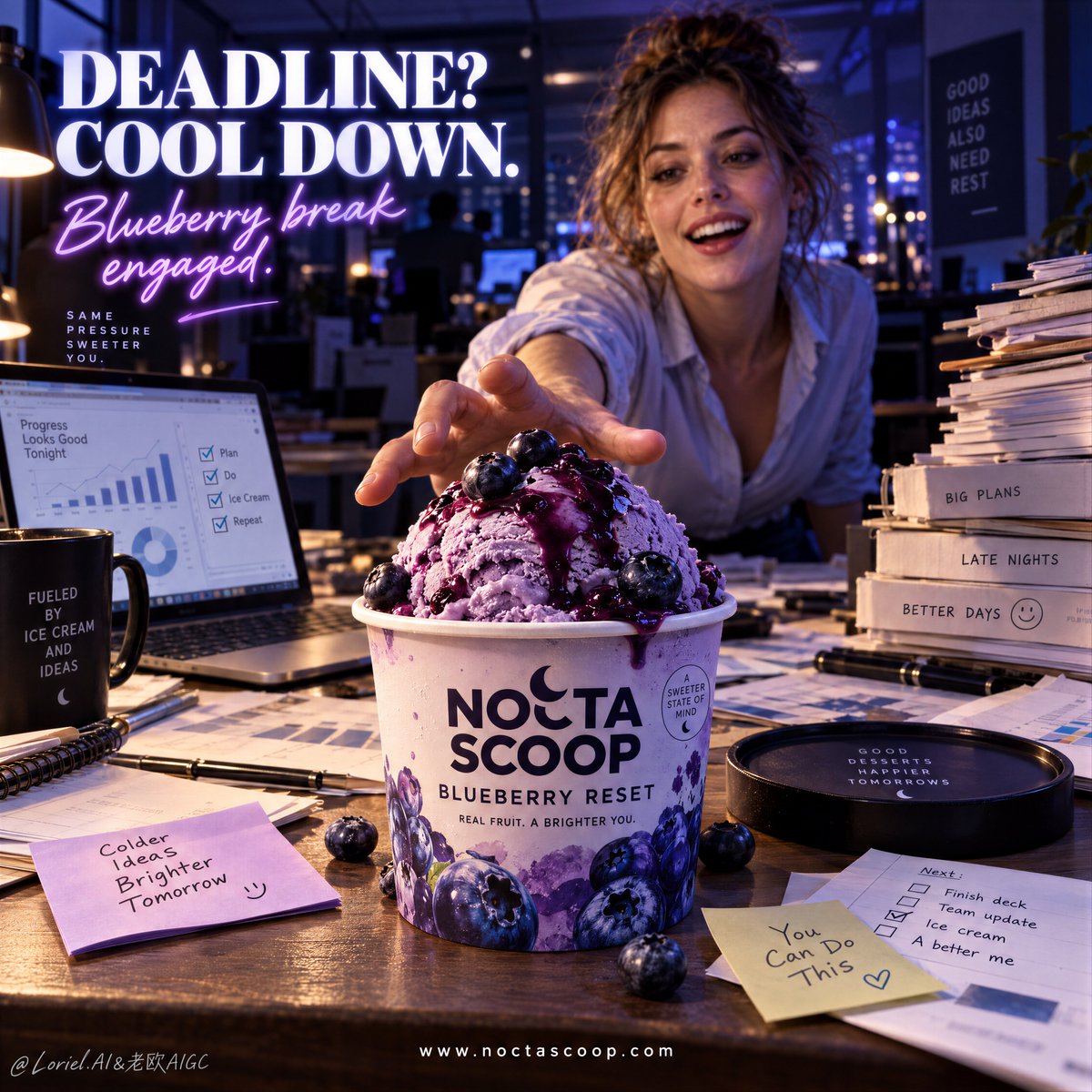
Anuncio cinematográfico de helado con producto héroe en oficina nocturna

Un prompt publicitario cinematográfico de alto impacto que sitúa un helado premium como héroe absoluto frente al estrés de una oficina nocturna.

OpenAI

Ejemplos de la fuente

Estas imágenes provienen de la fuente original. DROPIDEA no ha probado estos ejemplos; los resultados dependen del modelo y los ajustes.

Listo para personalizar

Tu prompt

Inglés

Sustituye las variables en rojo por tus datos. Copia el texto completo y úsalo con tu agente preferido.

TXT MD Versión en inglés
A stress-relief ad should not remove the chaos. It should make the product the only calm thing inside it. 🧊 extreme foreground product in sharp focus, with the reaching person and office clutter falling into soft depth behind it The cup becomes the immediate answer before the viewer reads any copy. The workload stays present, but it cannot steal the hierarchy. 🫐 cool violet office ambience with a warm front-left hero light isolating the cup, scoop, and glossy blueberry sauce This separates the dessert from the nocturnal desk without making the office feel staged. The cold product looks crisp; the pressure stays in the shadows. GPT- image 2.5 prompt👇 A high-impact premium ice cream poster for fictional dessert brand NOCTA SCOOP, built with the exact logic of a modern stress-relief product ad. Preserve the full narrative: a late-night office in deep blue-violet light, a large branded ice cream cup in the extreme foreground as the absolute hero, an adult Western woman in the background reaching toward it, cluttered documents and a laptop across the desk, a bold headline block in the upper left, and a clean website line centered near the bottom. Use a dramatic desk-height near-product perspective. The ice cream cup dominates the lower center foreground in sharp focus, while the woman stays slightly behind and softer in depth. The office should feel busy and believable: scattered charts, sticky notes, folders, stacked paperwork, a laptop with business graphs, and a dim open-office background with glowing practical lights. The woman is adult, photoreal, naturally proportioned, with a contemporary Western look, bright expressive eyes, a lightly open delighted smile, realistic skin texture, soft lips, natural hair density, correct head-neck-shoulder balance, correct hand anatomy, five normal fingers, a believable reaching gesture, rolled-up sleeves, loosened office styling, and late-work energy. If more of her body is visible, keep adult female anatomy natural, mature, and undistorted. She is not the hero; she exists to dramatize the product’s pull. The product is the core event: a premium blueberry ice cream cup on the desk like a salvation object in chaos. The cup is fully rebranded in English: “NOCTA SCOOP” as the brand mark, “BLUEBERRY RESET” as the flavor name, plus one small premium descriptor line. It must feel tangible and hyperreal, with matte printed packaging, crisp typography, controlled condensation, and subtle office-light reflections. On top, a rounded scoop of rich blueberry ice cream rises above the rim, dense, creamy, cold, and velvety, with glossy blueberry sauce drizzled over it and a few whole blueberries resting naturally on top. The texture should show fine freeze detail, soft spoonable density, and an appetizing cold sheen without messy melting. Lighting is cinematic and commercial: cool violet-blue office darkness overall, warm desk practicals and laptop spill, a controlled hero light on the cup from front-left, subtle rim light on the scoop and blueberries, and enough contrast for instant product read. Color hierarchy: 55% nocturnal violet and indigo office tones, 25% creamy lavender-blue dessert tones, 20% warm beige paperwork and skin highlights. Keep the atmosphere rich without muddy blacks or dirty shadows. Typography is a major graphic layer. In the upper left, place a bold headline such as “DEADLINE? COOL DOWN.” with a second luminous script line such as “Blueberry break engaged.” Keep it striking, slightly neon-kissed, and integrated into the dark office mood. At the bottom center, add one clean website line: “https://t.co/O9YZCra5ua”. If desired, add one very small icon or badge near the bottom. The text should feel witty, international, polished, and highly legible, never covering the product or the woman’s reaching hand. Materials must feel precise and tactile: creamy frozen texture, glossy fruit sauce, matte paper cup print, soft office paper fibers, brushed laptop metal, sticky-note paper, skin texture, shirt fabric, and slight environmental depth haze. The final image should feel like a Cannes-level FMCG ad for late-night work culture: playful, urgent, product-first, cinematic, relatable, and commercially exact. No copied wording, no malformed hands, no extra fingers, no distorted female anatomy, no warped cup, no chaotic typography, no muddy lighting, no melted texture collapse, no fake office props, no weak product hierarchy.
Ver resultados

Tu prompt

A stress-relief ad should not remove the chaos. It should make the product the only calm thing inside it. 🧊 extreme foreground product in sharp focus, with the reaching person and office clutter falling into soft depth behind it The cup becomes the immediate answer before the viewer reads any copy. The workload stays present, but it cannot steal the hierarchy. 🫐 cool violet office ambience with a warm front-left hero light isolating the cup, scoop, and glossy blueberry sauce This separates the dessert from the nocturnal desk without making the office feel staged. The cold product looks crisp; the pressure stays in the shadows. GPT- image 2.5 prompt👇 A high-impact premium ice cream poster for fictional dessert brand NOCTA SCOOP, built with the exact logic of a modern stress-relief product ad. Preserve the full narrative: a late-night office in deep blue-violet light, a large branded ice cream cup in the extreme foreground as the absolute hero, an adult Western woman in the background reaching toward it, cluttered documents and a laptop across the desk, a bold headline block in the upper left, and a clean website line centered near the bottom. Use a dramatic desk-height near-product perspective. The ice cream cup dominates the lower center foreground in sharp focus, while the woman stays slightly behind and softer in depth. The office should feel busy and believable: scattered charts, sticky notes, folders, stacked paperwork, a laptop with business graphs, and a dim open-office background with glowing practical lights. The woman is adult, photoreal, naturally proportioned, with a contemporary Western look, bright expressive eyes, a lightly open delighted smile, realistic skin texture, soft lips, natural hair density, correct head-neck-shoulder balance, correct hand anatomy, five normal fingers, a believable reaching gesture, rolled-up sleeves, loosened office styling, and late-work energy. If more of her body is visible, keep adult female anatomy natural, mature, and undistorted. She is not the hero; she exists to dramatize the product’s pull. The product is the core event: a premium blueberry ice cream cup on the desk like a salvation object in chaos. The cup is fully rebranded in English: “NOCTA SCOOP” as the brand mark, “BLUEBERRY RESET” as the flavor name, plus one small premium descriptor line. It must feel tangible and hyperreal, with matte printed packaging, crisp typography, controlled condensation, and subtle office-light reflections. On top, a rounded scoop of rich blueberry ice cream rises above the rim, dense, creamy, cold, and velvety, with glossy blueberry sauce drizzled over it and a few whole blueberries resting naturally on top. The texture should show fine freeze detail, soft spoonable density, and an appetizing cold sheen without messy melting. Lighting is cinematic and commercial: cool violet-blue office darkness overall, warm desk practicals and laptop spill, a controlled hero light on the cup from front-left, subtle rim light on the scoop and blueberries, and enough contrast for instant product read. Color hierarchy: 55% nocturnal violet and indigo office tones, 25% creamy lavender-blue dessert tones, 20% warm beige paperwork and skin highlights. Keep the atmosphere rich without muddy blacks or dirty shadows. Typography is a major graphic layer. In the upper left, place a bold headline such as “DEADLINE? COOL DOWN.” with a second luminous script line such as “Blueberry break engaged.” Keep it striking, slightly neon-kissed, and integrated into the dark office mood. At the bottom center, add one clean website line: “https://t.co/O9YZCra5ua”. If desired, add one very small icon or badge near the bottom. The text should feel witty, international, polished, and highly legible, never covering the product or the woman’s reaching hand. Materials must feel precise and tactile: creamy frozen texture, glossy fruit sauce, matte paper cup print, soft office paper fibers, brushed laptop metal, sticky-note paper, skin texture, shirt fabric, and slight environmental depth haze. The final image should feel like a Cannes-level FMCG ad for late-night work culture: playful, urgent, product-first, cinematic, relatable, and commercially exact. No copied wording, no malformed hands, no extra fingers, no distorted female anatomy, no warped cup, no chaotic typography, no muddy lighting, no melted texture collapse, no fake office props, no weak product hierarchy.

Guía de variables

NOCTA SCOOP

Nombre de la marca comercial en el envase

En la descripción de la marca del envase y título

Valor de ejemplo

NOCTA SCOOP

BLUEBERRY RESET

Nombre del sabor del producto en el vaso

En la sección de descripción del sabor

Valor de ejemplo

BLUEBERRY RESET

DEADLINE? COOL DOWN.

Titular publicitario principal en la esquina superior izquierda

En el párrafo de especificaciones tipográficas

Valor de ejemplo

DEADLINE? COOL DOWN.

Blueberry break engaged.

Subtítulo luminoso en tipografía manuscrita

En la sección tipográfica después del titular

Valor de ejemplo

Blueberry break engaged.

https://t.co/O9YZCra5ua

URL del sitio web centrada en la parte inferior

En la sección tipográfica inferior

Valor de ejemplo

https://t.co/O9YZCra5ua

Qué obtienes

  • Un póster publicitario de nivel Cannes con el producto como protagonista indiscutible.
  • Iluminación cinematográfica en tonos violetas fríos y cálidos de oficina con enfoque selectivo.
  • Texturas hiperrealistas de helado cremoso, salsa brillante y materiales de oficina.

Casos de uso

  • Campañas creativas para marcas de alimentos y bebidas de consumo masivo (FMCG).
  • Publicidad digital orientada al alivio del estrés laboral y trabajo nocturno.
  • Moodboards de dirección de arte para spots y sesiones fotográficas comerciales.

Cómo usarlo

  • Copia el prompt completo y personaliza la marca, sabor o textos publicitarios si lo deseas.
  • Pega el prompt en tu generador de imágenes de IA preferido para fotografía comercial.
  • Configura una relación de aspecto vertical (como 4:5 o 9:16) para formato de póster publicitario.
  • Revisa la anatomía de las manos y la legibilidad tipográfica en la imagen generada.

Prompts relacionados