Ir al contenido
ImágenesGratis

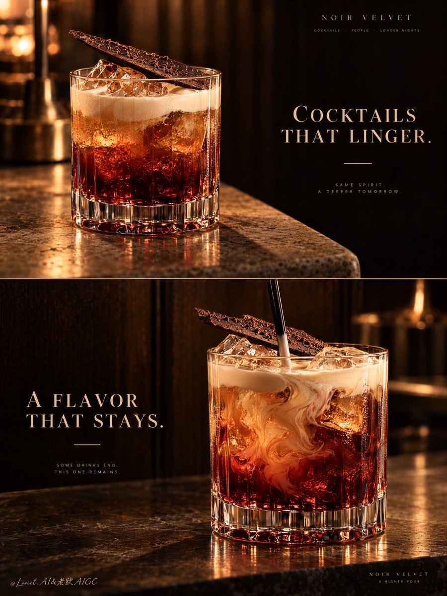
Póster de campaña de cóctel de lujo en dos paneles

Prompt para un cartel publicitario vertical de dos paneles para cócteles de lujo, contrastando una toma fija con el ritual del mezclado.

OpenAI

Ejemplos de la fuente

Estas imágenes provienen de la fuente original. DROPIDEA no ha probado estos ejemplos; los resultados dependen del modelo y los ajustes.

Listo para personalizar

Tu prompt

Inglés

Sustituye las variables en rojo por tus datos. Copia el texto completo y úsalo con tu agente preferido.

TXT MD Versión en inglés
A two-panel drink campaign becomes a system when the second image changes the moment, not the identity. 🍫 repeat the same rocks glass, red-to-amber liquid body, pale cream top, and diagonal chocolate shard in both panels The viewer recognizes one signature serve instantly. The campaign gains range without looking like two unrelated cocktails. 🌀 keep the upper panel still; reserve motion for the lower panel, where a black stirrer folds cream slowly into the amber-red drink The contrast creates a visual sequence: first the object of desire, then the ritual of making it. The motion stays elegant because everything else remains controlled. GPT- image 2.5 prompt👇 A premium cocktail campaign poster for fictional bar brand NOIR VELVET, merging emotional atmosphere, material precision, and curatorial restraint into one unified two-panel vertical advertising image. Preserve the exact luxury-drinks structure: two stacked horizontal panels, warm low-key bar atmosphere, dark wood and amber light language, one hero cocktail per panel, elegant text zones in negative space, and a strict campaign-wide product identity. Both cocktails must feel like the same brand family, bar program, and visual universe. Top panel: a close three-quarter beauty shot of a short crystal rocks glass on a softly lit stone or travertine bar edge. The cocktail is the hero: deep garnet-red at the base, glowing amber through the middle, topped with soft pale cream foam, with clear ice catching warm highlights. A thin crisp chocolate shard or cocoa tuile rests diagonally on top as the unmistakable signature garnish. The glass is heavy, premium, and hyperreal, with thick base refraction, subtle condensation, and rich liquid glow. On the right side, keep a calm dark negative-space zone for elegant English typography such as “COCKTAILS THAT LINGER.” in refined serif capitals, with one thin accent line beneath. This panel should feel quieter, stiller, and more seductive. Bottom panel: a second hero variation from the same drink family, larger and more front-facing, placed slightly right of center on a polished bar or stone surface against a deep dark wood backdrop. Keep the same short crystal glass, same red-to-amber body, same pale cream top note, and same chocolate garnish language. The liquid is shown in a fresh stirring moment, with cream folding into the amber-red body, visible ice, and a black stirrer descending from above. The motion should feel hypnotic but controlled, never messy. On the left side, preserve a clean text zone for a secondary English line such as “A FLAVOR THAT STAYS.” in the same typography system, with the same minimal accent. This is a tightly controlled product-promotion image, so the drinks must dominate at all times. No human figures, cluttered props, random garnish drift, or extra fruit unless extremely restrained. The signature identity must stay absolute across both panels: same glassware family, color hierarchy, cream signature, chocolate accent, warm cinematic bar light, typography discipline, and editorial quietness. The result should feel like Orbit, Transit, and Port fused together: emotionally warm, materially exact, and elevated into a global luxury hospitality campaign. Lighting is the key mood engine: warm directional amber key light from the upper side, soft fill preserving crystal, foam, and ice detail, deep brown-black background separation, glowing reflections through the red base, and smooth highlights on the cream and garnish. Color hierarchy: 60% dark espresso brown, black walnut, and shadowed bar tones, 30% garnet, burnt amber, and cognac-red liquid glow, 10% ivory foam and warm highlights. Materials must feel hyperreal and tactile: thick crystal glass, melting ice edges, silky cream foam, glossy liqueur body, delicate chocolate texture, polished stone, and dark timber depth. Typography must be original, elegant, and integrated like luxury hospitality branding. Use English only. Keep it minimal, serif-led, widely spaced, and never touching the core recognition area of the drinks. If needed, place “NOIR VELVET” subtly in one corner or between the panels. The final result should feel like a Cannes-level cocktail poster: sensual, warm, product-dominant, graphically disciplined, globally polished, and unforgettable. No copied text, no messy splashes, no muddy shadows, no broken glass geometry, no cheap nightclub look, no clutter.
Ver resultados

Tu prompt

A two-panel drink campaign becomes a system when the second image changes the moment, not the identity. 🍫 repeat the same rocks glass, red-to-amber liquid body, pale cream top, and diagonal chocolate shard in both panels The viewer recognizes one signature serve instantly. The campaign gains range without looking like two unrelated cocktails. 🌀 keep the upper panel still; reserve motion for the lower panel, where a black stirrer folds cream slowly into the amber-red drink The contrast creates a visual sequence: first the object of desire, then the ritual of making it. The motion stays elegant because everything else remains controlled. GPT- image 2.5 prompt👇 A premium cocktail campaign poster for fictional bar brand NOIR VELVET, merging emotional atmosphere, material precision, and curatorial restraint into one unified two-panel vertical advertising image. Preserve the exact luxury-drinks structure: two stacked horizontal panels, warm low-key bar atmosphere, dark wood and amber light language, one hero cocktail per panel, elegant text zones in negative space, and a strict campaign-wide product identity. Both cocktails must feel like the same brand family, bar program, and visual universe. Top panel: a close three-quarter beauty shot of a short crystal rocks glass on a softly lit stone or travertine bar edge. The cocktail is the hero: deep garnet-red at the base, glowing amber through the middle, topped with soft pale cream foam, with clear ice catching warm highlights. A thin crisp chocolate shard or cocoa tuile rests diagonally on top as the unmistakable signature garnish. The glass is heavy, premium, and hyperreal, with thick base refraction, subtle condensation, and rich liquid glow. On the right side, keep a calm dark negative-space zone for elegant English typography such as “COCKTAILS THAT LINGER.” in refined serif capitals, with one thin accent line beneath. This panel should feel quieter, stiller, and more seductive. Bottom panel: a second hero variation from the same drink family, larger and more front-facing, placed slightly right of center on a polished bar or stone surface against a deep dark wood backdrop. Keep the same short crystal glass, same red-to-amber body, same pale cream top note, and same chocolate garnish language. The liquid is shown in a fresh stirring moment, with cream folding into the amber-red body, visible ice, and a black stirrer descending from above. The motion should feel hypnotic but controlled, never messy. On the left side, preserve a clean text zone for a secondary English line such as “A FLAVOR THAT STAYS.” in the same typography system, with the same minimal accent. This is a tightly controlled product-promotion image, so the drinks must dominate at all times. No human figures, cluttered props, random garnish drift, or extra fruit unless extremely restrained. The signature identity must stay absolute across both panels: same glassware family, color hierarchy, cream signature, chocolate accent, warm cinematic bar light, typography discipline, and editorial quietness. The result should feel like Orbit, Transit, and Port fused together: emotionally warm, materially exact, and elevated into a global luxury hospitality campaign. Lighting is the key mood engine: warm directional amber key light from the upper side, soft fill preserving crystal, foam, and ice detail, deep brown-black background separation, glowing reflections through the red base, and smooth highlights on the cream and garnish. Color hierarchy: 60% dark espresso brown, black walnut, and shadowed bar tones, 30% garnet, burnt amber, and cognac-red liquid glow, 10% ivory foam and warm highlights. Materials must feel hyperreal and tactile: thick crystal glass, melting ice edges, silky cream foam, glossy liqueur body, delicate chocolate texture, polished stone, and dark timber depth. Typography must be original, elegant, and integrated like luxury hospitality branding. Use English only. Keep it minimal, serif-led, widely spaced, and never touching the core recognition area of the drinks. If needed, place “NOIR VELVET” subtly in one corner or between the panels. The final result should feel like a Cannes-level cocktail poster: sensual, warm, product-dominant, graphically disciplined, globally polished, and unforgettable. No copied text, no messy splashes, no muddy shadows, no broken glass geometry, no cheap nightclub look, no clutter.

Guía de variables

NOIR VELVET

Nombre de la marca del bar ficticio o real

Primer párrafo tras la introducción y en la sección de tipografía

Valor de ejemplo

NOIR VELVET

COCKTAILS THAT LINGER.

Eslogan principal para el panel superior estático

Segundo párrafo correspondiente al panel superior

Valor de ejemplo

COCKTAILS THAT LINGER.

A FLAVOR THAT STAYS.

Eslogan secundario para el panel inferior en movimiento

Tercer párrafo correspondiente al panel inferior

Valor de ejemplo

A FLAVOR THAT STAYS.

Qué obtienes

  • Un póster publicitario vertical de dos paneles armonizados estilísticamente.
  • Un panel superior con una toma fija y elegante del cóctel con tipografía en espacio negativo.
  • Un panel inferior dinámico que muestra el ritual de mezcla manteniendo la misma identidad.
  • Renderizado fotorrealista de cristal grueso, hielos, líquidos ámbar y texturas de madera oscura.

Casos de uso

  • Campañas publicitarias para bares exclusivos y coctelería de autor.
  • Menús impresos o carteles promocionales para eventos de alta gastronomía.
  • Presentaciones conceptuales de branding para marcas de licores premium.

Cómo usarlo

  • Copia el prompt completo e ingrésalo en GPT Image 2.5 o un generador de imágenes de alta fidelidad.
  • Personaliza el nombre de marca BRAND_NAME y los textos en inglés TOP_SLOGAN y BOTTOM_SLOGAN según tus requerimientos de campaña.
  • Mantén las especificaciones de iluminación, cristalería y colores para garantizar la continuidad estética entre ambos paneles.

Prompts relacionados