Ir al contenido
ImágenesGratis

Tablero Editorial De Lujo Con Héroes Estacionales

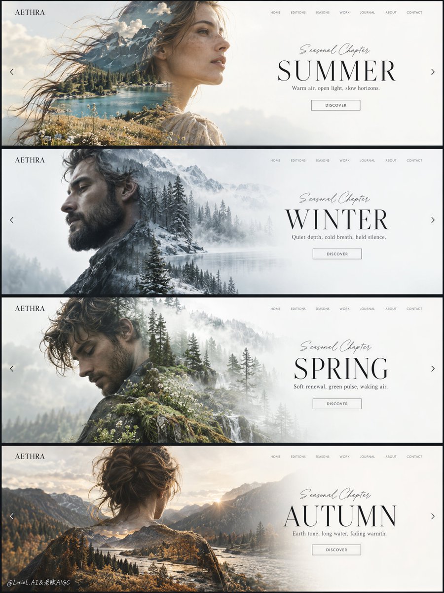
Un tablero de presentación con cuatro diapositivas de héroe de pantalla completa para la marca ficticia AETHRA, compartiendo un sistema de interfaz elegante reinterpretado en verano, invierno, primavera y otoño, con retratos de doble exposición que funden paisajes estacionales.

OpenAI

Ejemplos de la fuente

Estas imágenes provienen de la fuente original. DROPIDEA no ha probado estos ejemplos; los resultados dependen del modelo y los ajustes.

Listo para personalizar

Tu prompt

Inglés

Sustituye las variables en rojo por tus datos. Copia el texto completo y úsalo con tu agente preferido.

TXT MD Versión en inglés
Seasonal variety works best when everything but the atmosphere stays still. 🪽 repeat the exact hero grid: portrait on the left, spacious title field on the right, fixed navigation, label, and button positions The four slides read as one unmistakable design system before you even read the season. 🌿 change only the embedded landscape, light temperature, and restrained seasonal palette inside each portrait Summer, winter, spring, and autumn feel distinct without needing a new layout every time. GPT- image 2.5 prompt👇 Create a premium editorial web-design campaign board for a fictional lifestyle brand called AETHRA, presented as one single tall composition containing four stacked full-screen website hero slides, each built from the same elegant interface system but reinterpreted through a different season. The entire image must feel like a luxury creative-direction presentation: minimalist, airy, high-end, and curatorially precise. Preserve a consistent layout across all four slides: a small square brand mark at the upper left, a thin refined navigation row across the upper right, a large human portrait on the left half rendered as a soft double-exposure silhouette, and a clean seasonal title block on the right half over a spacious white or near-white field. The “product” is the design system itself, and it must remain the dominant visual focus. Overall composition: four horizontal website hero banners stacked vertically in one clean presentation board, separated by thin dark dividers or slim frame gaps. Each slide follows the same structure but carries its own seasonal mood, palette, portrait direction, and embedded landscape. The board should read like a polished design showcase for a premium homepage slider concept. Typography, grid, whitespace, navigation rhythm, and button placement must stay consistent from slide to slide. The left portrait and right title area should always form the primary balance. Everything must feel deliberate, spacious, and highly art-directed. Slide 1, SUMMER: an adult woman in side profile or three-quarter profile facing right, with softly windblown hair and a graceful elongated silhouette. Inside her silhouette, blend a luminous alpine summer landscape: teal lake water, sunlit ochre grass, pale rocky mountains, soft cloud haze, and warm summer air. Main title on the right reads exactly: "SUMMER". Small script line above reads exactly: "Seasonal Chapter". Supporting line below reads exactly: "Warm air, open light, slow horizons." Small button text reads exactly: "DISCOVER". Slide 2, WINTER: an adult bearded man in left-facing side profile, calm and introspective. Inside the silhouette, blend a muted winter forest landscape with bare trees, cool fog, pale frost, bluish-grey shadows, and soft white atmospheric layering. Main title reads exactly: "WINTER". Small script line above reads exactly: "Seasonal Chapter". Supporting line below reads exactly: "Quiet depth, cold breath, held silence." Small button text reads exactly: "DISCOVER". Slide 3, SPRING: an adult man in a softly bent or turning pose, looking slightly downward, elegant and reflective. Inside the silhouette, blend a light spring woodland scene with soft evergreen layers, misty white light, pale moss, wet bark, and fresh emerging growth. Main title reads exactly: "SPRING". Small script line above reads exactly: "Seasonal Chapter". Supporting line below reads exactly: "Soft renewal, green pulse, waking air." Small button text reads exactly: "DISCOVER". Slide 4, AUTUMN: an adult woman or androgynous adult figure shown from the back or slight rear three-quarter view, head centered, silhouette broad and calm. Inside the silhouette, blend an autumn river-valley landscape with muted golden grasses, cool mountain shadow, forest edge, silver water flow, and pale amber dusk light. Main title reads exactly: "AUTUMN". Small script line above reads exactly: "Seasonal Chapter". Supporting line below reads exactly: "Earth tone, long water, fading warmth." Small button text reads exactly: "DISCOVER". Brand and interface system: the small top-left mark on every slide reads exactly: "AETHRA". The top-right navigation on every slide reads exactly: "HOME", "EDITIONS", "SEASONS", "WORK", "JOURNAL", "ABOUT", "CONTACT". Keep the UI elegant, understated, and believable as a real luxury website, but reduce clutter so it still feels like a gallery-grade image rather than a literal web screenshot. Include tiny left and right arrow cues near the side edges of each slide to imply a fullscreen slider. Typography should be thin, premium, editorial, and spatially balanced, with the main seasonal titles in large refined uppercase serif or elegant display text, the smaller interface elements in light modern sans-serif, and the script line above each title delicate and controlled. Double-exposure treatment: the portrait silhouettes must be photoreal and anatomically elegant, with clean profiles, believable shoulders and necks, natural skin and hair detail where visible, and very soft edge transitions where the landscapes merge into the faces and bodies. The landscapes should align with the contour logic of each portrait so the horizon lines, tree masses, grass layers, and fog fields feel embedded inside the figures rather than pasted on top. Keep the integration subtle and premium, with no harsh collage cutouts, no muddy overlaps, and no chaotic texture stacking. Lighting and palette: overall board palette must remain restrained, premium, and seasonally differentiated while unified by the clean white interface field. Use a 60/30/10 logic within each slide, but maintain a coherent full-board look. Summer: warm white, teal water, sunlit ochre. Winter: cool whites, fog grey, blue-green forest shadow. Spring: pale mist, fresh green, soft bark brown. Autumn: warm stone, muted amber, deep conifer shadow. Keep contrast soft but deliberate, with enough tonal separation to preserve facial silhouettes and text readability. The board must feel calm, expensive, and editorial, never loud or saturated. Materials and finish: hyper-real portrait photography fused with fine-art landscape exposure and luxury UI design. Show realistic hair wisps, skin softness, lake texture, tree silhouette detail, mist depth, mountain atmosphere, and crisp rendered typography. The final image should feel like a Cannes-level digital-art-direction board: modern, collectible, emotionally intelligent, and brand-system driven. Output and constraints: one complete four-slide seasonal campaign board, no copied source text, no real brand names, no extra people, no cluttered interface, no heavy decorative noise, no cheap stock-template feeling. Keep all portraits adult, elegant, and anatomically correct. Keep typography crisp and readable, white fields spacious, blends clean, and seasonal differences clear but controlled. Avoid broken facial structure, muddy double exposure, random texture spill, unreadable UI, over-sharpened forests, oversaturated palettes, pasted collage edges, gibberish text, or drift away from high-end editorial realism.
Ver resultados

Tu prompt

Seasonal variety works best when everything but the atmosphere stays still. 🪽 repeat the exact hero grid: portrait on the left, spacious title field on the right, fixed navigation, label, and button positions The four slides read as one unmistakable design system before you even read the season. 🌿 change only the embedded landscape, light temperature, and restrained seasonal palette inside each portrait Summer, winter, spring, and autumn feel distinct without needing a new layout every time. GPT- image 2.5 prompt👇 Create a premium editorial web-design campaign board for a fictional lifestyle brand called AETHRA, presented as one single tall composition containing four stacked full-screen website hero slides, each built from the same elegant interface system but reinterpreted through a different season. The entire image must feel like a luxury creative-direction presentation: minimalist, airy, high-end, and curatorially precise. Preserve a consistent layout across all four slides: a small square brand mark at the upper left, a thin refined navigation row across the upper right, a large human portrait on the left half rendered as a soft double-exposure silhouette, and a clean seasonal title block on the right half over a spacious white or near-white field. The “product” is the design system itself, and it must remain the dominant visual focus. Overall composition: four horizontal website hero banners stacked vertically in one clean presentation board, separated by thin dark dividers or slim frame gaps. Each slide follows the same structure but carries its own seasonal mood, palette, portrait direction, and embedded landscape. The board should read like a polished design showcase for a premium homepage slider concept. Typography, grid, whitespace, navigation rhythm, and button placement must stay consistent from slide to slide. The left portrait and right title area should always form the primary balance. Everything must feel deliberate, spacious, and highly art-directed. Slide 1, SUMMER: an adult woman in side profile or three-quarter profile facing right, with softly windblown hair and a graceful elongated silhouette. Inside her silhouette, blend a luminous alpine summer landscape: teal lake water, sunlit ochre grass, pale rocky mountains, soft cloud haze, and warm summer air. Main title on the right reads exactly: "SUMMER". Small script line above reads exactly: "Seasonal Chapter". Supporting line below reads exactly: "Warm air, open light, slow horizons." Small button text reads exactly: "DISCOVER". Slide 2, WINTER: an adult bearded man in left-facing side profile, calm and introspective. Inside the silhouette, blend a muted winter forest landscape with bare trees, cool fog, pale frost, bluish-grey shadows, and soft white atmospheric layering. Main title reads exactly: "WINTER". Small script line above reads exactly: "Seasonal Chapter". Supporting line below reads exactly: "Quiet depth, cold breath, held silence." Small button text reads exactly: "DISCOVER". Slide 3, SPRING: an adult man in a softly bent or turning pose, looking slightly downward, elegant and reflective. Inside the silhouette, blend a light spring woodland scene with soft evergreen layers, misty white light, pale moss, wet bark, and fresh emerging growth. Main title reads exactly: "SPRING". Small script line above reads exactly: "Seasonal Chapter". Supporting line below reads exactly: "Soft renewal, green pulse, waking air." Small button text reads exactly: "DISCOVER". Slide 4, AUTUMN: an adult woman or androgynous adult figure shown from the back or slight rear three-quarter view, head centered, silhouette broad and calm. Inside the silhouette, blend an autumn river-valley landscape with muted golden grasses, cool mountain shadow, forest edge, silver water flow, and pale amber dusk light. Main title reads exactly: "AUTUMN". Small script line above reads exactly: "Seasonal Chapter". Supporting line below reads exactly: "Earth tone, long water, fading warmth." Small button text reads exactly: "DISCOVER". Brand and interface system: the small top-left mark on every slide reads exactly: "AETHRA". The top-right navigation on every slide reads exactly: "HOME", "EDITIONS", "SEASONS", "WORK", "JOURNAL", "ABOUT", "CONTACT". Keep the UI elegant, understated, and believable as a real luxury website, but reduce clutter so it still feels like a gallery-grade image rather than a literal web screenshot. Include tiny left and right arrow cues near the side edges of each slide to imply a fullscreen slider. Typography should be thin, premium, editorial, and spatially balanced, with the main seasonal titles in large refined uppercase serif or elegant display text, the smaller interface elements in light modern sans-serif, and the script line above each title delicate and controlled. Double-exposure treatment: the portrait silhouettes must be photoreal and anatomically elegant, with clean profiles, believable shoulders and necks, natural skin and hair detail where visible, and very soft edge transitions where the landscapes merge into the faces and bodies. The landscapes should align with the contour logic of each portrait so the horizon lines, tree masses, grass layers, and fog fields feel embedded inside the figures rather than pasted on top. Keep the integration subtle and premium, with no harsh collage cutouts, no muddy overlaps, and no chaotic texture stacking. Lighting and palette: overall board palette must remain restrained, premium, and seasonally differentiated while unified by the clean white interface field. Use a 60/30/10 logic within each slide, but maintain a coherent full-board look. Summer: warm white, teal water, sunlit ochre. Winter: cool whites, fog grey, blue-green forest shadow. Spring: pale mist, fresh green, soft bark brown. Autumn: warm stone, muted amber, deep conifer shadow. Keep contrast soft but deliberate, with enough tonal separation to preserve facial silhouettes and text readability. The board must feel calm, expensive, and editorial, never loud or saturated. Materials and finish: hyper-real portrait photography fused with fine-art landscape exposure and luxury UI design. Show realistic hair wisps, skin softness, lake texture, tree silhouette detail, mist depth, mountain atmosphere, and crisp rendered typography. The final image should feel like a Cannes-level digital-art-direction board: modern, collectible, emotionally intelligent, and brand-system driven. Output and constraints: one complete four-slide seasonal campaign board, no copied source text, no real brand names, no extra people, no cluttered interface, no heavy decorative noise, no cheap stock-template feeling. Keep all portraits adult, elegant, and anatomically correct. Keep typography crisp and readable, white fields spacious, blends clean, and seasonal differences clear but controlled. Avoid broken facial structure, muddy double exposure, random texture spill, unreadable UI, over-sharpened forests, oversaturated palettes, pasted collage edges, gibberish text, or drift away from high-end editorial realism.

Guía de variables

AETHRA

El nombre de marca mostrado arriba a la izquierda de cada diapositiva.

Marca entre comillas en el párrafo del sistema de marca e interfaz.

Valor de ejemplo

AETHRA

"SUMMER"

Los cuatro títulos principales estacionales.

Párrafo de cada diapositiva: el título principal dice exactamente.

Valor de ejemplo

SUMMER

"Seasonal Chapter"

La línea caligráfica sobre cada título.

Cuatro apariciones, una por párrafo de diapositiva.

Valor de ejemplo

Seasonal Chapter

"Warm air, open light, slow horizons."

Una línea de apoyo distinta por estación.

Final del párrafo de cada diapositiva.

Valor de ejemplo

Warm air, open light, slow horizons.

"DISCOVER"

Texto del botón en las cuatro diapositivas.

Final del párrafo de cada diapositiva.

Valor de ejemplo

DISCOVER

"HOME", "EDITIONS", "SEASONS", "WORK", "JOURNAL", "ABOUT", "CONTACT"

Los siete elementos de navegación arriba a la derecha.

Párrafo del sistema de marca e interfaz.

Valor de ejemplo

HOME, CONTACT

Summer: warm white, teal water, sunlit ochre.

Las paletas estacionales contenidas.

Sección de iluminación y paleta.

Valor de ejemplo

Winter: cool whites, fog grey

Inside her silhouette, blend a luminous alpine summer landscape

Paisajes fundidos dentro de las siluetas.

La frase "inside the silhouette, blend" en cada diapositiva.

Valor de ejemplo

Bosque invernal desnudo con niebla

Qué obtienes

  • Un tablero de presentación alto con cuatro diapositivas de héroe a pantalla completa apiladas verticalmente.
  • Un sistema de interfaz unificado: marca cuadrada arriba a la izquierda, navegación fina arriba a la derecha, retrato de doble exposición a la izquierda y título estacional a la derecha.
  • Cuatro retratos fotorrealistas de adultos con paisajes estacionales distintos fundidos dentro de sus siluetas.
  • Texto de interfaz renderizado literalmente como se especifica: títulos, líneas, botones y etiquetas de navegación.
  • Flechas laterales de deslizador y una sensación editorial de lujo con contraste suave y paletas estacionales contenidas.

Casos de uso

  • Presentar un concepto de slider de inicio para una marca lifestyle o agencia de diseño.
  • Dirección de arte y mood boards de campañas estacionales.
  • Piezas de portafolio para conceptos de diseño web de lujo.
  • Contenido visual para casos de estudio de sistemas de diseño e identidades estacionales.
  • Referencias de composición para retratos artísticos de doble exposición.

Cómo usarlo

  • Copia la plantilla árabe completa y pégala en un modelo de generación de imágenes como GPT- image 2.5.
  • Si lo deseas, cambia los valores creativos editables: nombre de marca, títulos, líneas de apoyo, texto del botón, etiquetas de navegación, paletas o paisajes fundidos — manteniendo el texto entre comillas exactamente como quieras que aparezca.
  • No cambies los números técnicos (numeración de diapositivas 1-4 y la lógica 60/30/10) ni la estructura del diseño si quieres respetar el sistema.
  • No se necesitan imágenes de referencia ni subidas; todo se genera a partir de texto.
  • Genera la imagen y revisa: las cuatro diapositivas deben compartir la misma retícula con estados de ánimo estacionales distintos.
  • Vuelve a generar cuando sea necesario; los resultados son estocásticos y varían entre ejecuciones incluso con la misma plantilla.

Prompts relacionados