Ir al contenido
ImágenesGratis

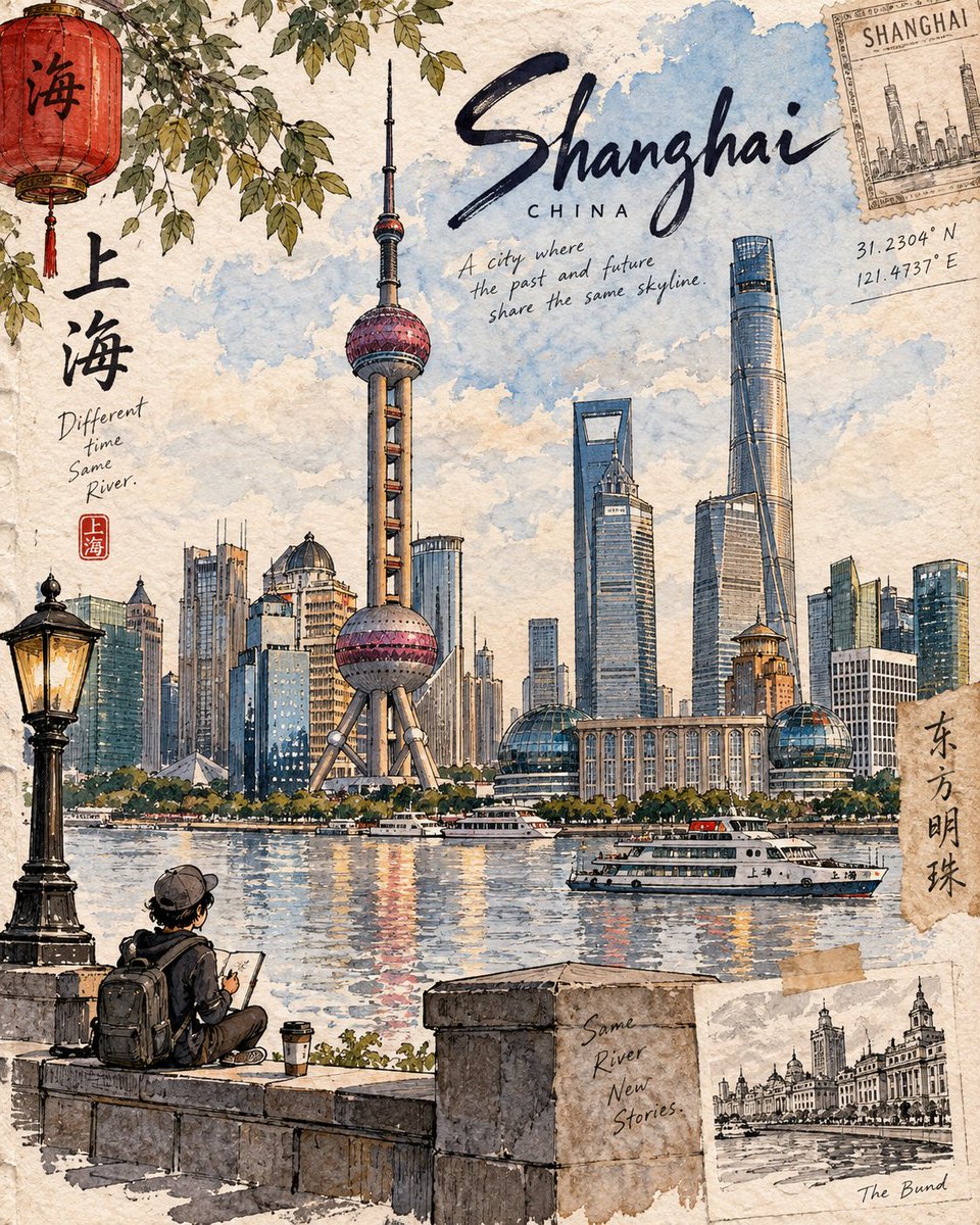
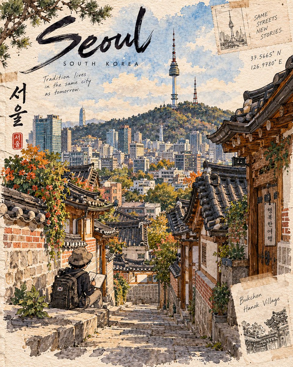
Ilustración vertical premium 4:5 del Destination Sketchbook

Una plantilla árabe completa para generar una ilustración premium de diario de viaje pintada a mano, con un monumento dominante, un pequeño viajero chibi, precisión geográfica, caligrafía manuscrita y una paleta acuarela contenida.

OpenAI

Ejemplos de la fuente

Estas imágenes provienen de la fuente original. DROPIDEA no ha probado estos ejemplos; los resultados dependen del modelo y los ajustes.
Listo para personalizar

Tu prompt

Inglés

Sustituye las variables en rojo por tus datos. Copia el texto completo y úsalo con tu agente preferido.

TXT MD Versión en inglés
Create a premium 4:5 vertical illustration for the “Destination Sketchbook” series. Use the Matterhorn artwork as the series DNA, not as a literal template. For [DESTINATION], identify its most distinctive and authentic landmark or place and build the entire scene around it. Prioritize geographic accuracy: landmark, architecture, terrain, vegetation, water, geology, culture, and viewpoint must naturally belong together and be realistically observable from one location. Never create composite landmarks or mix attractions from different places. COMPOSITION: One dominant hero landmark with 60–70% visual emphasis, strong foreground–middle–background depth, generous negative space, and exactly ONE tiny cute chibi traveler occupying 8–12% of the frame. The traveler should naturally explore, sketch, sit, walk, or observe—not pose for the viewer. Use destination-specific foreground details. STYLE: Hand-painted travel-journal artwork with expressive dark ink lines, varied line weight, loose watercolor/gouache washes, warm off-white paper, visible grain, subtle pencil marks, imperfect brush edges, natural paint bleeds, and restrained imperfections. It should feel personally observed, tactile, intimate, and handmade—not photorealistic, glossy, vector-like, or generically AI-watercolored. Make each destination visually unique through its architecture, vegetation, geology, materials, weather, light, culture, textures, and viewpoint, while preserving the same artist identity. Avoid generic tourism clichés and decorative elements unless genuinely relevant. TEXT: Minimal handwritten editorial lettering: [LANDMARK NAME] [LOCATION, COUNTRY] Optionally add 1–2 short, location-specific observations. COLOR: Naturally derived from the destination and season. Restrained watercolor palette, subtle accents, visible paper, no neon, excessive contrast, glossy gradients, or artificial cinematic grading. FINAL: The destination must be immediately recognizable, geographically coherent, landmark-dominant, authentically detailed, and unmistakably part of the Destination Sketchbook series. OUTPUT: 4:5 vertical premium hand-drawn travel-journal illustration.
Ver resultados

Tu prompt

Create a premium 4:5 vertical illustration for the “Destination Sketchbook” series. Use the Matterhorn artwork as the series DNA, not as a literal template. For [DESTINATION], identify its most distinctive and authentic landmark or place and build the entire scene around it. Prioritize geographic accuracy: landmark, architecture, terrain, vegetation, water, geology, culture, and viewpoint must naturally belong together and be realistically observable from one location. Never create composite landmarks or mix attractions from different places. COMPOSITION: One dominant hero landmark with 60–70% visual emphasis, strong foreground–middle–background depth, generous negative space, and exactly ONE tiny cute chibi traveler occupying 8–12% of the frame. The traveler should naturally explore, sketch, sit, walk, or observe—not pose for the viewer. Use destination-specific foreground details. STYLE: Hand-painted travel-journal artwork with expressive dark ink lines, varied line weight, loose watercolor/gouache washes, warm off-white paper, visible grain, subtle pencil marks, imperfect brush edges, natural paint bleeds, and restrained imperfections. It should feel personally observed, tactile, intimate, and handmade—not photorealistic, glossy, vector-like, or generically AI-watercolored. Make each destination visually unique through its architecture, vegetation, geology, materials, weather, light, culture, textures, and viewpoint, while preserving the same artist identity. Avoid generic tourism clichés and decorative elements unless genuinely relevant. TEXT: Minimal handwritten editorial lettering: [LANDMARK NAME] [LOCATION, COUNTRY] Optionally add 1–2 short, location-specific observations. COLOR: Naturally derived from the destination and season. Restrained watercolor palette, subtle accents, visible paper, no neon, excessive contrast, glossy gradients, or artificial cinematic grading. FINAL: The destination must be immediately recognizable, geographically coherent, landmark-dominant, authentically detailed, and unmistakably part of the Destination Sketchbook series. OUTPUT: 4:5 vertical premium hand-drawn travel-journal illustration.

Guía de variables

[DESTINATION]

El destino alrededor del cual se construye toda la escena; reemplaza el token solo con el nombre del destino, p. ej. Japón o París.

Reemplaza el token [DESTINATION] en el segundo párrafo de la plantilla, justo después de la frase 'Para'.

Valor de ejemplo

Suiza

[LANDMARK NAME]

El nombre del monumento escrito a mano en la parte superior; debe ser un monumento real y distintivo del destino.

Reemplaza el token [LANDMARK NAME] en la línea de texto manuscrito dentro de la sección TEXTO de la plantilla.

Valor de ejemplo

Matterhorn

[LOCATION, COUNTRY]

La ubicación y el país mostrados bajo el nombre del monumento en escritura a mano, p. ej. ciudad y país.

Reemplaza el token [LOCATION, COUNTRY] en la segunda línea de texto manuscrito dentro de la sección TEXTO de la plantilla.

Valor de ejemplo

Zermatt, Suiza

Qué obtienes

  • Una ilustración vertical premium 4:5 de diario de viaje pintada a mano.
  • Un monumento principal dominante con 60–70% de énfasis visual y gran profundidad.
  • Exactamente un pequeño viajero chibi que ocupa el 8–12% del encuadre mientras explora.
  • Una paleta acuarela contenida derivada del destino y la temporada con grano de papel visible.
  • Caligrafía manuscrita con el nombre del monumento, la ubicación y el país.

Casos de uso

  • Postales y láminas artísticas de destinos de viaje.
  • Contenido para redes sociales de marcas de viaje y turismo.
  • Páginas personales de cuaderno de viaje y proyectos creativos.
  • Diseños murales y tarjetas de recuerdo para destinos turísticos.

Cómo usarlo

  • Reemplaza el token [DESTINATION] con el nombre del destino que desees.
  • Identifica el monumento más distintivo del destino y escribe su nombre en el token [LANDMARK NAME].
  • Completa [LOCATION, COUNTRY] con el lugar y el país que aparecerán bajo el nombre del monumento.
  • Pega la plantilla completa en una herramienta de generación de imágenes que admita estilos de diario de viaje pintado a mano.
  • Opcionalmente añade 1–2 observaciones cortas específicas del lugar como permite la plantilla.

Prompts relacionados