Ir al contenido
ImágenesGratis

Tarjeta vertical: foto e ilustración mínima

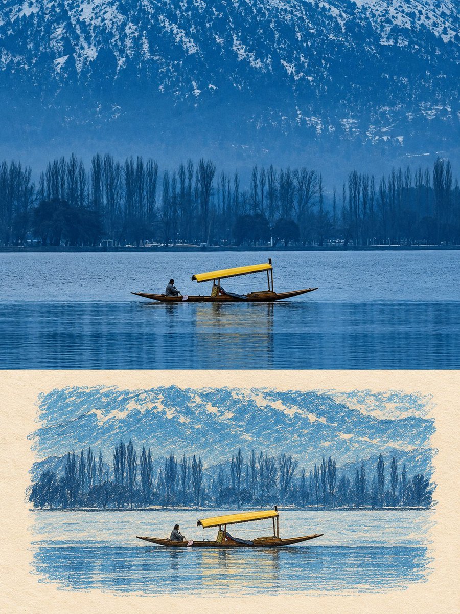
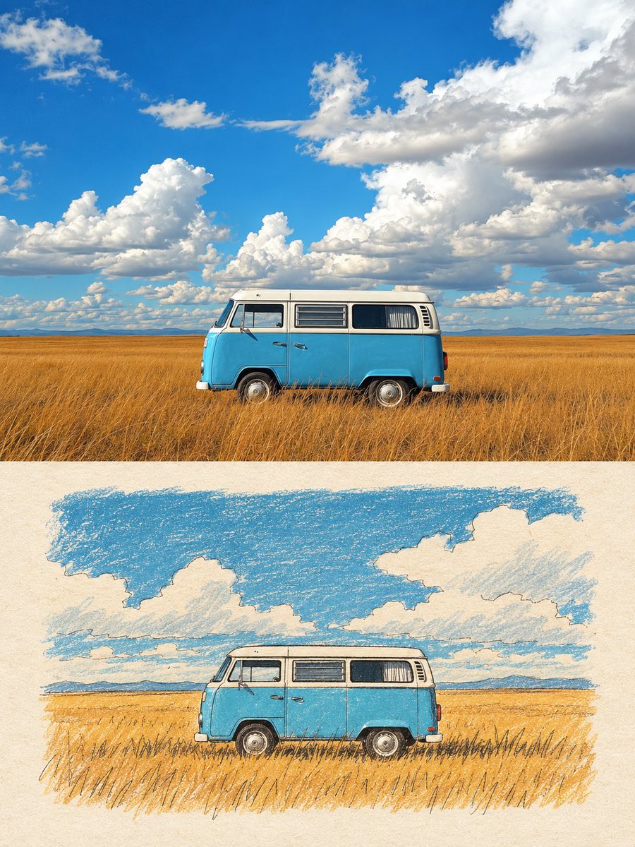
Tarjeta vertical 3:4: la mitad superior conserva la foto subida con textura fotográfica; la inferior es una ilustración naive editorial serena sobre papel marfil envejecido con colores derivados de la fuente, con dos líneas opcionales en inglés.

OpenAI

Ejemplos de la fuente

Estas imágenes provienen de la fuente original. DROPIDEA no ha probado estos ejemplos; los resultados dependen del modelo y los ajustes.
Listo para personalizar

Tu prompt

Inglés

Sustituye las variables en rojo por tus datos. Copia el texto completo y úsalo con tu agente preferido.

TXT MD Versión en inglés
Use the uploaded photo as the only content source. Create a vertical 3:4 “real photo + minimal illustration” memory card based entirely on that image. Preserve the main subjects, subject count, pose, viewpoint, spatial relationships, and overall scene logic. Do not redesign the source or add unrelated content. Layout Split the card into two horizontal sections, about 50% top and 50% bottom. The top half keeps the uploaded photo with photographic texture. Crop naturally to fit, but do not stretch, mirror, rearrange, or alter the main subjects. Keep natural lighting, real materials, and the original color mood, with subtle editorial grading. The lower half uses a warm ivory handmade-paper background and shows a centered horizontal illustration of the same scene. The illustration occupies about 63-67% of the lower width, with generous blank space around it. Scene Translation In the lower illustration, preserve the most recognizable subjects, major structures, important objects, viewpoint, depth, relative scale, and key positions from the source. Remove tiny clutter, fine photographic texture, reflections, and complex shadows. Simplify the scene into slightly awkward geometric color blocks and thin hand-drawn lines. People and animals, when present, remain identifiable through silhouette, pose, hair or fur shape, clothing color, and placement, but facial detail may be reduced. Outlines may wobble, break, shift, or misalign slightly while the scene stays recognizable. Illustration Style Use restrained naive editorial drawing with soft geometric simplification and handmade quality. Combine thin sketchy linework with flat shapes. The lower scene should feel calm, clean, slightly imperfect, and visually reduced rather than technically precise. Avoid realistic rendering. Color Extract 4-6 representative colors from the uploaded photo and reinterpret them as a soft low-saturation palette. Use muted tones derived from the source, with flat fills and enough contrast to separate major subjects and scene layers. No complex gradients, glossy highlights, or heavy 3D modeling. Texture Blend crayon, pastel, screen-print, and old-book illustration qualities. Keep paper show-through, fine grain, slight pigment unevenness, worn edges, and subtle off-register shifts. The result should feel like an independent editorial illustration printed on aged paper: warm, quiet, nostalgic, and collectible. Typography Below the illustration, you may include exactly two short English lines related to the scene, mood, place, or moment. Use a small vintage serif font, left-aligned. If clean readable text cannot be rendered, leave the area blank. No other readable text. Cleanup Remove phone UI, subtitles, screenshot traces, and interface elements when present. Do not invent missing scenery or decorative props. Negative No major layout change, no added or missing primary subjects, no photoreal painting, no polished watercolor, no anime, no manga, no vector clip-art, no oil paint, no impasto, no 3D, no logo, no watermark, no black border, no UI, no unrelated decoration. Vertical 3:4 split card · photo top / naive illustration bottom · aged paper texture
Ver resultados

Tu prompt

Use the uploaded photo as the only content source. Create a vertical 3:4 “real photo + minimal illustration” memory card based entirely on that image. Preserve the main subjects, subject count, pose, viewpoint, spatial relationships, and overall scene logic. Do not redesign the source or add unrelated content. Layout Split the card into two horizontal sections, about 50% top and 50% bottom. The top half keeps the uploaded photo with photographic texture. Crop naturally to fit, but do not stretch, mirror, rearrange, or alter the main subjects. Keep natural lighting, real materials, and the original color mood, with subtle editorial grading. The lower half uses a warm ivory handmade-paper background and shows a centered horizontal illustration of the same scene. The illustration occupies about 63-67% of the lower width, with generous blank space around it. Scene Translation In the lower illustration, preserve the most recognizable subjects, major structures, important objects, viewpoint, depth, relative scale, and key positions from the source. Remove tiny clutter, fine photographic texture, reflections, and complex shadows. Simplify the scene into slightly awkward geometric color blocks and thin hand-drawn lines. People and animals, when present, remain identifiable through silhouette, pose, hair or fur shape, clothing color, and placement, but facial detail may be reduced. Outlines may wobble, break, shift, or misalign slightly while the scene stays recognizable. Illustration Style Use restrained naive editorial drawing with soft geometric simplification and handmade quality. Combine thin sketchy linework with flat shapes. The lower scene should feel calm, clean, slightly imperfect, and visually reduced rather than technically precise. Avoid realistic rendering. Color Extract 4-6 representative colors from the uploaded photo and reinterpret them as a soft low-saturation palette. Use muted tones derived from the source, with flat fills and enough contrast to separate major subjects and scene layers. No complex gradients, glossy highlights, or heavy 3D modeling. Texture Blend crayon, pastel, screen-print, and old-book illustration qualities. Keep paper show-through, fine grain, slight pigment unevenness, worn edges, and subtle off-register shifts. The result should feel like an independent editorial illustration printed on aged paper: warm, quiet, nostalgic, and collectible. Typography Below the illustration, you may include exactly two short English lines related to the scene, mood, place, or moment. Use a small vintage serif font, left-aligned. If clean readable text cannot be rendered, leave the area blank. No other readable text. Cleanup Remove phone UI, subtitles, screenshot traces, and interface elements when present. Do not invent missing scenery or decorative props. Negative No major layout change, no added or missing primary subjects, no photoreal painting, no polished watercolor, no anime, no manga, no vector clip-art, no oil paint, no impasto, no 3D, no logo, no watermark, no black border, no UI, no unrelated decoration. Vertical 3:4 split card · photo top / naive illustration bottom · aged paper texture

Guía de variables

the uploaded photo

Una única foto que debe subirse como única fuente de contenido; la plantilla no funciona sin ella.

Se adjunta como imagen junto a la plantilla y se referencia en el texto como la foto subida.

Valor de ejemplo

Una foto de niños jugando en un parque

exactly two short English lines

Dos líneas cortas opcionales en inglés relacionadas con la escena, el ánimo, el lugar o el momento.

Debajo de la ilustración en la mitad inferior de la tarjeta, alineadas a la izquierda con serif vintage pequeño.

Valor de ejemplo

"Sunday light" / "on the terrace"

Qué obtienes

  • Tarjeta vertical 3:4 dividida horizontalmente en dos mitades de aproximadamente 50%/50%.
  • Mitad superior que conserva la foto subida con su textura, iluminación y tono de color, recortada de forma natural.
  • Mitad inferior sobre papel marfil cálido con una ilustración centrada de la misma escena al 63-67% del ancho.
  • Paleta suave de baja saturación con 4-6 colores extraídos de la foto.
  • Textura que mezcla cera, pastel, serigrafía e ilustración de libros antiguos.
  • Dos líneas cortas opcionales en inglés con serif vintage pequeño bajo la ilustración.

Casos de uso

  • Tarjetas de recuerdo para viajes, ocasiones familiares y momentos especiales.
  • Decoración de pared o impresiones de regalo con aire editorial nostálgico.
  • Tarjetas de agradecimiento o invitación con un toque visual cálido a partir de fotos reales.
  • Contenido para redes sociales que convierte fotos personales en arte coleccionable.

Cómo usarlo

  • Sube una foto clara con los sujetos principales que deseas conservar; la foto subida es la única fuente de contenido.
  • Copia la plantilla árabe completa y enviala con la foto subida sin alterar proporciones ni cifras como 3:4, 50% y 63-67%.
  • Decide si incluir dos líneas cortas en inglés bajo la ilustración o pedir que el área quede en blanco.
  • Mantén intactos los ajustes técnicos negativos como no 3D, no logo, no marca de agua, que garantizan un resultado limpio.
  • Revisa el resultado: la mitad superior debe seguir siendo una foto real sin cambios esenciales y la inferior una ilustración naive con colores derivados de la foto.

Prompts relacionados