Ir al contenido
ImágenesGratis

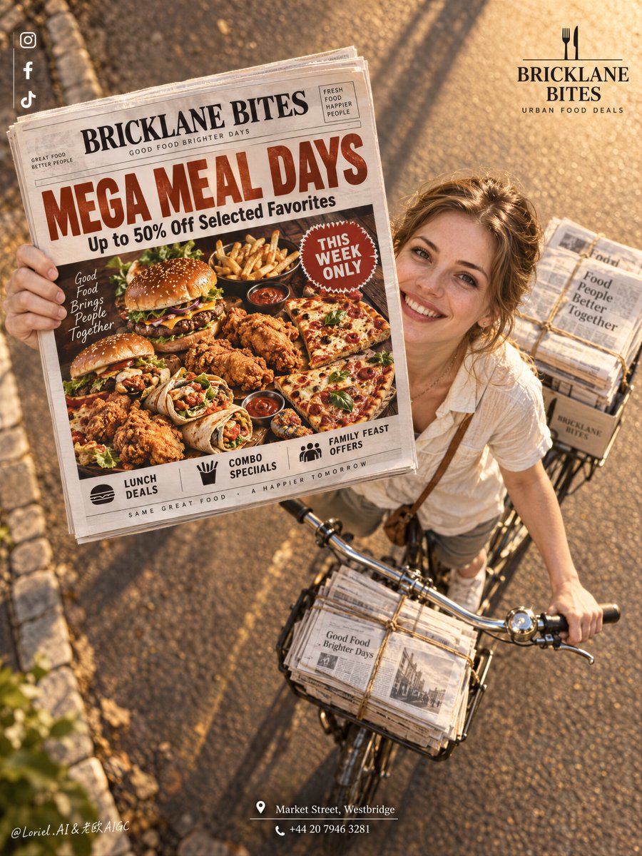
Póster Cinematográfico de Comida con Periódico en Perspectiva Forzada

Prompt publicitario comercial de alto nivel que fusiona fotografía callejera en hora dorada con un póster de comida integrado en un periódico en perspectiva forzada, repartido en bicicleta.

OpenAI

Ejemplos de la fuente

Estas imágenes provienen de la fuente original. DROPIDEA no ha probado estos ejemplos; los resultados dependen del modelo y los ajustes.

Listo para personalizar

Tu prompt

Inglés

Sustituye las variables en rojo por tus datos. Copia el texto completo y úsalo con tu agente preferido.

TXT MD Versión en inglés
The newspaper works because it is not a prop—it is the poster inside the poster. 🗞️ newspaper lifted toward the lens in the upper-left center, enlarged by forced perspective, with the rider and bicycle receding diagonally behind it The promotion reads before the street scene. You get a believable delivery moment without sacrificing the food offer’s legibility. 🍔 treat the newspaper front page as a complete food-ad layout: one oversized headline, one hero platter, one compact urgency badge This keeps the offer instantly scannable even at a distance. The print feels like a real promotional object, not texture pasted over a photograph. GPT- image 2.5 prompt👇 A premium restaurant promotion poster for fictional dining brand BRICKLANE BITES, merging street charm, material precision, and graphic clarity into one image. Preserve the exact structure: a dramatic high-angle overhead view of a bicycle moving along a warm sunlit road, an adult Western white girl looking up and smiling while extending a newspaper directly toward the camera, tied newspaper bundles on the bicycle, a small brand mark in the upper right, a clean vertical social-icon strip in the upper left, and a centered address block near the bottom. The newspaper front page remains the absolute visual leader. The girl is photoreal, adult, naturally attractive, and believable, with realistic skin texture, subtle pores, natural lips, soft facial structure, correct head-neck-shoulder proportion, elegant hands with five normal fingers, believable wrists and elbows, natural posture, and no distortion. She wears a simple light cream short-sleeve shirt with relaxed summer styling, authentic rather than fashion-forward. She rides the bicycle and looks up with a bright persuasive smile, but stays secondary to the newspaper and its promotion. The camera angle is critical: a top-down three-quarter overhead shot, with the bicycle diagonally crossing the lower right quadrant and the newspaper lifted toward the lens in the upper-left-central area, creating a bold forced-perspective moment. The road is warm and glowing with golden-hour sunlight, long soft shadows, subtle edge stones, and clean depth. The bicycle is classic and practical, with realistic metal handlebars, front tied bundles, rear stacks of paper, and believable weight balance. The whole image should feel like Orbit, Transit, and Port fused together: emotionally inviting, materially exact, and graphically elevated. The newspaper front page is fully redesigned in English as a restaurant mega-discount promotion. Use a bold premium food-ad layout with a large appetizing hero spread of burgers, fried chicken, loaded fries, wraps, and pizza slices arranged in a dramatic overhead tray or platter, with rich warm highlights, crisp fried texture, glossy sauces, and irresistible realism. Use one giant original English headline such as “MEGA MEAL DAYS” or “BIG BITES, SMALLER PRICES”, plus one strong support line such as “Up to 50% Off Selected Favorites”. Add only a few smaller clean sub-lines like “Lunch Deals”, “Combo Specials”, “Family Feast Offers”, and one compact badge like “This Week Only”. Keep the newspaper typography sharp, readable, premium, and uncluttered. Branding is minimal and elegant. Upper right: a clean BRICKLANE BITES logo with a short descriptor such as “Urban Food Deals”. Upper left: minimal social icons aligned vertically. Bottom center: one refined English address-and-contact block such as “Market Street, Westbridge” and one phone line. Outside the newspaper, keep text restrained so the printed promo page carries most of the communication. Lighting is warm, cinematic, and commercially precise: golden-hour key light from the upper side, soft facial glow on the girl, crisp highlights on the newspaper edges, readable print contrast, gentle metallic reflections on the bicycle handlebar, and strong volume without muddy shadows or clutter. Color hierarchy: 55% warm amber road and sunlight, 25% cream and white newspaper tones, 20% rich food colors including red, golden brown, lettuce green, and sauce accents. Materials must feel hyperreal and tactile: printed paper grain, folded newspaper edges, twine-bound stacks, metal bicycle parts, realistic skin, cotton shirt fabric, crisp fried crust, glossy sauces, and clean commercial food photography embedded in the newspaper design. The final image should feel like a Cannes-level food-promo campaign fused with a street-distribution photograph: persuasive, warm, premium, clean, and highly readable.
Ver resultados

Tu prompt

The newspaper works because it is not a prop—it is the poster inside the poster. 🗞️ newspaper lifted toward the lens in the upper-left center, enlarged by forced perspective, with the rider and bicycle receding diagonally behind it The promotion reads before the street scene. You get a believable delivery moment without sacrificing the food offer’s legibility. 🍔 treat the newspaper front page as a complete food-ad layout: one oversized headline, one hero platter, one compact urgency badge This keeps the offer instantly scannable even at a distance. The print feels like a real promotional object, not texture pasted over a photograph. GPT- image 2.5 prompt👇 A premium restaurant promotion poster for fictional dining brand BRICKLANE BITES, merging street charm, material precision, and graphic clarity into one image. Preserve the exact structure: a dramatic high-angle overhead view of a bicycle moving along a warm sunlit road, an adult Western white girl looking up and smiling while extending a newspaper directly toward the camera, tied newspaper bundles on the bicycle, a small brand mark in the upper right, a clean vertical social-icon strip in the upper left, and a centered address block near the bottom. The newspaper front page remains the absolute visual leader. The girl is photoreal, adult, naturally attractive, and believable, with realistic skin texture, subtle pores, natural lips, soft facial structure, correct head-neck-shoulder proportion, elegant hands with five normal fingers, believable wrists and elbows, natural posture, and no distortion. She wears a simple light cream short-sleeve shirt with relaxed summer styling, authentic rather than fashion-forward. She rides the bicycle and looks up with a bright persuasive smile, but stays secondary to the newspaper and its promotion. The camera angle is critical: a top-down three-quarter overhead shot, with the bicycle diagonally crossing the lower right quadrant and the newspaper lifted toward the lens in the upper-left-central area, creating a bold forced-perspective moment. The road is warm and glowing with golden-hour sunlight, long soft shadows, subtle edge stones, and clean depth. The bicycle is classic and practical, with realistic metal handlebars, front tied bundles, rear stacks of paper, and believable weight balance. The whole image should feel like Orbit, Transit, and Port fused together: emotionally inviting, materially exact, and graphically elevated. The newspaper front page is fully redesigned in English as a restaurant mega-discount promotion. Use a bold premium food-ad layout with a large appetizing hero spread of burgers, fried chicken, loaded fries, wraps, and pizza slices arranged in a dramatic overhead tray or platter, with rich warm highlights, crisp fried texture, glossy sauces, and irresistible realism. Use one giant original English headline such as “MEGA MEAL DAYS” or “BIG BITES, SMALLER PRICES”, plus one strong support line such as “Up to 50% Off Selected Favorites”. Add only a few smaller clean sub-lines like “Lunch Deals”, “Combo Specials”, “Family Feast Offers”, and one compact badge like “This Week Only”. Keep the newspaper typography sharp, readable, premium, and uncluttered. Branding is minimal and elegant. Upper right: a clean BRICKLANE BITES logo with a short descriptor such as “Urban Food Deals”. Upper left: minimal social icons aligned vertically. Bottom center: one refined English address-and-contact block such as “Market Street, Westbridge” and one phone line. Outside the newspaper, keep text restrained so the printed promo page carries most of the communication. Lighting is warm, cinematic, and commercially precise: golden-hour key light from the upper side, soft facial glow on the girl, crisp highlights on the newspaper edges, readable print contrast, gentle metallic reflections on the bicycle handlebar, and strong volume without muddy shadows or clutter. Color hierarchy: 55% warm amber road and sunlight, 25% cream and white newspaper tones, 20% rich food colors including red, golden brown, lettuce green, and sauce accents. Materials must feel hyperreal and tactile: printed paper grain, folded newspaper edges, twine-bound stacks, metal bicycle parts, realistic skin, cotton shirt fabric, crisp fried crust, glossy sauces, and clean commercial food photography embedded in the newspaper design. The final image should feel like a Cannes-level food-promo campaign fused with a street-distribution photograph: persuasive, warm, premium, clean, and highly readable.

Guía de variables

BRICKLANE BITES

Nombre de la marca o restaurante ficticio/real

En la sección de marca y descripción del logotipo superior derecho

Valor de ejemplo

BRICKLANE BITES

MEGA MEAL DAYS

Titular principal de la portada del periódico

Dentro de la descripción del diseño de portada del periódico

Valor de ejemplo

MEGA MEAL DAYS

Up to 50% Off Selected Favorites

Texto de apoyo que indica el descuento u oferta

En la línea secundaria de apoyo del periódico

Valor de ejemplo

Up to 50% Off Selected Favorites

Market Street, Westbridge

Información de ubicación y contacto en la parte inferior

En el bloque de dirección y contacto al pie del póster

Valor de ejemplo

Market Street, Westbridge

Qué obtienes

  • Una composición creativa que integra un anuncio publicitario de comida dentro de una escena callejera verídica.
  • Efecto de perspectiva forzada que prioriza visualmente la lectura de la oferta sin perder el ambiente urbano.
  • Estética comercial de nivel publicitario internacional con texturas táctiles y fidelidad fotográfica.

Casos de uso

  • Campañas en redes sociales para restaurantes y cadenas de comida rápida gourmet.
  • Pósteres publicitarios digitales o impresos para promociones semanales o menús especiales.
  • Propuestas creativas y moodboards para agencias de publicidad y marketing gastronómico.

Cómo usarlo

  • Copia el prompt completo e ingrésalo en tu generador de imágenes de IA preferido.
  • Personaliza el nombre de la marca, titulares y textos promocionales entre comillas según tu oferta gastronómica.
  • Conserva las especificaciones de perspectiva forzada, ángulo cenital y paleta de color 55/25/20 para garantizar el equilibrio.
  • Genera la imagen y revisa la nitidez tipográfica del periódico y la armonía de la luz de hora dorada.

Prompts relacionados