Ir al contenido
ImágenesGratis

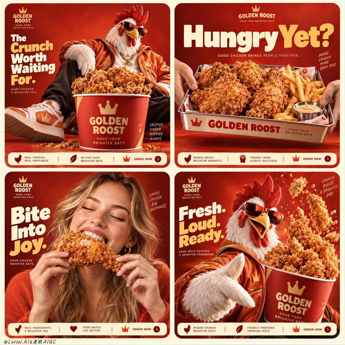
Campaña Publicitaria de Pollo Frito en Cuadrícula Cuádruple

Prompt de nivel Cannes para generar un póster publicitario de comida rápida en cuadrícula 2x2 con identidad de marca sólida, apetito sensorial y pollo frito de calidad premium.

OpenAI

Ejemplos de la fuente

Estas imágenes provienen de la fuente original. DROPIDEA no ha probado estos ejemplos; los resultados dependen del modelo y los ajustes.

Listo para personalizar

Tu prompt

Inglés

Sustituye las variables en rojo por tus datos. Copia el texto completo y úsalo con tu agente preferido.

TXT MD Versión en inglés
A four-panel food campaign feels cohesive when the brand system repeats—not when every panel repeats the same image. 🍗 lock the same red-orange background, logo position, rounded card frame, and bottom information strip across all four panels These fixed anchors make the grid feel like one campaign before the viewer even notices the individual scenes. 👑 vary the appetite trigger in each card: bucket abundance, tray-sharing, first bite, then controlled food burst Each panel earns its place with a different reason to crave the product, while the chicken remains the visual constant. GPT- image 2.5 prompt👇 A Cannes-level fried chicken campaign poster for fictional premium fast-food brand GOLDEN ROOST, merging emotional appetite, material precision, and curatorial graphic control into one unified 2x2 social-ad grid. Preserve the exact structure: four rounded-corner square cards on a pale buttery-cream background, each set on a saturated red-to-orange studio field with the same mascot-and-product universe, product-first hierarchy, bold headline zones, and tiny bottom information strips. The food remains the absolute visual leader across all four panels. Top-left panel: a fashion-forward anthropomorphic rooster mascot lounges beside an oversized branded bucket overflowing with hyperreal fried chicken, wearing tactile orange street-luxury outerwear and tinted sunglasses. Top-right panel: a metal tray loaded with fried chicken pieces and fries is held from both sides by entering hands, tight and direct, with a bold headline above. Bottom-left panel: replace the black person with an adult Western white girl, photoreal and internationally commercial, joyfully biting into a large piece of fried chicken; she has fair or lightly sun-kissed skin, realistic pores, natural lips and teeth, soft hair, elegant hands with five normal fingers, correct anatomy, warm orange-red styling, and genuine delight. Bottom-right panel: the rooster mascot returns larger in the foreground while a branded bucket of fried chicken tenders erupts upward in a controlled burst of crumbs and crisp fragments. Create a fully original English-only brand system. Use a small GOLDEN ROOST logo in the upper area of each panel, with short original headlines such as “The Crunch Worth Waiting For.”, “Hungry Yet?”, “Bite Into Joy.”, and “Fresh. Loud. Ready.” Keep typography bold, rounded, well spaced, and integrated into each card without covering the hero food. Add minimal order-strip information at the bottom edge of each card only as graphic structure. The fried chicken must be irresistibly real: thick, deeply golden, rough crisp crust, visible crumb texture, subtle seasoning dust, hot edible volume, tender interior glimpses where relevant, and rich commercial food highlights. The bucket and tray feel tactile and premium, with matte printed surfaces, believable curvature, crisp logo print, and strong object weight. The mascot feels polished and brand-iconic, with feather texture, sculptural beak, expressive pose, glossy sunglasses, and soft fabric detail. Lighting is polished commercial food lighting fused with campaign styling: warm front-upper key light, soft fill for detail retention, subtle rim light on mascot feathers and the girl’s face, crisp highlights on breading ridges, and strong volume without muddy shadows or dead blacks. Color hierarchy: 65% fiery red-orange brand field, 25% golden-brown fried chicken texture, 10% cream, white, and soft skin highlights. The final image should feel like Orbit, Transit, and Port fused together: emotionally addictive, materially exact, internationally polished, graphically clean, playful but premium. No copied branding, no copied slogans, no extra people, no malformed hands, no extra fingers, no distorted female anatomy, no warped tray or bucket, no muddy crust texture, no weak typography, no clutter hiding the chicken, no cheap fast-food look.
Ver resultados

Tu prompt

A four-panel food campaign feels cohesive when the brand system repeats—not when every panel repeats the same image. 🍗 lock the same red-orange background, logo position, rounded card frame, and bottom information strip across all four panels These fixed anchors make the grid feel like one campaign before the viewer even notices the individual scenes. 👑 vary the appetite trigger in each card: bucket abundance, tray-sharing, first bite, then controlled food burst Each panel earns its place with a different reason to crave the product, while the chicken remains the visual constant. GPT- image 2.5 prompt👇 A Cannes-level fried chicken campaign poster for fictional premium fast-food brand GOLDEN ROOST, merging emotional appetite, material precision, and curatorial graphic control into one unified 2x2 social-ad grid. Preserve the exact structure: four rounded-corner square cards on a pale buttery-cream background, each set on a saturated red-to-orange studio field with the same mascot-and-product universe, product-first hierarchy, bold headline zones, and tiny bottom information strips. The food remains the absolute visual leader across all four panels. Top-left panel: a fashion-forward anthropomorphic rooster mascot lounges beside an oversized branded bucket overflowing with hyperreal fried chicken, wearing tactile orange street-luxury outerwear and tinted sunglasses. Top-right panel: a metal tray loaded with fried chicken pieces and fries is held from both sides by entering hands, tight and direct, with a bold headline above. Bottom-left panel: replace the black person with an adult Western white girl, photoreal and internationally commercial, joyfully biting into a large piece of fried chicken; she has fair or lightly sun-kissed skin, realistic pores, natural lips and teeth, soft hair, elegant hands with five normal fingers, correct anatomy, warm orange-red styling, and genuine delight. Bottom-right panel: the rooster mascot returns larger in the foreground while a branded bucket of fried chicken tenders erupts upward in a controlled burst of crumbs and crisp fragments. Create a fully original English-only brand system. Use a small GOLDEN ROOST logo in the upper area of each panel, with short original headlines such as “The Crunch Worth Waiting For.”, “Hungry Yet?”, “Bite Into Joy.”, and “Fresh. Loud. Ready.” Keep typography bold, rounded, well spaced, and integrated into each card without covering the hero food. Add minimal order-strip information at the bottom edge of each card only as graphic structure. The fried chicken must be irresistibly real: thick, deeply golden, rough crisp crust, visible crumb texture, subtle seasoning dust, hot edible volume, tender interior glimpses where relevant, and rich commercial food highlights. The bucket and tray feel tactile and premium, with matte printed surfaces, believable curvature, crisp logo print, and strong object weight. The mascot feels polished and brand-iconic, with feather texture, sculptural beak, expressive pose, glossy sunglasses, and soft fabric detail. Lighting is polished commercial food lighting fused with campaign styling: warm front-upper key light, soft fill for detail retention, subtle rim light on mascot feathers and the girl’s face, crisp highlights on breading ridges, and strong volume without muddy shadows or dead blacks. Color hierarchy: 65% fiery red-orange brand field, 25% golden-brown fried chicken texture, 10% cream, white, and soft skin highlights. The final image should feel like Orbit, Transit, and Port fused together: emotionally addictive, materially exact, internationally polished, graphically clean, playful but premium. No copied branding, no copied slogans, no extra people, no malformed hands, no extra fingers, no distorted female anatomy, no warped tray or bucket, no muddy crust texture, no weak typography, no clutter hiding the chicken, no cheap fast-food look.

Guía de variables

GOLDEN ROOST

Nombre de marca ficticia para la empresa de comida

En el texto en inglés donde aparece GOLDEN ROOST

Valor de ejemplo

GOLDEN ROOST

rooster mascot

Tipo de mascota antropomórfica de la marca

En el texto en inglés donde aparece rooster mascot

Valor de ejemplo

rooster mascot

Qué obtienes

  • Un póster publicitario estilo festival de Cannes en cuadrícula 2x2 con cuatro tarjetas de bordes redondeados.
  • Cuatro disparadores de apetito complementarios: cubo abundante, bandeja para compartir, primer bocado fotorrealista y explosión de producto.
  • Iluminación comercial de alta gama, texturas crujientes realistas e integración tipográfica pulida.

Casos de uso

  • Campañas y cuadrículas publicitarias en redes sociales para restaurantes y marcas de comida rápida.
  • Propuestas creativas y maquetas de identidad visual para el sector gastronómico.
  • Guías de dirección de arte para fotografía publicitaria de alimentos.

Cómo usarlo

  • Copia el texto completo del prompt directamente en tu generador de imágenes avanzado (como GPT-4o / DALL-E 3).
  • Personaliza el nombre de la marca o el tipo de mascota si deseas adaptarlo a una marca ficticia diferente.
  • Conserva intacta la estructura de cuadrícula 2x2 y la jerarquía de color para asegurar la coherencia de la campaña.

Prompts relacionados