Ir al contenido
ImágenesGratis

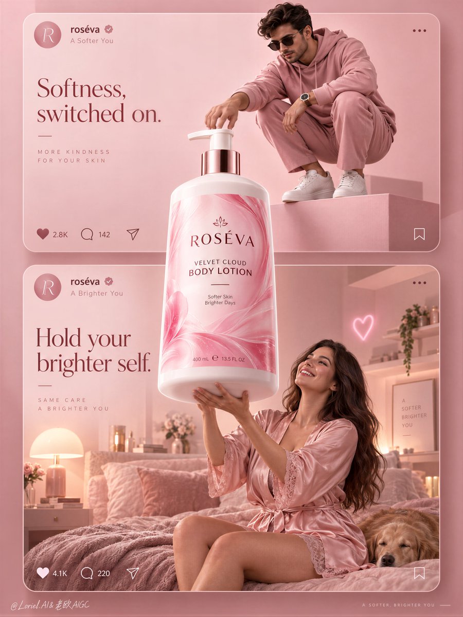
Póster de Campaña de Belleza para Redes que Rompe el Feed

Prompt para generar un póster de campaña editorial de belleza que combina tarjetas superpuestas de redes sociales con un producto gigante que rompe la interfaz.

OpenAI

Ejemplos de la fuente

Estas imágenes provienen de la fuente original. DROPIDEA no ha probado estos ejemplos; los resultados dependen del modelo y los ajustes.

Listo para personalizar

Tu prompt

Inglés

Sustituye las variables en rojo por tus datos. Copia el texto completo y úsalo con tu agente preferido.

TXT MD Versión en inglés
A social-style campaign feels like a brand world when the product is allowed to break the feed. 🌸 one oversized bottle centered on the shared axis, overlapping both stacked cards and extending beyond their internal scene boundaries The bottle becomes the bridge between two moods instead of a product pasted into two separate posts. ✨ keep interface bars and interaction icons thin, low-contrast, and pinned to the card edges—not the product center The UI reads as structure, not decoration. Your eye stays on the label, while the cards still feel instantly social-native. GPT- image 2.5 prompt👇 A premium social-first beauty campaign poster for fictional body-care brand ROSÉVA, merging emotional lifestyle softness, material precision, and curated minimalism into one image. Preserve the exact structure: two large stacked social-media-style cards inside a monochrome blush-pink world, one oversized hero pump bottle breaking through the center and overlapping both cards, simplified interface bars at the top of each card, and minimal interaction icons below. The product is the absolute visual leader and bridges the two scenes. Top card: a stylish adult man in a monochrome rose-pink fashion look crouches on a clean pink pedestal in a minimal editorial studio, reaching toward the giant bottle as if switching it on or claiming it. He wears a refined pink hoodie, tailored pink trousers, clean white sneakers, dark sunglasses, and a polished modern watch. His pose is sculptural, compact, controlled, and fashion-led, with strong negative space. Bottom card: an adult woman in a silky blush-pink robe or pajama set lifts both arms toward the giant bottle in a dreamy bedroom scene, smiling with real delight. She is photoreal, adult, naturally proportioned, anatomically correct, with realistic skin texture, subtle pores, natural tonal variation, elegant hands, five normal fingers, long healthy hair, mature body softness, believable gravity, natural lower-body volume, and no plastic AI skin. The bedroom is softly styled with a blush bed, warm bedside lamp, restrained shelf objects, one tiny neon heart accent, and minimal feminine decor without clutter. The hero product dominates the center axis: one oversized premium body-lotion pump bottle floating or standing between the cards, visibly larger than life and brighter than everything else. Redesign it fully in English with an original premium system: brand name “ROSÉVA”, product name “VELVET CLOUD BODY LOTION”, one short support line only, clean elegant hierarchy, and no excess claims. The bottle must feel hyperreal and luxurious: soft-touch white plastic body, satin sheen, crisp shoulder geometry, polished pump, luminous pink label with fluid marbling or petal-like gradient movement, sharp fine print, subtle reflected highlights, and strong volumetric presence. The label is vivid but controlled, acting as the most saturated element in the composition. Use a vertical campaign composition with clear rule-of-thirds balance, refined top-middle-bottom rhythm, and enough negative space to breathe. The social-post UI should be premium and reduced: circular profile icon, English handle, tiny verification mark, minimal like/comment/share icons, and one or two very short caption lines treated as graphic architecture rather than app clutter. Reimagine the copy in an international tone: top card line such as “Softness, switched on.” and bottom card line such as “Hold your brighter self.” Keep all text minimal, elegant, globally legible, and integrated into the pink system. Lighting is soft, layered, and beauty-commercial: clean high-key pink studio light in the top card, warm blush ambient practical light in the bottom bedroom card, and a brighter hero light on the central bottle so it reads as the campaign core. Add soft contour light on the bottle edges, subtle glow on the label, gentle fabric sheen on the satin robe, and readable depth without muddy shadows. Color hierarchy: 70% blush pink, rose, powder, and cream tones, 20% soft white and skin highlights, 10% hot-pink label energy and tiny neon accents. Materials must feel exact and tactile: satin fabric, matte pedestal paint, soft-touch bottle plastic, polished pump, velvet bedding, glassy neon, clean interface graphics, and subtle premium print finish. The final result should feel like Orbit, Transit, and Port fused together: emotionally inviting, materially precise, socially fluent, and elevated into a campaign-board beauty image rather than a literal feed screenshot. Hyperreal, international, graphically unified, soft yet sharp, minimal yet persuasive. No copied branding, no broken typography, no malformed hands, no extra fingers, no distorted anatomy, no warped bottle, no cluttered UI, no muddy pinks, no chaotic props, no cheap influencer aesthetic.
Ver resultados

Tu prompt

A social-style campaign feels like a brand world when the product is allowed to break the feed. 🌸 one oversized bottle centered on the shared axis, overlapping both stacked cards and extending beyond their internal scene boundaries The bottle becomes the bridge between two moods instead of a product pasted into two separate posts. ✨ keep interface bars and interaction icons thin, low-contrast, and pinned to the card edges—not the product center The UI reads as structure, not decoration. Your eye stays on the label, while the cards still feel instantly social-native. GPT- image 2.5 prompt👇 A premium social-first beauty campaign poster for fictional body-care brand ROSÉVA, merging emotional lifestyle softness, material precision, and curated minimalism into one image. Preserve the exact structure: two large stacked social-media-style cards inside a monochrome blush-pink world, one oversized hero pump bottle breaking through the center and overlapping both cards, simplified interface bars at the top of each card, and minimal interaction icons below. The product is the absolute visual leader and bridges the two scenes. Top card: a stylish adult man in a monochrome rose-pink fashion look crouches on a clean pink pedestal in a minimal editorial studio, reaching toward the giant bottle as if switching it on or claiming it. He wears a refined pink hoodie, tailored pink trousers, clean white sneakers, dark sunglasses, and a polished modern watch. His pose is sculptural, compact, controlled, and fashion-led, with strong negative space. Bottom card: an adult woman in a silky blush-pink robe or pajama set lifts both arms toward the giant bottle in a dreamy bedroom scene, smiling with real delight. She is photoreal, adult, naturally proportioned, anatomically correct, with realistic skin texture, subtle pores, natural tonal variation, elegant hands, five normal fingers, long healthy hair, mature body softness, believable gravity, natural lower-body volume, and no plastic AI skin. The bedroom is softly styled with a blush bed, warm bedside lamp, restrained shelf objects, one tiny neon heart accent, and minimal feminine decor without clutter. The hero product dominates the center axis: one oversized premium body-lotion pump bottle floating or standing between the cards, visibly larger than life and brighter than everything else. Redesign it fully in English with an original premium system: brand name “ROSÉVA”, product name “VELVET CLOUD BODY LOTION”, one short support line only, clean elegant hierarchy, and no excess claims. The bottle must feel hyperreal and luxurious: soft-touch white plastic body, satin sheen, crisp shoulder geometry, polished pump, luminous pink label with fluid marbling or petal-like gradient movement, sharp fine print, subtle reflected highlights, and strong volumetric presence. The label is vivid but controlled, acting as the most saturated element in the composition. Use a vertical campaign composition with clear rule-of-thirds balance, refined top-middle-bottom rhythm, and enough negative space to breathe. The social-post UI should be premium and reduced: circular profile icon, English handle, tiny verification mark, minimal like/comment/share icons, and one or two very short caption lines treated as graphic architecture rather than app clutter. Reimagine the copy in an international tone: top card line such as “Softness, switched on.” and bottom card line such as “Hold your brighter self.” Keep all text minimal, elegant, globally legible, and integrated into the pink system. Lighting is soft, layered, and beauty-commercial: clean high-key pink studio light in the top card, warm blush ambient practical light in the bottom bedroom card, and a brighter hero light on the central bottle so it reads as the campaign core. Add soft contour light on the bottle edges, subtle glow on the label, gentle fabric sheen on the satin robe, and readable depth without muddy shadows. Color hierarchy: 70% blush pink, rose, powder, and cream tones, 20% soft white and skin highlights, 10% hot-pink label energy and tiny neon accents. Materials must feel exact and tactile: satin fabric, matte pedestal paint, soft-touch bottle plastic, polished pump, velvet bedding, glassy neon, clean interface graphics, and subtle premium print finish. The final result should feel like Orbit, Transit, and Port fused together: emotionally inviting, materially precise, socially fluent, and elevated into a campaign-board beauty image rather than a literal feed screenshot. Hyperreal, international, graphically unified, soft yet sharp, minimal yet persuasive. No copied branding, no broken typography, no malformed hands, no extra fingers, no distorted anatomy, no warped bottle, no cluttered UI, no muddy pinks, no chaotic props, no cheap influencer aesthetic.

Guía de variables

ROSÉVA

Nombre ficticio de la marca que aparece en la botella

El texto del nombre de la marca dentro de la descripción del producto central

Valor de ejemplo

ROSÉVA

VELVET CLOUD BODY LOTION

Nombre del producto en la etiqueta

El texto del nombre del producto dentro de la descripción del producto central

Valor de ejemplo

VELVET CLOUD BODY LOTION

Softness, switched on.

Lema publicitario breve en la tarjeta superior

La línea de texto sugerida para la tarjeta superior

Valor de ejemplo

Softness, switched on.

Hold your brighter self.

Lema publicitario breve en la tarjeta inferior

La línea de texto sugerida para la tarjeta inferior

Valor de ejemplo

Hold your brighter self.

Qué obtienes

  • Un póster publicitario editorial de belleza que integra tarjetas de redes sociales con fotografía comercial de producto.
  • Una composición tridimensional donde el producto principal sobredimensionado une dos escenas diferentes.
  • Una paleta cromática monocromática en rosa pastel con texturas de piel realistas e iluminación sofisticada.

Casos de uso

  • Campañas publicitarias para redes sociales de marcas de cosmética, belleza y cuidado corporal.
  • Presentaciones conceptuales de marca (moodboards y brand decks) para lanzamientos de productos.
  • Contenido visual de alto impacto para Instagram, TikTok y Pinterest.

Cómo usarlo

  • Copia el prompt completo en tu generador compatible con GPT Image / DALL-E 3.
  • Personaliza opcionalmente el nombre de la marca, el producto o los textos publicitarios cortos.
  • Configura una relación de aspecto vertical (como 9:16 o 4:5) para respetar la disposición de las tarjetas apiladas.
  • Genera la imagen y verifica la limpieza de la interfaz gráfica y la armonía de los tonos rosa pastel.

Prompts relacionados