Ir al contenido
ImágenesGratis

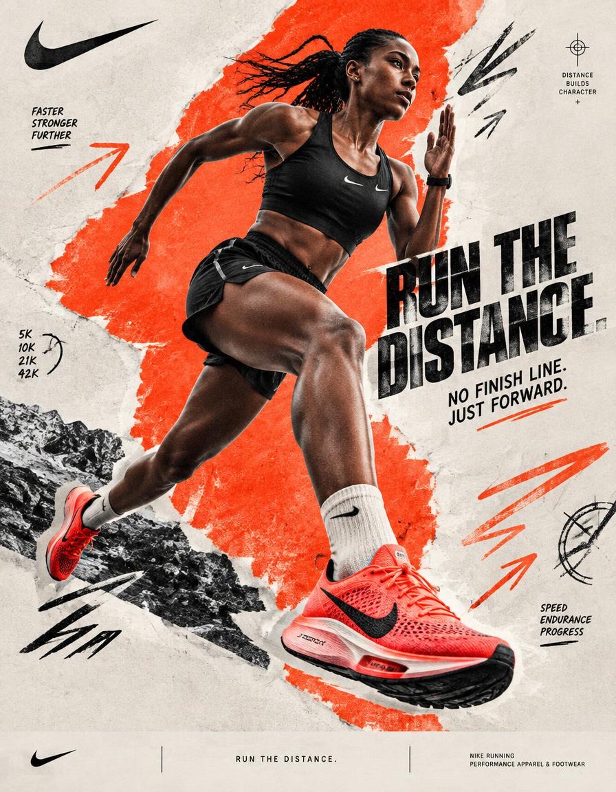
Póster collage digital campaña Nike running

Prompt completo de dirección de arte para generar un póster premium de campaña Nike de running: corredor editorial explosivo, zapato héroe, texturas crudas, gráficos direccionales agresivos y bloques de color asimétricos.

OpenAI

Ejemplos de la fuente

Estas imágenes provienen de la fuente original. DROPIDEA no ha probado estos ejemplos; los resultados dependen del modelo y los ajustes.

Listo para personalizar

Tu prompt

Inglés

Sustituye las variables en rojo por tus datos. Copia el texto completo y úsalo con tu agente preferido.

TXT MD Versión en inglés
BRAND NAME = NIKE Act as a Social Media Art Director and Digital Collage Artist specializing in bold, youth-oriented brand content for Instagram and digital campaigns. PHASE 1: CONCEPTUAL FRAMEWORK Create a dynamic digital collage that merges high-performance running photography with graphic design chaos. This is controlled athletic rebellion — a composition that feels spontaneous, explosive, and expressive while maintaining strong Nike brand coherence. Aesthetic direction: * Anti-polished * Raw textures * Layered imperfections * Youth-driven visual noise * High confidence, high movement energy Visual language: Torn edges, aggressive brush strokes, grain overlays, hand-drawn running marks, directional arrows, speed lines, and bold Nike-inspired color blocking. PHASE 2: MODEL & PHOTOGRAPHY * Subject: One elite adult runner, age 20–30 * Pose Energy: 80% attitude, 20% natural (full sprint, explosive stride, leaning forward, airborne transition — NEVER static) * Outfit: Performance running apparel aligned with NIKE * Hero Product: One key Nike running shoe, clearly visible as the visual anchor * Photography Style: Editorial sports photography cutout * Background Removal: Clean, sharp extraction * Camera Angle: Slight low angle (hero perspective) * Crop: Full body or 3/4 body, with running shoe clearly visible PHASE 3: COLOR BLOCKING FOUNDATION * Primary Color Blob: Large organic Nike-inspired shape (40–60% of frame) * Color Selection: 1 dominant Nike-inspired high-energy accent color — vivid electric red/orange * Shape Style: Irregular, hand-painted / torn paper (NO perfect geometry) * Texture: Brush grain / noise (15–25% opacity) * Placement: Behind or wrapping around runner (must frame, not hide the runner or shoe) PHASE 4: GRAPHIC ELEMENTS LAYER Add 3–5 abstract elements: Element types: * Hand-drawn speed marks * Directional arrows * Running trajectory lines * Circular impact marks * Texture overlays (dust, grain, fabric, noise) * Minimal athletic measurement symbols Rules: * Colors: 2–3 total (black + off-white + electric red/orange accent) * Placement: Asymmetric (top-left + bottom-right bias) * Scale: Small (5%) + medium (15%) * Avoid center clutter * Keep imperfect, handmade feel PHASE 5: TYPOGRAPHY INTEGRATION * Logo: Upper-left or upper-right (10–15% width) * Slogan/Headline: “RUN THE DISTANCE.” * Supporting Copy: “NO FINISH LINE. JUST FORWARD.” * Type Style: Bold condensed sans-serif / grotesk / athletic editorial typography * Treatment: Mix straight + slight rotation (2–5°) * Hierarchy: Nike Swoosh → Headline → Supporting copy PHASE 6: TEXTURE & BACKGROUND * Base Layer: Off-white / light grey (NOT pure white) * Color Range: RGB 245–250 (warm neutral) * Texture Options: Paper grain / fabric texture / subtle noise * Rule: Texture should be FELT, not dominant PHASE 7: COMPOSITION RULES * Layout: Asymmetric balance (runner off-center) * Breathing Room: 15–20% negative space * Layering Order: Background → Color blob → Graphics → Runner → Typography * Focal Point: Runner + Nike shoe = 60% Graphics = 40% support * Movement: Strong diagonal flow (top-left → bottom-right OR reverse) The runner must visually travel through the composition rather than simply stand inside it. PHASE 8: BRAND INTELLIGENCE (AUTO-ADAPT) Adapt energy based on NIKE’s sportswear identity: → Sportswear Bold contrast, aggressive motion, louder graphics → Running Explosive movement, aerodynamic visual language, speed lines, performance-driven composition → Youth Culture Raw textures, asymmetric layouts, expressive typography and controlled visual noise → Performance Sharp product visibility, dynamic low-angle photography, athletic realism and strong directional composition The final visual should communicate movement, determination, performance and Nike’s “just do it” attitude without becoming a generic running advertisement. PHASE 9: SOCIAL MEDIA FOOTER (OPTIONAL) * Bottom strip (8–10% height) * Light neutral background * Minimal Nike branding * Small campaign descriptor: “RUN THE DISTANCE.” * Clean grid layout * Keep minimal (contrast to collage) TECHNICAL SPECS: * Aspect Ratio: 4:5 (primary) or 1:1 * Resolution: 2400x3000px+ * Color Mode: sRGB (Instagram optimized) * Sharpness: High detail, slight grain allowed * Output Style: Digital collage mimicking analog craft * Photography Base (before cutout): 85mm lens, f/2.8, shallow depth of field FINAL IMAGE: A premium Nike running campaign poster combining an explosive editorial runner photograph, a hero Nike running shoe, bold athletic typography, raw paper textures, aggressive directional graphics and asymmetric color blocking. The finished artwork should feel like a contemporary Nike campaign discovered on Behance — highly art-directed, energetic, editorial, imperfect, youth-driven and immediately recognizable as Nike.
Ver resultados

Tu prompt

BRAND NAME = NIKE Act as a Social Media Art Director and Digital Collage Artist specializing in bold, youth-oriented brand content for Instagram and digital campaigns. PHASE 1: CONCEPTUAL FRAMEWORK Create a dynamic digital collage that merges high-performance running photography with graphic design chaos. This is controlled athletic rebellion — a composition that feels spontaneous, explosive, and expressive while maintaining strong Nike brand coherence. Aesthetic direction: * Anti-polished * Raw textures * Layered imperfections * Youth-driven visual noise * High confidence, high movement energy Visual language: Torn edges, aggressive brush strokes, grain overlays, hand-drawn running marks, directional arrows, speed lines, and bold Nike-inspired color blocking. PHASE 2: MODEL & PHOTOGRAPHY * Subject: One elite adult runner, age 20–30 * Pose Energy: 80% attitude, 20% natural (full sprint, explosive stride, leaning forward, airborne transition — NEVER static) * Outfit: Performance running apparel aligned with NIKE * Hero Product: One key Nike running shoe, clearly visible as the visual anchor * Photography Style: Editorial sports photography cutout * Background Removal: Clean, sharp extraction * Camera Angle: Slight low angle (hero perspective) * Crop: Full body or 3/4 body, with running shoe clearly visible PHASE 3: COLOR BLOCKING FOUNDATION * Primary Color Blob: Large organic Nike-inspired shape (40–60% of frame) * Color Selection: 1 dominant Nike-inspired high-energy accent color — vivid electric red/orange * Shape Style: Irregular, hand-painted / torn paper (NO perfect geometry) * Texture: Brush grain / noise (15–25% opacity) * Placement: Behind or wrapping around runner (must frame, not hide the runner or shoe) PHASE 4: GRAPHIC ELEMENTS LAYER Add 3–5 abstract elements: Element types: * Hand-drawn speed marks * Directional arrows * Running trajectory lines * Circular impact marks * Texture overlays (dust, grain, fabric, noise) * Minimal athletic measurement symbols Rules: * Colors: 2–3 total (black + off-white + electric red/orange accent) * Placement: Asymmetric (top-left + bottom-right bias) * Scale: Small (5%) + medium (15%) * Avoid center clutter * Keep imperfect, handmade feel PHASE 5: TYPOGRAPHY INTEGRATION * Logo: Upper-left or upper-right (10–15% width) * Slogan/Headline: “RUN THE DISTANCE.” * Supporting Copy: “NO FINISH LINE. JUST FORWARD.” * Type Style: Bold condensed sans-serif / grotesk / athletic editorial typography * Treatment: Mix straight + slight rotation (2–5°) * Hierarchy: Nike Swoosh → Headline → Supporting copy PHASE 6: TEXTURE & BACKGROUND * Base Layer: Off-white / light grey (NOT pure white) * Color Range: RGB 245–250 (warm neutral) * Texture Options: Paper grain / fabric texture / subtle noise * Rule: Texture should be FELT, not dominant PHASE 7: COMPOSITION RULES * Layout: Asymmetric balance (runner off-center) * Breathing Room: 15–20% negative space * Layering Order: Background → Color blob → Graphics → Runner → Typography * Focal Point: Runner + Nike shoe = 60% Graphics = 40% support * Movement: Strong diagonal flow (top-left → bottom-right OR reverse) The runner must visually travel through the composition rather than simply stand inside it. PHASE 8: BRAND INTELLIGENCE (AUTO-ADAPT) Adapt energy based on NIKE’s sportswear identity: → Sportswear Bold contrast, aggressive motion, louder graphics → Running Explosive movement, aerodynamic visual language, speed lines, performance-driven composition → Youth Culture Raw textures, asymmetric layouts, expressive typography and controlled visual noise → Performance Sharp product visibility, dynamic low-angle photography, athletic realism and strong directional composition The final visual should communicate movement, determination, performance and Nike’s “just do it” attitude without becoming a generic running advertisement. PHASE 9: SOCIAL MEDIA FOOTER (OPTIONAL) * Bottom strip (8–10% height) * Light neutral background * Minimal Nike branding * Small campaign descriptor: “RUN THE DISTANCE.” * Clean grid layout * Keep minimal (contrast to collage) TECHNICAL SPECS: * Aspect Ratio: 4:5 (primary) or 1:1 * Resolution: 2400x3000px+ * Color Mode: sRGB (Instagram optimized) * Sharpness: High detail, slight grain allowed * Output Style: Digital collage mimicking analog craft * Photography Base (before cutout): 85mm lens, f/2.8, shallow depth of field FINAL IMAGE: A premium Nike running campaign poster combining an explosive editorial runner photograph, a hero Nike running shoe, bold athletic typography, raw paper textures, aggressive directional graphics and asymmetric color blocking. The finished artwork should feel like a contemporary Nike campaign discovered on Behance — highly art-directed, energetic, editorial, imperfect, youth-driven and immediately recognizable as Nike.

Guía de variables

NIKE

Nombre de la marca del póster.

Primera línea: BRAND NAME = NIKE.

Valor de ejemplo

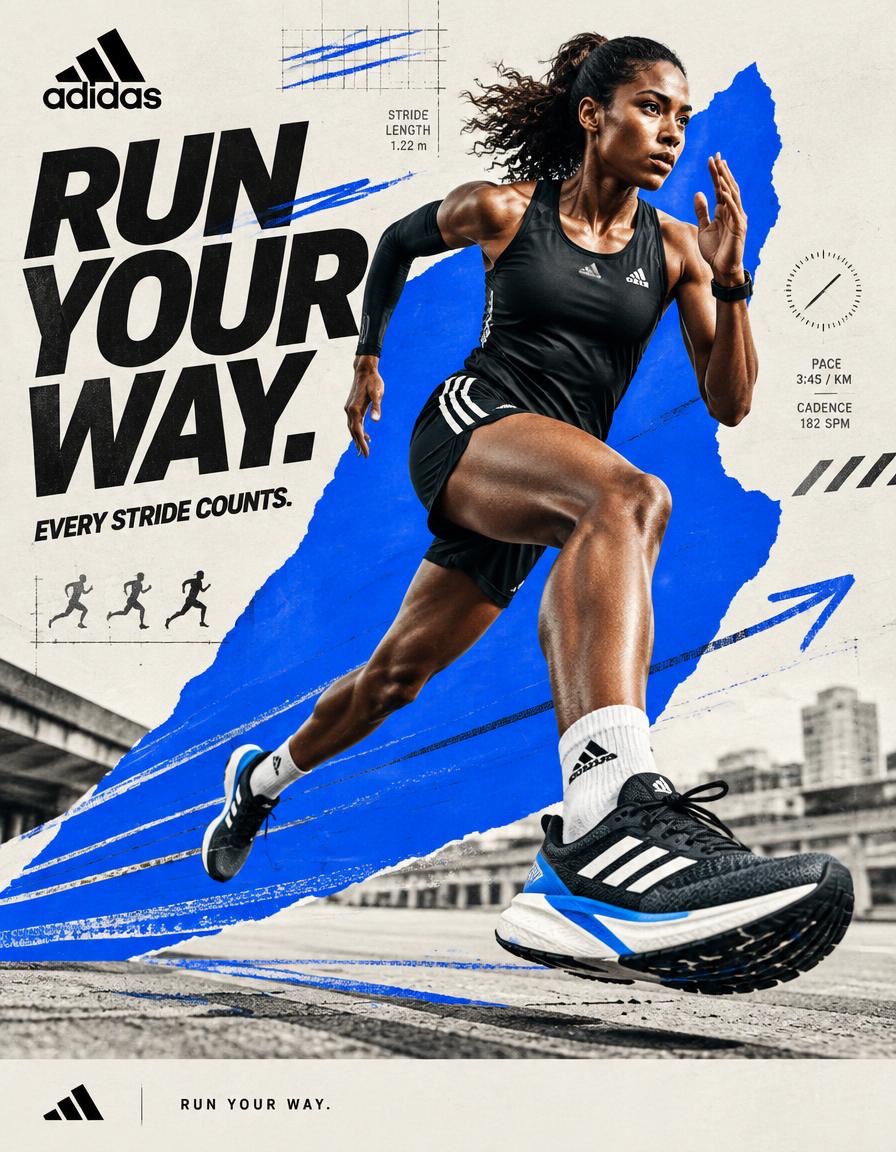
ADIDAS

“RUN THE DISTANCE.”

Titular principal que debe aparecer como texto en el diseño.

Fase 5 y Fase 9: texto entre comillas “RUN THE DISTANCE.”.

Valor de ejemplo

OWN THE ROAD.

“NO FINISH LINE. JUST FORWARD.”

Texto de apoyo bajo el titular.

Fase 5: texto entre comillas “NO FINISH LINE. JUST FORWARD.”.

Valor de ejemplo

EVERY MILE COUNTS.

vivid electric red/orange

Color de acento dominante de alta energía.

Fase 3: vivid electric red/orange; Fase 4: acento rojo/naranja eléctrico.

Valor de ejemplo

azul eléctrico vibrante

Qué obtienes

  • Un póster premium de campaña de running en estilo collage digital que imita la artesanía analógica.
  • Un corredor editorial explosivo en ángulo bajo con un zapato héroe claramente visible como ancla visual.
  • Bloques de color orgánicos asimétricos con texturas crudas de papel y elementos gráficos hechos a mano.
  • Tipografía deportiva audaz con jerarquía clara: logotipo, titular y texto de apoyo.

Casos de uso

  • Publicaciones de Instagram y campañas deportivas en redes sociales.
  • Anuncios de lanzamiento de zapatillas de running y productos de rendimiento.
  • Identidad visual juvenil y audaz para contenido editorial y deportivo.

Cómo usarlo

  • Reemplaza NIKE por el nombre de tu marca en la primera línea si es necesario.
  • Edita el eslogan y el texto de apoyo en la Fase 5 (y la Fase 9) con tu texto de campaña, conservando las comillas.
  • Cambia el color de acento en las Fases 3 y 4 si otro color conviene a tu marca.
  • Pega la plantilla completa en tu herramienta de generación de imágenes y mantén intactas las especificaciones técnicas (proporción, resolución, sRGB).

Prompts relacionados