Skip to content
ImagesFree

Commercial Trail-Snack Campaign Key Visual Poster

Advanced advertising prompt creating a master marketing poster combining a macro monumental ingredient, white line explorer art, and commercial packaging.

OpenAI

Source previews

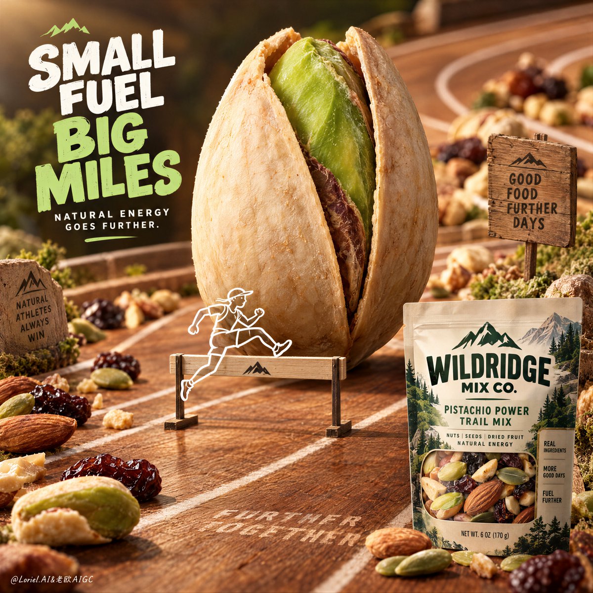
These example images come from the original source. DROPIDEA has not independently tested these examples; results depend on the model and settings.

Ready to personalize

Your prompt

English

Replace the red variables with your information. Copy the full prompt and use it with your preferred agent.

TXT MD English version
The pack should not be the only proof of product—turn one ingredient into a landmark. 🌿 Enlarge one hero ingredient into a central monument, while preserving its real texture: ridges, asymmetry, dry surface, and natural flaws. The food becomes an icon at first glance without losing its appetite appeal. 🪽 Add one small line-drawn explorer interacting with the ingredient, then keep the real retail pack quiet in a corner. The illustration gives the product a story, while the pack confirms what the viewer can actually buy. GPT- image 2.5 prompt👇 Create the definitive Orbit + Transit + Port final poster for the fictional international trail-snack brand WILDRIDGE MIX CO. Preserve the exact whimsical product-led architecture of the reference, but refine it into a cleaner, sharper, more collectible campaign master visual with stronger ingredient hierarchy, more elegant illustration integration, and a clearer retail-pack read. Keep the same essential structure: one giant upright almond at the center like a natural monument, one small white line-drawn explorer character interacting with it as if carrying it like an expedition pack, a premium macro forest-floor ground plane beneath, a guided path of real trail-mix ingredients crossing the image, and one crisp packaged snack product anchored in the lower-left corner. The final result must feel adventurous, healthy, premium, and unmistakably commercial, with the food product remaining the absolute hero. The absolute hero is the monumental almond at center. Render it in extreme photoreal macro detail, upright and slightly dominant over the surrounding world, with rich shell ridges, believable asymmetry, warm toasted brown tone, dry tactile surface, and subtle natural imperfections. It must read instantly as a real edible ingredient enlarged into an icon. The almond should feel monumental enough to become the core symbol of the poster, but still appetizing and materially accurate. It reads first from across the room. Integrated around the almond is one small white line-drawn trail explorer character, walking forward with a hiking stick and carrying the almond as if it were a giant backpack. The illustration must be crisp, charming, and intentionally branded, like a premium mascot sketch printed into the campaign world. It must remain secondary to the almond and never turn the image into a cartoon. The relationship between the line character and the almond should communicate that the snack is built for endurance, movement, and long-haul adventure. The ground plane must feel like a premium macro trail environment rather than a simple tabletop. Use dark bark-like stone, forest moss, tiny leaf fragments, subtle soil texture, and slightly damp natural detail, all rendered in shallow macro depth. Across this surface, arrange real trail-mix ingredients in a loose path that guides the eye through the frame: pumpkin seeds, raisins, dried berries, nut fragments, and other believable snack components. These ingredients must feel edible, texturally varied, and naturally scattered, but still compositionally controlled. They support the almond hero without competing with it. Typography must be newly invented and entirely English only. Do not copy any wording from the source image. Place one bold playful headline block in the upper-right quadrant using a rounded but premium display type, communicating the idea of adventure-packed fuel, trail energy, or portable endurance. Add one short supporting line near the lower-right only if it helps clarify the product promise. Typography must feel graphic, clean, and brand-smart, never overwhelming the almond. A small refined brand lockup near the upper-left is acceptable if useful, but all text remains secondary to the product monument. The packaged product is essential and must be clearly visible in the lower-left corner as the retail anchor. Render a premium snack jar or pouch with newly invented English-only branding for WILDRIDGE MIX CO., including a clean label, natural trail-food cues, and realistic shelf-ready packaging materials. The pack must feel commercially exact and readable, with believable transparency or printed wrap behavior if appropriate. It should confirm what the product is without stealing dominance from the giant almond. Lighting must be tactile, warm, and natural, like filtered outdoor sunlight passing through a forest opening. Use soft directional light to reveal almond ridges, glossy raisin skin, matte seed surfaces, moss texture, and packaging detail. Build gentle highlights and controlled earthy shadows so the image feels appetizing, healthy, and grounded. Avoid muddy darkness, flat food-photography blandness, or harsh flash. The scene should feel like a miniature expedition built from real ingredients. Use a disciplined 60/30/10 palette hierarchy: 60% forest green, bark brown, moss darks, and earthy ground atmosphere, 30% warm almond brown and seed-gold ingredient accents, 10% clean white illustration lines and packaging highlights. The palette must feel organic, premium, and immediately ownable as a brand world. Material semantics are critical. The almond must feel dry, textured, and real. The seeds and dried fruit must feel naturally varied and edible. The moss and bark ground must feel tactile and slightly moist. The packaging must feel premium and shelf-real. The white line explorer must feel crisp, intentional, and graphic. Every element should reinforce that this is a trail-snack campaign where adventure is literally built from the product ingredients. Orbit priority: maximize first-glance impact through the triad of giant almond monument, tiny explorer illustration, and ingredient trail path. Transit priority: make the poster clearly expandable into a full WILDRIDGE MIX CO. universe of walnut chapters, cashew chapters, berry variants, protein blends, energy-bar companions, and outdoor endurance editions while preserving the same monument-ingredient grammar. Port priority: remove all unnecessary forest clutter, reduce copy to the minimum useful amount, preserve strong negative control around the almond, and compress the image into a rare, internationally polished snack campaign key visual. Quality target and structured exclusions: photoreal food-advertising poster, exact almond shell realism, realistic seeds and dried fruit, believable package design with invented English-only branding, clean white line illustration, no random letters, no toy-like almond, no cartoon food styling, no muddy greens, no cluttered forest background, no messy composition, no style drift, no AI artifacts, no watermark, no real brand names, no real person names.
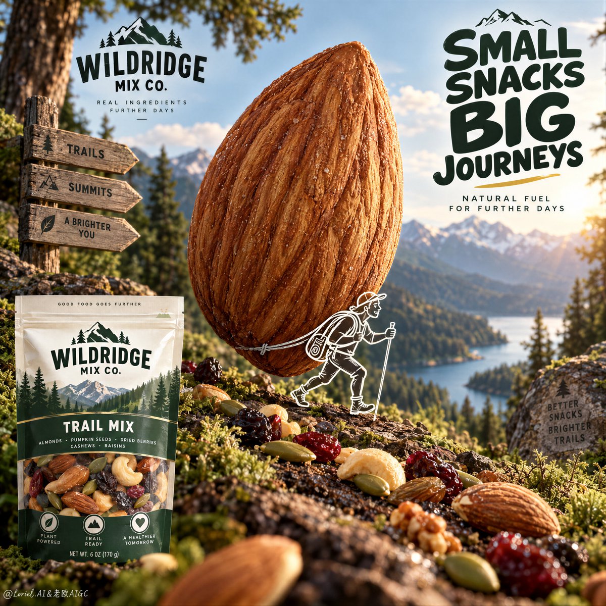
Preview results

Your prompt

The pack should not be the only proof of product—turn one ingredient into a landmark. 🌿 Enlarge one hero ingredient into a central monument, while preserving its real texture: ridges, asymmetry, dry surface, and natural flaws. The food becomes an icon at first glance without losing its appetite appeal. 🪽 Add one small line-drawn explorer interacting with the ingredient, then keep the real retail pack quiet in a corner. The illustration gives the product a story, while the pack confirms what the viewer can actually buy. GPT- image 2.5 prompt👇 Create the definitive Orbit + Transit + Port final poster for the fictional international trail-snack brand WILDRIDGE MIX CO. Preserve the exact whimsical product-led architecture of the reference, but refine it into a cleaner, sharper, more collectible campaign master visual with stronger ingredient hierarchy, more elegant illustration integration, and a clearer retail-pack read. Keep the same essential structure: one giant upright almond at the center like a natural monument, one small white line-drawn explorer character interacting with it as if carrying it like an expedition pack, a premium macro forest-floor ground plane beneath, a guided path of real trail-mix ingredients crossing the image, and one crisp packaged snack product anchored in the lower-left corner. The final result must feel adventurous, healthy, premium, and unmistakably commercial, with the food product remaining the absolute hero. The absolute hero is the monumental almond at center. Render it in extreme photoreal macro detail, upright and slightly dominant over the surrounding world, with rich shell ridges, believable asymmetry, warm toasted brown tone, dry tactile surface, and subtle natural imperfections. It must read instantly as a real edible ingredient enlarged into an icon. The almond should feel monumental enough to become the core symbol of the poster, but still appetizing and materially accurate. It reads first from across the room. Integrated around the almond is one small white line-drawn trail explorer character, walking forward with a hiking stick and carrying the almond as if it were a giant backpack. The illustration must be crisp, charming, and intentionally branded, like a premium mascot sketch printed into the campaign world. It must remain secondary to the almond and never turn the image into a cartoon. The relationship between the line character and the almond should communicate that the snack is built for endurance, movement, and long-haul adventure. The ground plane must feel like a premium macro trail environment rather than a simple tabletop. Use dark bark-like stone, forest moss, tiny leaf fragments, subtle soil texture, and slightly damp natural detail, all rendered in shallow macro depth. Across this surface, arrange real trail-mix ingredients in a loose path that guides the eye through the frame: pumpkin seeds, raisins, dried berries, nut fragments, and other believable snack components. These ingredients must feel edible, texturally varied, and naturally scattered, but still compositionally controlled. They support the almond hero without competing with it. Typography must be newly invented and entirely English only. Do not copy any wording from the source image. Place one bold playful headline block in the upper-right quadrant using a rounded but premium display type, communicating the idea of adventure-packed fuel, trail energy, or portable endurance. Add one short supporting line near the lower-right only if it helps clarify the product promise. Typography must feel graphic, clean, and brand-smart, never overwhelming the almond. A small refined brand lockup near the upper-left is acceptable if useful, but all text remains secondary to the product monument. The packaged product is essential and must be clearly visible in the lower-left corner as the retail anchor. Render a premium snack jar or pouch with newly invented English-only branding for WILDRIDGE MIX CO., including a clean label, natural trail-food cues, and realistic shelf-ready packaging materials. The pack must feel commercially exact and readable, with believable transparency or printed wrap behavior if appropriate. It should confirm what the product is without stealing dominance from the giant almond. Lighting must be tactile, warm, and natural, like filtered outdoor sunlight passing through a forest opening. Use soft directional light to reveal almond ridges, glossy raisin skin, matte seed surfaces, moss texture, and packaging detail. Build gentle highlights and controlled earthy shadows so the image feels appetizing, healthy, and grounded. Avoid muddy darkness, flat food-photography blandness, or harsh flash. The scene should feel like a miniature expedition built from real ingredients. Use a disciplined 60/30/10 palette hierarchy: 60% forest green, bark brown, moss darks, and earthy ground atmosphere, 30% warm almond brown and seed-gold ingredient accents, 10% clean white illustration lines and packaging highlights. The palette must feel organic, premium, and immediately ownable as a brand world. Material semantics are critical. The almond must feel dry, textured, and real. The seeds and dried fruit must feel naturally varied and edible. The moss and bark ground must feel tactile and slightly moist. The packaging must feel premium and shelf-real. The white line explorer must feel crisp, intentional, and graphic. Every element should reinforce that this is a trail-snack campaign where adventure is literally built from the product ingredients. Orbit priority: maximize first-glance impact through the triad of giant almond monument, tiny explorer illustration, and ingredient trail path. Transit priority: make the poster clearly expandable into a full WILDRIDGE MIX CO. universe of walnut chapters, cashew chapters, berry variants, protein blends, energy-bar companions, and outdoor endurance editions while preserving the same monument-ingredient grammar. Port priority: remove all unnecessary forest clutter, reduce copy to the minimum useful amount, preserve strong negative control around the almond, and compress the image into a rare, internationally polished snack campaign key visual. Quality target and structured exclusions: photoreal food-advertising poster, exact almond shell realism, realistic seeds and dried fruit, believable package design with invented English-only branding, clean white line illustration, no random letters, no toy-like almond, no cartoon food styling, no muddy greens, no cluttered forest background, no messy composition, no style drift, no AI artifacts, no watermark, no real brand names, no real person names.

Variable guide

WILDRIDGE MIX CO.

The fictional snack brand name

Throughout campaign instructions and pack callouts

Example value

WILDRIDGE MIX CO.

almond

The central monumental food ingredient

Throughout ingredient description, lighting, and hierarchy sections

Example value

almond

What you get

  • A hyper-realistic commercial advertising poster featuring a giant, appetizing hero food ingredient.
  • A charming white line-drawn explorer character interacting with the monument.
  • A crisp, shelf-ready retail snack pack anchored in the lower corner amid an organic macro forest floor.

Use cases

  • Key visual campaign creation for premium snack and healthy food brands.
  • Creative advertising pitch decks and brand world concept art.
  • FMCG product launch visual development and packaging campaign tests.

How to use

  • Copy the entire prompt text directly into your advanced image generation model (e.g., GPT-image 2.5 or Midjourney).
  • Optionally replace the brand name or hero ingredient (e.g., swapping almond for cashew or walnut).
  • Ensure the 60/30/10 palette rule and structured negative exclusions remain intact for commercial fidelity.

Related prompts