Skip to content
ImagesFree

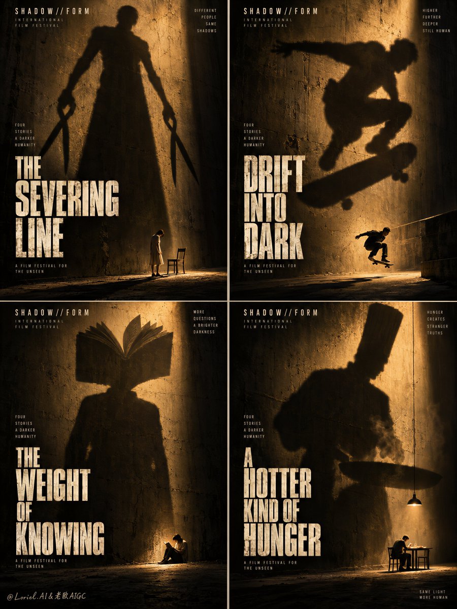
Arthouse Film Festival 2x2 Shadow Poster System

Prompt generating a cohesive 4-poster cinematic campaign board (2x2 grid) using massive symbolic cast shadows, tiny scale figures, and dramatic amber lighting.

OpenAI

Source previews

These example images come from the original source. DROPIDEA has not independently tested these examples; results depend on the model and settings.

Ready to personalize

Your prompt

English

Replace the red variables with your information. Copy the full prompt and use it with your preferred agent.

TXT MD English version
A four-poster series becomes a system when the threat stays fixed and only the metaphor changes. 🌑 Repeat one rough wall, one hard amber light, one tiny figure at the floor line, and one oversized cast shadow. Every panel carries the same scale shock, so the grid reads as one festival identity before the titles are even read. 🪞 Change only the shadow shape and its small human echo; keep the stacked title block in the same lower position. Each chapter gains its own idea while the poster architecture stays unmistakably consistent. GPT- image 2.5 prompt👇 Create the definitive Orbit + Transit + Port final board for the fictional international film-festival campaign SHADOW//FORM. Preserve the exact 2x2 grid architecture of four interconnected mini-posters, but refine the whole image into a sharper, rarer, more collectible festival master visual with stricter visual unity, stronger shadow monumentality, and a cleaner typography system. Each panel must feel like a standalone arthouse thriller poster, yet the total grid must read instantly as one coherent campaign identity built on giant symbolic shadows, tiny vulnerable humans, distressed walls, and severe amber theatrical light. The overall board is a perfectly balanced four-panel grid with narrow clean separations. All four posters share the same world: rough concrete or plaster walls, dusty ground, deep shadow pools, strong directional amber-gold light, subtle atmospheric haze, and one tiny real human figure near the base of the frame overshadowed by a giant shadow-form cast across the wall. The shadow is always the true visual event. The human is always physically small, emotionally exposed, and positioned as the scale anchor. Each panel must operate with the same composition logic so the full board feels like a festival-branded system rather than four random images. Panel one is the cutting chapter. A giant shadow figure towers over the wall, elongated and severe, holding oversized shears or scissor-like forms at both sides. Near the base, a tiny human figure stands in uneasy proximity to a minimal chair or restraint-like object, creating a ritualistic sense of threat and control. The stacked English title sits large in the lower half, newly invented and conceptually tied to severing, division, or shadow incision, but without copying any source wording. The panel should feel brutal, iconic, and immediately legible from a distance. Panel two is the motion chapter. A huge shadow figure stretches across the wall in a crouched, airborne, or lunging posture that implies leap, escape, or impact. Near the lower area, a tiny skateboarder or similarly kinetic real figure echoes the movement, making the scale contrast feel physically dangerous. The title is stacked and bold in the lower half, newly invented in English only, built around ideas of flight, drift, lift, or velocity in darkness, without copying the source wording. The panel must feel tense, urban, and suspended. Panel three is the knowledge chapter. A giant shadow figure stands with an open book replacing the head or expanding like an intellectual crown above the shoulders, monumental and uncanny. Near the base, a tiny solitary reader sits or crouches in a small pool of light, emphasizing vulnerability and devotion to thought. The title is a new English stacked phrase placed low in the frame, suggesting illuminated knowledge, burdened reading, shadow literacy, or inner education. The panel must feel solemn, cerebral, and haunting. Panel four is the appetite chapter. A giant shadow figure with a tall chef-like silhouette or severe vertical hat shape looms over the wall like a ritual authority. Near the base, a tiny real figure sits at a small illuminated table or under a hanging work light, creating the tension between comfort and menace. The title is stacked, newly invented, and placed low in the frame, evoking heat, ritual, hunger, or dark preparation without copying the original. The panel must feel warm, threatening, and psychologically domestic. Typography across all four posters must now be even more disciplined. Each panel receives one large stacked English title in a tall condensed weathered type treatment, always positioned near the lower half and scaled with matching rhythm. The wording changes panel to panel, but the font family, texture logic, alignment, and spacing system remain identical. Add only the minimum tiny credit-line structures at the bottom edge if necessary, fully re-authored in English only and kept secondary. The board must feel like a single film-festival visual identity with four chapters rather than four unrelated titles. Lighting is the emotional engine and must be extremely controlled. Use powerful directional amber-gold illumination cutting through deep black shadow, creating long cast silhouettes, glowing dust in the air, and rich pools of theatrical darkness. The light must feel physically plausible but mythic in scale. The tiny human figures sit at the edge of illumination where vulnerability is strongest. The shadow figures must read as believable cast forms while also feeling archetypal and oversized. Keep the light-to-dark contrast sharp, expensive, and clean, with no muddy blacks or uncontrolled noise. Use a disciplined 60/30/10 palette hierarchy across the entire board: 60% deep black, charcoal, and umber-shadow atmosphere, 30% warm amber-gold illumination and dusty wall tones, 10% pale off-white or muted cream typography and small highlight accents. The color system must be extremely restrained, cinematic, and festival-premium. Material semantics are critical. The walls must feel rough, worn, and tactile. The dust and haze must feel particulate and light-catching. The shadow masses must feel dense and physically cast. The floor must feel gritty and grounded. The typography must feel printed, aged, and integrated into the poster surface. Every element must reinforce that this is not fantasy illustration but a design-led prestige-cinema campaign based on shadow, metaphor, and human scale. Orbit priority: maximize first-glance impact through the four giant shadow monuments and the tiny exposed figures below them, so the full board reads instantly from a distance as one unforgettable festival wall. Transit priority: make the system clearly expandable into additional poster chapters, director retrospectives, genre variants, and film-program identities while preserving the same shadow grammar, amber-light palette, and stacked title architecture. Port priority: remove all nonessential scene detail, compress each panel to its most brutal symbolic form, reduce micro-text to the minimum, and preserve clean negative darkness so the board feels rarer, colder, and more internationally authoritative. Target feeling: collectible arthouse thriller poster grid, prestige film-festival identity, monumental shadow symbolism, minimal narrative clues, psychological scale shock, museum-grade cinematic design. Quality target and structured exclusions: photoreal cinematic poster board, exact 2x2 grid organization, consistent visual language across all four panels, realistic cast shadows, believable small human anatomy, no extra limbs, no deformed silhouettes, no random letters, no cluttered scenery, no cartoon style, no overdesigned props, no muddy blacks, no flat lighting, no style drift, no AI artifacts, no watermark, no real brand names, no real person names.
Preview results

Your prompt

A four-poster series becomes a system when the threat stays fixed and only the metaphor changes. 🌑 Repeat one rough wall, one hard amber light, one tiny figure at the floor line, and one oversized cast shadow. Every panel carries the same scale shock, so the grid reads as one festival identity before the titles are even read. 🪞 Change only the shadow shape and its small human echo; keep the stacked title block in the same lower position. Each chapter gains its own idea while the poster architecture stays unmistakably consistent. GPT- image 2.5 prompt👇 Create the definitive Orbit + Transit + Port final board for the fictional international film-festival campaign SHADOW//FORM. Preserve the exact 2x2 grid architecture of four interconnected mini-posters, but refine the whole image into a sharper, rarer, more collectible festival master visual with stricter visual unity, stronger shadow monumentality, and a cleaner typography system. Each panel must feel like a standalone arthouse thriller poster, yet the total grid must read instantly as one coherent campaign identity built on giant symbolic shadows, tiny vulnerable humans, distressed walls, and severe amber theatrical light. The overall board is a perfectly balanced four-panel grid with narrow clean separations. All four posters share the same world: rough concrete or plaster walls, dusty ground, deep shadow pools, strong directional amber-gold light, subtle atmospheric haze, and one tiny real human figure near the base of the frame overshadowed by a giant shadow-form cast across the wall. The shadow is always the true visual event. The human is always physically small, emotionally exposed, and positioned as the scale anchor. Each panel must operate with the same composition logic so the full board feels like a festival-branded system rather than four random images. Panel one is the cutting chapter. A giant shadow figure towers over the wall, elongated and severe, holding oversized shears or scissor-like forms at both sides. Near the base, a tiny human figure stands in uneasy proximity to a minimal chair or restraint-like object, creating a ritualistic sense of threat and control. The stacked English title sits large in the lower half, newly invented and conceptually tied to severing, division, or shadow incision, but without copying any source wording. The panel should feel brutal, iconic, and immediately legible from a distance. Panel two is the motion chapter. A huge shadow figure stretches across the wall in a crouched, airborne, or lunging posture that implies leap, escape, or impact. Near the lower area, a tiny skateboarder or similarly kinetic real figure echoes the movement, making the scale contrast feel physically dangerous. The title is stacked and bold in the lower half, newly invented in English only, built around ideas of flight, drift, lift, or velocity in darkness, without copying the source wording. The panel must feel tense, urban, and suspended. Panel three is the knowledge chapter. A giant shadow figure stands with an open book replacing the head or expanding like an intellectual crown above the shoulders, monumental and uncanny. Near the base, a tiny solitary reader sits or crouches in a small pool of light, emphasizing vulnerability and devotion to thought. The title is a new English stacked phrase placed low in the frame, suggesting illuminated knowledge, burdened reading, shadow literacy, or inner education. The panel must feel solemn, cerebral, and haunting. Panel four is the appetite chapter. A giant shadow figure with a tall chef-like silhouette or severe vertical hat shape looms over the wall like a ritual authority. Near the base, a tiny real figure sits at a small illuminated table or under a hanging work light, creating the tension between comfort and menace. The title is stacked, newly invented, and placed low in the frame, evoking heat, ritual, hunger, or dark preparation without copying the original. The panel must feel warm, threatening, and psychologically domestic. Typography across all four posters must now be even more disciplined. Each panel receives one large stacked English title in a tall condensed weathered type treatment, always positioned near the lower half and scaled with matching rhythm. The wording changes panel to panel, but the font family, texture logic, alignment, and spacing system remain identical. Add only the minimum tiny credit-line structures at the bottom edge if necessary, fully re-authored in English only and kept secondary. The board must feel like a single film-festival visual identity with four chapters rather than four unrelated titles. Lighting is the emotional engine and must be extremely controlled. Use powerful directional amber-gold illumination cutting through deep black shadow, creating long cast silhouettes, glowing dust in the air, and rich pools of theatrical darkness. The light must feel physically plausible but mythic in scale. The tiny human figures sit at the edge of illumination where vulnerability is strongest. The shadow figures must read as believable cast forms while also feeling archetypal and oversized. Keep the light-to-dark contrast sharp, expensive, and clean, with no muddy blacks or uncontrolled noise. Use a disciplined 60/30/10 palette hierarchy across the entire board: 60% deep black, charcoal, and umber-shadow atmosphere, 30% warm amber-gold illumination and dusty wall tones, 10% pale off-white or muted cream typography and small highlight accents. The color system must be extremely restrained, cinematic, and festival-premium. Material semantics are critical. The walls must feel rough, worn, and tactile. The dust and haze must feel particulate and light-catching. The shadow masses must feel dense and physically cast. The floor must feel gritty and grounded. The typography must feel printed, aged, and integrated into the poster surface. Every element must reinforce that this is not fantasy illustration but a design-led prestige-cinema campaign based on shadow, metaphor, and human scale. Orbit priority: maximize first-glance impact through the four giant shadow monuments and the tiny exposed figures below them, so the full board reads instantly from a distance as one unforgettable festival wall. Transit priority: make the system clearly expandable into additional poster chapters, director retrospectives, genre variants, and film-program identities while preserving the same shadow grammar, amber-light palette, and stacked title architecture. Port priority: remove all nonessential scene detail, compress each panel to its most brutal symbolic form, reduce micro-text to the minimum, and preserve clean negative darkness so the board feels rarer, colder, and more internationally authoritative. Target feeling: collectible arthouse thriller poster grid, prestige film-festival identity, monumental shadow symbolism, minimal narrative clues, psychological scale shock, museum-grade cinematic design. Quality target and structured exclusions: photoreal cinematic poster board, exact 2x2 grid organization, consistent visual language across all four panels, realistic cast shadows, believable small human anatomy, no extra limbs, no deformed silhouettes, no random letters, no cluttered scenery, no cartoon style, no overdesigned props, no muddy blacks, no flat lighting, no style drift, no AI artifacts, no watermark, no real brand names, no real person names.

What you get

  • A cohesive 2x2 grid containing four cinematic arthouse thriller mini-posters operating under a single festival visual identity.
  • Dramatic scale dissonance featuring colossal symbolic cast shadows towering over tiny, vulnerable human anchor figures.
  • A strictly disciplined 60/30/10 lighting and palette scheme dominated by deep umber shadows, directional amber glow, and off-white condensed typography.

Use cases

  • Branding and visual identity design for prestige arthouse film festivals and cultural retrospectives.
  • Art direction and conceptual moodboard development for psychological thrillers and auteur cinema.
  • Collectible graphic design and typography poster series showcase.

How to use

  • Copy the entire prompt text directly into an advanced AI image generation model capable of fine cinematic rendering and typography.
  • Set the appropriate aspect ratio for a balanced 2x2 poster campaign sheet (such as 1:1, 4:5, or 16:9 depending on your layout preference).
  • Generate the image without altering core composition rules to preserve the strict 60/30/10 palette and inter-panel narrative logic.

Related prompts