Skip to content
ImagesFree

Ultra-Premium Architectural Sales Poster Watercolor Study

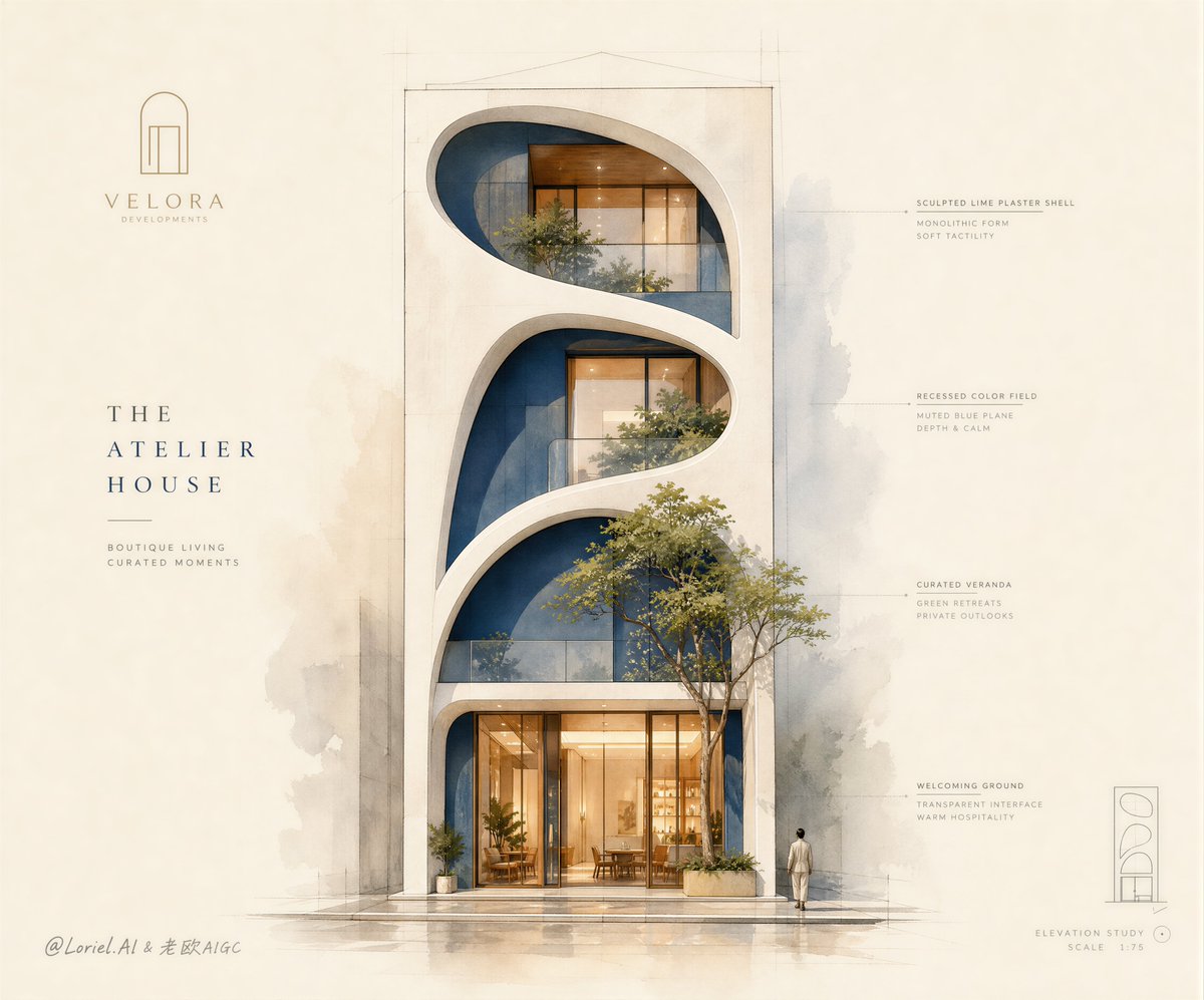
Directs an ultra-premium architectural sales poster for a fictional luxury developer, blending poetic watercolor and sketch language into a symbolic vertical single-building facade study: white sculptural shell, deep blue recessed voids, warm glowing ground floor, restrained premium notation, and English-only on-image text.

OpenAI

Source previews

These example images come from the original source. DROPIDEA has not independently tested these examples; results depend on the model and settings.

Ready to personalize

Your prompt

English

Replace the red variables with your information. Copy the full prompt and use it with your preferred agent.

TXT MD English version
The strongest part is not the watercolor style. It is the facade being reduced into one memorable architectural symbol. This kind of sales poster works when the building can be read in three seconds: white sculptural shell, blue recessed voids, warm ground-floor glow. 🧊 continuous soft-edged white architectural envelope wrapping the facade as one carved mass This keeps the elevation from becoming a collection of floors. The viewer sees one unified silhouette first, then discovers the openings and terraces inside it. 🌊 muted cobalt-blue recessed wall planes with warm amber interiors behind refined glazing This solves the depth problem. The blue voids make the white shell feel dimensional, while the amber ground floor makes the project feel inhabitable and premium. GPT- image 2 prompt👇 Create an ultra-premium architectural sales poster for a fictional luxury real estate developer, preserving the poetic watercolor-and-architectural-sketch language while elevating it into a more international, flagship, and symbolically distilled presentation. The composition is a clean vertical single-building facade study on a warm off-white paper background, with one boutique mixed-use landmark centered in the frame and surrounded by only a minimal amount of elegant technical notation. The image must feel like a collectible developer launch sheet, a top-tier architectural watercolor presentation, and a luxury property campaign visual at the same time. Design one slender urban boutique building with a highly recognizable sculptural facade: a continuous soft-edged white architectural envelope wraps the whole elevation like a single flowing carved mass, forming two or three large rounded voids that reveal deep blue recessed wall planes and warm interior spaces. The facade silhouette must be instantly memorable and extremely clean, reading as one unified super symbol. The ground floor should be transparent, inviting, and premium, with warm amber lighting, refined glazing, elegant timber frames, and subtle hospitality or sales-gallery atmosphere. Upper levels should feel quieter and more exclusive, with selective planted terraces or inset lounge spaces. Add one strategically placed tree growing through or in front of a facade opening to soften the composition and enhance lifestyle appeal, but keep it subordinate to the building form. Push the Transit direction strongly: simplify the page, reduce annotation density, enlarge negative space, clean up all secondary details, and make the whole image feel more international, luxurious, editorial, and controlled. Push the Port direction strongly: compress the visual memory into three dominant symbols only, the central white sculptural facade mass, the deep blue recessed voids, and the warm glowing ground-floor interface. Everything else must become light atmosphere. The building must remain the unquestioned visual hero. Preserve the watercolor effect clearly and elegantly: soft pigment washes, transparent tonal layering, restrained ink outlines, delicate pencil construction traces, subtle drafting notes, light paper grain, and controlled pigment bloom around edges and shadows. The rendering must not look like a loose illustration; it should feel like a highly disciplined architect’s hand-rendered presentation where watercolor atmosphere and real material logic coexist perfectly. Materials must still read believably: matte white stucco or lime plaster, muted cobalt-blue inset planes, warm natural wood, low-iron glass, pale stone paving, and fresh green foliage. Lighting should be soft, luminous, and premium, like late afternoon daylight translated through watercolor media. Use gentle warm-cool contrast: creamy white shell, slightly cooler blue recesses, warm interior amber glow, and tender green foliage catching light. Shadows should remain transparent and watercolor-like, never heavy, but deep enough to give the architecture volume and presence. Keep the street calm and minimal, with only a tiny human scale figure if needed, very secondary. Graphic layout must be extremely restrained: one minimal fictional developer mark, one elegant original English project title, and a few sparse English architectural notes placed around the facade with beautiful spacing. Do not copy any source wording. Typography should feel premium, architectural, small, and secondary to the building image. The whole page should look quieter, more expensive, and more iconic than a typical facade study. Color system: warm off-white paper, ivory-white facade, muted cobalt-blue recessed spaces, amber interior light, soft timber brown, pale graphite linework, and restrained spring green foliage. Keep saturation disciplined, breathable, and globally premium. The final image must feel calm, sophisticated, highly brandable, and immediately recognizable. No copied brand names, no copied cafe text, no heavy black shadows, no messy sketch clutter, no distorted architecture, no fantasy structure, no overcrowded street scene, no random cars, no excessive people, no dirty paper stains, no black blotches, no watermark, no existing logos.
Preview results

Your prompt

The strongest part is not the watercolor style. It is the facade being reduced into one memorable architectural symbol. This kind of sales poster works when the building can be read in three seconds: white sculptural shell, blue recessed voids, warm ground-floor glow. 🧊 continuous soft-edged white architectural envelope wrapping the facade as one carved mass This keeps the elevation from becoming a collection of floors. The viewer sees one unified silhouette first, then discovers the openings and terraces inside it. 🌊 muted cobalt-blue recessed wall planes with warm amber interiors behind refined glazing This solves the depth problem. The blue voids make the white shell feel dimensional, while the amber ground floor makes the project feel inhabitable and premium. GPT- image 2 prompt👇 Create an ultra-premium architectural sales poster for a fictional luxury real estate developer, preserving the poetic watercolor-and-architectural-sketch language while elevating it into a more international, flagship, and symbolically distilled presentation. The composition is a clean vertical single-building facade study on a warm off-white paper background, with one boutique mixed-use landmark centered in the frame and surrounded by only a minimal amount of elegant technical notation. The image must feel like a collectible developer launch sheet, a top-tier architectural watercolor presentation, and a luxury property campaign visual at the same time. Design one slender urban boutique building with a highly recognizable sculptural facade: a continuous soft-edged white architectural envelope wraps the whole elevation like a single flowing carved mass, forming two or three large rounded voids that reveal deep blue recessed wall planes and warm interior spaces. The facade silhouette must be instantly memorable and extremely clean, reading as one unified super symbol. The ground floor should be transparent, inviting, and premium, with warm amber lighting, refined glazing, elegant timber frames, and subtle hospitality or sales-gallery atmosphere. Upper levels should feel quieter and more exclusive, with selective planted terraces or inset lounge spaces. Add one strategically placed tree growing through or in front of a facade opening to soften the composition and enhance lifestyle appeal, but keep it subordinate to the building form. Push the Transit direction strongly: simplify the page, reduce annotation density, enlarge negative space, clean up all secondary details, and make the whole image feel more international, luxurious, editorial, and controlled. Push the Port direction strongly: compress the visual memory into three dominant symbols only, the central white sculptural facade mass, the deep blue recessed voids, and the warm glowing ground-floor interface. Everything else must become light atmosphere. The building must remain the unquestioned visual hero. Preserve the watercolor effect clearly and elegantly: soft pigment washes, transparent tonal layering, restrained ink outlines, delicate pencil construction traces, subtle drafting notes, light paper grain, and controlled pigment bloom around edges and shadows. The rendering must not look like a loose illustration; it should feel like a highly disciplined architect’s hand-rendered presentation where watercolor atmosphere and real material logic coexist perfectly. Materials must still read believably: matte white stucco or lime plaster, muted cobalt-blue inset planes, warm natural wood, low-iron glass, pale stone paving, and fresh green foliage. Lighting should be soft, luminous, and premium, like late afternoon daylight translated through watercolor media. Use gentle warm-cool contrast: creamy white shell, slightly cooler blue recesses, warm interior amber glow, and tender green foliage catching light. Shadows should remain transparent and watercolor-like, never heavy, but deep enough to give the architecture volume and presence. Keep the street calm and minimal, with only a tiny human scale figure if needed, very secondary. Graphic layout must be extremely restrained: one minimal fictional developer mark, one elegant original English project title, and a few sparse English architectural notes placed around the facade with beautiful spacing. Do not copy any source wording. Typography should feel premium, architectural, small, and secondary to the building image. The whole page should look quieter, more expensive, and more iconic than a typical facade study. Color system: warm off-white paper, ivory-white facade, muted cobalt-blue recessed spaces, amber interior light, soft timber brown, pale graphite linework, and restrained spring green foliage. Keep saturation disciplined, breathable, and globally premium. The final image must feel calm, sophisticated, highly brandable, and immediately recognizable. No copied brand names, no copied cafe text, no heavy black shadows, no messy sketch clutter, no distorted architecture, no fantasy structure, no overcrowded street scene, no random cars, no excessive people, no dirty paper stains, no black blotches, no watermark, no existing logos.

Variable guide

continuous soft-edged white architectural envelope wrapping the facade as one carved mass

Edit this phrase to change the main sculptural white envelope treatment.

The line starting with the 🧊 symbol at the top of the template.

Example value

continuous white horizontally-ridged architectural envelope wrapping the facade as one carved mass

muted cobalt-blue recessed wall planes with warm amber interiors behind refined glazing

Edit this phrase to change the blue recessed voids and interior treatment.

The line starting with the 🌊 symbol at the top of the template.

Example value

muted lapis-blue recessed wall planes with warm interiors behind clear glazing

one strategically placed tree growing through or in front of a facade opening

Edit this phrase to customize or replace the tree element.

The sentence starting with 'Add' in the building-design paragraph.

Example value

one strategically placed tree growing in front of a large facade opening

What you get

  • A clean vertical single-building facade study on warm off-white paper.
  • A unified white sculptural shell pierced by cobalt-blue recessed voids and a warm amber glowing ground floor.
  • A disciplined watercolor style with restrained ink lines, pencil traces, and sparse English architectural notes.
  • A quiet page with wide negative space and a premium, brandable feel.

Use cases

  • Launch campaigns for luxury real estate developments and sales galleries.
  • Developer launch sheets and high-end architectural presentation boards.
  • Project profile covers and marketing collateral for premium property brands.
  • Iconic visuals for boutique hospitality and mixed-use landmark branding.

How to use

  • Copy the template as-is and optionally customize the three editable values (white shell envelope, blue recessed voids, tree element) while keeping the Transit and Port directions intact.
  • The prompt requires no reference images or uploads; it is fully text-based, though you may optionally attach a watercolor style reference to lock the look.
  • Send it to an image model that supports on-image text, such as GPT- image 2, using a vertical aspect ratio.
  • After generation, verify the constraints: original English-only on-image text, no watermarks, no existing logos, no heavy black shadows.
  • Regenerate and pick the cleanest, most iconic version for your property campaign materials.

Related prompts