Skip to content
ImagesFree

Scenic Postcard Front-and-Back Editorial Poster

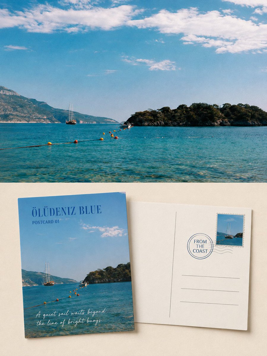
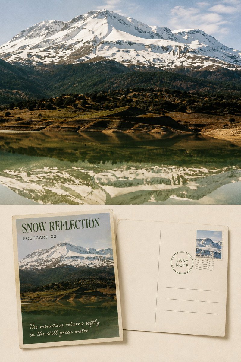
Turns each uploaded travel photo into a refined 3:4 vertical editorial poster: the original photo retained as comparative evidence, plus two tangible postcards showing front and back in a quiet, restrained collectible style.

OpenAI

Source previews

These example images come from the original source. DROPIDEA has not independently tested these examples; results depend on the model and settings.

Ready to personalize

Your prompt

English

Replace the red variables with your information. Copy the full prompt and use it with your preferred agent.

TXT MD English version
Please produce, for each of my uploaded travel photos, an independent, high-end scenic postcard front-and-back editorial poster — not a multi-image collage, and output each photo separately. Use an overall 3:4 vertical composition, and clearly retain the same original travel photo as comparative evidence. The upper half or background of the image should occupy roughly 45%–55% of the entire work, faithfully presenting the original photo, accurately preserving the identity, quantity, direction, proportion, spatial position, viewing angle, natural light and shadow, true texture, and original color atmosphere of mountains, coastline, lakes, architecture, boats, roads, plants, people, or animals. Only perform subtle high-end travel-photography color grading and a very light film-grain treatment; do not turn the photo into an illustration, do not replace the sky, add or remove subjects, move scenery, change terrain, or reshape architecture. On the lower half, on a warm-white, pale ivory, or quietly tinted paper derived from the photo, simultaneously display two same-size, tangibly real physical postcards: one showing the front, one showing the back. The two cards should maintain standard horizontal postcard proportions, slightly offset or rotated at corners, but must not occlude each other in a large area. Clearly convey paper thickness, stiff edges, slight wear, natural shadows, and uncoated paper fibers. The original photo must not be hidden only inside the front card; the upper real-photography area must still have substantial area and be clearly legible. The front postcard should re-select the most representative scenic crop from the original photo, preserving the most identifiable silhouette, terrain relationships, weather, color, and spatial direction of the subject, but do not simply shrink the complete photo to fit proportionally inside the card. You may enlarge one visual anchor and remove cluttered background, so the front reads more like a carefully chosen travel scenic print. Add a place or scene title of 1–3 English words, as well as restrained fields such as "SCENIC NOTE 01" or "POSTCARD STUDY". The back postcard should use clear centerlines, address lines, a stamp area, and appropriate blank space. The stamp is derived from a subject, silhouette, or accent color in the same photo — keep only one stamp; keep the postmark restrained, and do not fabricate complex postal information. In the writing area, place an original travel observation of no more than two sentences, describing only the weather, light, color, boats, mountains, lake surface, village, or spatial feeling actually visible in the photo. All text must be determined word-for-word from the photo, with clear and legible size. The paper should be primarily warm white or pale ivory; the ink color should be extracted from the deep blue, gray-green, charcoal, or brown tones of the photo; the stamp may retain one accent color from the original photo. The two cards should occupy roughly 45%–65% of the lower area, with at least 30% continuous low-information negative space preserved around them. Titles and short phrases should use a gentle serif, handwriting, or postal typeface, with slight paper-teeth, broken ink, and old-print deviations, so the text truly belongs to the postcard. There must be a clear, restrained hierarchical relationship between the original photo and the postcard display area. If a top-and-bottom structure is used, the boundary must be clear — no haze, no feathering, no blending into a single image. Overall, reference collectible travel postcards, independent publications, photographic archives, and modern editorial design — conveying a quiet, sincere, restrained visual temperament with paper warmth and an unfinished story. Avoid: multi-photo collages, nine-grid layouts, missing photos, the original image used only as tiny decoration, duplicate cards, excessive stamps, complex stickers, fabricated cities, long garbled text, author names, account names, brands, QR codes, logos, photo-frame mockups, handheld displays, watermarks…
Preview results

Your prompt

Please produce, for each of my uploaded travel photos, an independent, high-end scenic postcard front-and-back editorial poster — not a multi-image collage, and output each photo separately. Use an overall 3:4 vertical composition, and clearly retain the same original travel photo as comparative evidence. The upper half or background of the image should occupy roughly 45%–55% of the entire work, faithfully presenting the original photo, accurately preserving the identity, quantity, direction, proportion, spatial position, viewing angle, natural light and shadow, true texture, and original color atmosphere of mountains, coastline, lakes, architecture, boats, roads, plants, people, or animals. Only perform subtle high-end travel-photography color grading and a very light film-grain treatment; do not turn the photo into an illustration, do not replace the sky, add or remove subjects, move scenery, change terrain, or reshape architecture. On the lower half, on a warm-white, pale ivory, or quietly tinted paper derived from the photo, simultaneously display two same-size, tangibly real physical postcards: one showing the front, one showing the back. The two cards should maintain standard horizontal postcard proportions, slightly offset or rotated at corners, but must not occlude each other in a large area. Clearly convey paper thickness, stiff edges, slight wear, natural shadows, and uncoated paper fibers. The original photo must not be hidden only inside the front card; the upper real-photography area must still have substantial area and be clearly legible. The front postcard should re-select the most representative scenic crop from the original photo, preserving the most identifiable silhouette, terrain relationships, weather, color, and spatial direction of the subject, but do not simply shrink the complete photo to fit proportionally inside the card. You may enlarge one visual anchor and remove cluttered background, so the front reads more like a carefully chosen travel scenic print. Add a place or scene title of 1–3 English words, as well as restrained fields such as "SCENIC NOTE 01" or "POSTCARD STUDY". The back postcard should use clear centerlines, address lines, a stamp area, and appropriate blank space. The stamp is derived from a subject, silhouette, or accent color in the same photo — keep only one stamp; keep the postmark restrained, and do not fabricate complex postal information. In the writing area, place an original travel observation of no more than two sentences, describing only the weather, light, color, boats, mountains, lake surface, village, or spatial feeling actually visible in the photo. All text must be determined word-for-word from the photo, with clear and legible size. The paper should be primarily warm white or pale ivory; the ink color should be extracted from the deep blue, gray-green, charcoal, or brown tones of the photo; the stamp may retain one accent color from the original photo. The two cards should occupy roughly 45%–65% of the lower area, with at least 30% continuous low-information negative space preserved around them. Titles and short phrases should use a gentle serif, handwriting, or postal typeface, with slight paper-teeth, broken ink, and old-print deviations, so the text truly belongs to the postcard. There must be a clear, restrained hierarchical relationship between the original photo and the postcard display area. If a top-and-bottom structure is used, the boundary must be clear — no haze, no feathering, no blending into a single image. Overall, reference collectible travel postcards, independent publications, photographic archives, and modern editorial design — conveying a quiet, sincere, restrained visual temperament with paper warmth and an unfinished story. Avoid: multi-photo collages, nine-grid layouts, missing photos, the original image used only as tiny decoration, duplicate cards, excessive stamps, complex stickers, fabricated cities, long garbled text, author names, account names, brands, QR codes, logos, photo-frame mockups, handheld displays, watermarks…

What you get

  • A 3:4 vertical editorial poster per uploaded travel photo, with no multi-image collage.
  • A real-photography area of roughly 45%–55% faithfully preserving the original photo with subtle grading and very light film grain.
  • Two same-size paper postcards: a front with a carefully chosen scenic crop and short English title, and a back with centerline, address lines, a single stamp, and an observation of at most two sentences.
  • At least 30% continuous negative space around the cards, in a quiet paper aesthetic inspired by collectible postcards and independent publications.

Use cases

  • Creating a keepsake postcard series from real trip photos.
  • Preparing an editorial presentation or photography portfolio in an archival style.
  • Designing premium print collateral for travel agencies or hospitality brands.
  • Turning a travel album into a printed publication or framed memento per destination.

How to use

  • Upload one or more travel photos; each photo will be output as its own independent poster.
  • Keep the prompt structure as-is for the default result: original photo on top, two postcards below.
  • Optionally replace the quoted English titles such as "SCENIC NOTE 01" with a real place title of 1–3 words matching the photo.
  • Generate in a 3:4 vertical composition and verify the original photo stays clear and substantively unaltered.
  • Check the back card to confirm the written observation is no more than two sentences and describes only what is actually visible in the photo.

Related prompts