Skip to content
ImagesFree

High-End Photo and Doodle Split Posters

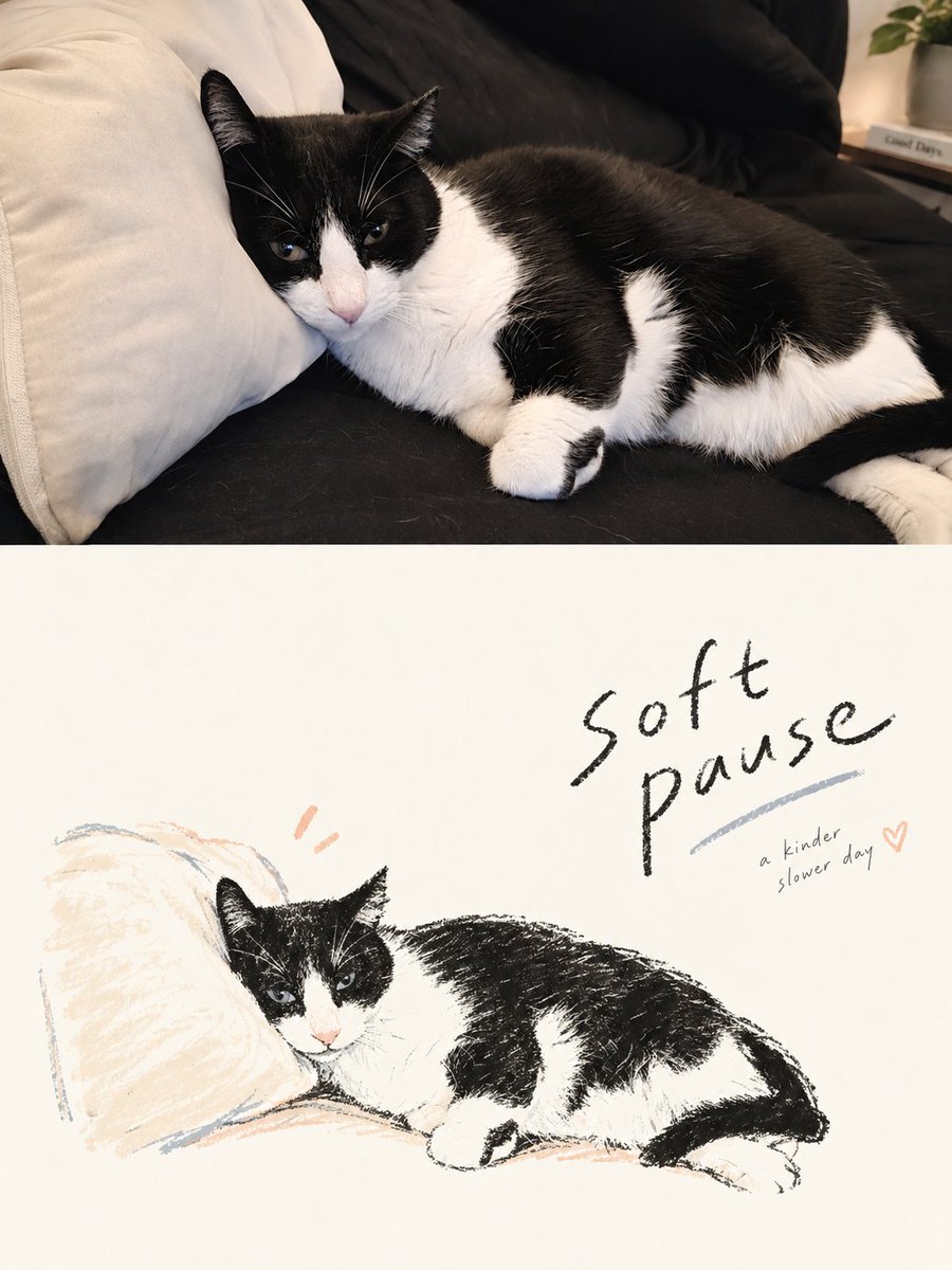
Template turning each uploaded photo into a separate 3:4 vertical poster: the top half preserves the original photograph with refined color grading, while the bottom half reconstructs the subject as a loose hand-drawn naive illustration with generous negative space and integrated typography.

OpenAI

Source previews

These example images come from the original source. DROPIDEA has not independently tested these examples; results depend on the model and settings.

Ready to personalize

Your prompt

English

Replace the red variables with your information. Copy the full prompt and use it with your preferred agent.

TXT MD English version
Please turn each photo I upload into a separate, high-end designed poster. Do not create multi-image collages. Output each photo as an individual poster. Use an overall 3:4 vertical composition, divided into two sections of exactly equal height, with the top and bottom each occupying 50% of the canvas. The upper half should preserve the original photograph. Maintain the subject’s identity, structure, pose, realistic texture, natural lighting, and original color atmosphere. Apply only subtle, refined color grading to give the image the visual quality of an art magazine or exhibition photograph. The surrounding environment may be naturally extended to fit the format, but the main subject must never be stretched, distorted, or altered. For the lower half, make a completely new artistic judgment. Extract only the most recognizable subject, silhouette, structure, pose, and narrative relationship from the original photo, then reconstruct them as a Hand-drawn Doodle Lifestyle Illustration / Naïve Illustration / Marker Drawing. Do not preserve every object. Do not replicate the original scene. Actively remove most of the background and irrelevant information. Through reduction, recomposition, cropping, and scale changes, re-direct the image so that even an ordinary original composition can be transformed into a visually resolved artwork. Simplify and symbolize the forms. The illustration should feel loose, expressive, and full of personality. Use slightly shaky, broken, imperfect hand-drawn lines, with natural marker, crayon, or oil pastel style coloring. Allow slight coloring outside the lines, visible unpainted gaps, and handmade imperfections. Do not aim for realistic proportions, perfect perspective, or highly detailed rendering. The lower half must be built around an extremely generous amount of intentional negative space. The illustrated elements should occupy only a relatively small portion of the composition, while the remaining space is deliberately left empty. The subject may be placed off-center, pushed toward an edge, suspended within the frame, or partially cropped, depending on the direction of the pose and the visual center of gravity. Negative space and the subject should work together to create positive and negative shapes, distance, pauses, and a sense of breathing room. It is always better to draw less than to fill the entire frame. Graphics and typography must be re-composed as a single integrated system, rather than following a simple “text above, character below” layout. First establish an invisible grid, visual axes, and reading path. Then determine the placement of the typography. Text may sit close to the subject’s contour, follow the direction of an action or gesture, align with the head or shoulder line, occupy a large area of negative space, or interact with the illustration through offset placement, overlap, and asymmetrical visual echoes. Avoid mechanical centering, vertical stacking, and fixed templates. The illustration should carry the emotion, while the typography controls the rhythm. Together, they should complete the composition. The language of the typography is unrestricted, but use only a very small number of genuinely meaningful words or short phrases. Use light, natural handwriting with subtle variations in character width and pen pressure. Preserve a slightly spontaneous handwritten quality, but keep letter spacing, line spacing, and overall placement carefully controlled through editorial design. A slightly more prominent short phrase may be paired with extremely small supporting text to create hierarchy, but avoid menu-like headings, long blocks of copy, or layouts filled with text. The overall result should pursue naïve drawing, mature composition, intelligent relationships between graphics and typography, and an extremely generous amount of negative space, like a high-end independent magazine, lifestyle editorial illustration, or art publication.
Preview results

Your prompt

Please turn each photo I upload into a separate, high-end designed poster. Do not create multi-image collages. Output each photo as an individual poster. Use an overall 3:4 vertical composition, divided into two sections of exactly equal height, with the top and bottom each occupying 50% of the canvas. The upper half should preserve the original photograph. Maintain the subject’s identity, structure, pose, realistic texture, natural lighting, and original color atmosphere. Apply only subtle, refined color grading to give the image the visual quality of an art magazine or exhibition photograph. The surrounding environment may be naturally extended to fit the format, but the main subject must never be stretched, distorted, or altered. For the lower half, make a completely new artistic judgment. Extract only the most recognizable subject, silhouette, structure, pose, and narrative relationship from the original photo, then reconstruct them as a Hand-drawn Doodle Lifestyle Illustration / Naïve Illustration / Marker Drawing. Do not preserve every object. Do not replicate the original scene. Actively remove most of the background and irrelevant information. Through reduction, recomposition, cropping, and scale changes, re-direct the image so that even an ordinary original composition can be transformed into a visually resolved artwork. Simplify and symbolize the forms. The illustration should feel loose, expressive, and full of personality. Use slightly shaky, broken, imperfect hand-drawn lines, with natural marker, crayon, or oil pastel style coloring. Allow slight coloring outside the lines, visible unpainted gaps, and handmade imperfections. Do not aim for realistic proportions, perfect perspective, or highly detailed rendering. The lower half must be built around an extremely generous amount of intentional negative space. The illustrated elements should occupy only a relatively small portion of the composition, while the remaining space is deliberately left empty. The subject may be placed off-center, pushed toward an edge, suspended within the frame, or partially cropped, depending on the direction of the pose and the visual center of gravity. Negative space and the subject should work together to create positive and negative shapes, distance, pauses, and a sense of breathing room. It is always better to draw less than to fill the entire frame. Graphics and typography must be re-composed as a single integrated system, rather than following a simple “text above, character below” layout. First establish an invisible grid, visual axes, and reading path. Then determine the placement of the typography. Text may sit close to the subject’s contour, follow the direction of an action or gesture, align with the head or shoulder line, occupy a large area of negative space, or interact with the illustration through offset placement, overlap, and asymmetrical visual echoes. Avoid mechanical centering, vertical stacking, and fixed templates. The illustration should carry the emotion, while the typography controls the rhythm. Together, they should complete the composition. The language of the typography is unrestricted, but use only a very small number of genuinely meaningful words or short phrases. Use light, natural handwriting with subtle variations in character width and pen pressure. Preserve a slightly spontaneous handwritten quality, but keep letter spacing, line spacing, and overall placement carefully controlled through editorial design. A slightly more prominent short phrase may be paired with extremely small supporting text to create hierarchy, but avoid menu-like headings, long blocks of copy, or layouts filled with text. The overall result should pursue naïve drawing, mature composition, intelligent relationships between graphics and typography, and an extremely generous amount of negative space, like a high-end independent magazine, lifestyle editorial illustration, or art publication.

What you get

  • A 3:4 vertical poster split into two exactly equal halves.
  • A top half preserving the original photo with art-magazine visual quality.
  • A bottom half as a loose hand-drawn naive illustration with generous intentional negative space.
  • An integrated graphic-typography system in the style of premium independent magazines.

Use cases

  • Promotional posters for marketing campaigns and lifestyle brands.
  • Covers and visual content for magazines and independent publications.
  • Wall and social media art designs.
  • Personal printed gifts with a refined artistic touch.

How to use

  • Upload one or more photos; each will become a separate individual poster, not a collage.
  • Use photos with a clear main subject for the best identity, pose, and texture preservation.
  • Leave the rest of the settings unchanged; the 3:4 vertical composition and equal 50% split are applied automatically.
  • Review the resulting posters and try other photos for different variations.

Related prompts