Skip to content
ImagesFree

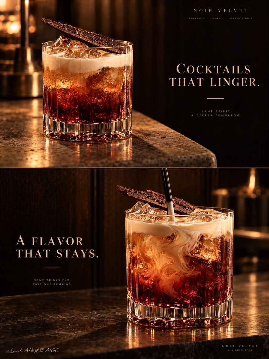
Two-Panel Luxury Cocktail Campaign Poster

Prompt for a unified two-panel vertical luxury cocktail advertising poster, contrasting an elegant still beauty shot with a fluid stirring motion.

OpenAI

Source previews

These example images come from the original source. DROPIDEA has not independently tested these examples; results depend on the model and settings.

Ready to personalize

Your prompt

English

Replace the red variables with your information. Copy the full prompt and use it with your preferred agent.

TXT MD English version
A two-panel drink campaign becomes a system when the second image changes the moment, not the identity. 🍫 repeat the same rocks glass, red-to-amber liquid body, pale cream top, and diagonal chocolate shard in both panels The viewer recognizes one signature serve instantly. The campaign gains range without looking like two unrelated cocktails. 🌀 keep the upper panel still; reserve motion for the lower panel, where a black stirrer folds cream slowly into the amber-red drink The contrast creates a visual sequence: first the object of desire, then the ritual of making it. The motion stays elegant because everything else remains controlled. GPT- image 2.5 prompt👇 A premium cocktail campaign poster for fictional bar brand NOIR VELVET, merging emotional atmosphere, material precision, and curatorial restraint into one unified two-panel vertical advertising image. Preserve the exact luxury-drinks structure: two stacked horizontal panels, warm low-key bar atmosphere, dark wood and amber light language, one hero cocktail per panel, elegant text zones in negative space, and a strict campaign-wide product identity. Both cocktails must feel like the same brand family, bar program, and visual universe. Top panel: a close three-quarter beauty shot of a short crystal rocks glass on a softly lit stone or travertine bar edge. The cocktail is the hero: deep garnet-red at the base, glowing amber through the middle, topped with soft pale cream foam, with clear ice catching warm highlights. A thin crisp chocolate shard or cocoa tuile rests diagonally on top as the unmistakable signature garnish. The glass is heavy, premium, and hyperreal, with thick base refraction, subtle condensation, and rich liquid glow. On the right side, keep a calm dark negative-space zone for elegant English typography such as “COCKTAILS THAT LINGER.” in refined serif capitals, with one thin accent line beneath. This panel should feel quieter, stiller, and more seductive. Bottom panel: a second hero variation from the same drink family, larger and more front-facing, placed slightly right of center on a polished bar or stone surface against a deep dark wood backdrop. Keep the same short crystal glass, same red-to-amber body, same pale cream top note, and same chocolate garnish language. The liquid is shown in a fresh stirring moment, with cream folding into the amber-red body, visible ice, and a black stirrer descending from above. The motion should feel hypnotic but controlled, never messy. On the left side, preserve a clean text zone for a secondary English line such as “A FLAVOR THAT STAYS.” in the same typography system, with the same minimal accent. This is a tightly controlled product-promotion image, so the drinks must dominate at all times. No human figures, cluttered props, random garnish drift, or extra fruit unless extremely restrained. The signature identity must stay absolute across both panels: same glassware family, color hierarchy, cream signature, chocolate accent, warm cinematic bar light, typography discipline, and editorial quietness. The result should feel like Orbit, Transit, and Port fused together: emotionally warm, materially exact, and elevated into a global luxury hospitality campaign. Lighting is the key mood engine: warm directional amber key light from the upper side, soft fill preserving crystal, foam, and ice detail, deep brown-black background separation, glowing reflections through the red base, and smooth highlights on the cream and garnish. Color hierarchy: 60% dark espresso brown, black walnut, and shadowed bar tones, 30% garnet, burnt amber, and cognac-red liquid glow, 10% ivory foam and warm highlights. Materials must feel hyperreal and tactile: thick crystal glass, melting ice edges, silky cream foam, glossy liqueur body, delicate chocolate texture, polished stone, and dark timber depth. Typography must be original, elegant, and integrated like luxury hospitality branding. Use English only. Keep it minimal, serif-led, widely spaced, and never touching the core recognition area of the drinks. If needed, place “NOIR VELVET” subtly in one corner or between the panels. The final result should feel like a Cannes-level cocktail poster: sensual, warm, product-dominant, graphically disciplined, globally polished, and unforgettable. No copied text, no messy splashes, no muddy shadows, no broken glass geometry, no cheap nightclub look, no clutter.
Preview results

Your prompt

A two-panel drink campaign becomes a system when the second image changes the moment, not the identity. 🍫 repeat the same rocks glass, red-to-amber liquid body, pale cream top, and diagonal chocolate shard in both panels The viewer recognizes one signature serve instantly. The campaign gains range without looking like two unrelated cocktails. 🌀 keep the upper panel still; reserve motion for the lower panel, where a black stirrer folds cream slowly into the amber-red drink The contrast creates a visual sequence: first the object of desire, then the ritual of making it. The motion stays elegant because everything else remains controlled. GPT- image 2.5 prompt👇 A premium cocktail campaign poster for fictional bar brand NOIR VELVET, merging emotional atmosphere, material precision, and curatorial restraint into one unified two-panel vertical advertising image. Preserve the exact luxury-drinks structure: two stacked horizontal panels, warm low-key bar atmosphere, dark wood and amber light language, one hero cocktail per panel, elegant text zones in negative space, and a strict campaign-wide product identity. Both cocktails must feel like the same brand family, bar program, and visual universe. Top panel: a close three-quarter beauty shot of a short crystal rocks glass on a softly lit stone or travertine bar edge. The cocktail is the hero: deep garnet-red at the base, glowing amber through the middle, topped with soft pale cream foam, with clear ice catching warm highlights. A thin crisp chocolate shard or cocoa tuile rests diagonally on top as the unmistakable signature garnish. The glass is heavy, premium, and hyperreal, with thick base refraction, subtle condensation, and rich liquid glow. On the right side, keep a calm dark negative-space zone for elegant English typography such as “COCKTAILS THAT LINGER.” in refined serif capitals, with one thin accent line beneath. This panel should feel quieter, stiller, and more seductive. Bottom panel: a second hero variation from the same drink family, larger and more front-facing, placed slightly right of center on a polished bar or stone surface against a deep dark wood backdrop. Keep the same short crystal glass, same red-to-amber body, same pale cream top note, and same chocolate garnish language. The liquid is shown in a fresh stirring moment, with cream folding into the amber-red body, visible ice, and a black stirrer descending from above. The motion should feel hypnotic but controlled, never messy. On the left side, preserve a clean text zone for a secondary English line such as “A FLAVOR THAT STAYS.” in the same typography system, with the same minimal accent. This is a tightly controlled product-promotion image, so the drinks must dominate at all times. No human figures, cluttered props, random garnish drift, or extra fruit unless extremely restrained. The signature identity must stay absolute across both panels: same glassware family, color hierarchy, cream signature, chocolate accent, warm cinematic bar light, typography discipline, and editorial quietness. The result should feel like Orbit, Transit, and Port fused together: emotionally warm, materially exact, and elevated into a global luxury hospitality campaign. Lighting is the key mood engine: warm directional amber key light from the upper side, soft fill preserving crystal, foam, and ice detail, deep brown-black background separation, glowing reflections through the red base, and smooth highlights on the cream and garnish. Color hierarchy: 60% dark espresso brown, black walnut, and shadowed bar tones, 30% garnet, burnt amber, and cognac-red liquid glow, 10% ivory foam and warm highlights. Materials must feel hyperreal and tactile: thick crystal glass, melting ice edges, silky cream foam, glossy liqueur body, delicate chocolate texture, polished stone, and dark timber depth. Typography must be original, elegant, and integrated like luxury hospitality branding. Use English only. Keep it minimal, serif-led, widely spaced, and never touching the core recognition area of the drinks. If needed, place “NOIR VELVET” subtly in one corner or between the panels. The final result should feel like a Cannes-level cocktail poster: sensual, warm, product-dominant, graphically disciplined, globally polished, and unforgettable. No copied text, no messy splashes, no muddy shadows, no broken glass geometry, no cheap nightclub look, no clutter.

Variable guide

NOIR VELVET

Brand name for the fictional or real bar lounge

First paragraph after GPT prompt intro and in the typography section

Example value

NOIR VELVET

COCKTAILS THAT LINGER.

Main tagline featured in the upper still panel

Second paragraph defining the top panel composition

Example value

COCKTAILS THAT LINGER.

A FLAVOR THAT STAYS.

Secondary tagline featured in the lower action panel

Third paragraph defining the bottom panel composition

Example value

A FLAVOR THAT STAYS.

What you get

  • A vertical two-panel luxury advertising poster unified by lighting and product identity.
  • A serene, high-end still beauty shot in the top panel with elegant typography.
  • A kinetic lower panel depicting the stirring ritual while keeping visual consistency.
  • Ultra-realistic tactile rendering of crystal glassware, liquids, ice, and dark moody wood.

Use cases

  • High-end hospitality and bar branding marketing campaigns.
  • Editorial social media and print poster mockups for craft cocktail menus.
  • Creative advertising pitch decks for luxury spirits and beverage launches.

How to use

  • Paste the complete prompt into GPT Image 2.5 or any advanced image generation model that supports long-form prompt adherence.
  • Customize the brand name BRAND_NAME and typography slogans TOP_SLOGAN and BOTTOM_SLOGAN to fit your marketing concept.
  • Maintain the exact lighting ratio, color hierarchy, and glass specifications to keep the cohesive identity across both stacked panels.

Related prompts