Skip to content
ImagesFree

Luxury Editorial Winter Skincare Recovery Serum Hero Poster

High-end commercial beauty prompt generating a Cannes-level luxury skincare campaign poster featuring macro skin realism, a translucent bio-cellulose veil, and a hero serum bottle.

OpenAI

Source previews

These example images come from the original source. DROPIDEA has not independently tested these examples; results depend on the model and settings.

Ready to personalize

Your prompt

English

Replace the red variables with your information. Copy the full prompt and use it with your preferred agent.

TXT MD English version
Skincare looks more convincing when the treatment has the same physical language as the problem. 🪽 “a serum-soaked translucent bio-cellulose veil draped in thin overlapping layers across real winter skin texture” The membrane signals protection while pores, fine creases, and dehydration remain visible. Repair feels tangible, not airbrushed. ✨ “let the veil catch soft pearly highlights at its folds while the skin beneath stays warm, matte, and detailed” The two surfaces separate instantly: the treatment looks moist and weightless; the skin still looks human. GPT- image 2.5 prompt👇 Create a Cannes-level luxury skincare poster for fictional winter-repair beauty brand VEILORÉ, merging macro skin realism, translucent treatment texture, premium product design, and gallery-clean editorial typography into one unified hero image. The core concept is winter recovery made visible: ultra-close female facial fragments become a tactile landscape of dry-season skin, softly covered by translucent treatment veils, while one serum bottle stands at the center as the source of repair, protection, and quiet radiance. The product must remain the absolute visual leader. Use a vertical full-bleed beauty poster with an extreme macro editorial composition, disciplined by rule of thirds but centrally anchored. Preserve the exact structure: one closed eye in the upper third, partial cheek and nose bridge through the middle, soft natural lips in the lower third, all cropped into abstract skin planes. Across these zones, a sheer semi-transparent hydration veil stretches in overlapping lightly wrinkled layers, softly luminous and revealing the skin beneath. At the exact center, place one large upright serum bottle, fully readable and integrated into the facial landscape without breaking the emotional flow. Typography sits in a refined centered stack around the bottle. The composition must feel intimate, tactile, sculptural, and controlled. Show one realistic adult woman only, presented as close-cropped facial fragments rather than a full portrait. Her skin must feel de-AI and physiologically believable: visible pores, subtle winter dehydration texture, fine under-eye creasing, soft tonal variation, realistic lashes, believable lip texture, and natural elasticity. No heavy makeup, no glossy fashion artifice. The treatment veil should feel like a serum-soaked cosmetic membrane, breathable and delicate, softening the skin while preserving real detail. The beauty language should sit between clinical repair and couture skincare. The hero product is a collectible luxury serum bottle called VEILORÉ WINTER VEIL RECOVERY SERUM. The bottle is frosted glass with softly rounded rectangular geometry, a pale nude-rose serum core, a satin ivory or champagne cap, subtle embossed branding, and precise minimalist label typography. It must feel manufacturable, clinical-luxury, and highly desirable, with controlled reflections, gentle internal refraction, and refined packaging proportion. The bottle is the visual anchor and must read clearly at first glance. The eye remains gently closed, suggesting restoration and relief rather than performance. The lips are softly relaxed and slightly parted with natural hydration texture. The face planes must align anatomically even in fragmented crop. The translucent membrane flows across forehead, eyelid, cheek, and mouth area in elegant overlapping layers, never obscuring anatomy unnaturally. No hands, no jewelry, no extra faces, no tools, no decorative props. Lighting and color should follow a precise winter-beauty palette. Use diffused warm-neutral light from the upper left with creamy frontal fill and faint cool undertones in shadow. Palette hierarchy: 60% warm ivory, skin nude, dusty blush, muted beige, and soft wheat; 30% translucent pearl, serum rose, quiet champagne, and hydrated cream highlights; 10% shadowed taupe, faint mauve depth, and low-contrast cosmetic shadow. The image should feel breathable, cocooning, premium, and restorative, with no muddy beige haze, dirty brown cast, dead blacks, or oversaturated beauty pink. Materials must feel extremely real: fine winter dryness, natural folds, subtle texture compression, luminous hydration highlights, and micro-detail in the skin without plastic retouching; an ultra-thin bio-cellulose or serum-silk film that feels semi-transparent, moist, softly crinkled, and weightless; and bottle glass showing frosted diffusion, elegant edge highlights, soft internal glow, and exact label clarity. The overall finish should feel like a flagship international skincare campaign: tactile, intelligent, clean, and print-ready. All in-image text must be English only, centered and elegantly integrated into the composition. Main title: “WINTER SKIN, REWRITTEN.” set in a refined high-contrast serif with airy spacing and quiet editorial rhythm. Beneath it, add a smaller support line: “barrier repair for the season of thin light.” Below the hero bottle, place “VEILORÉ” and “WINTER VEIL RECOVERY SERUM” in minimalist small caps. Typography must feel softly luminous and sculpted into the image architecture, never heavy or templated. Output: a full-bleed luxury skincare poster with product-first hierarchy, one realistic adult woman only, macro face fragments in the background, a translucent treatment veil across the skin, one centered serum bottle, English text only, no hands, no extra faces, no warped anatomy, no extra eyes, no distorted lips, no unreadable label, no plastic skin retouching, no muddy beige cast, no dead black blocks, no low-quality AI texture, no generic social-media skincare flyer styling, and no style drift.
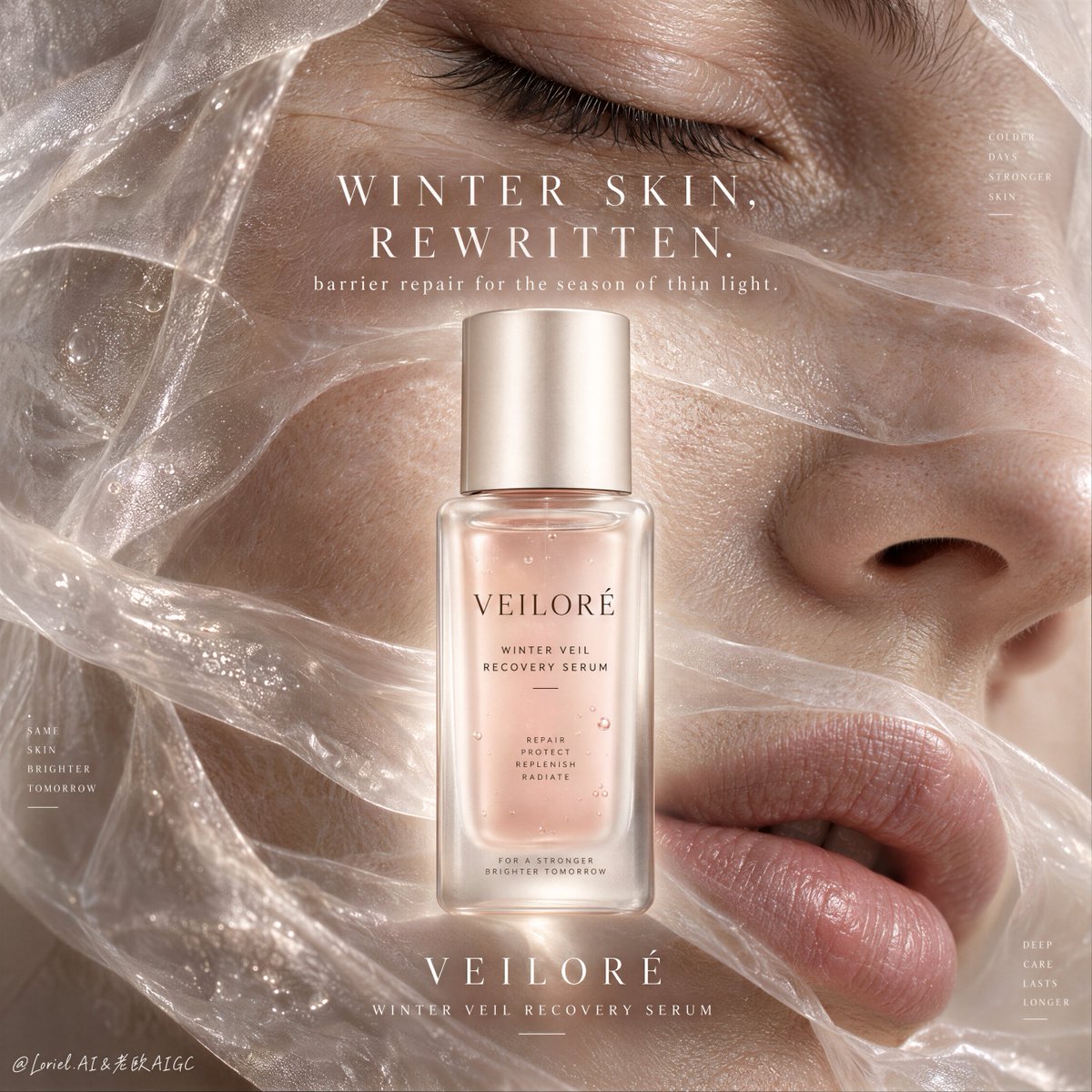
Preview results

Your prompt

Skincare looks more convincing when the treatment has the same physical language as the problem. 🪽 “a serum-soaked translucent bio-cellulose veil draped in thin overlapping layers across real winter skin texture” The membrane signals protection while pores, fine creases, and dehydration remain visible. Repair feels tangible, not airbrushed. ✨ “let the veil catch soft pearly highlights at its folds while the skin beneath stays warm, matte, and detailed” The two surfaces separate instantly: the treatment looks moist and weightless; the skin still looks human. GPT- image 2.5 prompt👇 Create a Cannes-level luxury skincare poster for fictional winter-repair beauty brand VEILORÉ, merging macro skin realism, translucent treatment texture, premium product design, and gallery-clean editorial typography into one unified hero image. The core concept is winter recovery made visible: ultra-close female facial fragments become a tactile landscape of dry-season skin, softly covered by translucent treatment veils, while one serum bottle stands at the center as the source of repair, protection, and quiet radiance. The product must remain the absolute visual leader. Use a vertical full-bleed beauty poster with an extreme macro editorial composition, disciplined by rule of thirds but centrally anchored. Preserve the exact structure: one closed eye in the upper third, partial cheek and nose bridge through the middle, soft natural lips in the lower third, all cropped into abstract skin planes. Across these zones, a sheer semi-transparent hydration veil stretches in overlapping lightly wrinkled layers, softly luminous and revealing the skin beneath. At the exact center, place one large upright serum bottle, fully readable and integrated into the facial landscape without breaking the emotional flow. Typography sits in a refined centered stack around the bottle. The composition must feel intimate, tactile, sculptural, and controlled. Show one realistic adult woman only, presented as close-cropped facial fragments rather than a full portrait. Her skin must feel de-AI and physiologically believable: visible pores, subtle winter dehydration texture, fine under-eye creasing, soft tonal variation, realistic lashes, believable lip texture, and natural elasticity. No heavy makeup, no glossy fashion artifice. The treatment veil should feel like a serum-soaked cosmetic membrane, breathable and delicate, softening the skin while preserving real detail. The beauty language should sit between clinical repair and couture skincare. The hero product is a collectible luxury serum bottle called VEILORÉ WINTER VEIL RECOVERY SERUM. The bottle is frosted glass with softly rounded rectangular geometry, a pale nude-rose serum core, a satin ivory or champagne cap, subtle embossed branding, and precise minimalist label typography. It must feel manufacturable, clinical-luxury, and highly desirable, with controlled reflections, gentle internal refraction, and refined packaging proportion. The bottle is the visual anchor and must read clearly at first glance. The eye remains gently closed, suggesting restoration and relief rather than performance. The lips are softly relaxed and slightly parted with natural hydration texture. The face planes must align anatomically even in fragmented crop. The translucent membrane flows across forehead, eyelid, cheek, and mouth area in elegant overlapping layers, never obscuring anatomy unnaturally. No hands, no jewelry, no extra faces, no tools, no decorative props. Lighting and color should follow a precise winter-beauty palette. Use diffused warm-neutral light from the upper left with creamy frontal fill and faint cool undertones in shadow. Palette hierarchy: 60% warm ivory, skin nude, dusty blush, muted beige, and soft wheat; 30% translucent pearl, serum rose, quiet champagne, and hydrated cream highlights; 10% shadowed taupe, faint mauve depth, and low-contrast cosmetic shadow. The image should feel breathable, cocooning, premium, and restorative, with no muddy beige haze, dirty brown cast, dead blacks, or oversaturated beauty pink. Materials must feel extremely real: fine winter dryness, natural folds, subtle texture compression, luminous hydration highlights, and micro-detail in the skin without plastic retouching; an ultra-thin bio-cellulose or serum-silk film that feels semi-transparent, moist, softly crinkled, and weightless; and bottle glass showing frosted diffusion, elegant edge highlights, soft internal glow, and exact label clarity. The overall finish should feel like a flagship international skincare campaign: tactile, intelligent, clean, and print-ready. All in-image text must be English only, centered and elegantly integrated into the composition. Main title: “WINTER SKIN, REWRITTEN.” set in a refined high-contrast serif with airy spacing and quiet editorial rhythm. Beneath it, add a smaller support line: “barrier repair for the season of thin light.” Below the hero bottle, place “VEILORÉ” and “WINTER VEIL RECOVERY SERUM” in minimalist small caps. Typography must feel softly luminous and sculpted into the image architecture, never heavy or templated. Output: a full-bleed luxury skincare poster with product-first hierarchy, one realistic adult woman only, macro face fragments in the background, a translucent treatment veil across the skin, one centered serum bottle, English text only, no hands, no extra faces, no warped anatomy, no extra eyes, no distorted lips, no unreadable label, no plastic skin retouching, no muddy beige cast, no dead black blocks, no low-quality AI texture, no generic social-media skincare flyer styling, and no style drift.

Variable guide

VEILORÉ

Fictional or real luxury skincare brand name

Occurrences of brand name across the prompt and lower typography

Example value

VEILORÉ

WINTER VEIL RECOVERY SERUM

Full hero serum product name

Within product description and bottle typography section

Example value

WINTER VEIL RECOVERY SERUM

“WINTER SKIN, REWRITTEN.”

Main editorial campaign headline

Inside the typography instruction paragraph as the primary title

Example value

WINTER SKIN, REWRITTEN.

“barrier repair for the season of thin light.”

Supporting tagline text

Directly below the main headline

Example value

barrier repair for the season of thin light.

What you get

  • A Cannes Lions-level luxury skincare editorial poster.
  • Ultra-realistic macro skin texture layered with a dewy, translucent bio-cellulose recovery veil.
  • A centrally anchored, manufacturable premium serum bottle with frosted glass and clear labeling.
  • High-contrast, airy minimalist typography seamlessly integrated into the poster layout.

Use cases

  • High-end winter barrier repair skincare launch campaigns.
  • Creative agency pitch decks and luxury cosmetics packaging concept presentation.
  • Editorial marketing visuals for print publications, luxury storefronts, and e-commerce hero banners.

How to use

  • Copy the prompt into an advanced AI image generation tool (such as GPT Image 2.5 or Midjourney).
  • Customize brand name, product title, or tagline tokens if adapting for a specific product line.
  • Set the canvas to a vertical aspect ratio (e.g., 4:5 or 9:16) to achieve a full-bleed luxury poster look.
  • Run the generation and inspect for tactile skin detail, bottle reflections, and legible typography.

Related prompts