Skip to content
ImagesFree

Split Poster with Mid-Century Schematic Graphic Illustration

Transforms uploaded photos into a 1:1 vertically split poster featuring editorial photography on top and a retro mid-century schematic two-color illustration on the bottom.

OpenAI

Source previews

These example images come from the original source. DROPIDEA has not independently tested these examples; results depend on the model and settings.

Ready to personalize

Your prompt

English

Replace the red variables with your information. Copy the full prompt and use it with your preferred agent.

TXT MD English version
Please create a separate, independently designed premium poster from each uploaded photo. Do not combine multiple photos into one composition; output one individual poster for each photo. Use a vertical 3:4 composition, with the upper and lower sections strictly divided 1:1, each occupying exactly 50% of the total height. Upper Half: Preserve the original photograph, maintaining the subject’s identity, structure, pose, realistic texture, natural lighting, and original color atmosphere. Apply only subtle, sophisticated color grading to give it the visual quality of an art magazine, independent publication, or exhibition image. To adapt the image to the 3:4 format, the surrounding background may be naturally extended, but do not stretch, distort, or alter the subject. Lower Half: Extract the most recognizable subject, silhouette, structure, pose, and narrative relationship from the photograph and reconstruct it in the style of Mid-century vernacular graphic illustration + schematic line drawing + two-color spot printing. Do not completely trace or replicate the photograph. Instead, use diagrammatic abstraction to compress complex objects into a small number of clear geometric shapes, functional contours, and essential structural elements. The result should resemble an illustration from an old instruction manual, advertising card, technical label, or vernacular print: immediately recognizable, yet more direct, humorous, and symbolic than the realistic object itself. Emphasize economy of line: if a structure can be explained with a single line, do not use unnecessary strokes. Use direct black pen outlines, rectangles, circles, diamonds, straight lines, and simple planes to describe the objects. People, animals, and objects may have slightly exaggerated proportions, while machines, buildings, and complex structures should be simplified into clear boxes, openings, panels, and silhouette relationships. Use a flat, schematic diagrammatic perspective rather than realistic lighting or strictly accurate spatial depth. The visual language should exist somewhere between illustration and technical diagram, maintaining this distinctive character throughout the composition. Reorganize the composition according to the most important narrative relationship in the original image. Maintain one clear primary subject, while using a small number of supporting objects, guide lines, directional relationships, or structural symbols to reinforce the story. Pay close attention to visual hierarchy, geometric order, scale contrast, positive and negative space, and intentional whitespace. The image may feel slightly naïve, awkward, or handmade in a vernacular way, but it must never feel cluttered. Every visual element should appear to exist for the purpose of “explaining what is happening”, rather than simply serving as decoration.
Preview results

Your prompt

Please create a separate, independently designed premium poster from each uploaded photo. Do not combine multiple photos into one composition; output one individual poster for each photo. Use a vertical 3:4 composition, with the upper and lower sections strictly divided 1:1, each occupying exactly 50% of the total height. Upper Half: Preserve the original photograph, maintaining the subject’s identity, structure, pose, realistic texture, natural lighting, and original color atmosphere. Apply only subtle, sophisticated color grading to give it the visual quality of an art magazine, independent publication, or exhibition image. To adapt the image to the 3:4 format, the surrounding background may be naturally extended, but do not stretch, distort, or alter the subject. Lower Half: Extract the most recognizable subject, silhouette, structure, pose, and narrative relationship from the photograph and reconstruct it in the style of Mid-century vernacular graphic illustration + schematic line drawing + two-color spot printing. Do not completely trace or replicate the photograph. Instead, use diagrammatic abstraction to compress complex objects into a small number of clear geometric shapes, functional contours, and essential structural elements. The result should resemble an illustration from an old instruction manual, advertising card, technical label, or vernacular print: immediately recognizable, yet more direct, humorous, and symbolic than the realistic object itself. Emphasize economy of line: if a structure can be explained with a single line, do not use unnecessary strokes. Use direct black pen outlines, rectangles, circles, diamonds, straight lines, and simple planes to describe the objects. People, animals, and objects may have slightly exaggerated proportions, while machines, buildings, and complex structures should be simplified into clear boxes, openings, panels, and silhouette relationships. Use a flat, schematic diagrammatic perspective rather than realistic lighting or strictly accurate spatial depth. The visual language should exist somewhere between illustration and technical diagram, maintaining this distinctive character throughout the composition. Reorganize the composition according to the most important narrative relationship in the original image. Maintain one clear primary subject, while using a small number of supporting objects, guide lines, directional relationships, or structural symbols to reinforce the story. Pay close attention to visual hierarchy, geometric order, scale contrast, positive and negative space, and intentional whitespace. The image may feel slightly naïve, awkward, or handmade in a vernacular way, but it must never feel cluttered. Every visual element should appear to exist for the purpose of “explaining what is happening”, rather than simply serving as decoration.

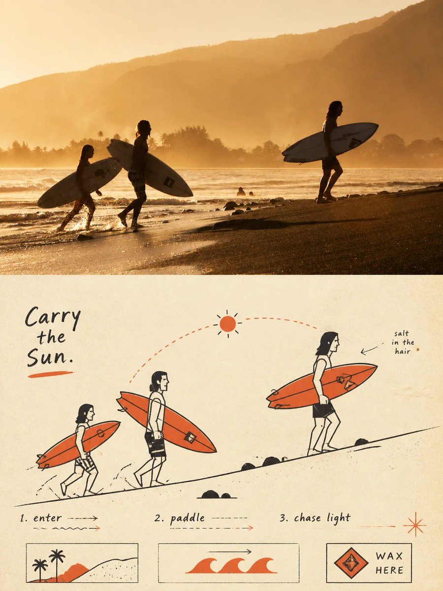
What you get

  • A premium 3:4 vertical poster split exactly 1:1 between top and bottom.
  • Upper half displaying the original subject with refined editorial color grading.
  • Lower half reconstructing the subject as a mid-century schematic two-color spot print diagram.

Use cases

  • Art prints, editorial magazine covers, and independent publications.
  • Exhibition posters and conceptual branding merchandise.
  • Creative social media showcases juxtaposing reality with minimal graphic abstractions.

How to use

  • Upload a clear photograph featuring a distinct primary subject (person, animal, machine, or scene).
  • Send the prompt alongside your image to the multimodal generative model.
  • Verify that the output follows the 3:4 ratio with a strict 50/50 split between photo and diagram.

Related prompts