Skip to content
ImagesFree

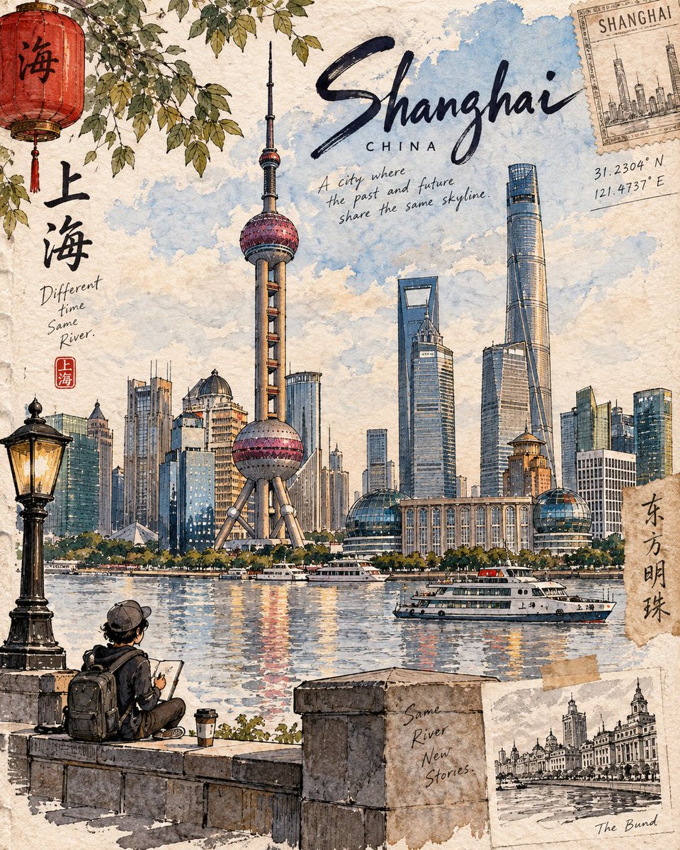
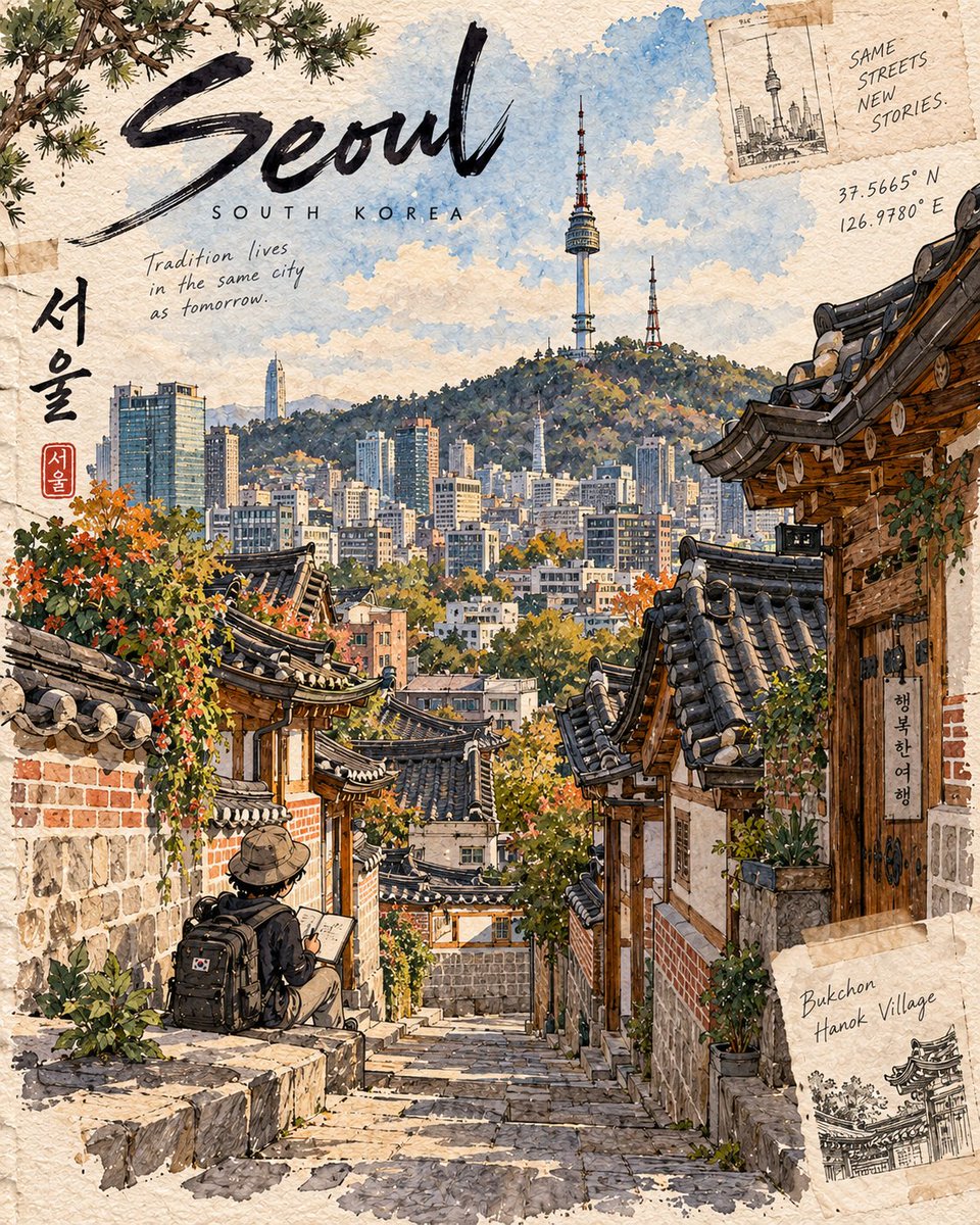
Premium 4:5 Vertical Destination Sketchbook Illustration

A complete Arabic template for generating a premium hand-painted travel-journal illustration, with one dominant hero landmark, a tiny chibi traveler, geographic accuracy, handwritten lettering, and a restrained watercolor palette.

OpenAI

Source previews

These example images come from the original source. DROPIDEA has not independently tested these examples; results depend on the model and settings.
Ready to personalize

Your prompt

English

Replace the red variables with your information. Copy the full prompt and use it with your preferred agent.

TXT MD English version
Create a premium 4:5 vertical illustration for the “Destination Sketchbook” series. Use the Matterhorn artwork as the series DNA, not as a literal template. For [DESTINATION], identify its most distinctive and authentic landmark or place and build the entire scene around it. Prioritize geographic accuracy: landmark, architecture, terrain, vegetation, water, geology, culture, and viewpoint must naturally belong together and be realistically observable from one location. Never create composite landmarks or mix attractions from different places. COMPOSITION: One dominant hero landmark with 60–70% visual emphasis, strong foreground–middle–background depth, generous negative space, and exactly ONE tiny cute chibi traveler occupying 8–12% of the frame. The traveler should naturally explore, sketch, sit, walk, or observe—not pose for the viewer. Use destination-specific foreground details. STYLE: Hand-painted travel-journal artwork with expressive dark ink lines, varied line weight, loose watercolor/gouache washes, warm off-white paper, visible grain, subtle pencil marks, imperfect brush edges, natural paint bleeds, and restrained imperfections. It should feel personally observed, tactile, intimate, and handmade—not photorealistic, glossy, vector-like, or generically AI-watercolored. Make each destination visually unique through its architecture, vegetation, geology, materials, weather, light, culture, textures, and viewpoint, while preserving the same artist identity. Avoid generic tourism clichés and decorative elements unless genuinely relevant. TEXT: Minimal handwritten editorial lettering: [LANDMARK NAME] [LOCATION, COUNTRY] Optionally add 1–2 short, location-specific observations. COLOR: Naturally derived from the destination and season. Restrained watercolor palette, subtle accents, visible paper, no neon, excessive contrast, glossy gradients, or artificial cinematic grading. FINAL: The destination must be immediately recognizable, geographically coherent, landmark-dominant, authentically detailed, and unmistakably part of the Destination Sketchbook series. OUTPUT: 4:5 vertical premium hand-drawn travel-journal illustration.
Preview results

Your prompt

Create a premium 4:5 vertical illustration for the “Destination Sketchbook” series. Use the Matterhorn artwork as the series DNA, not as a literal template. For [DESTINATION], identify its most distinctive and authentic landmark or place and build the entire scene around it. Prioritize geographic accuracy: landmark, architecture, terrain, vegetation, water, geology, culture, and viewpoint must naturally belong together and be realistically observable from one location. Never create composite landmarks or mix attractions from different places. COMPOSITION: One dominant hero landmark with 60–70% visual emphasis, strong foreground–middle–background depth, generous negative space, and exactly ONE tiny cute chibi traveler occupying 8–12% of the frame. The traveler should naturally explore, sketch, sit, walk, or observe—not pose for the viewer. Use destination-specific foreground details. STYLE: Hand-painted travel-journal artwork with expressive dark ink lines, varied line weight, loose watercolor/gouache washes, warm off-white paper, visible grain, subtle pencil marks, imperfect brush edges, natural paint bleeds, and restrained imperfections. It should feel personally observed, tactile, intimate, and handmade—not photorealistic, glossy, vector-like, or generically AI-watercolored. Make each destination visually unique through its architecture, vegetation, geology, materials, weather, light, culture, textures, and viewpoint, while preserving the same artist identity. Avoid generic tourism clichés and decorative elements unless genuinely relevant. TEXT: Minimal handwritten editorial lettering: [LANDMARK NAME] [LOCATION, COUNTRY] Optionally add 1–2 short, location-specific observations. COLOR: Naturally derived from the destination and season. Restrained watercolor palette, subtle accents, visible paper, no neon, excessive contrast, glossy gradients, or artificial cinematic grading. FINAL: The destination must be immediately recognizable, geographically coherent, landmark-dominant, authentically detailed, and unmistakably part of the Destination Sketchbook series. OUTPUT: 4:5 vertical premium hand-drawn travel-journal illustration.

Variable guide

[DESTINATION]

The destination the entire scene is built around; replace the token with a destination name only, e.g. Japan or Paris.

Replace the [DESTINATION] token in the second paragraph of the template, right after the phrase 'For'.

Example value

Switzerland

[LANDMARK NAME]

The landmark name handwritten at the top of the illustration; it must be a real, distinctive landmark of the destination.

Replace the [LANDMARK NAME] token in the handwritten text line inside the TEXT section of the template.

Example value

Matterhorn

[LOCATION, COUNTRY]

The location and country shown under the landmark name in handwriting, e.g. city and state/country.

Replace the [LOCATION, COUNTRY] token in the second handwritten text line inside the TEXT section of the template.

Example value

Zermatt, Switzerland

What you get

  • A premium 4:5 vertical hand-painted travel-journal illustration.
  • One dominant hero landmark with 60–70% visual emphasis and strong scene depth.
  • Exactly one tiny cute chibi traveler occupying 8–12% of the frame while exploring.
  • A restrained watercolor palette derived from the destination and season with visible paper grain.
  • Handwritten lettering including the landmark name, location, and country.

Use cases

  • Postcards and art prints for travel destinations.
  • Social media content for travel and tourism brands.
  • Personal travel sketchbook pages and creative projects.
  • Wall designs and souvenir cards for tourist destinations.

How to use

  • Replace the [DESTINATION] token with your desired destination name.
  • Identify the destination's most distinctive landmark and write its name in the [LANDMARK NAME] token.
  • Fill [LOCATION, COUNTRY] with the place and country to appear under the landmark name.
  • Paste the complete template into an image generation tool that supports hand-painted travel-journal styles.
  • Optionally add 1–2 short location-specific observations as the template allows.

Related prompts