Skip to content
ImagesFree

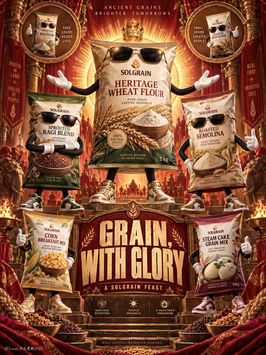
Theatrical Cannes-Level Ensemble Food Campaign Poster

Prompt for generating a Cannes-level luxury FMCG poster featuring anthropomorphic heritage grain food packages in a symmetrical, ceremonial stage hierarchy.

OpenAI

Source previews

These example images come from the original source. DROPIDEA has not independently tested these examples; results depend on the model and settings.

Ready to personalize

Your prompt

English

Replace the red variables with your information. Copy the full prompt and use it with your preferred agent.

TXT MD English version
An ensemble poster becomes iconic when the product hierarchy behaves like a stage. ✨ one central hero pack elevated on the vertical axis, framed by a radiant halo; secondary packs mirrored at lower scale on both sides The hero reads first as the lead figure. The range feels expansive without becoming a row of equally loud packages. 🪿 use ornate framing, medallions, and smoke ribbons as a symmetrical border system, leaving the pack fronts clean and unobstructed The decoration creates ceremony around the products instead of competing with their labels. The result feels mythic but still shelf-ready. GPT- image 2.5 prompt👇 A Cannes-level food campaign poster for fictional heritage grain brand SOLGRAIN, merging emotional spectacle, material precision, and curatorial symbolism into one unified image. Preserve the exact power of an ornate festival poster: a tall symmetrical vertical composition, deep red and burnt-orange ceremonial backdrop, carved ornamental framing, radiant halo behind the central hero product, curling smoke ribbons, circular medallion insets in the upper and lower corners, anthropomorphic food packages arranged like iconic brand characters, and one monumental headline block in the lower middle. The products must remain the absolute visual leaders. Build a premium ensemble of grain-based food packages turned into stylish anthropomorphic mascots, each keeping its real package form while gaining expressive arms, legs, gloves, shoes, and dark sunglasses. The central hero pack stands tallest and slightly elevated, arms open in a commanding celebratory gesture like the lead figure of a ritual procession. Surround it with secondary package characters in balanced symmetrical positions: crossed arms, confident hand gestures, and proud side stances. Use original English-only branding under the master brand “SOLGRAIN”, with variants such as “Heritage Wheat Flour”, “Sprouted Ragi Blend”, “Roasted Semolina”, “Corn Breakfast Mix”, and “Steam Cake Grain Mix”. Every package must feel hyperreal and premium, with crisp print, believable crinkles, tactile matte-plastic surface, sharp grain imagery, and strong shelf presence. The central hero pack is the largest and most saturated object, framed by a radiant golden halo that makes it feel mythic and celebratory. The upper circular medallions contain supporting package portraits like sacred product icons. The lower section includes two or three smaller product characters reinforcing the family range without competing with the hero. Keep the cast product-first, never generic cartoon. Their poses should feel witty, proud, bold, and fashion-aware while preserving edible grain credibility. Typography behaves like festival architecture. Create one huge original English headline in the lower center such as “GRAIN, WITH GLORY” or “TRADITION, TURNED LOUD”, using bold distressed condensed lettering with a slightly vintage screen-print feel. Add one short support line beneath it, such as “A SOLGRAIN FEAST”. Keep all text integrated into the vertical axis and never blocking the main package faces. The tone should feel like Orbit, Transit, and Port fused together: emotionally charged, materially exact, and culturally elevated into brand myth. Lighting is warm, sculptural, and premium: frontal hero key light on the main package, soft side separation on secondary characters, metallic glints on sunglasses and details, and controlled highlights across the packaging so every pack reads dimensional and tactile. Color hierarchy: 60% deep festive red, burnt orange, and ceremonial gold, 30% beige grain tones, wheat creams, and pack-specific accents, 10% black sunglasses, deep shadow definition, and tiny metallic highlights. Materials must feel exact and luxurious: crinkled package plastic, matte printed labels, visible grain kernels, flour imagery, embossed ornamental surfaces, velvet-like shadow pockets, glossy sunglasses, and subtle poster-surface texture. The final image should feel like a global FMCG masterpiece crossed with a ritual shrine poster and a fashion-ensemble campaign: bold, humorous, product-dominant, culturally rich, hyperreal, and graphically controlled. No copied brand names, no copied slogans, no human faces, no malformed limbs, no extra fingers, no warped packaging, no unreadable labels, no muddy shadows, no clutter that weakens the hero pack, no cheap cartoon feel.
Preview results

Your prompt

An ensemble poster becomes iconic when the product hierarchy behaves like a stage. ✨ one central hero pack elevated on the vertical axis, framed by a radiant halo; secondary packs mirrored at lower scale on both sides The hero reads first as the lead figure. The range feels expansive without becoming a row of equally loud packages. 🪿 use ornate framing, medallions, and smoke ribbons as a symmetrical border system, leaving the pack fronts clean and unobstructed The decoration creates ceremony around the products instead of competing with their labels. The result feels mythic but still shelf-ready. GPT- image 2.5 prompt👇 A Cannes-level food campaign poster for fictional heritage grain brand SOLGRAIN, merging emotional spectacle, material precision, and curatorial symbolism into one unified image. Preserve the exact power of an ornate festival poster: a tall symmetrical vertical composition, deep red and burnt-orange ceremonial backdrop, carved ornamental framing, radiant halo behind the central hero product, curling smoke ribbons, circular medallion insets in the upper and lower corners, anthropomorphic food packages arranged like iconic brand characters, and one monumental headline block in the lower middle. The products must remain the absolute visual leaders. Build a premium ensemble of grain-based food packages turned into stylish anthropomorphic mascots, each keeping its real package form while gaining expressive arms, legs, gloves, shoes, and dark sunglasses. The central hero pack stands tallest and slightly elevated, arms open in a commanding celebratory gesture like the lead figure of a ritual procession. Surround it with secondary package characters in balanced symmetrical positions: crossed arms, confident hand gestures, and proud side stances. Use original English-only branding under the master brand “SOLGRAIN”, with variants such as “Heritage Wheat Flour”, “Sprouted Ragi Blend”, “Roasted Semolina”, “Corn Breakfast Mix”, and “Steam Cake Grain Mix”. Every package must feel hyperreal and premium, with crisp print, believable crinkles, tactile matte-plastic surface, sharp grain imagery, and strong shelf presence. The central hero pack is the largest and most saturated object, framed by a radiant golden halo that makes it feel mythic and celebratory. The upper circular medallions contain supporting package portraits like sacred product icons. The lower section includes two or three smaller product characters reinforcing the family range without competing with the hero. Keep the cast product-first, never generic cartoon. Their poses should feel witty, proud, bold, and fashion-aware while preserving edible grain credibility. Typography behaves like festival architecture. Create one huge original English headline in the lower center such as “GRAIN, WITH GLORY” or “TRADITION, TURNED LOUD”, using bold distressed condensed lettering with a slightly vintage screen-print feel. Add one short support line beneath it, such as “A SOLGRAIN FEAST”. Keep all text integrated into the vertical axis and never blocking the main package faces. The tone should feel like Orbit, Transit, and Port fused together: emotionally charged, materially exact, and culturally elevated into brand myth. Lighting is warm, sculptural, and premium: frontal hero key light on the main package, soft side separation on secondary characters, metallic glints on sunglasses and details, and controlled highlights across the packaging so every pack reads dimensional and tactile. Color hierarchy: 60% deep festive red, burnt orange, and ceremonial gold, 30% beige grain tones, wheat creams, and pack-specific accents, 10% black sunglasses, deep shadow definition, and tiny metallic highlights. Materials must feel exact and luxurious: crinkled package plastic, matte printed labels, visible grain kernels, flour imagery, embossed ornamental surfaces, velvet-like shadow pockets, glossy sunglasses, and subtle poster-surface texture. The final image should feel like a global FMCG masterpiece crossed with a ritual shrine poster and a fashion-ensemble campaign: bold, humorous, product-dominant, culturally rich, hyperreal, and graphically controlled. No copied brand names, no copied slogans, no human faces, no malformed limbs, no extra fingers, no warped packaging, no unreadable labels, no muddy shadows, no clutter that weakens the hero pack, no cheap cartoon feel.

Variable guide

SOLGRAIN

Target or fictional brand master name

Brand name occurrences in the prompt

Example value

SOLGRAIN

GRAIN, WITH GLORY

Monumental festival headline at the bottom

Main headline text in the typography section

Example value

GRAIN, WITH GLORY

A SOLGRAIN FEAST

Supporting tagline beneath the main headline

Support line text in the typography section

Example value

A SOLGRAIN FEAST

What you get

  • A Cannes-caliber hyperrealistic ensemble poster with a ceremonial vertical composition.
  • Stylized anthropomorphic packaging characters with high shelf credibility and fashion flair.
  • Integrated vintage-modern festival typography and balanced theatrical lighting.

Use cases

  • Award-winning concept pitches and visual identity mood boards for FMCG brands.
  • Hero print advertising and billboard campaigns for food or lifestyle ranges.
  • Creative marketing visuals celebrating heritage or artisan food lines.

How to use

  • Copy the prompt and replace the brand name and headline copy with your own.
  • Keep the architectural composition rules and lighting balance intact for best results.
  • Run the prompt in your preferred modern image generation model.

Related prompts