Skip to content
ImagesFree

Refined Architectural Travel Postcard and Print

Generate sophisticated, museum-quality architectural travel postcards using detailed pen-and-ink linework, minimal flat color palettes, and archival layouts.

OpenAI

Source previews

These example images come from the original source. DROPIDEA has not independently tested these examples; results depend on the model and settings.

Ready to personalize

Your prompt

English

Replace the red variables with your information. Copy the full prompt and use it with your preferred agent.

TXT MD English version
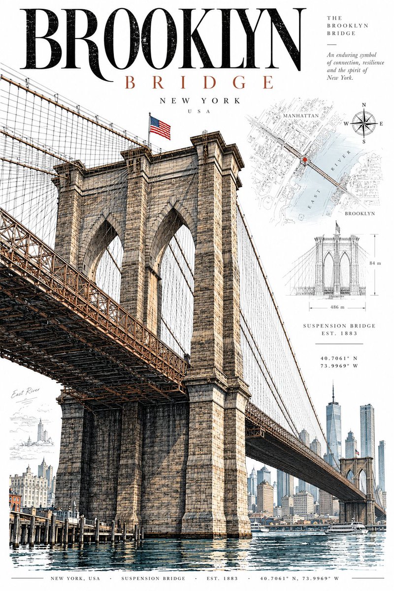
DESTINATION: [DESTINATION] Create a sophisticated vertical 2:3 architectural travel postcard featuring [DESTINATION]. STYLE Premium contemporary editorial postcard with subtle vintage influence. Combine precise architectural pen-and-ink illustration, restrained travel graphics, archival details, and modern graphic design. The result should feel cultured, timeless, architectural, and collectible—not like a tourist souvenir. MAIN SUBJECT Feature ONE iconic building, monument, structure, street façade, or architectural landmark strongly associated with [DESTINATION]. Make it the clear visual hero, shown from a believable three-quarter or slightly dramatic architectural perspective. No landmark collage. ILLUSTRATION Use exceptionally fine black or dark graphite linework, detailed architectural hatching, accurate proportions, and subtle hand-drawn imperfections. Include recognizable structural details such as windows, façades, roofs, columns, or ornaments where appropriate. COLOR Keep much of the architecture as line art with selective flat color using only 2–4 destination-specific tones. Colors should be sophisticated and slightly muted. Avoid gradients, glossy rendering, photorealism, excessive beige, and muddy sepia. BACKGROUND Use a clean pure white background with subtle archival elements such as faint maps, street plans, coordinates, contour lines, architectural diagrams, or minimal local-language annotations. Keep these elements secondary and lightly faded. COMPOSITION Vertical 2:3 format, with the landmark occupying roughly 60–75% of the artwork. Use generous negative space and an asymmetric editorial layout. Allow tasteful cropping when it improves the composition. TYPOGRAPHY Add restrained typography: [LOCAL NAME] [DESTINATION] Use elegant architectural or museum-catalogue-inspired typography. Add a tiny bottom information strip with relevant details such as CITY / COUNTRY · ARCHITECTURE · EST. YEAR · COORDINATES. DETAILS & MOOD Add only a few tiny contextual elements—people, bicycles, trees, lamps, vehicles, or street details—when appropriate, mainly to establish scale. Mood: quiet urban sophistication, cultural authenticity, history, and refined design. AVOID Tourist clichés, cartoon styling, fake architecture, landmark collages, giant typography, excessive decoration, heavy vintage filters, fake stamps, clutter, 3D rendering, and unnecessary text. FINAL GOAL: A timeless, highly detailed, premium architectural postcard that feels like a museum-shop collectible or contemporary design print.
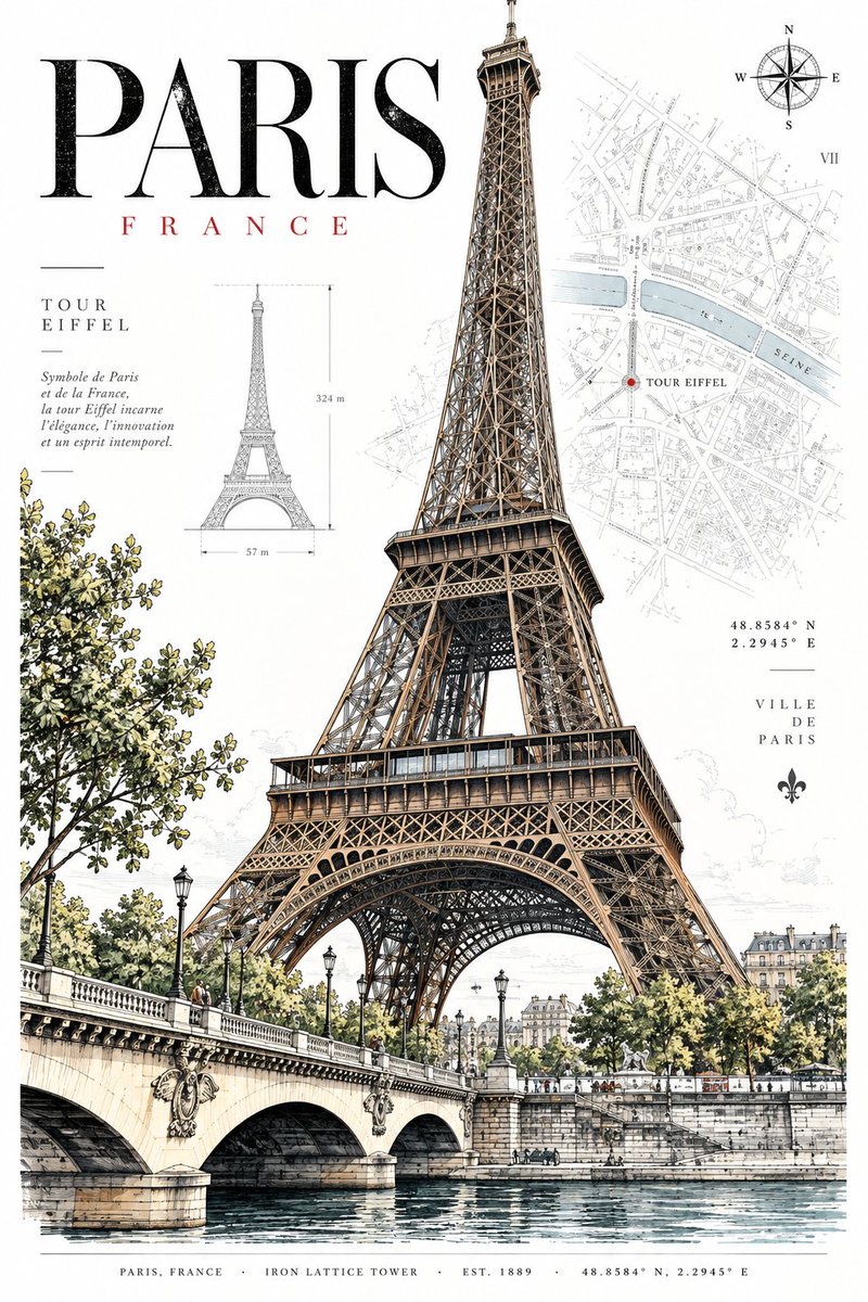
Preview results

Your prompt

DESTINATION: [DESTINATION] Create a sophisticated vertical 2:3 architectural travel postcard featuring [DESTINATION]. STYLE Premium contemporary editorial postcard with subtle vintage influence. Combine precise architectural pen-and-ink illustration, restrained travel graphics, archival details, and modern graphic design. The result should feel cultured, timeless, architectural, and collectible—not like a tourist souvenir. MAIN SUBJECT Feature ONE iconic building, monument, structure, street façade, or architectural landmark strongly associated with [DESTINATION]. Make it the clear visual hero, shown from a believable three-quarter or slightly dramatic architectural perspective. No landmark collage. ILLUSTRATION Use exceptionally fine black or dark graphite linework, detailed architectural hatching, accurate proportions, and subtle hand-drawn imperfections. Include recognizable structural details such as windows, façades, roofs, columns, or ornaments where appropriate. COLOR Keep much of the architecture as line art with selective flat color using only 2–4 destination-specific tones. Colors should be sophisticated and slightly muted. Avoid gradients, glossy rendering, photorealism, excessive beige, and muddy sepia. BACKGROUND Use a clean pure white background with subtle archival elements such as faint maps, street plans, coordinates, contour lines, architectural diagrams, or minimal local-language annotations. Keep these elements secondary and lightly faded. COMPOSITION Vertical 2:3 format, with the landmark occupying roughly 60–75% of the artwork. Use generous negative space and an asymmetric editorial layout. Allow tasteful cropping when it improves the composition. TYPOGRAPHY Add restrained typography: [LOCAL NAME] [DESTINATION] Use elegant architectural or museum-catalogue-inspired typography. Add a tiny bottom information strip with relevant details such as CITY / COUNTRY · ARCHITECTURE · EST. YEAR · COORDINATES. DETAILS & MOOD Add only a few tiny contextual elements—people, bicycles, trees, lamps, vehicles, or street details—when appropriate, mainly to establish scale. Mood: quiet urban sophistication, cultural authenticity, history, and refined design. AVOID Tourist clichés, cartoon styling, fake architecture, landmark collages, giant typography, excessive decoration, heavy vintage filters, fake stamps, clutter, 3D rendering, and unnecessary text. FINAL GOAL: A timeless, highly detailed, premium architectural postcard that feels like a museum-shop collectible or contemporary design print.

Variable guide

[DESTINATION]

The name of the target city or travel destination

First line of prompt and within landmark/typography sections

Example value

Kyoto, Japan

[LOCAL NAME]

The local-language or native name of the destination or landmark

Inside the TYPOGRAPHY section

Example value

京都

What you get

  • Detailed pen-and-ink architectural illustration with precise perspective.
  • Editorial museum-gift-shop style composition with archival background touches.
  • Restrained, curated flat color palette of 2–4 destination-specific tones.
  • Clean, elegant graphic layout with understated typographical hierarchy.

Use cases

  • Designing collectible postcard sets and art prints for retail.
  • Editorial illustrations for boutique travel guides and architecture magazines.
  • Branding and visual identity collateral for hospitality and cultural heritage.

How to use

  • Replace [DESTINATION] with your target city or architectural location.
  • Replace [LOCAL NAME] with the local or native script name of the landmark or city in the typography section.
  • Set your image generator aspect ratio to 2:3 vertical for optimal framing.
  • Run the prompt to generate a museum-grade archival travel postcard print.

Related prompts