Skip to content
ImagesFree

Cinematic Forced-Perspective Newspaper Food Campaign Poster

A premium commercial advertising prompt blending golden-hour street photography with a high-end food discount poster embedded on a newspaper via forced perspective, delivered by a cyclist.

OpenAI

Source previews

These example images come from the original source. DROPIDEA has not independently tested these examples; results depend on the model and settings.

Ready to personalize

Your prompt

English

Replace the red variables with your information. Copy the full prompt and use it with your preferred agent.

TXT MD English version
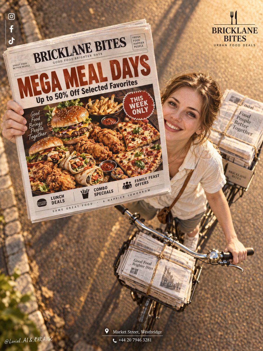
The newspaper works because it is not a prop—it is the poster inside the poster. 🗞️ newspaper lifted toward the lens in the upper-left center, enlarged by forced perspective, with the rider and bicycle receding diagonally behind it The promotion reads before the street scene. You get a believable delivery moment without sacrificing the food offer’s legibility. 🍔 treat the newspaper front page as a complete food-ad layout: one oversized headline, one hero platter, one compact urgency badge This keeps the offer instantly scannable even at a distance. The print feels like a real promotional object, not texture pasted over a photograph. GPT- image 2.5 prompt👇 A premium restaurant promotion poster for fictional dining brand BRICKLANE BITES, merging street charm, material precision, and graphic clarity into one image. Preserve the exact structure: a dramatic high-angle overhead view of a bicycle moving along a warm sunlit road, an adult Western white girl looking up and smiling while extending a newspaper directly toward the camera, tied newspaper bundles on the bicycle, a small brand mark in the upper right, a clean vertical social-icon strip in the upper left, and a centered address block near the bottom. The newspaper front page remains the absolute visual leader. The girl is photoreal, adult, naturally attractive, and believable, with realistic skin texture, subtle pores, natural lips, soft facial structure, correct head-neck-shoulder proportion, elegant hands with five normal fingers, believable wrists and elbows, natural posture, and no distortion. She wears a simple light cream short-sleeve shirt with relaxed summer styling, authentic rather than fashion-forward. She rides the bicycle and looks up with a bright persuasive smile, but stays secondary to the newspaper and its promotion. The camera angle is critical: a top-down three-quarter overhead shot, with the bicycle diagonally crossing the lower right quadrant and the newspaper lifted toward the lens in the upper-left-central area, creating a bold forced-perspective moment. The road is warm and glowing with golden-hour sunlight, long soft shadows, subtle edge stones, and clean depth. The bicycle is classic and practical, with realistic metal handlebars, front tied bundles, rear stacks of paper, and believable weight balance. The whole image should feel like Orbit, Transit, and Port fused together: emotionally inviting, materially exact, and graphically elevated. The newspaper front page is fully redesigned in English as a restaurant mega-discount promotion. Use a bold premium food-ad layout with a large appetizing hero spread of burgers, fried chicken, loaded fries, wraps, and pizza slices arranged in a dramatic overhead tray or platter, with rich warm highlights, crisp fried texture, glossy sauces, and irresistible realism. Use one giant original English headline such as “MEGA MEAL DAYS” or “BIG BITES, SMALLER PRICES”, plus one strong support line such as “Up to 50% Off Selected Favorites”. Add only a few smaller clean sub-lines like “Lunch Deals”, “Combo Specials”, “Family Feast Offers”, and one compact badge like “This Week Only”. Keep the newspaper typography sharp, readable, premium, and uncluttered. Branding is minimal and elegant. Upper right: a clean BRICKLANE BITES logo with a short descriptor such as “Urban Food Deals”. Upper left: minimal social icons aligned vertically. Bottom center: one refined English address-and-contact block such as “Market Street, Westbridge” and one phone line. Outside the newspaper, keep text restrained so the printed promo page carries most of the communication. Lighting is warm, cinematic, and commercially precise: golden-hour key light from the upper side, soft facial glow on the girl, crisp highlights on the newspaper edges, readable print contrast, gentle metallic reflections on the bicycle handlebar, and strong volume without muddy shadows or clutter. Color hierarchy: 55% warm amber road and sunlight, 25% cream and white newspaper tones, 20% rich food colors including red, golden brown, lettuce green, and sauce accents. Materials must feel hyperreal and tactile: printed paper grain, folded newspaper edges, twine-bound stacks, metal bicycle parts, realistic skin, cotton shirt fabric, crisp fried crust, glossy sauces, and clean commercial food photography embedded in the newspaper design. The final image should feel like a Cannes-level food-promo campaign fused with a street-distribution photograph: persuasive, warm, premium, clean, and highly readable.
Preview results

Your prompt

The newspaper works because it is not a prop—it is the poster inside the poster. 🗞️ newspaper lifted toward the lens in the upper-left center, enlarged by forced perspective, with the rider and bicycle receding diagonally behind it The promotion reads before the street scene. You get a believable delivery moment without sacrificing the food offer’s legibility. 🍔 treat the newspaper front page as a complete food-ad layout: one oversized headline, one hero platter, one compact urgency badge This keeps the offer instantly scannable even at a distance. The print feels like a real promotional object, not texture pasted over a photograph. GPT- image 2.5 prompt👇 A premium restaurant promotion poster for fictional dining brand BRICKLANE BITES, merging street charm, material precision, and graphic clarity into one image. Preserve the exact structure: a dramatic high-angle overhead view of a bicycle moving along a warm sunlit road, an adult Western white girl looking up and smiling while extending a newspaper directly toward the camera, tied newspaper bundles on the bicycle, a small brand mark in the upper right, a clean vertical social-icon strip in the upper left, and a centered address block near the bottom. The newspaper front page remains the absolute visual leader. The girl is photoreal, adult, naturally attractive, and believable, with realistic skin texture, subtle pores, natural lips, soft facial structure, correct head-neck-shoulder proportion, elegant hands with five normal fingers, believable wrists and elbows, natural posture, and no distortion. She wears a simple light cream short-sleeve shirt with relaxed summer styling, authentic rather than fashion-forward. She rides the bicycle and looks up with a bright persuasive smile, but stays secondary to the newspaper and its promotion. The camera angle is critical: a top-down three-quarter overhead shot, with the bicycle diagonally crossing the lower right quadrant and the newspaper lifted toward the lens in the upper-left-central area, creating a bold forced-perspective moment. The road is warm and glowing with golden-hour sunlight, long soft shadows, subtle edge stones, and clean depth. The bicycle is classic and practical, with realistic metal handlebars, front tied bundles, rear stacks of paper, and believable weight balance. The whole image should feel like Orbit, Transit, and Port fused together: emotionally inviting, materially exact, and graphically elevated. The newspaper front page is fully redesigned in English as a restaurant mega-discount promotion. Use a bold premium food-ad layout with a large appetizing hero spread of burgers, fried chicken, loaded fries, wraps, and pizza slices arranged in a dramatic overhead tray or platter, with rich warm highlights, crisp fried texture, glossy sauces, and irresistible realism. Use one giant original English headline such as “MEGA MEAL DAYS” or “BIG BITES, SMALLER PRICES”, plus one strong support line such as “Up to 50% Off Selected Favorites”. Add only a few smaller clean sub-lines like “Lunch Deals”, “Combo Specials”, “Family Feast Offers”, and one compact badge like “This Week Only”. Keep the newspaper typography sharp, readable, premium, and uncluttered. Branding is minimal and elegant. Upper right: a clean BRICKLANE BITES logo with a short descriptor such as “Urban Food Deals”. Upper left: minimal social icons aligned vertically. Bottom center: one refined English address-and-contact block such as “Market Street, Westbridge” and one phone line. Outside the newspaper, keep text restrained so the printed promo page carries most of the communication. Lighting is warm, cinematic, and commercially precise: golden-hour key light from the upper side, soft facial glow on the girl, crisp highlights on the newspaper edges, readable print contrast, gentle metallic reflections on the bicycle handlebar, and strong volume without muddy shadows or clutter. Color hierarchy: 55% warm amber road and sunlight, 25% cream and white newspaper tones, 20% rich food colors including red, golden brown, lettuce green, and sauce accents. Materials must feel hyperreal and tactile: printed paper grain, folded newspaper edges, twine-bound stacks, metal bicycle parts, realistic skin, cotton shirt fabric, crisp fried crust, glossy sauces, and clean commercial food photography embedded in the newspaper design. The final image should feel like a Cannes-level food-promo campaign fused with a street-distribution photograph: persuasive, warm, premium, clean, and highly readable.

Variable guide

BRICKLANE BITES

Brand or restaurant name used in logos and copy

In the branding and upper-right logo specification sections

Example value

BRICKLANE BITES

MEGA MEAL DAYS

Primary bold promotional headline on the newspaper cover

Inside the newspaper front-page layout description

Example value

MEGA MEAL DAYS

Up to 50% Off Selected Favorites

Secondary supporting discount copy or tagline

Supporting headline text inside the newspaper section

Example value

Up to 50% Off Selected Favorites

Market Street, Westbridge

Contact and location details placed at the bottom

Within the bottom contact and address block specification

Example value

Market Street, Westbridge

What you get

  • An innovative composition embedding a detailed food ad within a candid golden-hour street scene.
  • A dramatic forced-perspective visual trick that elevates offer readability above the background action.
  • Cannes-grade commercial advertising aesthetics with tactile paper textures, crispy food details, and realistic anatomy.

Use cases

  • Social media feed and story campaigns for premium fast-casual restaurant promotions.
  • Hero banners, out-of-home (OOH) concepts, and print posters for weekly food discounts.
  • Creative pitch decks and advertising moodboards for restaurant chains and branding agencies.

How to use

  • Copy the full prompt into your preferred AI image generator (such as GPT Image or Midjourney).
  • Customize the brand name, headlines, and discount copy inside the quotation marks to match your specific dining offer.
  • Keep the forced-perspective angle instructions, overhead framing, and 55/25/20 color distribution intact for best visual impact.
  • Generate the image and inspect newspaper typography sharpness and golden-hour lighting integration.

Related prompts