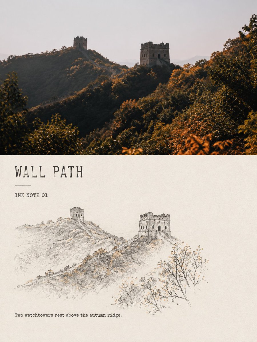
Create a separate "Minimalist Ink-Line Landscape Note" comparison poster for each of my uploaded travel photos. Do not combine multiple images into one composition; output each photo individually.
Use a 3:4 vertical layout overall, clearly preserving the visual comparison of "original photo on top, style reinterpretation below." The upper and lower zones may naturally adjust their proportion according to the content of the source image; a strict 50/50 split is not required, but the boundary between the two parts must be unambiguous and the reading relationship must be clear, and together they must form one complete editorial design piece.
The upper section preserves the original photo in high fidelity: retain the location, subject, architectural structure, human posture, natural light and shadow, spatial depth, and original color atmosphere. Do not replace the scene, alter key objects, distort the subject, or fabricate landmarks not present in the original. Apply only light, restrained magazine-photography color grading. If needed to fit the canvas, naturally extend the sky, water surface, ground, or environmental background.
The lower section uses a warm off-white or natural paper-white as a complete ground, distilling the photo into a reduced minimalist ink-line landscape sketch. Do not copy the original image in full, and do not render the entire frame with uniform line work. Instead, actively curate only the few most recognizable and poetic pieces of information from the image, such as: one architectural or landform structural anchor, one ridgeline or waterline, one plant with clear posture, one small figure or one travel object, and one to two atmospheric or spatial cues.
Remove unrelated crowds, cluttered vegetation, repetitive architecture, and trivial background details. The reinterpreted subject should occupy approximately 38%–62% of the lower zone's width, leaving approximately 55%–72% of continuous, complete, perceptible paper-white.
Lines should use black or deep gray-black with the texture of a fine pen, dry ink, and slight brush fly-white (skipped strokes): allow variation in thickness, pauses, broken strokes, paper tooth, ink bleed, and unclosed contours, so that the result reads like a quick but accurate observation sketch made during travel.
Rely on a small number of structural lines to convey architectural proportion; for peaks and distant scenery keep only sparse contours; water surface, mist, sky, and distance should be expressed primarily through reserved paper-white. Do not depict leaves one by one on plants; express posture through branch direction and a very few ink dots. Avoid large-area gray washes; avoid rendering this as a fully finished traditional landscape painting or a precise architectural drawing.
The palette is dominated by black ink. Only allow at most two small-area accent colors extracted from the original photo, such as cinnabar red, autumn-leaf ochre, lotus pale pink, moss gray-green, or fishing-net warm yellow. The total accent area must not exceed 8% of the lower canvas, placed only at the single most memorable detail. Do not apply watercolor fills, colored outlines, or high-saturation decoration.
Typography should resemble the running head and image caption of a small travel publication: few in number but clearly legible. Generate a short English title based on the photo's content, paired with the numbered field "INK NOTE 01" and a very short English observation sentence.
The title may use a restrained serif, typewriter-style, or slightly hand-printed face with minor irregularity. Place text in the main reserved-paper-white area, maintaining breathing distance from the illustration; do not overlap the subject. Do not use ornate calligraphy, and do not generate Chinese seals, author signatures, brand names, or watermarks. Only the title, number, and observation sentence change between images; the overall layout and typographic feel must remain consistent.
The final frame should present a clear comparison between real travel photography and a light ink-line observation sketch: quiet, restrained, spacious, like a single page taken from an independent travel journal, an architectural observation booklet, or a private sketchbook. The point is not to show off technique, but through subtraction, stopped brushstrokes, and reserved paper-white, to let the location, weather, or brief action in the original photo...