Skip to content
ImagesFree

Luxury Four-Panel Eyewear Editorial Campaign Poster

Prompt for generating a Cannes-level 2x2 four-panel luxury eyewear editorial poster with crimson and pale-grey tones, glass overlays, and architectural typography.

OpenAI

Source previews

These example images come from the original source. DROPIDEA has not independently tested these examples; results depend on the model and settings.

Ready to personalize

Your prompt

English

Replace the red variables with your information. Copy the full prompt and use it with your preferred agent.

TXT MD English version
The strongest eyewear boards don’t repeat one image—they repeat one lens through four different conditions. 🪞 Use one recognizable eyewear silhouette across speed, rain-filtered glass, city reflection, and tight facial crops. The campaign gains range without losing product recall. 🟥 Let red blocks interrupt the close-up only where they frame the lens, eye, or type. Fragmentation then feels like a visual point of view—not decoration. GPT- image 2.5 prompt👇 Create a premium four-panel editorial fashion poster for a fictional international luxury eyewear house named PRISM NOIR, designed as a single square 2x2 grid composition with razor-clean panel divisions and a strict gallery-magazine layout. The campaign must feel like a Cannes-level fashion key visual, a collectible art-zine cover system, and a product-led optical advertisement at the same time. Preserve the reference logic as pure visual structure only, but compress it into four stronger, more distilled panels: alternating crimson and pale-grey tonal worlds, blurred and sharp portrait contrasts, frosted-glass overlays, face fragment crops, urban double exposure, giant typography, and cold editorial spacing. The true product hero is one consistent eyewear family repeated across all four panels: sculptural luxury optical pieces with translucent smoke lenses, pale silver titanium temples, refined frameless or semi-rimless geometry, subtle mirror glare, precise hinge engineering, and expensive fashion-tech presence. The eyewear must appear across every panel as the recurring identity anchor, sometimes fully visible, sometimes partially obscured by blur, crop, reflection, or masking, but always clearly the defining object of the campaign. The eyewear should feel like a prestige design artifact, not generic sunglasses. Top-left panel: a deep lacquer-red motion portrait with a mature female model in side profile moving through soft horizontal blur, the eyewear catching a thin silver highlight while the face remains elegant and partially smeared by speed. The panel should communicate urban velocity and psychological distance. Integrate one giant vertical or stacked word such as "VELOCITY" or "STATIC" in bold condensed uppercase, but keep it sparse and architectural. Top-right panel: a cool pale-grey portrait behind a frosted-glass plane, the model facing slightly upward or toward camera, wearing the hero eyewear with refined lens reflection and softened facial edges. The glass haze, reflection bands, and optical distortion should make the face feel half-visible, as if seen through a veil of light. Place one large typographic word such as "PRISM" or "GLAZE" across the lower or central area, with only minimal supporting microtype if absolutely needed. Bottom-left panel: a monochrome-to-grey urban double-exposure silhouette where the outline of a woman wearing the eyewear contains city streets, windows, architectural voids, and distant traffic glow. The body becomes a vessel for metropolitan memory and emotional isolation. Keep the eyewear readable within the silhouette logic. Add one short editorial headline such as "LOST IN THE STATIC" or "CITY INSIDE" in a controlled, sparse typographic system. Bottom-right panel: a red-and-grey fragmented face composition where the portrait is divided into geometric mask blocks or vertical strips, revealing different parts of the face, lens, eye, mouth, and skin texture. This is the most graphic and curatorially sharpened panel, combining close-up beauty realism with rigid editorial construction. The eyewear should sit at the center of the visual disruption, becoming the line between identity and abstraction. Use one bold short word such as "HER", "AFTERIMAGE", or "STATE" as the typographic anchor. Across all four panels, the models are real mature women with correct anatomy, refined fashion-editorial features, believable skin texture, natural lips, accurate eyes, elegant neck-shoulder proportion, and no plastic smoothing. Hair can vary subtly between panels but must stay within one coherent cold-fashion world: sleek bob, controlled wet strands, or soft studio flyaways. If hands appear, they must be anatomically correct with five fingers and elegant gesture logic. Emotion across the board is controlled alienation, optical seduction, urban intimacy, and self-possession. Color hierarchy: 40% saturated crimson, lacquer red, and deep vermilion; 35% pale paper-grey, stone-beige, and cold silver haze; 15% black, charcoal, and urban shadow; 10% white typography and chrome-silver eyewear highlights. Lighting must shift between soft editorial daylight, neon-reflected blur, frosted studio glow, and low urban contrast, but stay unified through cool luxury grading. Typography must behave as graphic architecture, not ad copy: giant condensed uppercase, sparse microtext, vertical index-like labels, and a few short editorial fragments only. All visible text must be newly invented in English only, crisp and beautiful, integrated into the composition flow, and never crudely pasted over the eyes or the core eyewear silhouette. Material semantics must be explicit and high-end: glass haze, mirrored lens glare, titanium temple sheen, skin pores, paper grain, print dust, urban window reflections, mask edges, and soft analogue blur. The overall result must feel like a world-class fashion-optics campaign where the product is not isolated from the image world but becomes the visual language of memory, city, identity, and refraction. Quality control and exclusion constraints: photoreal fashion-editorial realism only, no cartoon styling, no warped eyewear geometry, no floating temples, no broken hinge logic, no distorted face, no asymmetrical eyes, no duplicated facial features, no plastic skin, no unreadable typography, no random letters, no cheap glitch effects, no muddy red, no cluttered layout, no style drift, no AI slop, no real person names, no brand plagiarism, no hand deformity, no extra fingers, no missing fingers, no fused fingers.
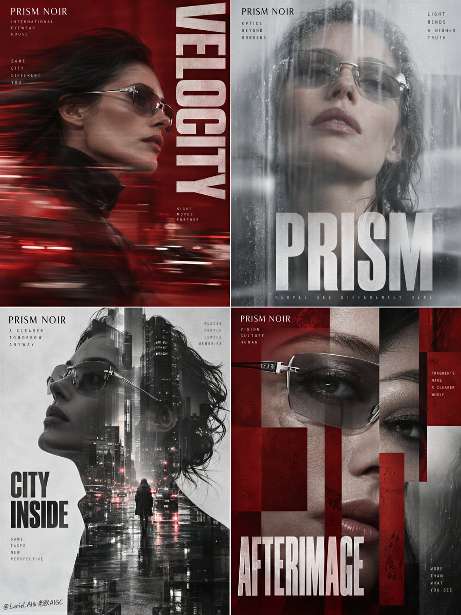
Preview results

Your prompt

The strongest eyewear boards don’t repeat one image—they repeat one lens through four different conditions. 🪞 Use one recognizable eyewear silhouette across speed, rain-filtered glass, city reflection, and tight facial crops. The campaign gains range without losing product recall. 🟥 Let red blocks interrupt the close-up only where they frame the lens, eye, or type. Fragmentation then feels like a visual point of view—not decoration. GPT- image 2.5 prompt👇 Create a premium four-panel editorial fashion poster for a fictional international luxury eyewear house named PRISM NOIR, designed as a single square 2x2 grid composition with razor-clean panel divisions and a strict gallery-magazine layout. The campaign must feel like a Cannes-level fashion key visual, a collectible art-zine cover system, and a product-led optical advertisement at the same time. Preserve the reference logic as pure visual structure only, but compress it into four stronger, more distilled panels: alternating crimson and pale-grey tonal worlds, blurred and sharp portrait contrasts, frosted-glass overlays, face fragment crops, urban double exposure, giant typography, and cold editorial spacing. The true product hero is one consistent eyewear family repeated across all four panels: sculptural luxury optical pieces with translucent smoke lenses, pale silver titanium temples, refined frameless or semi-rimless geometry, subtle mirror glare, precise hinge engineering, and expensive fashion-tech presence. The eyewear must appear across every panel as the recurring identity anchor, sometimes fully visible, sometimes partially obscured by blur, crop, reflection, or masking, but always clearly the defining object of the campaign. The eyewear should feel like a prestige design artifact, not generic sunglasses. Top-left panel: a deep lacquer-red motion portrait with a mature female model in side profile moving through soft horizontal blur, the eyewear catching a thin silver highlight while the face remains elegant and partially smeared by speed. The panel should communicate urban velocity and psychological distance. Integrate one giant vertical or stacked word such as "VELOCITY" or "STATIC" in bold condensed uppercase, but keep it sparse and architectural. Top-right panel: a cool pale-grey portrait behind a frosted-glass plane, the model facing slightly upward or toward camera, wearing the hero eyewear with refined lens reflection and softened facial edges. The glass haze, reflection bands, and optical distortion should make the face feel half-visible, as if seen through a veil of light. Place one large typographic word such as "PRISM" or "GLAZE" across the lower or central area, with only minimal supporting microtype if absolutely needed. Bottom-left panel: a monochrome-to-grey urban double-exposure silhouette where the outline of a woman wearing the eyewear contains city streets, windows, architectural voids, and distant traffic glow. The body becomes a vessel for metropolitan memory and emotional isolation. Keep the eyewear readable within the silhouette logic. Add one short editorial headline such as "LOST IN THE STATIC" or "CITY INSIDE" in a controlled, sparse typographic system. Bottom-right panel: a red-and-grey fragmented face composition where the portrait is divided into geometric mask blocks or vertical strips, revealing different parts of the face, lens, eye, mouth, and skin texture. This is the most graphic and curatorially sharpened panel, combining close-up beauty realism with rigid editorial construction. The eyewear should sit at the center of the visual disruption, becoming the line between identity and abstraction. Use one bold short word such as "HER", "AFTERIMAGE", or "STATE" as the typographic anchor. Across all four panels, the models are real mature women with correct anatomy, refined fashion-editorial features, believable skin texture, natural lips, accurate eyes, elegant neck-shoulder proportion, and no plastic smoothing. Hair can vary subtly between panels but must stay within one coherent cold-fashion world: sleek bob, controlled wet strands, or soft studio flyaways. If hands appear, they must be anatomically correct with five fingers and elegant gesture logic. Emotion across the board is controlled alienation, optical seduction, urban intimacy, and self-possession. Color hierarchy: 40% saturated crimson, lacquer red, and deep vermilion; 35% pale paper-grey, stone-beige, and cold silver haze; 15% black, charcoal, and urban shadow; 10% white typography and chrome-silver eyewear highlights. Lighting must shift between soft editorial daylight, neon-reflected blur, frosted studio glow, and low urban contrast, but stay unified through cool luxury grading. Typography must behave as graphic architecture, not ad copy: giant condensed uppercase, sparse microtext, vertical index-like labels, and a few short editorial fragments only. All visible text must be newly invented in English only, crisp and beautiful, integrated into the composition flow, and never crudely pasted over the eyes or the core eyewear silhouette. Material semantics must be explicit and high-end: glass haze, mirrored lens glare, titanium temple sheen, skin pores, paper grain, print dust, urban window reflections, mask edges, and soft analogue blur. The overall result must feel like a world-class fashion-optics campaign where the product is not isolated from the image world but becomes the visual language of memory, city, identity, and refraction. Quality control and exclusion constraints: photoreal fashion-editorial realism only, no cartoon styling, no warped eyewear geometry, no floating temples, no broken hinge logic, no distorted face, no asymmetrical eyes, no duplicated facial features, no plastic skin, no unreadable typography, no random letters, no cheap glitch effects, no muddy red, no cluttered layout, no style drift, no AI slop, no real person names, no brand plagiarism, no hand deformity, no extra fingers, no missing fingers, no fused fingers.

Variable guide

PRISM NOIR

Fictional luxury eyewear brand name

In the first paragraph introducing the luxury house

Example value

PRISM NOIR

VELOCITY

Primary typography word for the top-left panel

In the top-left panel description

Example value

VELOCITY

STATIC

Alternative typography word for the top-left panel

In the top-left panel description

Example value

STATIC

PRISM

Primary typography word for the top-right panel

In the top-right panel description

Example value

PRISM

GLAZE

Alternative typography word for the top-right panel

In the top-right panel description

Example value

GLAZE

LOST IN THE STATIC

Primary editorial headline for the bottom-left panel

In the bottom-left panel description

Example value

LOST IN THE STATIC

CITY INSIDE

Alternative editorial headline for the bottom-left panel

In the bottom-left panel description

Example value

CITY INSIDE

HER

Primary typographic anchor word for the bottom-right panel

In the bottom-right panel description

Example value

HER

AFTERIMAGE

Second alternative typographic anchor word for the bottom-right panel

In the bottom-right panel description

Example value

AFTERIMAGE

STATE

Third alternative typographic anchor word for the bottom-right panel

In the bottom-right panel description

Example value

STATE

What you get

  • A premium 2x2 four-panel fashion poster with razor-sharp editorial magazine divisions.
  • A unified hero eyewear silhouette rendered across four distinct artistic conditions.
  • Integrated architectural typography and a disciplined palette of crimson, pale grey, and titanium sheen.

Use cases

  • Key visual campaign concepts for luxury fashion and eyewear brands.
  • High-fashion editorial spreads, art-zine covers, and boutique print posters.
  • Creative direction mood boards for avant-garde photography and product advertising.

How to use

  • Copy the entire prompt text directly into your GPT-image-enabled model.
  • Optionally replace the brand name and suggested typographic anchor words to match your custom concept.
  • Set the aspect ratio to 1:1 square to maintain the strict 2x2 grid balance.
  • Keep the material fidelity and color percentage instructions intact to achieve high-end editorial results.

Related prompts