Skip to content
ImagesFree

Premium 4:5 Vertical Handcrafted Travel Poster

Template for a premium travel poster in the established "Cities Made by Hand" style, featuring a layered paper city, a sculpted clay transport icon, and a human story for any chosen location.

OpenAI

Source previews

These example images come from the original source. DROPIDEA has not independently tested these examples; results depend on the model and settings.
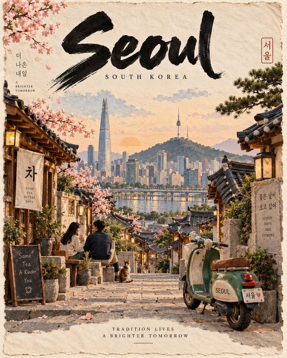
Ready to personalize

Your prompt

English

Replace the red variables with your information. Copy the full prompt and use it with your preferred agent.

TXT MD English version
Create a premium 4:5 vertical handcrafted travel poster for [LOCATION], following the established “Cities Made by Hand” visual style. Automatically interpret the location through its most iconic architecture, landscape, streetscape, culture, transportation, vegetation, and atmosphere, creating one cohesive cinematic scene rather than a landmark collage. TYPOGRAPHY: Large expressive black hand-painted CITY NAME at the top, small widely tracked COUNTRY NAME beneath, and a short poetic tagline specific to [LOCATION] at the bottom. Keep this hierarchy consistent across the series. PAPER WORLD: Build the city as a sophisticated handcrafted miniature using layered paper, visible grain, cut-paper depth, deckled edges, restrained watercolor, fine black architectural ink lines, physical micro-shadows, and subtle handmade imperfections. Premium editorial craftsmanship—not children's papercraft or CGI. CLAY ICON: Feature the most recognizable local mode of transport as a hand-sculpted clay miniature. Give it tactile surfaces, subtle fingerprints, slight asymmetry, soft handmade edges, realistic contact shadows, and a distinctive color accent. This is the recurring collectible signature of the series. HUMAN STORY: Include 1–2 naturally styled, expressive human figures interacting with the environment. Keep them realistic and not clay. COMPOSITION: Top — typography. Midground — iconic local landmark or landscape anchor. Sides — layered architecture and streetscape. Foreground — tactile street, path, square, or waterfront. One side — human story. Opposite side — clay transport icon. Add one authentic local foreground object. Use authentic location-specific details and a restrained natural palette. Maintain the permanent hierarchy: PAPER WORLD → CLAY ICON → HUMAN STORY The result must feel premium, collectible, cinematic, tactile, editorial, handcrafted, and globally consistent with the New York, London, Mumbai, and Cape Town posters, while allowing [LOCATION] to define its own architecture, colors, climate, culture, and atmosphere. Avoid: generic tourist clichés, AI gloss, photorealistic CGI, clutter, plastic-looking paper, or inconsistent materials.
Preview results

Your prompt

Create a premium 4:5 vertical handcrafted travel poster for [LOCATION], following the established “Cities Made by Hand” visual style. Automatically interpret the location through its most iconic architecture, landscape, streetscape, culture, transportation, vegetation, and atmosphere, creating one cohesive cinematic scene rather than a landmark collage. TYPOGRAPHY: Large expressive black hand-painted CITY NAME at the top, small widely tracked COUNTRY NAME beneath, and a short poetic tagline specific to [LOCATION] at the bottom. Keep this hierarchy consistent across the series. PAPER WORLD: Build the city as a sophisticated handcrafted miniature using layered paper, visible grain, cut-paper depth, deckled edges, restrained watercolor, fine black architectural ink lines, physical micro-shadows, and subtle handmade imperfections. Premium editorial craftsmanship—not children's papercraft or CGI. CLAY ICON: Feature the most recognizable local mode of transport as a hand-sculpted clay miniature. Give it tactile surfaces, subtle fingerprints, slight asymmetry, soft handmade edges, realistic contact shadows, and a distinctive color accent. This is the recurring collectible signature of the series. HUMAN STORY: Include 1–2 naturally styled, expressive human figures interacting with the environment. Keep them realistic and not clay. COMPOSITION: Top — typography. Midground — iconic local landmark or landscape anchor. Sides — layered architecture and streetscape. Foreground — tactile street, path, square, or waterfront. One side — human story. Opposite side — clay transport icon. Add one authentic local foreground object. Use authentic location-specific details and a restrained natural palette. Maintain the permanent hierarchy: PAPER WORLD → CLAY ICON → HUMAN STORY The result must feel premium, collectible, cinematic, tactile, editorial, handcrafted, and globally consistent with the New York, London, Mumbai, and Cape Town posters, while allowing [LOCATION] to define its own architecture, colors, climate, culture, and atmosphere. Avoid: generic tourist clichés, AI gloss, photorealistic CGI, clutter, plastic-looking paper, or inconsistent materials.

Variable guide

[LOCATION]

The city or destination the poster is designed for.

Replace [LOCATION] in all three template positions: the opening sentence, the poetic tagline line in the typography section, and the closing consistency sentence.

Example value

Kyoto

What you get

  • A premium 4:5 vertical handcrafted editorial-style travel poster.
  • One cohesive cinematic scene combining local architecture, scenery, and culture instead of a landmark collage.
  • A locally recognizable transport icon sculpted in clay as the recurring collectible series signature.
  • Layered paper details with visible grain, deckled edges, and physical micro-shadows.

Use cases

  • A globally consistent travel poster series for world cities.
  • Editorial collectible artwork for interior decor.
  • Marketing materials for travel agencies or destination campaigns.
  • High-quality social media content for tourism brands.

How to use

  • Replace the [LOCATION] token in all three positions with your desired city or destination.
  • Paste the full template into an image generation tool that supports vertical aspect ratios.
  • Keep the 4:5 ratio and the reference city names (New York, London, Mumbai, Cape Town) unchanged, as they anchor the visual consistency.
  • Review the output for the hierarchy: typography at top, iconic landmark in the middle, human story and clay transport icon on opposite sides.
  • Retry with minor rewording if AI gloss or inconsistent materials appear, since results are stochastic and may vary.

Related prompts