Skip to content
ImagesFree

Luxury flat-vector travel poster for any city

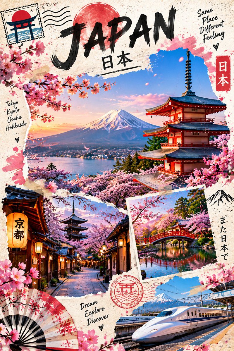
A complete GPT image 2 prompt that generates a premium 3:4 vertical flat-vector illustrated travel poster blending Alpine, Mediterranean, and Japanese inspirations into one unified artwork tailored to [CITY_NAME], with elegant typography, a short English tagline, and a detailed negative prompt.

OpenAI

Source previews

These example images come from the original source. DROPIDEA has not independently tested these examples; results depend on the model and settings.

Ready to personalize

Your prompt

English

Replace the red variables with your information. Copy the full prompt and use it with your preferred agent.

TXT MD English version
GPT image 2 prompt on chatGpt Image Prompt 👇 Premium sophisticated flat-vector and illustrated travel poster for [CITY_NAME], 3:4 vertical format. Create an original, luxurious travel-poster artwork inspired by the combined visual language of three distinct travel destinations: an elegant Alpine lakeside village, a dramatic Mediterranean coastal hillside town, and a refined Japanese mountain-and-cherry-blossom landscape. Do not copy any existing poster or reproduce any exact composition. Merge these influences into one cohesive, purpose-built destination artwork that feels like a premium boutique travel magazine cover. CITY IDENTITY Interpret the unique personality of [CITY_NAME] through a harmonious blend of: A striking architectural landmark or recognizable city feature as the primary focal point. A beautiful natural setting combining elements such as mountains, water, coastline, gardens, or elevated viewpoints where appropriate. A subtle local lifestyle moment with a few small-scale travelers naturally integrated into the environment. Rich native vegetation such as flowering trees, alpine greenery, Mediterranean bougainvillea, or other destination-specific plants. A carefully designed viewpoint that gives the poster a strong sense of travel, discovery, and place. The composition should feel like a beautifully curated collection of travel memories while remaining visually unified. Use a sophisticated layered travel-poster composition with one large hero scene and 2–3 smaller secondary scenic moments integrated around it. Secondary scenes may show a peaceful lakeside village, dramatic coastal architecture, a narrow flower-lined historic street, a Japanese temple or pagoda, a mountain lake, a sunset over the sea, or a scenic transportation moment depending on [CITY_NAME]. VISUAL COMPOSITION Create an elegant vertical editorial composition with: One dominant central scenic illustration. Smaller irregularly framed travel snapshots around the main scene. Organic torn-paper edges. Subtle overlapping postcard/photo-paper layers. Hand-painted ink splashes and delicate brush marks around selected edges. Small illustrated travel stamps, postal marks, camera sketches, hearts, botanical details, or understated travel symbols. Natural asymmetry rather than a rigid grid. Generous negative space around important typography. The overall composition should feel collected, artistic, premium, and intentionally designed rather than like a generic tourist collage. LANDSCAPE & ARCHITECTURE Blend the strongest visual qualities from the three reference aesthetics: Crystal-clear alpine lakes with dramatic snow-capped mountains. Charming wooden or traditional European hillside architecture. Colorful Mediterranean buildings climbing steep coastal cliffs. Deep blue sea with small boats and elegant waterfront terraces. Traditional Japanese temples, pagodas, gates, tiled roofs, or cultural architecture. Mount Fuji–style volcanic mountain silhouettes where naturally appropriate. Flower-filled balconies, bridges, waterfront promenades, stone paths, and scenic terraces. Cherry blossom branches and soft flowering trees as refined decorative accents. Do not place every landmark together as a literal collection. Select only the elements that can naturally coexist and visually represent [CITY_NAME]. TYPOGRAPHY Place “[CITY_NAME]” prominently in an elegant upper or central area with generous breathing room. Add one short sophisticated English travel tagline beneath or beside the title, inspired by the atmosphere of the destination, such as: “Same Place, Different Feeling” Typography should combine refined editorial lettering with subtle hand-painted travel-poster character. Use tasteful dark navy, charcoal, or deep muted blue lettering. Typography must remain integrated with the artwork and never overpower the scenery. PEOPLE Include only 3–6 small-scale figures distributed naturally throughout the composition. Possible activities: walking beside a lake, exploring a historic lane, sitting at a scenic terrace, photographing architecture, walking beneath flowering trees, boarding a small boat, cycling along a waterfront, visiting a temple, or quietly enjoying a mountain viewpoint. People must remain secondary environmental details. No oversized characters and no single hero person. TRAVEL DETAILS Include a restrained collection of premium travel motifs: small vintage-style postage stamp, minimal airplane icon, subtle postal cancellation marks, tiny camera illustration, delicate map-line graphics, small heart symbols, understated handwritten travel notes, minimal location marker, small boat or train illustration where relevant. Keep these elements sparse and elegant. ART DIRECTION Japanese stationery-inspired aesthetic, premium luxury travel scrapbook, high-end editorial travel branding, boutique tourism poster, luxury sticker illustration, premium commercial vector artwork, clean delicate outlines, controlled uniform line weight, simple geometric forms, soft organic shapes, refined flat-color illustration, subtle hand-drawn accents, elegant postcard composition, sophisticated mixed-media travel illustration, beautifully balanced visual rhythm, premium magazine-cover quality. COLOR SYSTEM Build the primary palette around: pale powder blue, clear sky blue, mist blue, deep elegant ocean blue, soft turquoise, warm ivory, cream, natural beige, muted sage, soft gray-green, warm architectural neutrals. Introduce carefully controlled accents of: dusty rose, soft blush pink, cherry blossom pink, muted coral, warm terracotta, soft sunset peach, subtle golden yellow. Use the warm sunset colors primarily in small scenic areas and highlights, while keeping the overall artwork airy, sophisticated, slightly desaturated, and cohesive. MOOD Fresh, dreamy, peaceful, romantic, adventurous, refined, nostalgic, elegant, contemporary, luxurious. The final artwork should feel like a premium international travel collection — combining the serenity of an Alpine lake, the romance of a Mediterranean coastline, and the poetic beauty of Japan — while still appearing as one unified destination poster. IMPORTANT QUALITY RULES Every composition must feel intentionally designed for [CITY_NAME]. Do not simply place three separate photographs together. Blend the Alpine, Mediterranean, and Japanese inspirations naturally into one artistic visual language. Change the camera angle, landmark placement, foreground treatment, secondary scenes, architecture, vegetation, and travel details according to the destination. Maintain strong visual hierarchy and generous breathing room. Use beautiful organic torn-paper framing and subtle ink-splash accents, but keep them controlled and premium. The final result should look like a luxury boutique travel poster, not a cheap tourist advertisement. No exact copying of any reference image. No repeated generic template. No excessive decorative elements. NEGATIVE PROMPT No photorealism. No hyperrealistic photography. No watercolor painting. No heavy painterly brushwork. No messy collage. No chaotic scrapbook layout. No excessive torn-paper layers. No excessive ink splashes. No cluttered background. No landmark overload. No random landmarks from unrelated countries. No oversized characters. No dominant hero person. No crowded streets. No generic tourist-poster formula. No copied composition. No identical photo frames. No repetitive foreground treatment. No heavy shadows. No dramatic cinematic lighting. No neon colors. No harsh gradients. No excessive text. No misspelled city name. No unnecessary logos. No watermark. No low-resolution appearance. No blurry details. No distorted architecture. No malformed boats, trains, buildings, or people. No visual elements that overpower the main destination.
Preview results

Your prompt

GPT image 2 prompt on chatGpt Image Prompt 👇 Premium sophisticated flat-vector and illustrated travel poster for [CITY_NAME], 3:4 vertical format. Create an original, luxurious travel-poster artwork inspired by the combined visual language of three distinct travel destinations: an elegant Alpine lakeside village, a dramatic Mediterranean coastal hillside town, and a refined Japanese mountain-and-cherry-blossom landscape. Do not copy any existing poster or reproduce any exact composition. Merge these influences into one cohesive, purpose-built destination artwork that feels like a premium boutique travel magazine cover. CITY IDENTITY Interpret the unique personality of [CITY_NAME] through a harmonious blend of: A striking architectural landmark or recognizable city feature as the primary focal point. A beautiful natural setting combining elements such as mountains, water, coastline, gardens, or elevated viewpoints where appropriate. A subtle local lifestyle moment with a few small-scale travelers naturally integrated into the environment. Rich native vegetation such as flowering trees, alpine greenery, Mediterranean bougainvillea, or other destination-specific plants. A carefully designed viewpoint that gives the poster a strong sense of travel, discovery, and place. The composition should feel like a beautifully curated collection of travel memories while remaining visually unified. Use a sophisticated layered travel-poster composition with one large hero scene and 2–3 smaller secondary scenic moments integrated around it. Secondary scenes may show a peaceful lakeside village, dramatic coastal architecture, a narrow flower-lined historic street, a Japanese temple or pagoda, a mountain lake, a sunset over the sea, or a scenic transportation moment depending on [CITY_NAME]. VISUAL COMPOSITION Create an elegant vertical editorial composition with: One dominant central scenic illustration. Smaller irregularly framed travel snapshots around the main scene. Organic torn-paper edges. Subtle overlapping postcard/photo-paper layers. Hand-painted ink splashes and delicate brush marks around selected edges. Small illustrated travel stamps, postal marks, camera sketches, hearts, botanical details, or understated travel symbols. Natural asymmetry rather than a rigid grid. Generous negative space around important typography. The overall composition should feel collected, artistic, premium, and intentionally designed rather than like a generic tourist collage. LANDSCAPE & ARCHITECTURE Blend the strongest visual qualities from the three reference aesthetics: Crystal-clear alpine lakes with dramatic snow-capped mountains. Charming wooden or traditional European hillside architecture. Colorful Mediterranean buildings climbing steep coastal cliffs. Deep blue sea with small boats and elegant waterfront terraces. Traditional Japanese temples, pagodas, gates, tiled roofs, or cultural architecture. Mount Fuji–style volcanic mountain silhouettes where naturally appropriate. Flower-filled balconies, bridges, waterfront promenades, stone paths, and scenic terraces. Cherry blossom branches and soft flowering trees as refined decorative accents. Do not place every landmark together as a literal collection. Select only the elements that can naturally coexist and visually represent [CITY_NAME]. TYPOGRAPHY Place “[CITY_NAME]” prominently in an elegant upper or central area with generous breathing room. Add one short sophisticated English travel tagline beneath or beside the title, inspired by the atmosphere of the destination, such as: “Same Place, Different Feeling” Typography should combine refined editorial lettering with subtle hand-painted travel-poster character. Use tasteful dark navy, charcoal, or deep muted blue lettering. Typography must remain integrated with the artwork and never overpower the scenery. PEOPLE Include only 3–6 small-scale figures distributed naturally throughout the composition. Possible activities: walking beside a lake, exploring a historic lane, sitting at a scenic terrace, photographing architecture, walking beneath flowering trees, boarding a small boat, cycling along a waterfront, visiting a temple, or quietly enjoying a mountain viewpoint. People must remain secondary environmental details. No oversized characters and no single hero person. TRAVEL DETAILS Include a restrained collection of premium travel motifs: small vintage-style postage stamp, minimal airplane icon, subtle postal cancellation marks, tiny camera illustration, delicate map-line graphics, small heart symbols, understated handwritten travel notes, minimal location marker, small boat or train illustration where relevant. Keep these elements sparse and elegant. ART DIRECTION Japanese stationery-inspired aesthetic, premium luxury travel scrapbook, high-end editorial travel branding, boutique tourism poster, luxury sticker illustration, premium commercial vector artwork, clean delicate outlines, controlled uniform line weight, simple geometric forms, soft organic shapes, refined flat-color illustration, subtle hand-drawn accents, elegant postcard composition, sophisticated mixed-media travel illustration, beautifully balanced visual rhythm, premium magazine-cover quality. COLOR SYSTEM Build the primary palette around: pale powder blue, clear sky blue, mist blue, deep elegant ocean blue, soft turquoise, warm ivory, cream, natural beige, muted sage, soft gray-green, warm architectural neutrals. Introduce carefully controlled accents of: dusty rose, soft blush pink, cherry blossom pink, muted coral, warm terracotta, soft sunset peach, subtle golden yellow. Use the warm sunset colors primarily in small scenic areas and highlights, while keeping the overall artwork airy, sophisticated, slightly desaturated, and cohesive. MOOD Fresh, dreamy, peaceful, romantic, adventurous, refined, nostalgic, elegant, contemporary, luxurious. The final artwork should feel like a premium international travel collection — combining the serenity of an Alpine lake, the romance of a Mediterranean coastline, and the poetic beauty of Japan — while still appearing as one unified destination poster. IMPORTANT QUALITY RULES Every composition must feel intentionally designed for [CITY_NAME]. Do not simply place three separate photographs together. Blend the Alpine, Mediterranean, and Japanese inspirations naturally into one artistic visual language. Change the camera angle, landmark placement, foreground treatment, secondary scenes, architecture, vegetation, and travel details according to the destination. Maintain strong visual hierarchy and generous breathing room. Use beautiful organic torn-paper framing and subtle ink-splash accents, but keep them controlled and premium. The final result should look like a luxury boutique travel poster, not a cheap tourist advertisement. No exact copying of any reference image. No repeated generic template. No excessive decorative elements. NEGATIVE PROMPT No photorealism. No hyperrealistic photography. No watercolor painting. No heavy painterly brushwork. No messy collage. No chaotic scrapbook layout. No excessive torn-paper layers. No excessive ink splashes. No cluttered background. No landmark overload. No random landmarks from unrelated countries. No oversized characters. No dominant hero person. No crowded streets. No generic tourist-poster formula. No copied composition. No identical photo frames. No repetitive foreground treatment. No heavy shadows. No dramatic cinematic lighting. No neon colors. No harsh gradients. No excessive text. No misspelled city name. No unnecessary logos. No watermark. No low-resolution appearance. No blurry details. No distorted architecture. No malformed boats, trains, buildings, or people. No visual elements that overpower the main destination.
Variable guide

[CITY_NAME]

The target city or destination name; replace all six occurrences, keeping the square brackets intact.

Six places: the opening poster line, the CITY IDENTITY paragraph, the end of the secondary-scenes paragraph, the LANDSCAPE & ARCHITECTURE section, the TYPOGRAPHY section in quotes, and the IMPORTANT QUALITY RULES section.

Example value

Kyoto

What you get

  • A premium 3:4 vertical flat-vector illustrated travel poster.
  • A layered composition with one hero scene and 2–3 secondary scenes framed by organic torn-paper edges.
  • The city name in elegant editorial lettering plus a short English travel tagline.
  • An airy blue-based palette with controlled dusty rose, peach, and golden accents.
  • 3–6 small-scale figures as secondary details and sparse premium travel motifs.
  • A comprehensive negative prompt preventing photorealism, clutter, and watermarks.

Use cases

  • Decorative posters for living rooms, offices, or boutique hotels.
  • Travel magazine or blog covers and destination article headers.
  • Visual identity for tourism campaigns or luxury hospitality brands.
  • Greeting cards or keepsake prints inspired by specific cities.
  • Editorial-quality social media travel content.

How to use

  • Copy the full template and replace all six [CITY_NAME] occurrences with your destination, spelled correctly.
  • Paste the prompt into GPT image 2 on ChatGPT and keep the 3:4 vertical format unchanged.
  • Optionally edit the short English tagline (e.g., "Same Place, Different Feeling") to match your destination's atmosphere, keeping it short and sophisticated.
  • Generate the image and rerun for variations; identical stochastic images are not guaranteed.
  • For more creative control, adjust the secondary scenes or people activities to fit your city while keeping the negative prompt intact.

Related prompts