Skip to content
ImagesFree

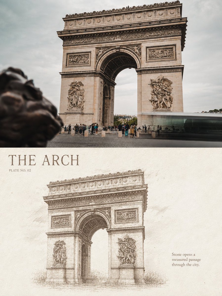
Photo vs Architectural Etching Comparison Poster

Turns each uploaded European architecture photo into a 3:4 vertical poster pairing the original photograph on top with a monochrome copperplate etching below, complete with an English title, plate number, and observation line in a classical architectural print style.

OpenAI

Source previews

These example images come from the original source. DROPIDEA has not independently tested these examples; results depend on the model and settings.
Ready to personalize

Your prompt

English

Replace the red variables with your information. Copy the full prompt and use it with your preferred agent.

TXT MD English version
Turn each of my uploaded European architecture travel photos into its own separate refined monochrome architectural etching comparison poster; no multi-image compositing, one output per photo. Use an overall 3:4 vertical composition, with a clear yet natural top-and-bottom pairing of the original photo and the redrawn version. The two zones usually take about 50% each and may be adjusted slightly according to the subject proportions of the original photo, but the comparison with the original must never be removed. The upper half preserves the original photograph with high fidelity. Keep the building's identity, main structure, real materials, perspective relationships, natural light and shadow, environmental scale, and original color atmosphere, applying only light high-end photographic grading so it feels like architectural magazine, independent publication, and exhibition photography. To fit the frame, the sky, ground, or environmental background may be extended naturally, but the main building body must not be stretched, distorted, replaced, or arbitrarily altered. The lower half extracts the building's most recognizable contours, structure, and spatial relationships from the original photo and recomposes them as a monochrome copperplate etching or classical architectural engraving. Do not turn the whole photo into a line drawing, and do not mechanically copy the upper half's composition; instead, reselect scale, cropping, and placement based on the building's features. You may enlarge arches, spires, domes, colonnades, or pediments, or compress a continuous facade into a horizontal rhythm, so the lower half becomes an edited, distilled independent plate that is still instantly recognizable as the original building. Use extremely fine etching lines, parallel hatching, cross-hatching, stippling, broken lines, and a few drypoint scratches to model stone, brick walls, carvings, window mullions, metal roofing, and spatial shadows. Near structures stay clear; darks are built through line density rather than large solid black areas; distant views, air, sky, and the image edges gradually reduce lines and stipple, dissolving naturally into the paper, avoiding hard rectangular frames and a complete photo outline. The lower half uses a warm ivory, natural off-white, or lightly aged paper background, keeping about 35%—55% continuous paper white. The subject is concentrated toward the center and lower area, with breathing room on all sides. The paper has restrained realistic fibers, fine impressions, and plate pressure, but must not become dirty old kraft paper or an over-vintage filter. Each work may use only one ink color and its tonal variations. Choose the ink adaptively to match the original photo's mood — deep indigo, Prussian blue, blue-gray, charcoal ink, or warm deep brown — but never mix multiple colored inks within one work. Build volume, distance, and light through changes in thickness, density, overlap, and ink starvation of same-color lines. Distill from the photo's location, building type, form, or travel feeling a title of 1—3 English words, add a plate number in the form "PLATE NO. 01", and a one-line observation of 5—10 English words. Set the text in a narrow capital serif or old-gazette type in the same ink color as the engraving, clearly legible, with slight ink starvation and paper bite; placed within the continuous white space to form a spacious, restrained editorial layout with the building subject. No garbled characters, meaningless long passages, or large text areas that compete with the subject. Overall, reference classical copperplate etching, European city topography, museum architecture plates, old architectural survey folios, and contemporary high-end editorial design, presenting a precise, quiet, rational visual character with collectible value and a real printed feel. Avoid simple black-and-white filters, pencil sketch, watercolor, gouache, comic ink lines, CAD blueprints, pure vector line art, halftone screen dots, multicolor printing, hard-edged photo tracing, full-bleed with no white space, hard rectangular illustration frames, 3D rend…
Preview results

Your prompt

Turn each of my uploaded European architecture travel photos into its own separate refined monochrome architectural etching comparison poster; no multi-image compositing, one output per photo. Use an overall 3:4 vertical composition, with a clear yet natural top-and-bottom pairing of the original photo and the redrawn version. The two zones usually take about 50% each and may be adjusted slightly according to the subject proportions of the original photo, but the comparison with the original must never be removed. The upper half preserves the original photograph with high fidelity. Keep the building's identity, main structure, real materials, perspective relationships, natural light and shadow, environmental scale, and original color atmosphere, applying only light high-end photographic grading so it feels like architectural magazine, independent publication, and exhibition photography. To fit the frame, the sky, ground, or environmental background may be extended naturally, but the main building body must not be stretched, distorted, replaced, or arbitrarily altered. The lower half extracts the building's most recognizable contours, structure, and spatial relationships from the original photo and recomposes them as a monochrome copperplate etching or classical architectural engraving. Do not turn the whole photo into a line drawing, and do not mechanically copy the upper half's composition; instead, reselect scale, cropping, and placement based on the building's features. You may enlarge arches, spires, domes, colonnades, or pediments, or compress a continuous facade into a horizontal rhythm, so the lower half becomes an edited, distilled independent plate that is still instantly recognizable as the original building. Use extremely fine etching lines, parallel hatching, cross-hatching, stippling, broken lines, and a few drypoint scratches to model stone, brick walls, carvings, window mullions, metal roofing, and spatial shadows. Near structures stay clear; darks are built through line density rather than large solid black areas; distant views, air, sky, and the image edges gradually reduce lines and stipple, dissolving naturally into the paper, avoiding hard rectangular frames and a complete photo outline. The lower half uses a warm ivory, natural off-white, or lightly aged paper background, keeping about 35%—55% continuous paper white. The subject is concentrated toward the center and lower area, with breathing room on all sides. The paper has restrained realistic fibers, fine impressions, and plate pressure, but must not become dirty old kraft paper or an over-vintage filter. Each work may use only one ink color and its tonal variations. Choose the ink adaptively to match the original photo's mood — deep indigo, Prussian blue, blue-gray, charcoal ink, or warm deep brown — but never mix multiple colored inks within one work. Build volume, distance, and light through changes in thickness, density, overlap, and ink starvation of same-color lines. Distill from the photo's location, building type, form, or travel feeling a title of 1—3 English words, add a plate number in the form "PLATE NO. 01", and a one-line observation of 5—10 English words. Set the text in a narrow capital serif or old-gazette type in the same ink color as the engraving, clearly legible, with slight ink starvation and paper bite; placed within the continuous white space to form a spacious, restrained editorial layout with the building subject. No garbled characters, meaningless long passages, or large text areas that compete with the subject. Overall, reference classical copperplate etching, European city topography, museum architecture plates, old architectural survey folios, and contemporary high-end editorial design, presenting a precise, quiet, rational visual character with collectible value and a real printed feel. Avoid simple black-and-white filters, pencil sketch, watercolor, gouache, comic ink lines, CAD blueprints, pure vector line art, halftone screen dots, multicolor printing, hard-edged photo tracing, full-bleed with no white space, hard rectangular illustration frames, 3D rend…

Variable guide

3:4

نسبة أبعاد الملصق العمودي؛ غيّرها فقط إذا أردت قالبًا آخر مع الحفاظ على الاتجاه العمودي.

استبدل القيمة 3:4 في جملة «قالب عمودي بنسبة 3:4» (المسار: template_ar، الفقرة الثانية).

Example value

3:4

deep indigo, Prussian blue, blue-gray, charcoal ink, or warm deep brown

لوحة ألوان الحبر المسموح بها للنقش؛ حدّد لونًا واحدًا للعمل الواحد.

استبدل قائمة الألوان في جملة «من بين النيلي الداكن أو ... البني الداكن الدافئ» (المسار: template_ar، فقرة لون الحبر).

Example value

النيلي الداكن أو الأزرق البروسي أو الرمادي المزرق أو حبر الفحم أو البني الداكن الدافئ

warm ivory, natural off-white, or lightly aged

درجة خلفية الورق في النصف السفلي؛ تبقى فاتحة وبها بياض متصل.

استبدل وصف درجة الورق في جملة «بخلفية ورقية ... أو معتّقة قليلًا» (المسار: template_ar، فقرة الورق).

Example value

بيضاء عاجية دافئة أو بيضاء طبيعية مائلة للبيج أو معتّقة قليلًا

35%—55%

نطاق نسبة البياض الورقي المتصل المطلوب الإبقاء عليه في النصف السفلي.

استبدل النطاق الرقمي في جملة «الإبقاء على نحو 35%—55% من البياض الورقي» (المسار: template_ar، فقرة الورق).

Example value

35%—55%

PLATE NO. 01

رقم اللوحة الظاهر في المطبوعة؛ حافظ على الصيغة الإنجليزية حرفيًا.

استبدل الرقم داخل النص المقتبس «PLATE NO. 01» (المسار: template_ar، فقرة العنوان ورقم اللوحة).

Example value

PLATE NO. 01

What you get

  • A 3:4 vertical poster pairing the graded original photo with the architectural engraving in one piece.
  • A lower half in monochrome copperplate etching style with continuous paper white around 35%—55%.
  • An English title of 1—3 words, a plate number in the PLATE NO. 01 form, and a 5—10 word English observation line.
  • Realistic paper fibers and printing pressure in the feel of classical architectural plates.

Use cases

  • A commemorative print series from a European architecture trip.
  • Gallery wall pieces for architectural magazines and independent publications.
  • High-end printed gifts for architecture and history lovers.
  • Exhibition or editorial photography content with a refined publishing feel.

How to use

  • Upload one clear photo per European building from your trip; each photo yields its own separate poster.
  • Attach an original image that shows the building's architectural identity from a strong angle.
  • Optionally edit the editable values below, such as the aspect ratio or ink color, keeping the layout vertical.
  • Let the model generate the short English title, plate number, and observation line from the photo's content.
  • Reuse the prompt with different ink colors to build a consistent print series from your trip.

Related prompts