Responsive design template development is one of the basic things that any WordPress theme designer or developer must take care of, given that there are several devices with different screen sizes through which these sites are browsed online. Visits to websites originating from mobile phones are increasing day after day. Most people now prefer to use their phones to search for anything, and the use of desktop computers for browsing the Internet has declined. Therefore, the site’s responsiveness to small screen sizes and the ease of displaying, navigating, and browsing it easily on these small devices has become an urgent necessity. In today's article, we will highlight the importance of using Bootstrap in WordPress to develop responsive themes that fit all screen sizes. Website elements self-adjust according to the screen size and contribute to improving readability and improving the website user experience in general.
Contents of the article What is Bootstrap? Learn Bootstrap 1-Learn Bootstrap classes? 2-Understanding the grid layout in Bootstrap How can you benefit from Bootstrap in WordPress?
Practical steps to build a Bootstrap template in WordPress Step 1 - Create the template folder and its basic files Step 2 - Add Bootstrap to the WordPress template The first method - Refer to the Bootstrap source files from the Content Delivery Network (CDN). Second method: Download the PostRap source files. Step 3- Programming and designing the template files 1- Programming the template’s formats file style.css 2- Programming the template functions file functions.php 2- Programming the template header file 4- Programming the main template file index.php A helpful way to speed up the process of building a Bootstrap template in WordPress Conclusion: What is Bootstrap?
Bootstrap is an open source framework that was created by the Twitter designer team, and then made available to the open source community. It is compatible with all modern browsers (Chrome, Safari, Internet Explorer, etc.). Bootstrap is mainly used to develop the front-end of websites that are responsive to mobile phones. It forces designers to create sites designed for small screen sizes in the first place (Mobile First CSS framework) and then scale the designs for larger screens. In size, it also consists of a set of ready-made software tools that facilitate the process of designing complex websites for developers. Bootstrap has become one of the most popular front-end frameworks due to its lightweight structure. It consists of a combination of HTML, CSS, and Javascripts code and enables you to design and build professional and responsive websites with minimal code and a minimal number of media queries that are usually used to create custom formats for different types of devices. You can also avoid writing this query yourself completely if you are not accustomed to dealing with it.
The latest version of Bootstrap is Bootstrap 5 and it was launched in May (2021). It differs from previous versions in that it no longer uses jQuery to make it easier to use Bootstrap in projects that do not require or use jQuery. However, you can still use jQuery with Bootstrap if you need to use it in your website. Learn Bootstrap Although learning Bootstrap is of course not as easy as learning WordPress, it has a strong support community that enables you to use it at any time.
In order to learn Bootstrap, you basically need to learn Bootstrap's ready-made classes, and understand the grid system on which this framework works. 1-Learn Bootstrap classes? PostRap provides many ready-made, pre-formatted classes or classes (Utility Classes) that you can use to create layouts for your site pages and coordinate the elements within these pages in an easy and flexible way.
The version of Bootstrap 5 included a wide range of ready-made classes that were already present in Bootstrap 4 and added some new classes to them. These rows are used to quickly apply some formatting and styles to HTML elements without having to write any custom CSS rules, and they are divided into different groups. Classes for Buttons Classes for text formatting Typography Classes for Forms Classes for Carousel slides Classes for Tables Classes for navigation menus Navbar and many more..
For example, Bootstrap 5 provides nine classes for formatting buttons, as shown in the following image: Bootstrap’s custom button styles. All you have to do is add the required class within the HTML code of the button so that it is formatted with the custom style and add its default JavaScript interaction directly. Primary Secondary Success Danger Warning Info Light Dark Link You can view all of these classes and learn how they work from here. 2-Understanding the grid layout in Bootstrap It is necessary to understand how the grid layout system works in Bootstrap so that you can plan your page and make the most of all Bootstrap features when preparing your design.
Bootstrap provides a flexible and responsive flexbox grid system that can accommodate up to 12 responsive columns that are based on percentages and automatically rearrange the elements inside them when the screen size changes. Poststrap can be likened to a canvas that transforms a web page into a horizontal grid consisting of a basic container that represents a frame within which all other elements are collected and each container has lines (div elements have the row class) and columns (div elements have the col class) and places the elements within the visible area of the web page (viewport) as the screen size increases. There are three types of container rows in Bootstrap that you can use for div (or section) elements on your page: container container-fluid responsive container This grid supports six responsive breakpoints.
These breakpoints are based on the media query for the minimum size (min-width), which means that they affect this breakpoint and all points higher than it - as we will explain shortly. These points are: very small, the default Pixel (class prefix corresponding to .col-md-) is large lg, which means the size of the device is greater than or equal to 992 pixels (class prefix corresponding to .col-lg-) xl is very large, which means the size of the device is greater than or equal to 1200 pixels (class prefix corresponding to .col-xl-) xxl, which means the size of the device is greater than or equal to 1400 pixels (class prefix corresponding to .col-xxl-) is attached to each of these classes. With a number from 1 to 12 attached to it in accordance with certain percentage values, and a combination of these classes can be used (i.e. declaring several classes at the same time in your design), so that the class mentioned first is the one that is applied first. For example, the class .col-xs-1 will be 8.33333333333333333333333333332% wide of the phone screen. The class .col-xs-2 will be 16.666666666666664% wide of the phone screen. The class .col-xs-3 will be 25% of the width of the phone screen, and so on until we reach the class .col-xs -12, which will be 100% wide. From the width of the phone screen, the same applies to other classes. For example, the class .col-sm-1 will be 8.33333333333333333333333333332% wide, the class .col-sm-2 will be 16.666666666666664% wide, the class .col-sm-3 will be 25% wider than the width of the tablet screen. sm-12 will be 100% of the width of the tablet screen. Note: Bootstrap is a mobile-first responsive system (min-width), so if you declare only the .col-xs row in your design, this row will be available to all devices and applying it to an element will not only affect its design on small phones but also on larger devices such as tablets and medium and large desktop computers in the absence of the other rows. Also, using the .col-sm row in an element will not only affect its design on the tablet, but will also affect its design on larger devices such as small and large desktop computers in the absence of the .col-md- and .col-lg- rows.
So when you design your site's page layout you can customize the size of your columns to extra small, small, medium, large or extra large as you see fit. It is preferable to first declare the class that corresponds to the devices of the users who visit the site the most, and then declare the classes that make your design responsive to the rest of the devices. In order to plan any page according to a wireframe layout, you must first create a div element that represents a container in which to place all of your website content.
Bostrap uses containers as the foundation of its network system. You can use as many containers as you want, but the containers should not be overlapping. You can then place columns inside lines, and lines inside containers, and each container can contain one or more lines and you must include at least one line of columns in each container.
After adding the container, first add lines for each container. A row in Bootstrap is simply a group of horizontal Bootstrap columns that can be divided into 12 parts. Finally add columns and define the divisions for this column. The line is the one that will contain your col elements and the number of columns within the row must be up to 12.
Understanding Bootstrap classes and grid system Bootstrap may take some time to learn and understand but once you understand it well you can create amazing layouts in no time. I recommend you check out the Bootstrap documentation from the official website to see how to add features to your website, and get appropriate code snippets for what you want.
How can you benefit from Bootstrap in WordPress?
Bootstrap allows you to create entire websites independently or within another system. But you can also take advantage of Bootstrap within the WordPress system to develop custom WordPress templates or add-ons as add-ons to create image galleries or other add-ons that add a professional aesthetic appearance to your site and look great on mobile devices. But in this article, we will focus on the aspect of developing a WordPress template through the Bootstrap framework. If you are a WordPress template developer, then you can add Bootstrap support to your WordPress template and benefit from its powerful features.
There are many WordPress templates based on Bootstrap in the template repository. Search for Bootstrap on the official WordPress templates page and you will get nearly a thousand results of free, distinctive, responsive templates whose design is based on the Bootstrap framework in its various versions. The following question may come to your mind: What are the benefits of developing my template using PostRap? Here is the answer: Developing a WordPress template through Bootstrap makes the elements on the site easily responsive to all screen sizes. Developing a WordPress template using the Bootstrap framework allows you to take advantage of the ready-made design elements that it provides to you, such as buttons, tables, and lists that are ready-formatted and based on CSS and JavaScript codes in the WordPress system, to develop visually attractive and responsive WordPress templates for your site.
Because Bootstrap is open source, it has a large support community and many learning resources. It is constantly updated and properly managed by a strong team. This means that it rarely crashes or suffers from serious problems, and you can use it safely to obtain visually attractive designs. Bootstrap is also distinguished by the fact that it is well integrated with HTML5. In addition to the fact that it includes special design classes, it includes all designs for a complete set of HTML5 elements that you can use in your template. Designing all of these things from scratch is tiring and takes time, so it saves you a lot of work. So Poststrap is a design framework, and WordPress is a content management system (CMS), and although they are two completely different things, each of them provides many technical elements and hides them behind an easy-to-use interface, and all the site developer has to do is simply use them without paying attention to all the complex details through which these elements were accomplished.
In order to be able to work with Poststrap to develop a WordPress template, you need to have the following skills: Basics of HTML/CSS Basics in dealing with the WordPress system Basics of the PHP programming language The basic structure of template files in WordPress Basics of designing templates in WordPress Basic knowledge of programming in the general concept Read also: Learn about the WordPress programming system and its basic components Practical steps for building a Poststrap template in WordPress In order to be able to build a Poststrap template for WordPress, you must have the necessary knowledge about designing and creating templates in WordPress in advance, so we are here in advance. We will not explain how to create a fully functional WordPress template, and we will focus more on explaining how to use Bootstrap to design and develop this template. Step 1 - Create a folder for the template and basic files. The WordPress template, as we know, has a pre-defined file structure. You can view these files and their names in the template through the following article. In the following paragraphs, we will explain in detailed steps how to create a simple, basic template for a WordPress website based on the PostRap framework as follows.
First, we will create a folder called wpartheme to save our template files under the /wp-content/theme directory of the site (you can use the file manager in the control panel or an FTP program to deal with the files on the server). This folder will be our Bootstrap template folder, within which we will create a set of empty files necessary for the template. Some of these files are optional and others are mandatory in order for WordPress to recognize the template. The first one we have to create is the style.css file which is a mandatory file that contains the template's layouts.
In addition, this file also has another task, which is to provide information that describes the template, such as the template name, description, author name, template version, and other details. The second file is the index.php file. It is a mandatory file that represents the main WordPress template template that WordPress relies on to display any page if it is not possible to find any other template file that is more customized to display the page. Read more about the hierarchy of calling template files in WordPress. There are many optional files that you can add to the template to further customize it for each part of the site, but for our illustrative template in today’s article, we will only add the header and footer files: Header.php file: It is used to plan and design the template’s header, which is usually displayed on every page of the site.
This file usually includes information such as the title and description of the site, defines what format files we will typically use on the site, and other information. Footer file footer.php: This file is responsible for displaying the information that is included at the end of each page of the site. Here, it is preferable to include Javascript codes so as not to cause slow loading of the page.
Template functions file functions.php In this file we will write the necessary code for the template to work. We will also add an image file and call it screenshot.png to be the image for the template that will appear when you browse the template in the site's control panel. Step 2 - Adding Bootstrap to a WordPress template The WordPress system does not support Bootstrap by default, so in order for you to be able to use Bootstrap as a basis for a WordPress template and benefit from the strengths of both systems, you can follow one of the following methods - knowing that there is no significant advantage for one over the other, and you can adopt the method you prefer - The first method - refer to the Bootstrap source files from the Content Delivery Network (CDN).
In this case, we do not need to download the Bootstrap files into our template folder. It is sufficient to indicate the CDN link for the files we need as follows: We will refer to the Bootstrap css file by adding the following link in the header file header.php under the tag >head< وقبل أي استدعاء لأي ملف ستايل آخر: هذا الرابط يحتوي على مكتبة CSS ويتيح لك استخدام صفوف بوتستراب في صفحات الويب الخاصة بك. وسنشير لملف جافا سكريبت الخاص ببوتستراب في ملف التذييل footer.php قبل وسم الإغلاق الوسم >/body<
Instead of including the Bootstrap embed code in the template's template files (in the header and footer), you can also add the linking code within the template's functions file functions.php through the queue functions wp_enqueue_script/wp_enqueue_style, which are special functions in WordPress known as hooks, which is just another way to include Bootstrap's CSS and JavaScript codes - and your own codes as well - in the template bootstraptheme_enqueue_styles(){ wp_enqueue_style('bootstrap-cdn-css', 'https://cdn.jsdelivr.net/npm/[email protected]/dist/css/bootstrap.min.css'); wp_enqueue_script('bootstrap-cdn-js', 'https://cdn.jsdelivr.net/npm/[email protected]/dist/js/bootstrap.min.js', 'jquery', false, true); wp_enqueue_style('my_style', get_stylesheet_directory_uri().'/style.css'); } add_action('wp_enqueue_scripts', 'bootstraptheme_enqueue_styles'); Note: To make Bootstrap 5 support RTL for Arabic sites, you need to add the Arabic language version of Bootstrap as follows. You also need to add the Arabic language tag “lang=”ar” and the direction tag in “dir=”rtl HTML codes.
Hello World!
Hello World! >
DROPIDEA
We hope this article has added real value to you. At DROPIDEA, we always strive to deliver high-quality content that helps you grow and evolve in the digital space. Follow us for more useful articles and guides.
Admin
DROPIDEA
Latest Articles

“Nofollow” tag: What it is, how and where it is used, “Infographics”

ASUS ROG Flow Z13 (2025) available: Everything you could dream of in a gaming tablet.
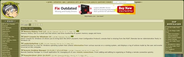
The best 5 sites to download safe computer programs without malware!
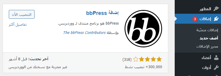
Create a forum on WordPress using the bbPress plugin step by step