انتقل إلى المحتوى
صورمجاني

DESTINATION: [CITY / DESTINATION] COUNTRY: [COUNTRY] Create a sophisticated vertical 2:3 premium architectural travel postcard for

DESTINATION: [CITY / DESTINATION] COUNTRY: [COUNTRY] Create a sophisticated vertical 2:3 premium architectural travel postcard for

أوبن إيه آي

معاينات من المصدر

صور النتائج منشورة لدى المصدر الأصلي. لم تُختبر هذه الأمثلة داخل دروب إيديا؛ قد تختلف النتائج بحسب النموذج والإعدادات.

جاهز للتخصيص والاستخدام

البرومبت الخاص بك

نص المصدر

هذا البرومبت بانتظار إكمال تعريبه وتدقيقه. تظهر النسخة العربية بعد اعتمادها، مع حفظ الأصل والنسخة الإنجليزية.

استبدل المتغيرات المميزة بالأحمر ببياناتك. انسخ النص كاملًا ثم استخدمه مع الوكيل الذي تفضله.

TXT MD النسخة الإنجليزية
DESTINATION: [CITY / DESTINATION] COUNTRY: [COUNTRY] Create a sophisticated vertical 2:3 premium architectural travel postcard for [DESTINATION], [COUNTRY]. CORE STYLE Use the visual language of a high-end contemporary architectural travel poster combined with refined vintage editorial illustration. The design should feel: - elegant - cultured - timeless - architectural - collectible - premium - museum-shop quality Combine extremely detailed architectural pen-and-ink illustration, delicate graphite linework, restrained watercolor-style flat color, archival cartographic graphics, elegant editorial typography, and generous white space. Do NOT make it look like a generic tourist poster. MAIN ARCHITECTURAL HERO Select ONE iconic and instantly recognizable architectural landmark strongly associated with [DESTINATION]. Examples can include: - historic monument - palace - cathedral - mosque - temple - tower - bridge - government building - famous street façade - traditional architectural landmark - modern architectural icon The selected landmark must be the dominant visual subject. Show it from a believable three-quarter or slightly dramatic architectural perspective. Maintain accurate architectural proportions and recognizable structural details. Do not combine multiple major landmarks into one main illustration. ILLUSTRATION STYLE Render the main landmark using exceptionally fine black or dark graphite ink lines. Include: - detailed architectural hatching - precise windows - doors - columns - roofs - arches - ornaments - façade details - realistic structural geometry - subtle hand-drawn imperfections Keep the architecture primarily as detailed line art with selective flat color. Use refined illustrative detailing rather than photorealistic rendering. COLOR PALETTE Use mostly white space with only 2–4 sophisticated destination-specific colors. Choose colors naturally associated with [DESTINATION] or the landmark. Examples: - muted architectural stone tones - traditional local colors - restrained blue - muted green - terracotta - burgundy - soft red - architectural gold - subtle natural tones Colors should be elegant and slightly muted. Avoid: - neon colors - excessive saturation - gradients - glossy effects - muddy sepia - excessive beige - photorealistic color grading BACKGROUND Use a clean pure white background. Behind the architecture, add extremely subtle archival graphic elements such as: - faint city map - street plan - river outline - coordinates - contour lines - architectural diagram - compass - grid lines - local-language annotations - minimal geographical markings These elements must remain secondary and lightly faded. Do not allow the background map to overpower the main architecture. COMPOSITION Use a vertical 2:3 editorial composition. The main landmark should occupy approximately 60–75% of the artwork. Create generous negative space around the typography and architectural subject. Use an asymmetric premium editorial layout. The composition should feel carefully designed rather than centered like a basic tourist souvenir. Tasteful cropping is allowed when it creates a stronger architectural composition. TYPOGRAPHY At the top or upper-left area, display: [DESTINATION] Use large elegant high-contrast editorial serif typography inspired by premium architecture magazines and museum catalogues. Below it, optionally include: [LOCAL NAME] using the authentic local writing system of the destination. For example: Seoul 서울 London London Tokyo 東京 Paris Paris Use restrained typography with generous letter spacing. Do not use giant decorative typography that overwhelms the architecture. SECONDARY INFORMATION Include a small elegant information block containing destination-specific details such as: [SHORT DESTINATION DESCRIPTION] [COORDINATES] [LOCAL NAME] [COUNTRY] Use tiny refined typography with generous spacing. Optional subtle elements: - compass - small architectural sketch - miniature landmark drawing - local-language stamp-like mark - faint map label Keep all secondary elements minimal. ARCHIVAL MAP ELEMENT Include a very subtle map or street-plan layer related specifically to [DESTINATION]. If the destination has a recognizable river, coastline, mountain, historic district, or urban grid, integrate it naturally into the background. Add a small understated geographical label where appropriate. Do not create a cluttered map. CONTEXTUAL DETAILS Add only a few tiny environmental elements when they naturally belong to the location: - pedestrians - bicycles - trees - street lamps - local vehicles - benches - small street details - birds These elements should primarily establish scale and atmosphere. Do not turn the image into a busy city scene. DESTINATION AUTHENTICITY Make the architecture, typography, environmental details, colors, map elements, and small contextual objects culturally and geographically appropriate to [DESTINATION], [COUNTRY]. Avoid generic architecture that could belong to another city. The landmark must immediately communicate the destination. VISUAL HIERARCHY Priority order: 1. Main architectural landmark 2. Destination name 3. Supporting map / archival graphics 4. Local-language name 5. Small contextual details 6. Coordinates and information strip Everything should support the main landmark. BOTTOM INFORMATION STRIP At the bottom, add a refined museum-catalogue-style information strip: [DESTINATION] | [COUNTRY] | [ARCHITECTURAL STYLE] | EST. [YEAR] Keep it small, elegant, evenly spaced, and understated. If the landmark's construction date is uncertain, use an appropriate historical date or omit the year rather than inventing information. MOOD Quiet urban sophistication. Cultural authenticity. Architectural heritage. Modern editorial design. Historical character combined with contemporary graphic design. The final artwork should feel like a premium collectible architectural print purchased from a museum design shop. AVOID No landmark collage. No fake architecture. No random buildings. No generic tourist-poster aesthetic. No cartoon style. No 3D rendering. No glossy photorealism. No excessive vintage filters. No heavy sepia. No fake passport stamps. No excessive decorative elements. No clutter. No giant unnecessary text. No random flags. No inaccurate cultural symbols. No distorted architecture. No unrealistic perspective. No excessive gradients. No excessive beige. FINAL GOAL Create a highly detailed, sophisticated, timeless architectural travel postcard that could work consistently for ANY city or country while maintaining the same premium visual identity. Only change the destination-specific elements such as: [DESTINATION] [COUNTRY] [ICONIC LANDMARK] [LOCAL NAME] [ARCHITECTURAL STYLE] [COORDINATES] [ESTABLISHED / CONSTRUCTION YEAR] [DESTINATION-SPECIFIC COLORS] [MAP / GEOGRAPHICAL ELEMENTS] Everything else should maintain the same refined editorial postcard design language.
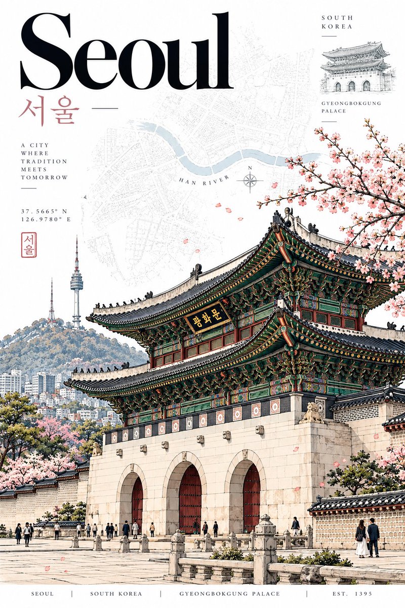
معاينة النتائج

البرومبت الخاص بك

DESTINATION: [CITY / DESTINATION] COUNTRY: [COUNTRY] Create a sophisticated vertical 2:3 premium architectural travel postcard for [DESTINATION], [COUNTRY]. CORE STYLE Use the visual language of a high-end contemporary architectural travel poster combined with refined vintage editorial illustration. The design should feel: - elegant - cultured - timeless - architectural - collectible - premium - museum-shop quality Combine extremely detailed architectural pen-and-ink illustration, delicate graphite linework, restrained watercolor-style flat color, archival cartographic graphics, elegant editorial typography, and generous white space. Do NOT make it look like a generic tourist poster. MAIN ARCHITECTURAL HERO Select ONE iconic and instantly recognizable architectural landmark strongly associated with [DESTINATION]. Examples can include: - historic monument - palace - cathedral - mosque - temple - tower - bridge - government building - famous street façade - traditional architectural landmark - modern architectural icon The selected landmark must be the dominant visual subject. Show it from a believable three-quarter or slightly dramatic architectural perspective. Maintain accurate architectural proportions and recognizable structural details. Do not combine multiple major landmarks into one main illustration. ILLUSTRATION STYLE Render the main landmark using exceptionally fine black or dark graphite ink lines. Include: - detailed architectural hatching - precise windows - doors - columns - roofs - arches - ornaments - façade details - realistic structural geometry - subtle hand-drawn imperfections Keep the architecture primarily as detailed line art with selective flat color. Use refined illustrative detailing rather than photorealistic rendering. COLOR PALETTE Use mostly white space with only 2–4 sophisticated destination-specific colors. Choose colors naturally associated with [DESTINATION] or the landmark. Examples: - muted architectural stone tones - traditional local colors - restrained blue - muted green - terracotta - burgundy - soft red - architectural gold - subtle natural tones Colors should be elegant and slightly muted. Avoid: - neon colors - excessive saturation - gradients - glossy effects - muddy sepia - excessive beige - photorealistic color grading BACKGROUND Use a clean pure white background. Behind the architecture, add extremely subtle archival graphic elements such as: - faint city map - street plan - river outline - coordinates - contour lines - architectural diagram - compass - grid lines - local-language annotations - minimal geographical markings These elements must remain secondary and lightly faded. Do not allow the background map to overpower the main architecture. COMPOSITION Use a vertical 2:3 editorial composition. The main landmark should occupy approximately 60–75% of the artwork. Create generous negative space around the typography and architectural subject. Use an asymmetric premium editorial layout. The composition should feel carefully designed rather than centered like a basic tourist souvenir. Tasteful cropping is allowed when it creates a stronger architectural composition. TYPOGRAPHY At the top or upper-left area, display: [DESTINATION] Use large elegant high-contrast editorial serif typography inspired by premium architecture magazines and museum catalogues. Below it, optionally include: [LOCAL NAME] using the authentic local writing system of the destination. For example: Seoul 서울 London London Tokyo 東京 Paris Paris Use restrained typography with generous letter spacing. Do not use giant decorative typography that overwhelms the architecture. SECONDARY INFORMATION Include a small elegant information block containing destination-specific details such as: [SHORT DESTINATION DESCRIPTION] [COORDINATES] [LOCAL NAME] [COUNTRY] Use tiny refined typography with generous spacing. Optional subtle elements: - compass - small architectural sketch - miniature landmark drawing - local-language stamp-like mark - faint map label Keep all secondary elements minimal. ARCHIVAL MAP ELEMENT Include a very subtle map or street-plan layer related specifically to [DESTINATION]. If the destination has a recognizable river, coastline, mountain, historic district, or urban grid, integrate it naturally into the background. Add a small understated geographical label where appropriate. Do not create a cluttered map. CONTEXTUAL DETAILS Add only a few tiny environmental elements when they naturally belong to the location: - pedestrians - bicycles - trees - street lamps - local vehicles - benches - small street details - birds These elements should primarily establish scale and atmosphere. Do not turn the image into a busy city scene. DESTINATION AUTHENTICITY Make the architecture, typography, environmental details, colors, map elements, and small contextual objects culturally and geographically appropriate to [DESTINATION], [COUNTRY]. Avoid generic architecture that could belong to another city. The landmark must immediately communicate the destination. VISUAL HIERARCHY Priority order: 1. Main architectural landmark 2. Destination name 3. Supporting map / archival graphics 4. Local-language name 5. Small contextual details 6. Coordinates and information strip Everything should support the main landmark. BOTTOM INFORMATION STRIP At the bottom, add a refined museum-catalogue-style information strip: [DESTINATION] | [COUNTRY] | [ARCHITECTURAL STYLE] | EST. [YEAR] Keep it small, elegant, evenly spaced, and understated. If the landmark's construction date is uncertain, use an appropriate historical date or omit the year rather than inventing information. MOOD Quiet urban sophistication. Cultural authenticity. Architectural heritage. Modern editorial design. Historical character combined with contemporary graphic design. The final artwork should feel like a premium collectible architectural print purchased from a museum design shop. AVOID No landmark collage. No fake architecture. No random buildings. No generic tourist-poster aesthetic. No cartoon style. No 3D rendering. No glossy photorealism. No excessive vintage filters. No heavy sepia. No fake passport stamps. No excessive decorative elements. No clutter. No giant unnecessary text. No random flags. No inaccurate cultural symbols. No distorted architecture. No unrealistic perspective. No excessive gradients. No excessive beige. FINAL GOAL Create a highly detailed, sophisticated, timeless architectural travel postcard that could work consistently for ANY city or country while maintaining the same premium visual identity. Only change the destination-specific elements such as: [DESTINATION] [COUNTRY] [ICONIC LANDMARK] [LOCAL NAME] [ARCHITECTURAL STYLE] [COORDINATES] [ESTABLISHED / CONSTRUCTION YEAR] [DESTINATION-SPECIFIC COLORS] [MAP / GEOGRAPHICAL ELEMENTS] Everything else should maintain the same refined editorial postcard design language.
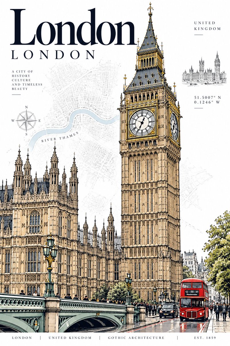
برومبتات ذات صلة

صورمعاينة المصدر

نموذج مصغر بجودة المتاحف لمنزل قديم

موجه تحويل صور المنازل القديمة إلى نماذج مصغرة واقعية بمقياس 1:24 بجودة العرض في المتاحف مع إبراز تفاصيل التقادم ال...

أوبن إيه آي
مجاني
معاينة النتائج

نموذج مصغر بجودة المتاحف لمنزل قديم

نموذج مصغر بجودة المتاحف لمنزل قديم
صورمعاينة المصدر

تصميم غرفة نوم سينمائية مستوحاة من هوية البلد

نمط فني فوتوغرافي متقدم لتوليد غرف نوم فاخرة ومترفة تعكس التراث، والعمارة، والأجواء الثقافية لأي دولة بأسلوب تحريري...

أوبن إيه آي
مجاني
معاينة النتائج

تصميم غرفة نوم سينمائية مستوحاة من هوية البلد

تصميم غرفة نوم سينمائية مستوحاة من هوية البلد
صورمعاينة المصدر

منزل هانوك كوري قديم في مدينة سايبربانك نيون

موجه لتوليد مشهد تصويري سينمائي يجمع بين العمارة التراثية لمنزل الهانوك الكوري وأضواء السايبربانك المستقبلية المشبع...

ميدجورني
مجاني
معاينة النتائج

منزل هانوك كوري قديم في مدينة سايبربانك نيون

منزل هانوك كوري قديم في مدينة سايبربانك نيون
صورمعاينة المصدر

بوابة بايفانغ أسطورية في قمة ثلجية بتفاصيل معمارية شرقية

مطالبة توليد فني لبوابة بايفانغ رخامية عملاقة مغطاة بنقوش التنانين والثلوج، مع درج صاعد إلى الغيوم وشخصية وحيدة، بأ...

ميدجورني
مجاني
معاينة النتائج

بوابة بايفانغ أسطورية في قمة ثلجية بتفاصيل معمارية شرقية

بوابة بايفانغ أسطورية في قمة ثلجية بتفاصيل معمارية شرقية