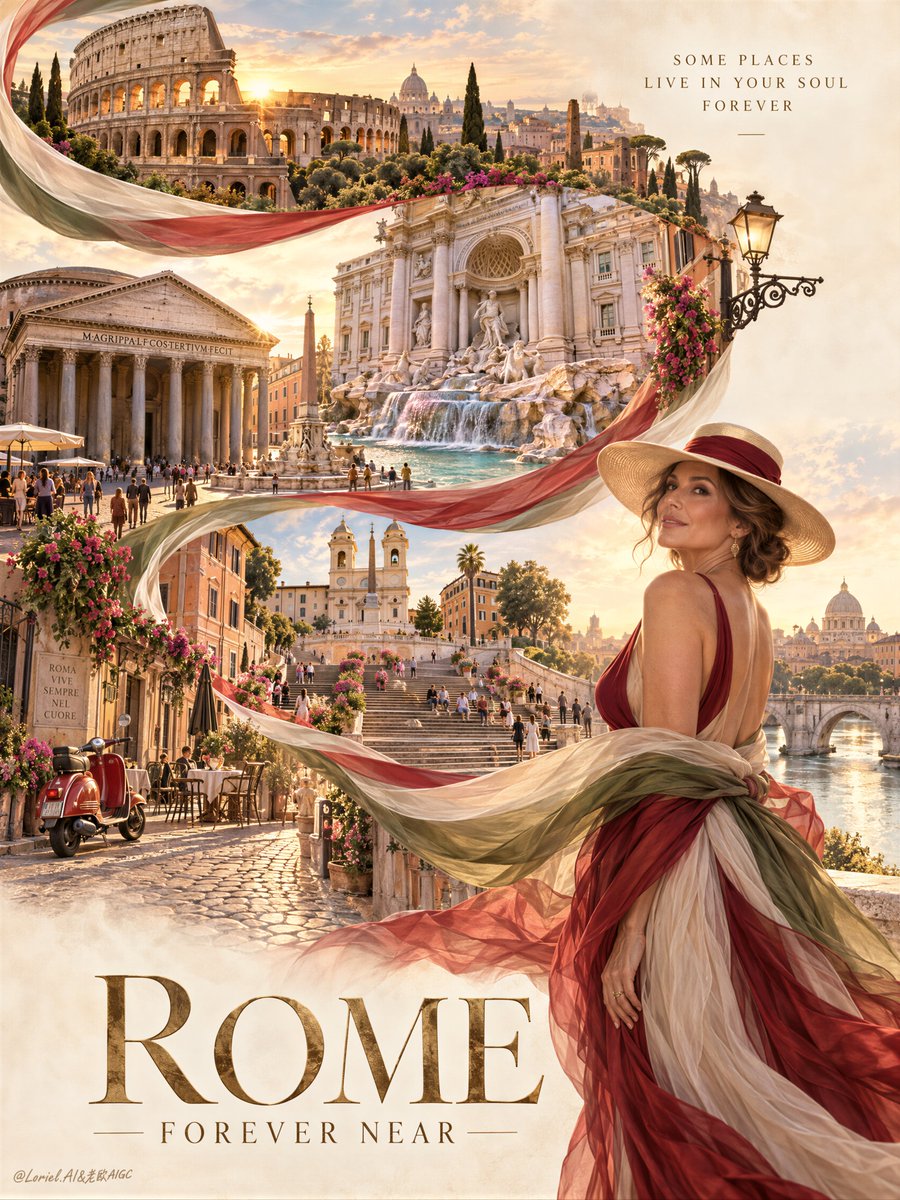
تبدو لوحة الكولاج للوجهات السياحية كرحلة متكاملة واحدة عندما يمتد عنصر مادي واحد عبر كل مشهد.
🧣 قم بتمرير وشاح شفاف طويل عبر طبقات المعالم البارزة، ثم لُفّه حول المسافرة في المقدمة. تتّبع العين مساراً واضحاً بدلاً من قراءة بطاقات بريدية منفصلة.
🌇 احتفظ بالمدينة في لوحة ألوان غروب واحدة—التراكوتا، الحجر الدافئ، الزيتوني الخافت، والذهب الناعم—ثم خصص أسطع إضاءة لحواف المعالم ووجه المسافرة. تظل المواقع المتعددة تبدو كذكرى واحدة متصلة.
GPT- image 2.5 prompt👇
Create a premium destination poster for a fictional international travel campaign brand named ROMA LUCENTE, designed as a single vertically composed emotional key visual where Rome itself is the undisputed hero and the entire image is built to deliver immediate romantic transport. This is the Orbit version: prioritize emotional atmosphere, cinematic longing, and instant destination desire above all else. The image must feel like a Cannes-level travel poster, a luxury editorial city dream, and a collectible European art print in one frame.
Build the composition around one sweeping serpentine ribbon of imagery flowing in a grand S-curve from the upper left through the center and down toward the lower half of the page, as if the soul of Rome is unfolding through one continuous breath. The ribbon should echo the Italian tricolor in a poetic, luxurious way through soft ivory, deep Roman red, and muted olive-green, rendered like translucent silk, painted editorial folds, and atmospheric graphic currents rather than literal flag material. This S-curve is the emotional spine of the poster and must guide the eye through the city with elegance and inevitability.
Inside this ribbon-like path, reveal Rome as a dream sequence of unforgettable landmarks and moods bathed in golden late-afternoon light. Show the Colosseum glowing with ancient stone warmth, the Trevi Fountain shimmering with luminous marble and silver-blue water, the Pantheon standing solemn and monumental, the Spanish Steps washed in sun, ochre Roman facades, narrow streets opening into elegant piazzas, distant domes and bell towers, café tables, flower-touched balconies, vintage Vespas, and a few softly moving travelers in refined attire. The scenes must feel seamlessly fused, emotionally escalating rather than merely informative, each one carrying a sense of wonder, romance, and timeless European grandeur. Rome must read as the hero product through beauty, scale, atmosphere, and cultural magnetism.
Place one mature woman in the lower right foreground as the emotional witness and aspirational anchor. She stands in graceful three-quarter profile, turning back toward the city with quiet awe and poised elegance, as if she has just stepped into a once-imagined dream. Her dress is couture-inspired and wind-responsive, built from layered sheer fabric in refined tones of wine red, soft cream, and muted olive, subtly echoing the Rome palette without ever becoming costume-like or literal. The fabric trails outward in a luxurious breeze, creating emotional continuity with the ribbon path above. Add a sophisticated wide-brim hat or elegant travel accessory to heighten the cinematic travel fantasy. Anatomy must be realistic and beautiful: correct head-neck-shoulder proportion, natural mature chest gravity, believable torso and pelvic logic, smooth hip-to-thigh transitions, realistic lower-body softness, subtle skin elasticity, faint natural dimpling, photoreal skin texture, and elegant hands with five clearly separated fingers and refined joints.
The background should remain soft, breathable, and elevated, like warm archival paper touched by Mediterranean light. Use a 60/30/10 palette hierarchy tuned for emotional seduction: 60% parchment, ivory, travertine, and sunwashed cream; 30% terracotta, Roman brick, wine red, muted olive, and cypress depth; 10% golden sunlight, marble glow, river shimmer, pale sky blue, and small floral accents. The overall color atmosphere must feel warm, noble, romantic, and transportive, never cluttered or brochure-like. Preserve open negative space around the upper right and lower title area so the image feels premium and collectible.
Typography must be entirely newly invented in English only. Do not copy any text from the source image. Use one monumental destination title such as "ROME, FOREVER NEAR" or another equally poetic phrase, placed at the bottom in large elegant serif lettering in antique gold or warm bronze. Add only one very restrained editorial whisper line near the upper left or upper right, something like a quiet invitation rather than information. Typography must feel emotionally resonant, sparse, and beautifully integrated into the poster architecture, never loud or touristic.
Lighting is central to the Orbit effect. Use luminous Roman golden-hour light with a soft cinematic glow, gentle atmospheric haze, warm highlights on stone and marble, subtle shimmer in water, and delicate backlight through the woman’s flowing fabric. The city should feel sun-kissed and almost sacred, as if every landmark is touched by memory as much as by light. Highlights should feel rich but soft, never harsh. Shadows must be velvety, refined, and coherent across all scenes so the poster holds together as one emotional world.
Material semantics are essential. Marble must feel cool, polished, and weathered by centuries. Travertine and stucco should show age, pores, and sun-softened edges. Fountain water should feel physically alive and luminous. The flowing ribbon should feel like a hybrid of silk, printed poster graphics, and drifting atmosphere. The woman’s dress must feel couture-grade, layered, weightless, and expensive. Skin remains photoreal and alive. Small lifestyle details such as boats, scooters, flowers, and café objects should be materially convincing but emotionally subordinate.
The final image must not read like a guidebook or itinerary collage. It must feel like desire made visible: one city, one dream pathway, one witnessing woman, one unforgettable invitation. The emotional priority is immediate and overwhelming travel longing, romantic grandeur, and timeless cultural seduction.
Quality target and structured exclusions: photoreal only, correct female anatomy, realistic hands with five fingers, no extra fingers, no missing fingers, no fused fingers, no broken wrists, no warped limbs, no twisted torso, no asymmetrical face, no plastic skin, no costume-like flag dress, no messy landmark collage, no brochure clutter, no unreadable typography, no random letters, no muddy color, no dead black blocks, no style drift, no AI artifacts, no watermark, no real person names, no real brand names.