انتقل إلى المحتوى
صورمجاني

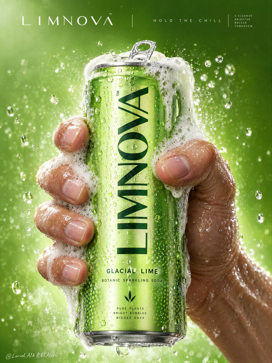
ملصق إعلاني تجاري فاخر لمشروب الصودا الفوار

موجه لتوليد ملصق تجاري سينمائي بمستوى جوائز كان لعلامة صودا راقية، يجمع بين الواقعية الملموسة للمنتج، وتفاعل اليد المشدودة بالرغوة والتكثيف، وتصميم جرافيكي نظيف.

أوبن إيه آي

معاينات من المصدر

صور النتائج منشورة لدى المصدر الأصلي. لم تُختبر هذه الأمثلة داخل دروب إيديا؛ قد تختلف النتائج بحسب النموذج والإعدادات.

جاهز للتخصيص والاستخدام

البرومبت الخاص بك

العربية

استبدل المتغيرات المميزة بالأحمر ببياناتك. انسخ النص كاملًا ثم استخدمه مع الوكيل الذي تفضله.

TXT MD النسخة الإنجليزية
الضغط يبدو حقيقياً لأن الرغوة تتبع قبضة اليد بدلاً من إخفاء المنتج. 🫧 رغوة كثيفة تعلو الحافة، ثم تتدفق على الحواف الجانبية للعلبة وعبر أصابع محددة مع إبقاء الشعار الرئيسي وخط النكهة واضحين هذا يمنحك لحظة انطلاق حقيقية دون التضحية بالتعرف على العبوة. تبدو الرغوة حيوية، لكن العلامة التجارية تظل مقروءة على الفور. 🧊 يد مبللة واحدة تلتف من اليمين والجانب السفلي الخلفي، مع توتر مرئي في مفاصل الأصابع، ومسافات طبيعية بين الأصابع، وانضغاط طفيف للجلد على العلبة القبضة تضيف قوة دون سحق العلبة أو جعل التشريح يبدو مصطنعاً. يصبح المنتج واليد والرغوة كتلة مركزية واحدة محكمة التحكم. GPT- image 2.5 prompt👇 Create a Cannes-level commercial poster for fictional premium sparkling soda brand LIMNOVA, merging tactile product realism, pressure-driven human interaction, and ultra-clean gallery-grade graphic design into one unified hero image. The core concept is controlled release: a cold lime soda can gripped at peak tension, overflowing with foam and condensation, turning an ordinary beverage moment into a sculptural event of freshness, pressure, and desire. Use a vertical full-bleed poster in extreme close-up, rule-of-thirds disciplined but visually centralized. Preserve the exact structure: a single slim can dominates the center, held tightly by one wet human hand wrapping from the right and lower rear; dense foam crowns the top and spills down the can; broad negative space remains above for elegant brand typography. The hand, can, and foam should read as one compressed central mass, surrounded by a luminous citrus atmosphere with no extra props. The can must remain the undisputed focal point and fully legible. The subject is a hyperreal slim aluminum soda can in radiant glacial lime green, with crisp pull-tab geometry, subtle printed microtexture, dense condensation droplets, and refined premium branding. Use the fictional text “LIMNOVA” as the main vertical logo, “GLACIAL LIME” as the flavor line, and “BOTANIC SPARKLING SODA” as the descriptor. The identity should feel bold, contemporary, and luxury-clean, with strong custom letterforms and exact print clarity. The can should look manufacturable, collectible, and ice-cold. One realistic human hand grips the can firmly with correct five-finger anatomy, natural finger spacing, believable knuckle tension, realistic nail beds, subtle skin compression, and wet highlights. The grip communicates force and freshness, not aggression. Foam surges over the top rim and flows across the fingers and can in airy dense clusters, while suspended micro-droplets and faint carbonation mist activate the space. The can remains undeformed except for natural optical tension created by the grip and liquid pressure. No extra hands, no anatomy drift. Build a minimal studio field rather than a literal location. The background is a luminous acid-lime to chilled-chartreuse gradient with suspended droplets, vapor-like fizz haze, and a soft freshness halo around the product. Keep the space clean and abstract, letting the product, hand, and foam generate all depth. No fruit slices, no ice cubes, no bar setup, no clutter. The world should feel like a distilled atmosphere of citrus pressure and cold carbonation. Lighting is a premium studio setup with a bright frontal key, cool upper-left freshness lift, and narrow specular edge highlights on wet aluminum and skin. Palette hierarchy: 60% glacial lime and electric citrus green, 30% white foam and bright condensation highlights, 10% natural warm skin tone as tactile counterpoint. Contrast should be crisp yet soft-edged, with no dead blacks, dirty grey mud, or cartoon oversaturation. The emotional tone is icy, alive, compressed, clean, and addictive. Materials must feel extremely photoreal: sharp reflective aluminum edges, chilled metallic bloom, droplets merging into trails, subtle ink adhesion texture; foam that feels light, wet, aerated, and creamy with translucent bubble variation and convincing thickness at the rim and fingers; and a real, de-AI hand with accurate anatomy, realistic skin texture, natural moisture sheen, crease detail, true finger joints, and no swollen or fused forms. Apply restrained high-end commercial polish, keeping hero detail sharp and print-ready. Integrate a minimalist top header as a refined brand system, not ad clutter. Place “LIMNOVA” on one side of the top band and a secondary studio-style signature or edition mark on the other, separated by a thin elegant divider. If an extra micro-headline is used, keep it very restrained, such as “HOLD THE CHILL” or “PRESS THE FIZZ”, set small outside the can recognition zone. Typography must feel architected into the negative space, aligned with the product axis, and never heavy or crude. Output: a premium beverage poster with product-first hierarchy, hyper-clean execution, strong tactile realism, elegant negative space, and exact brand readability. No extra cans, no fruit garnish, no ice props, no chaotic splash overload, no warped can geometry, no broken tab, no malformed hand, no extra or merged fingers, no unreadable text, no muddy shadows, no large dead black blocks, no low-quality AI artifacts, no clutter, no style drift, and no resemblance to existing real soda branding.
معاينة النتائج

البرومبت الخاص بك

الضغط يبدو حقيقياً لأن الرغوة تتبع قبضة اليد بدلاً من إخفاء المنتج. 🫧 رغوة كثيفة تعلو الحافة، ثم تتدفق على الحواف الجانبية للعلبة وعبر أصابع محددة مع إبقاء الشعار الرئيسي وخط النكهة واضحين هذا يمنحك لحظة انطلاق حقيقية دون التضحية بالتعرف على العبوة. تبدو الرغوة حيوية، لكن العلامة التجارية تظل مقروءة على الفور. 🧊 يد مبللة واحدة تلتف من اليمين والجانب السفلي الخلفي، مع توتر مرئي في مفاصل الأصابع، ومسافات طبيعية بين الأصابع، وانضغاط طفيف للجلد على العلبة القبضة تضيف قوة دون سحق العلبة أو جعل التشريح يبدو مصطنعاً. يصبح المنتج واليد والرغوة كتلة مركزية واحدة محكمة التحكم. GPT- image 2.5 prompt👇 Create a Cannes-level commercial poster for fictional premium sparkling soda brand LIMNOVA, merging tactile product realism, pressure-driven human interaction, and ultra-clean gallery-grade graphic design into one unified hero image. The core concept is controlled release: a cold lime soda can gripped at peak tension, overflowing with foam and condensation, turning an ordinary beverage moment into a sculptural event of freshness, pressure, and desire. Use a vertical full-bleed poster in extreme close-up, rule-of-thirds disciplined but visually centralized. Preserve the exact structure: a single slim can dominates the center, held tightly by one wet human hand wrapping from the right and lower rear; dense foam crowns the top and spills down the can; broad negative space remains above for elegant brand typography. The hand, can, and foam should read as one compressed central mass, surrounded by a luminous citrus atmosphere with no extra props. The can must remain the undisputed focal point and fully legible. The subject is a hyperreal slim aluminum soda can in radiant glacial lime green, with crisp pull-tab geometry, subtle printed microtexture, dense condensation droplets, and refined premium branding. Use the fictional text “LIMNOVA” as the main vertical logo, “GLACIAL LIME” as the flavor line, and “BOTANIC SPARKLING SODA” as the descriptor. The identity should feel bold, contemporary, and luxury-clean, with strong custom letterforms and exact print clarity. The can should look manufacturable, collectible, and ice-cold. One realistic human hand grips the can firmly with correct five-finger anatomy, natural finger spacing, believable knuckle tension, realistic nail beds, subtle skin compression, and wet highlights. The grip communicates force and freshness, not aggression. Foam surges over the top rim and flows across the fingers and can in airy dense clusters, while suspended micro-droplets and faint carbonation mist activate the space. The can remains undeformed except for natural optical tension created by the grip and liquid pressure. No extra hands, no anatomy drift. Build a minimal studio field rather than a literal location. The background is a luminous acid-lime to chilled-chartreuse gradient with suspended droplets, vapor-like fizz haze, and a soft freshness halo around the product. Keep the space clean and abstract, letting the product, hand, and foam generate all depth. No fruit slices, no ice cubes, no bar setup, no clutter. The world should feel like a distilled atmosphere of citrus pressure and cold carbonation. Lighting is a premium studio setup with a bright frontal key, cool upper-left freshness lift, and narrow specular edge highlights on wet aluminum and skin. Palette hierarchy: 60% glacial lime and electric citrus green, 30% white foam and bright condensation highlights, 10% natural warm skin tone as tactile counterpoint. Contrast should be crisp yet soft-edged, with no dead blacks, dirty grey mud, or cartoon oversaturation. The emotional tone is icy, alive, compressed, clean, and addictive. Materials must feel extremely photoreal: sharp reflective aluminum edges, chilled metallic bloom, droplets merging into trails, subtle ink adhesion texture; foam that feels light, wet, aerated, and creamy with translucent bubble variation and convincing thickness at the rim and fingers; and a real, de-AI hand with accurate anatomy, realistic skin texture, natural moisture sheen, crease detail, true finger joints, and no swollen or fused forms. Apply restrained high-end commercial polish, keeping hero detail sharp and print-ready. Integrate a minimalist top header as a refined brand system, not ad clutter. Place “LIMNOVA” on one side of the top band and a secondary studio-style signature or edition mark on the other, separated by a thin elegant divider. If an extra micro-headline is used, keep it very restrained, such as “HOLD THE CHILL” or “PRESS THE FIZZ”, set small outside the can recognition zone. Typography must feel architected into the negative space, aligned with the product axis, and never heavy or crude. Output: a premium beverage poster with product-first hierarchy, hyper-clean execution, strong tactile realism, elegant negative space, and exact brand readability. No extra cans, no fruit garnish, no ice props, no chaotic splash overload, no warped can geometry, no broken tab, no malformed hand, no extra or merged fingers, no unreadable text, no muddy shadows, no large dead black blocks, no low-quality AI artifacts, no clutter, no style drift, and no resemblance to existing real soda branding.

دليل المتغيرات

LIMNOVA

اسم العلامة التجارية الخيالية أو المخصصة المطبوعة على العلبة والرأسية

النص داخل الأقواس في قسم الشعار والرأسية

مثال على القيمة

LIMNOVA

GLACIAL LIME

اسم النكهة المطبوعة على العلبة

النص المخصص للنكهة

مثال على القيمة

GLACIAL LIME

BOTANIC SPARKLING SODA

الوصف التعريفي لنوع المشروب المطبوع تحت النكهة

النص التعريفي على جسم العلبة

مثال على القيمة

BOTANIC SPARKLING SODA

glacial lime green

لوحة الألوان الأساسية للمنتج والخلفية المتدرجة

وصف لون العلبة والخلفية

مثال على القيمة

glacial lime green

ماذا ستحصل عليه؟

  • ملصق إعلاني تجاري فائق الجودة يضاهي حملات الإعلانات العالمية.
  • تفاصيل واقعية جداً لقطرات الندى، انسياب الرغوة، وتوتر عضلات اليد الممسكة بالعلبة.
  • مساحة سلبية علوية نقية تتيح إضافة هوية بصرية أو خطوط طباعية إضافية بسهولة.

حالات الاستخدام

  • حملات إعلانية لمنتجات المشروبات الفاخرة والعصائر الفوارة.
  • عروض ملفات الأعمال (Portfolios) للمصممين ووكالات الدعاية والإعلان.
  • لوحات إعلانية ومطبوعات تسويقية ملفتة للأنظار لمنصات التواصل الاجتماعي.

طريقة الاستخدام

  • انسخ النص البرمجي الكامل وضعه في نموذج توليد الصور المتقدم المعتمد على GPT أو Midjourney.
  • قم بتعديل المتغيرات مثل اسم العلامة التجارية (LIMNOVA) أو النكهة ولوحة الألوان بما يناسب هويتك البصرية.
  • تأكد من الحفاظ على التعليمات السلبية لتجنب الأيدي المشوهة أو الفوضى البصرية الزائدة في الخلفية.
  • قم بتوليد الصورة بنسبة أبعاد رأسية (مثل 9:16 أو 4:5) للحصول على أفضل مظهر للملصق الإعلاني.

برومبتات ذات صلة

صورمعاينة المصدر

إعلان ملصق فاخر لبسكويت شاي بعد الظهر HOURMARK

موجه إعلاني تجاري عالي الجودة لابتكار ملصق بأسلوب حياة راقٍ يدمج فنجان الشاي بساعة عقارب ترمز لطقوس شاي الساعة الرا...

أوبن إيه آي
مجاني
معاينة النتائج

إعلان ملصق فاخر لبسكويت شاي بعد الظهر HOURMARK

إعلان ملصق فاخر لبسكويت شاي بعد الظهر HOURMARK
صورمعاينة المصدر

صورة إعلانية حضرية تفاعلية مع جدارية مقهى

موجه تصوير فوتوغرافي تجاري لإنشاء لقطة أسلوب حياة حضرية لرجل يقف أمام جدارية تفاعلية تسكب القهوة مباشرة في كوبه بتف...

أوبن إيه آي
مجاني
معاينة النتائج

صورة إعلانية حضرية تفاعلية مع جدارية مقهى

صورة إعلانية حضرية تفاعلية مع جدارية مقهى
صورمعاينة المصدر

ملصق إعلاني لابتكار جهاز لوحي سينمائي فائق الجودة

موجه إعلاني تجاري فاخر لإنشاء بوستر إطلاق جهاز لوحي خيالي بتقنية الشاشة الكاملة المندمجة مع مشهد سباق سيارات جبلي د...

أوبن إيه آي
مجاني
معاينة النتائج

ملصق إعلاني لابتكار جهاز لوحي سينمائي فائق الجودة

ملصق إعلاني لابتكار جهاز لوحي سينمائي فائق الجودة
صورمعاينة المصدر

شبكة حملة ضيافة وتسويق فاخرة من 4 لوحات

موجه متكامل لإنشاء شبكة إعلانية متحدة بنمط 2x2 لمطعم ولاونج فاخر، يجمع بين تصوير الأطعمة، والكوكتيلات المميزة، واست...

أوبن إيه آي
مجاني
معاينة النتائج

شبكة حملة ضيافة وتسويق فاخرة من 4 لوحات

شبكة حملة ضيافة وتسويق فاخرة من 4 لوحات