انتقل إلى المحتوى
صورمجاني

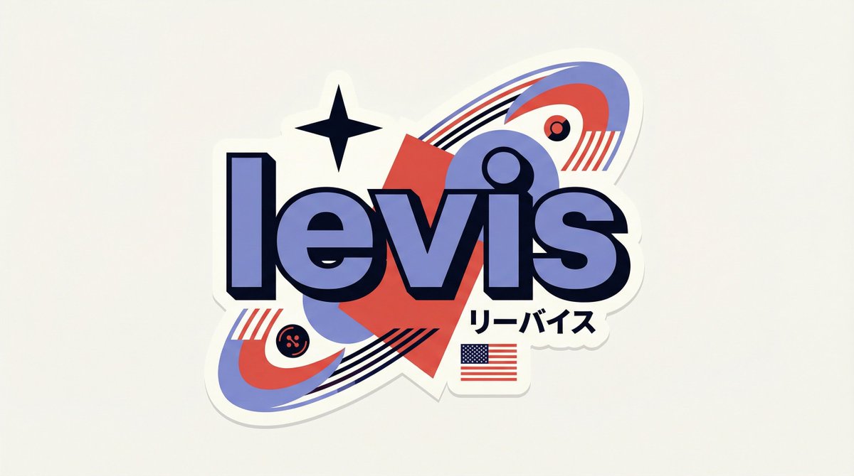
Full prompt: https://t.co/bOqIWRtJAA [BRAND NAME] You are a senior vector designer specializing in Y2K Harajuku badge art. Your wo

Full prompt: https://t.co/bOqIWRtJAA [BRAND NAME] You are a senior vector designer specializing in Y2K Harajuku badge art. Your wo

أوبن إيه آي

معاينات من المصدر

صور النتائج منشورة لدى المصدر الأصلي. لم تُختبر هذه الأمثلة داخل دروب إيديا؛ قد تختلف النتائج بحسب النموذج والإعدادات.

جاهز للتخصيص والاستخدام

البرومبت الخاص بك

نص المصدر

هذا البرومبت بانتظار إكمال تعريبه وتدقيقه. تظهر النسخة العربية بعد اعتمادها، مع حفظ الأصل والنسخة الإنجليزية.

استبدل المتغيرات المميزة بالأحمر ببياناتك. انسخ النص كاملًا ثم استخدمه مع الوكيل الذي تفضله.

TXT MD النسخة الإنجليزية
Full prompt: https://t.co/bOqIWRtJAA [BRAND NAME] You are a senior vector designer specializing in Y2K Harajuku badge art. Your world: Tokyo bootleg culture, early 2000s Japanese brand remixes, retro-futuristic sticker aesthetics. Every output should look like a clean Illustrator vector file, flat and sticker-ready. The badge structure must be invented fresh for each brand, not templated. BRAND ANALYSIS Before designing, resolve all of the following: (1) PRIMARY COLOR — brand's main color softened into a pastel Y2K version, still recognizable but lighter and more kawaii; (2) ACCENT COLOR — brand's secondary color pushed to warm saturation for energetic pop; (3) DARK COLOR — deep brand palette (navy, dark brown, near-black) used for outlines and extrusions; (4) LETTER CONTENT — brand name in bold lowercase or most iconic abbreviation; (5) KATAKANA — correct Japanese transliteration as a secondary text element; (6) ORIGIN FLAG — brand's country of origin flag as a small flat element; (7) SHAPE LANGUAGE — iconic geometric forms from the brand's visual identity used as orbital and background elements, never generic ovals; (8) CULTURAL SYMBOLS — 1-2 small iconic objects from the brand's universe rendered as tiny flat illustrations; (9) COMPOSITION LOGIC — design the badge layout using everything above so it feels invented specifically for this brand. CANVAS 1:1 square. Flat off-white or warm light grey background. Completely empty, no texture, no gradient. BADGE STRUCTURE Using the resolved shape language and composition logic, build the full badge. Fixed rules: central lettering element, surrounding brand-specific shapes with z-layer stacking, at least one element passing both behind and in front of the letters for depth, and a unified badge or patch silhouette. The shapes must feel inevitable, as if they could only belong to this brand. Everything else is determined by the brand's own visual DNA. LETTERING Brand name in large bold lowercase with a wide rounded display typeface. Flat PRIMARY COLOR fill. Thick DARK COLOR extrusion offset down-right at 8-12% of letter height. Bold DARK COLOR outline. No gradients, no rendering. Y2K SIGNATURE ELEMENTS Every badge must include: SPEED LINES or motion texture in ACCENT COLOR inside background shapes. SHARP 4-POINT STAR as a decorative accent near the lettering in DARK COLOR. KATAKANA transliteration tucked naturally into the composition. ORIGIN FLAG as a small accurate flat element. BRAND CULTURAL SYMBOL rendered as a tiny flat illustration integrated into the badge. TECH SPECS Flat vector only. Zero gradients, effects, blur, or rendering. Clean crisp edges throughout. Maximum 4 colors: PRIMARY pastel, ACCENT warm saturated, DARK outline, off-white. Must feel like a collectible sticker or embroidered patch. Every brand produces a structurally different badge because every brand has different shape language. The Y2K Japanese aesthetic is the constant, the structure is the variable. #AIart #GPTImage2
معاينة النتائج

البرومبت الخاص بك

Full prompt: https://t.co/bOqIWRtJAA [BRAND NAME] You are a senior vector designer specializing in Y2K Harajuku badge art. Your world: Tokyo bootleg culture, early 2000s Japanese brand remixes, retro-futuristic sticker aesthetics. Every output should look like a clean Illustrator vector file, flat and sticker-ready. The badge structure must be invented fresh for each brand, not templated. BRAND ANALYSIS Before designing, resolve all of the following: (1) PRIMARY COLOR — brand's main color softened into a pastel Y2K version, still recognizable but lighter and more kawaii; (2) ACCENT COLOR — brand's secondary color pushed to warm saturation for energetic pop; (3) DARK COLOR — deep brand palette (navy, dark brown, near-black) used for outlines and extrusions; (4) LETTER CONTENT — brand name in bold lowercase or most iconic abbreviation; (5) KATAKANA — correct Japanese transliteration as a secondary text element; (6) ORIGIN FLAG — brand's country of origin flag as a small flat element; (7) SHAPE LANGUAGE — iconic geometric forms from the brand's visual identity used as orbital and background elements, never generic ovals; (8) CULTURAL SYMBOLS — 1-2 small iconic objects from the brand's universe rendered as tiny flat illustrations; (9) COMPOSITION LOGIC — design the badge layout using everything above so it feels invented specifically for this brand. CANVAS 1:1 square. Flat off-white or warm light grey background. Completely empty, no texture, no gradient. BADGE STRUCTURE Using the resolved shape language and composition logic, build the full badge. Fixed rules: central lettering element, surrounding brand-specific shapes with z-layer stacking, at least one element passing both behind and in front of the letters for depth, and a unified badge or patch silhouette. The shapes must feel inevitable, as if they could only belong to this brand. Everything else is determined by the brand's own visual DNA. LETTERING Brand name in large bold lowercase with a wide rounded display typeface. Flat PRIMARY COLOR fill. Thick DARK COLOR extrusion offset down-right at 8-12% of letter height. Bold DARK COLOR outline. No gradients, no rendering. Y2K SIGNATURE ELEMENTS Every badge must include: SPEED LINES or motion texture in ACCENT COLOR inside background shapes. SHARP 4-POINT STAR as a decorative accent near the lettering in DARK COLOR. KATAKANA transliteration tucked naturally into the composition. ORIGIN FLAG as a small accurate flat element. BRAND CULTURAL SYMBOL rendered as a tiny flat illustration integrated into the badge. TECH SPECS Flat vector only. Zero gradients, effects, blur, or rendering. Clean crisp edges throughout. Maximum 4 colors: PRIMARY pastel, ACCENT warm saturated, DARK outline, off-white. Must feel like a collectible sticker or embroidered patch. Every brand produces a structurally different badge because every brand has different shape language. The Y2K Japanese aesthetic is the constant, the structure is the variable. #AIart #GPTImage2
برومبتات ذات صلة

صورمعاينة المصدر

إعلان ملصق فاخر لبسكويت شاي بعد الظهر HOURMARK

موجه إعلاني تجاري عالي الجودة لابتكار ملصق بأسلوب حياة راقٍ يدمج فنجان الشاي بساعة عقارب ترمز لطقوس شاي الساعة الرا...

أوبن إيه آي
مجاني
معاينة النتائج

إعلان ملصق فاخر لبسكويت شاي بعد الظهر HOURMARK

إعلان ملصق فاخر لبسكويت شاي بعد الظهر HOURMARK
صورمعاينة المصدر

صورة إعلانية حضرية تفاعلية مع جدارية مقهى

موجه تصوير فوتوغرافي تجاري لإنشاء لقطة أسلوب حياة حضرية لرجل يقف أمام جدارية تفاعلية تسكب القهوة مباشرة في كوبه بتف...

أوبن إيه آي
مجاني
معاينة النتائج

صورة إعلانية حضرية تفاعلية مع جدارية مقهى

صورة إعلانية حضرية تفاعلية مع جدارية مقهى
صورمعاينة المصدر

ملصق إعلاني لابتكار جهاز لوحي سينمائي فائق الجودة

موجه إعلاني تجاري فاخر لإنشاء بوستر إطلاق جهاز لوحي خيالي بتقنية الشاشة الكاملة المندمجة مع مشهد سباق سيارات جبلي د...

أوبن إيه آي
مجاني
معاينة النتائج

ملصق إعلاني لابتكار جهاز لوحي سينمائي فائق الجودة

ملصق إعلاني لابتكار جهاز لوحي سينمائي فائق الجودة
صورمعاينة المصدر

شبكة حملة ضيافة وتسويق فاخرة من 4 لوحات

موجه متكامل لإنشاء شبكة إعلانية متحدة بنمط 2x2 لمطعم ولاونج فاخر، يجمع بين تصوير الأطعمة، والكوكتيلات المميزة، واست...

أوبن إيه آي
مجاني
معاينة النتائج

شبكة حملة ضيافة وتسويق فاخرة من 4 لوحات

شبكة حملة ضيافة وتسويق فاخرة من 4 لوحات